October’s font of the month: Clavichord
In my worldview, typography has always lived at this fascinating intersection of history, technology and problem-solving/design, and I often approach my work through one or more of those lenses. But recently I’ve been thinking a lot about how type can also work on a visceral level, designed to evoke an emotional response rather than a historical connotation or general sense of elegance or craftsmanship.
There seems to a moment happening right now for this kind of expressive type design. I had the privilege of attending Les Rencontres de Lure this summer and was able to discuss this topic with a number of boundary-pushing French designers (including several members of Velvetyne Type Foundry). It is also a recurring theme in this recent interview with Jules Durand.
All of this led me to unearth a spindly blackletter that I started a couple years ago and abandoned shortly thereafter. I didn’t return to the design because I love the style or because think it is particularly useful. I returned to it because it makes my skin crawl.
This month, I’m sending you that spindly blackletter, which I’ve called Clavichord. I found its jumping-off point back in 2017 while browsing the private library of a friend here is Western Massachusetts. (Fun fact: this was actually the same day that I encountered the book that led to the creation of Klooster, December 2017’s Font of the Month.)
I spent a bunch of time with an 1860 tome called The History of Ink, published by one of the largest ink manufacturers at the time. Thanks in large part to the help of Florian Hardwig and the Fonts in Use moderators, there is now a post on Fonts in Use that showcases many of the typefaces used in this over-the-top book.
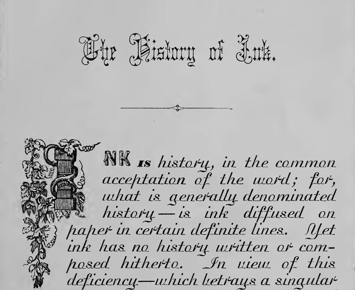
Of course, Madisonian steals the show as the book’s main text face, but my attention quickly turned to the bony, frail textura at the top of the first page. Called Italian Text or Cuneiform, depending on where you look, this typeface isn’t even the most beautiful American blackletter of that era. I guess what I appreciated about it was its ability to be both beautiful and a little icky at the same time.
This dichotomy is something that I tried to push even further in my interpretation of the design. Unlike the straightforward revival I took on last month, Clavichord takes many more liberties with the concepts set forth in the source material.
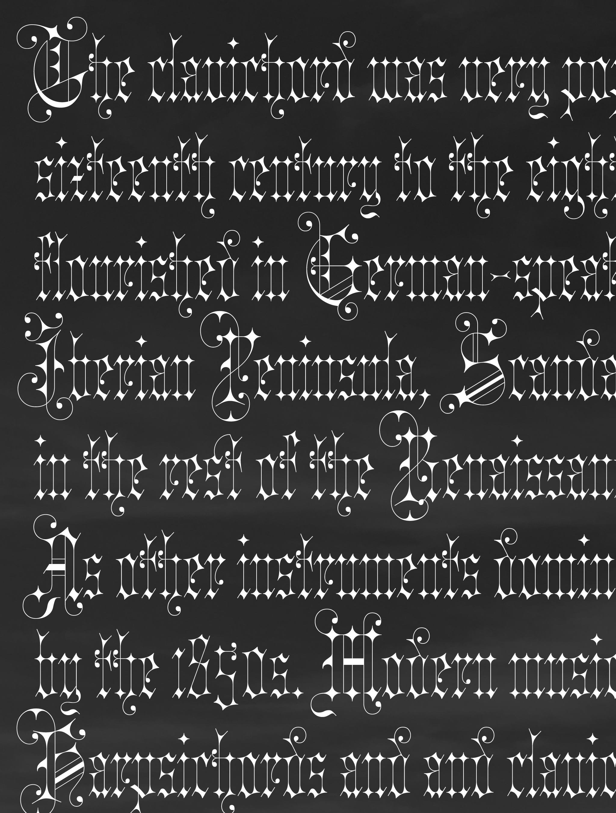
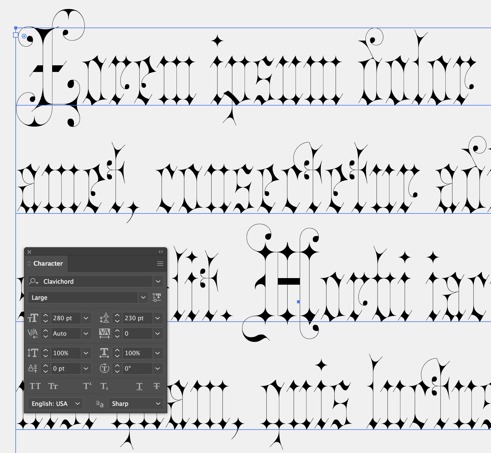
It is anchored by a distinctive “sparkle” shape, an abstraction of the diamond-like form made by a broadnib pen held at 45°. (It is certainly not alone in adopting something like this; recent examples include this striking piece by Wei Huang and Frida Medrano’s Jabin typeface.)
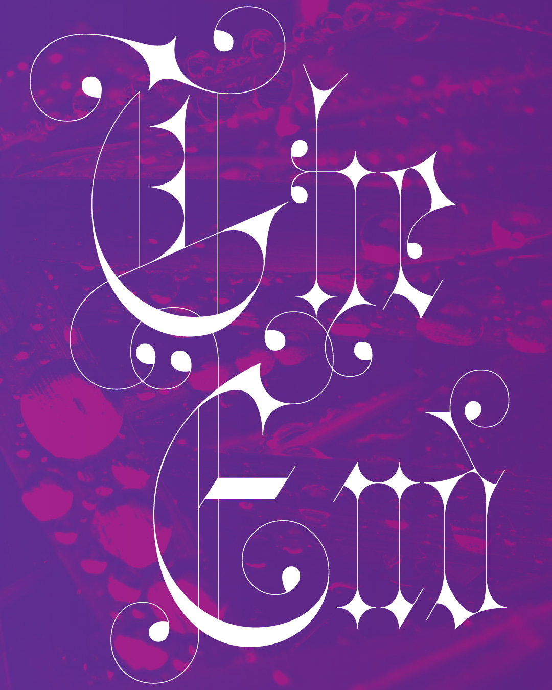
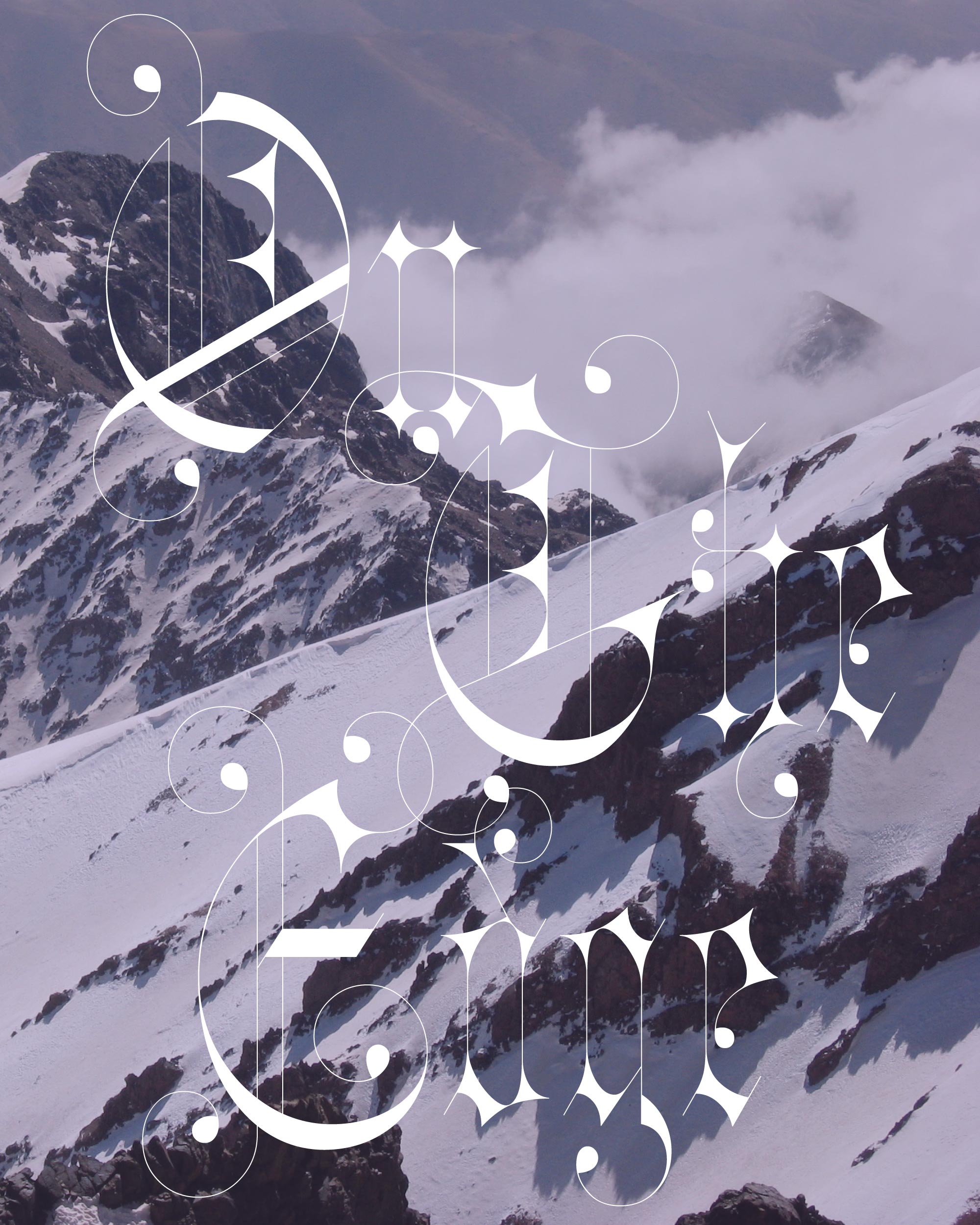
But Clavichord’s connection to the broadnib pen ends there; the rest of the typeface descends into lavish Victorian excess, with spirals, decorative ball terminals, and hairlines so razor-thin that they virtually disappear.
In the end, I added a variable Optical Size axis that allows you to control the hairlines thickness, keeping them at 0.5pt from 76pt to 332pt!
I’ll admit that this was a hard typeface to draw, and it might prove to be an even harder typeface to use. But I hope you can find a place in your designs to add a little “ick factor,” even if it’s just a drop cap or some words on top of a big photo. Happy Halloween!
Clavichord is October’s installment of Font of the Month Club. As always, you can sign up for as little as $24!