June’s Font of the Month: Fern Text
In spring, I am always taken by surprise here in Western Massachusetts. Since I wrote you last, flowers are blooming, deer and wild turkey are visiting, and birds are chirping...there’s even a nest directly above my front door! And the forest floor in the woods around my house—just dirt and dead leaves a few weeks ago—is now covered in a thick blanket of ferns.
These ferns are lovely, sure, but I couldn’t help but feel that they were taunting me...a constant reminder that I still haven’t figured out what to do with my typeface Fern, a family that has been described on my website as “coming soon” since 2016! 😬
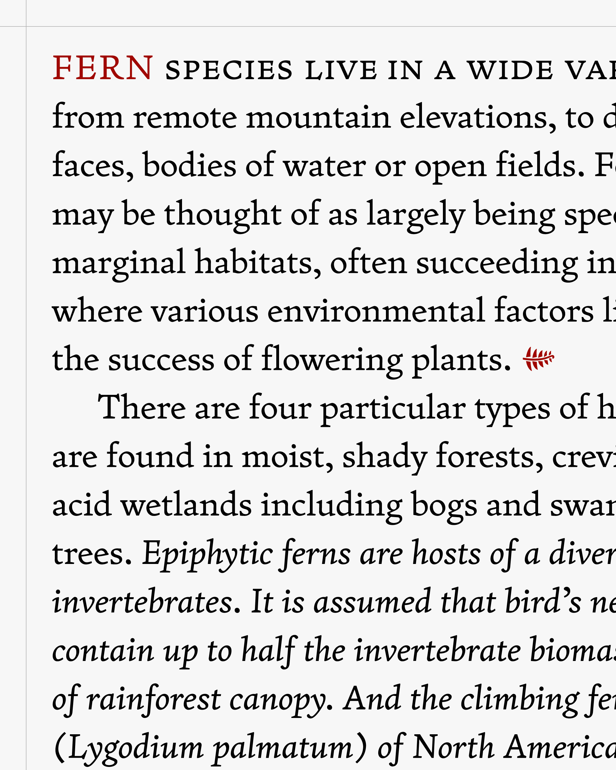
I started Fern Micro in 2013, in an attempt to translate the diagonal stress and ribbonlike texture of Jenson (and its twentieth-century ancestors like Centaur and Dante) to small sizes, especially on screen. Originally intended to be a part of Font Bureau’s Reading Edge Series for small text on the web, Fern Micro’s large x-height, loose spacing, and low contrast helped it stand up to the limitations of screen resolution and text rendering at the time. But I always thought of Fern Micro as the start of something bigger, and here I am eight years later still figuring that out.
I tend to have a love-hate relationship with my own work, but I’ve always liked Fern Micro. It’s a simple typeface that does a simple job: read nicely at small sizes. But as screen resolutions get sharper and folks use larger sizes for body text, the cracks start to show. Its chunkiness makes it super robust—a much-needed feature in small sizes—but can also make it feel horsey as it gets bigger. (It was this same impetus that sparked the creation of Roslindale Deck.)
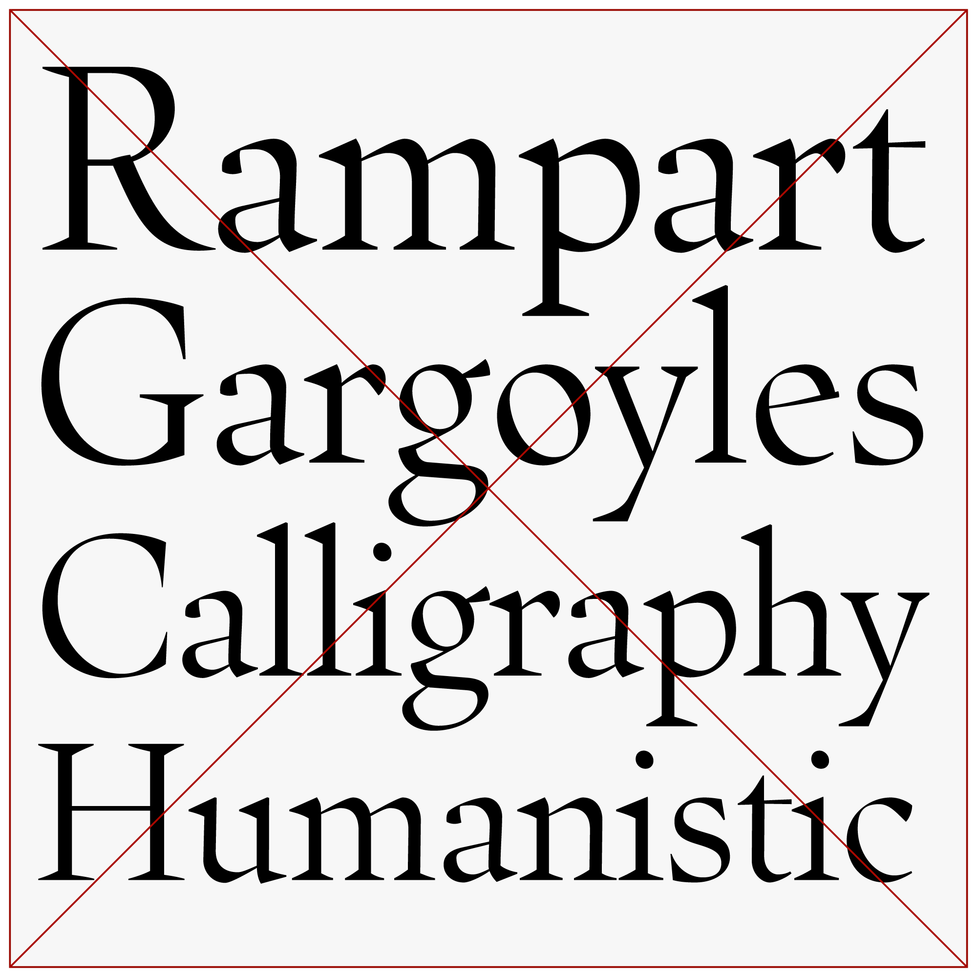
My original drawings for Fern Display, now scrapped
I’ve tried a couple times to go-big-or-go-home and draw a cut of Fern for huge sizes, but each time I found myself stymied by dissatisfaction and indecision. I’ve sharpened the serifs, I’ve boosted the thick/thin contrast, and I’ve completely rearranged the proportions so that the lowercase was narrower and smaller in relation to the caps. It never worked for me. It’s hard to put my finger on exactly why, but I guess the sharpness and contrast felt uncharacteristically loud and showy for a font that isn’t really about seeking attention. Fern isn’t trying to be the prettiest, most exquisite interpretation of Jenson’s Roman, and it’s not trying to be a postmodern deconstruction of it either. Fern is just a simple text face.
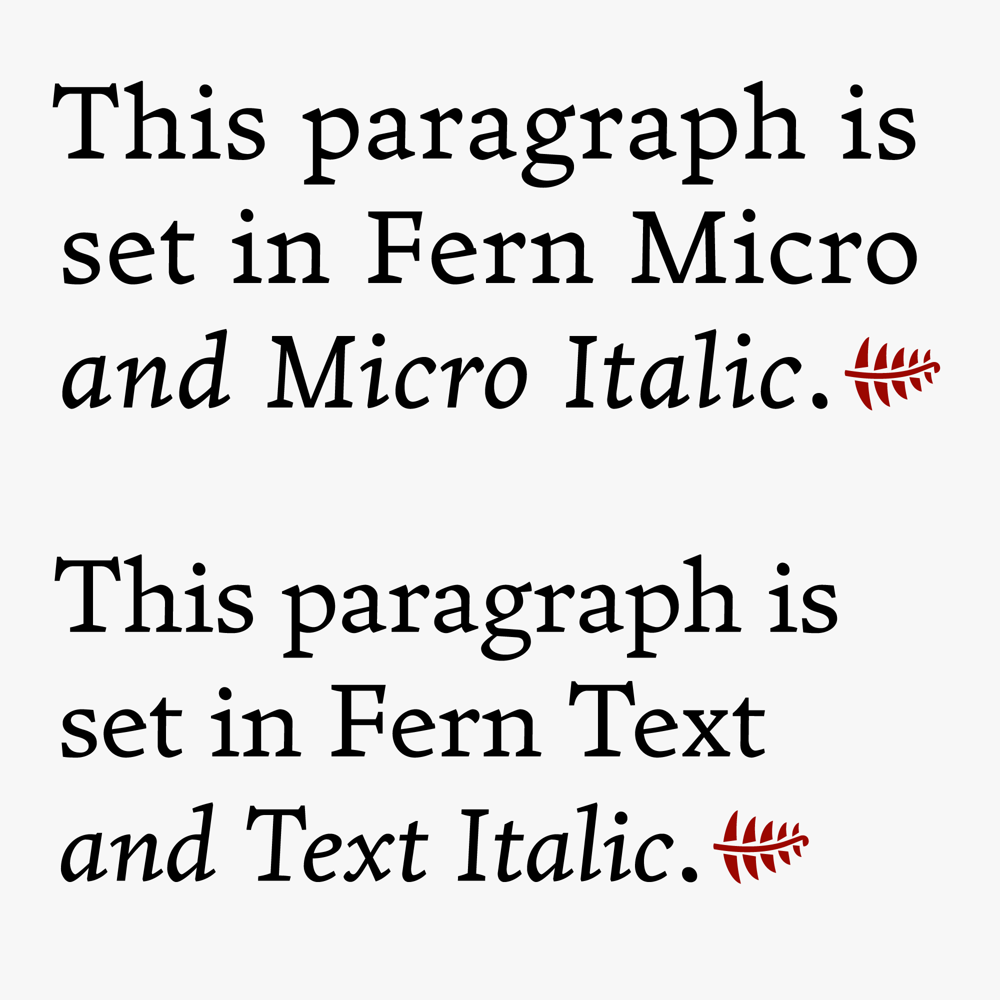
I decided I needed to embrace that simplicity, so I went back to the problem that I was actually trying to solve: Fern Micro gets ungainly as it gets larger. So, what I’m sending you this month is a “re-tuning” of Fern for those larger text sizes (I’m thinking 11–14pt, but your mileage may vary). It makes the same kinds of changes that I attempted in the scrapped Display cut (smaller x-height, higher contrast) but in smaller, subtler moves. I think it does the job!
Several of you have asked for a Bold weight for Fern (a reasonable request!), so you’ll find that in the package as well as an update of Fern Micro. The variable version unites Text and Micro along an Optical Size axis, which now works automatically in the latest InDesign (I’ve been playing with this feature a bunch since the Forma DJR expansion I released earlier this month with Ruggero Magrì.)
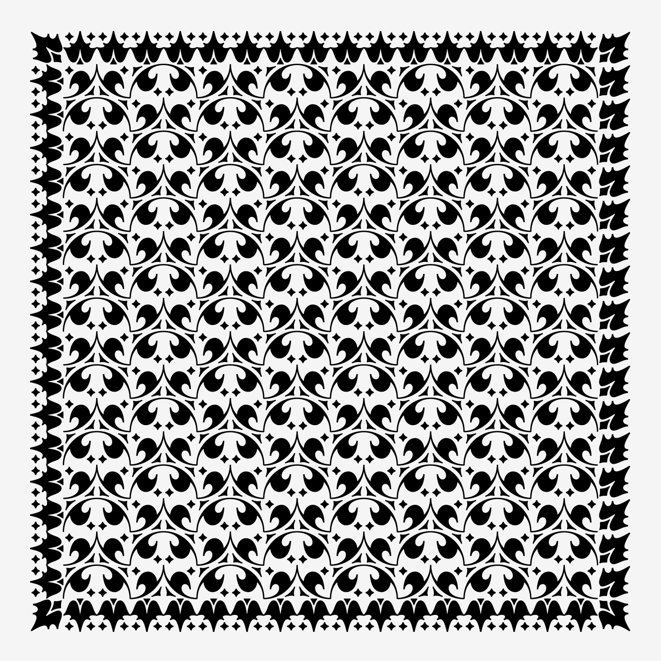
And I know I just said I was trying to keep things simple, but when it came to ornamentation I couldn’t help myself. On a whim, I added a set of ornaments that follows a system I found in a book by Centaur’s designer, Bruce Rogers. You can access them via the Glyphs palette, via a separate font mapped to a QWERTY keyboard layout, and even via a DrawBot script (inspired by James Edmonson’s Hobeaux Rococeaux borders script as well as Marina Chaccur’s recent talk on the Kaba ornament).
I’m excited to share a little piece of my woods with you, so that you can go forth and cover your endpapers and empty spaces in a thick blanket of greenery!
Have a jubilant June, and maybe “see” you at Typographics?
—DJR

Fern photos by Emily Richardson