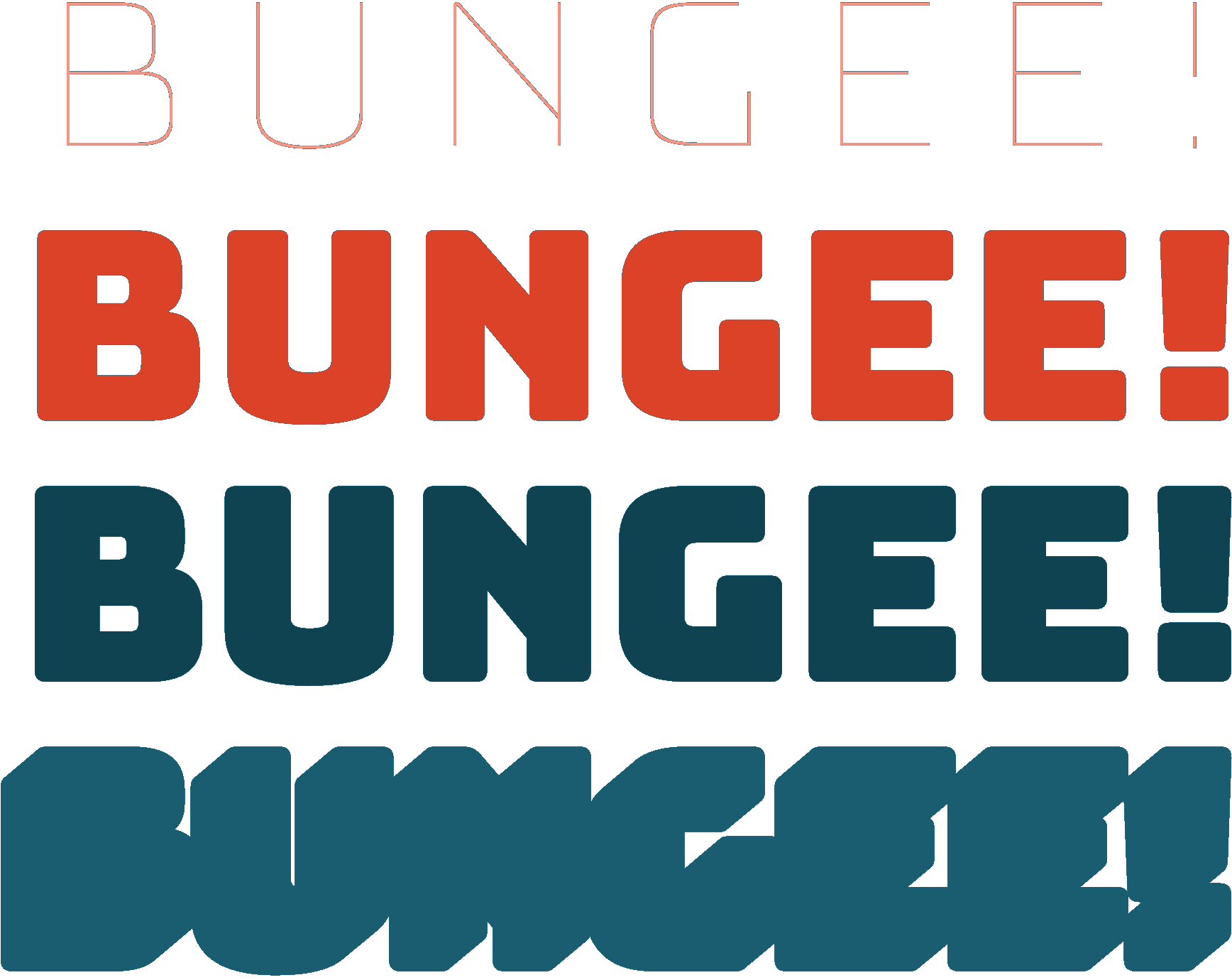
Bun-
gee!
Fonts for vertical and multicolor typography


Stacking
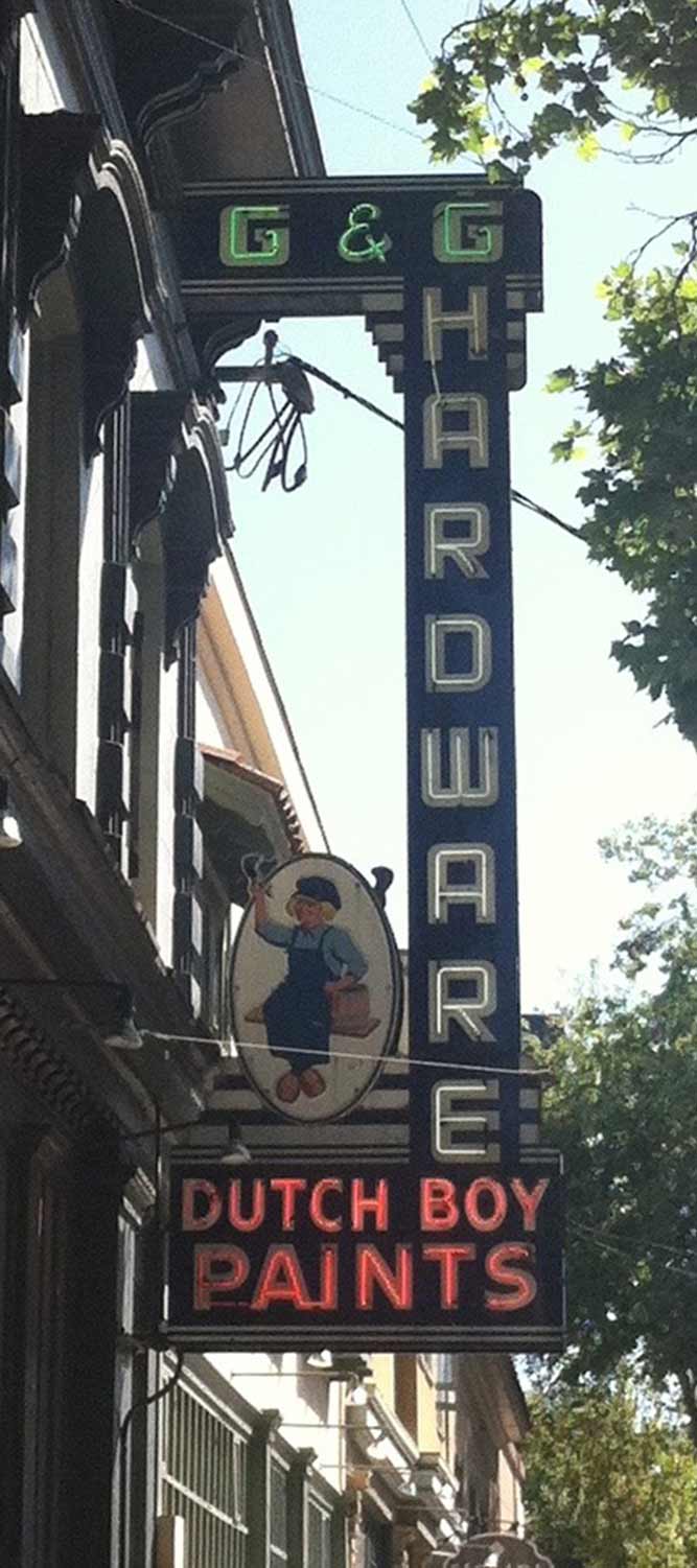
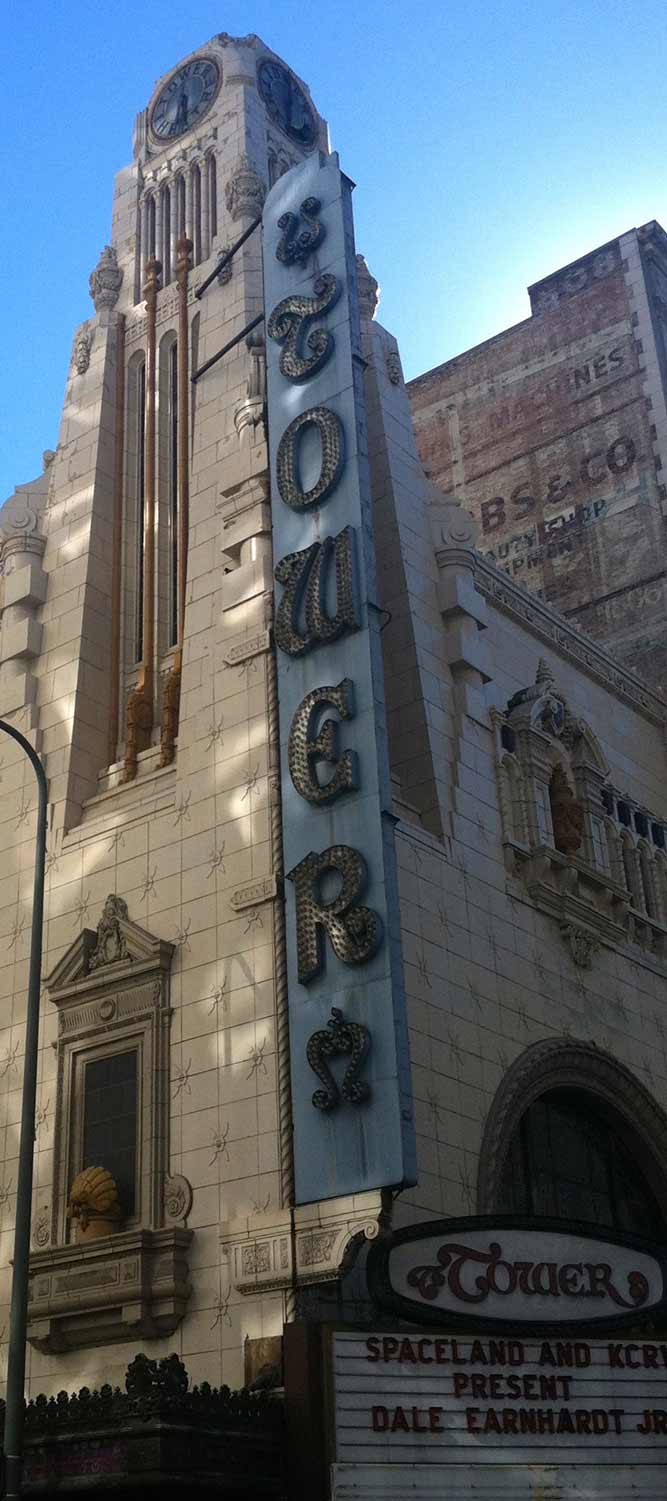
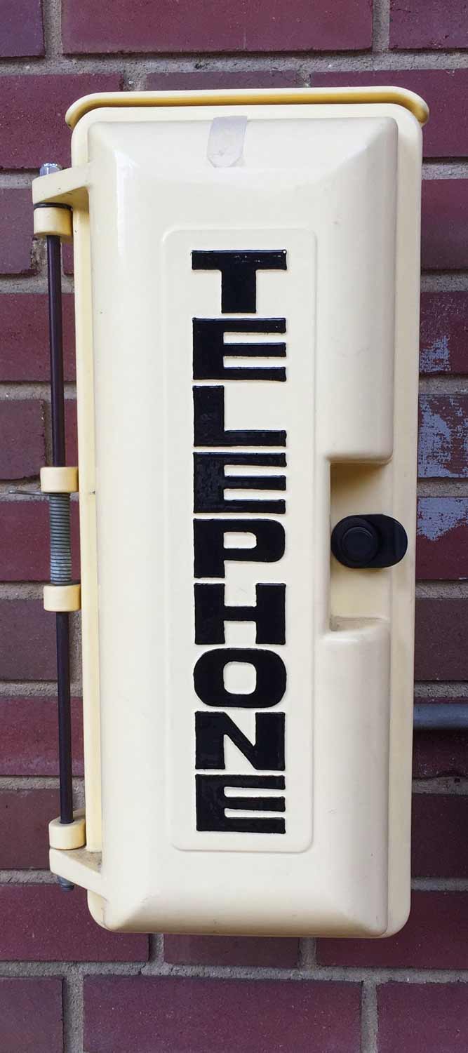
Vertical signs in Oakland, San Francisco, and Los Angeles, CA.
Bungee is a typeface that celebrates the urban sign. From crummy liquor stores to majestic theaters, vertical signage fills our cities. They stack the Latin alphabet, one letter on top of the other, in order to make dramatic use of limited space. Following their lead, I designed Bungee to be able to adapt to horizontal or vertical text, so it is always ready to take your text in a new direction.

In vertical type, the downward flow of text becomes more important than the proportions of any individual letter. I drew Bungee’s round and diagonal characters with straight sides (see O and A), which reinforces their verticality and creates words with well-defined left and right edges. Letters that are unusually wide, narrow, or asymmetrical (such as I, L, M, and W) can be especially tricky. You can avoid these letters or play with Bungee’s alternates to get the best results for your design.
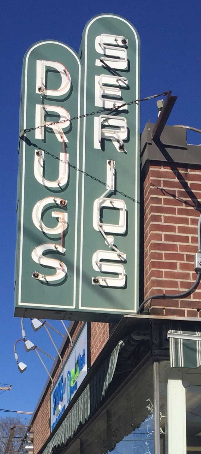
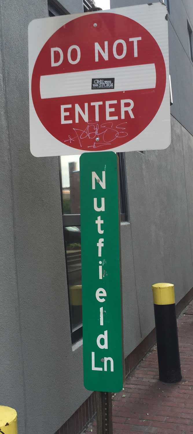
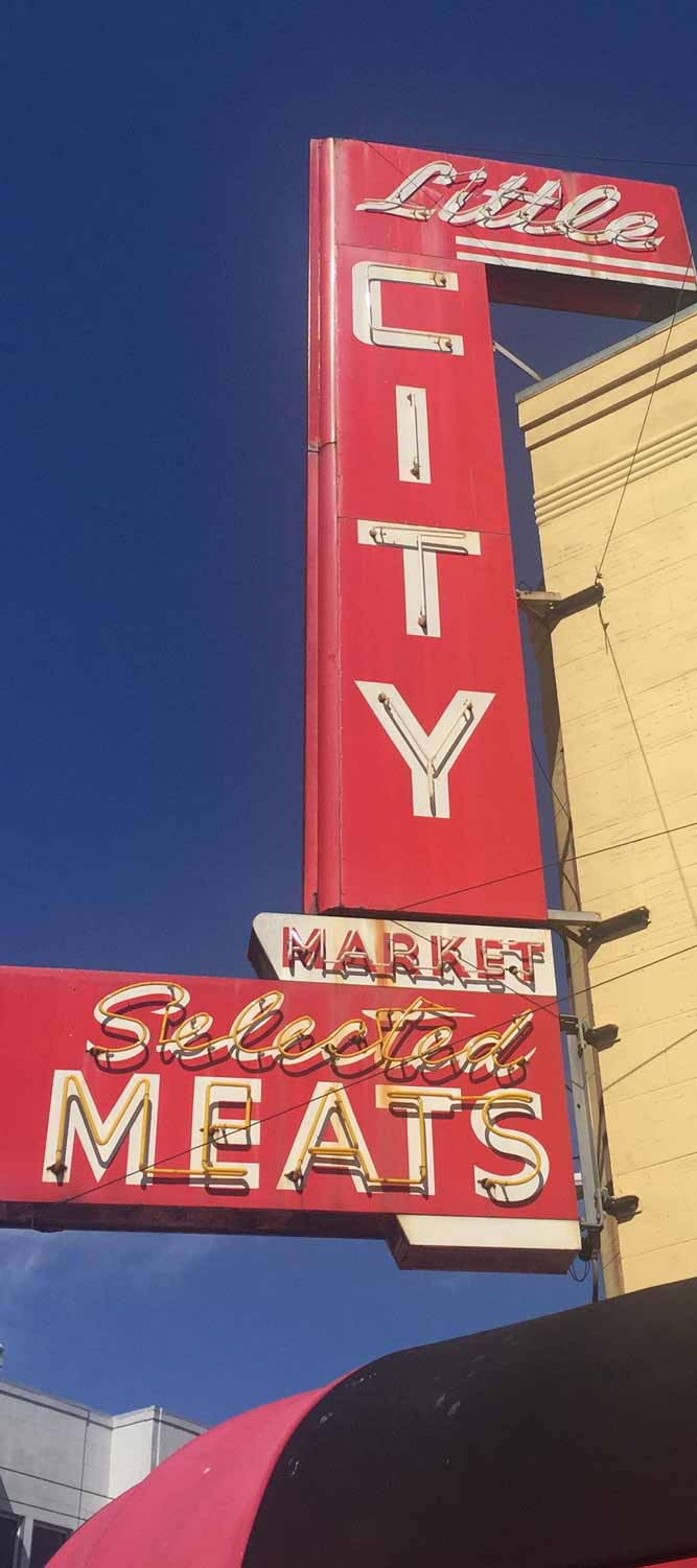
Unusual signs from Northampton, MA, Philadelphia, PA, and Manchester, NH.
The Latin alphabet is designed for horizontal writing, and stacking it is not always the best idea. But, when used deftly and sparingly, I believe Bungee’s vertical forms can help your text stand out among the crowd. Despite readability issues for long and unfamiliar words, changing the text orientation may lead to unusual design solutions and raise interesting questions: How should I handle word breaks and apostrophes? How monowidth is too monowidth? Should I even consider using lowercase?

Bungee implements its vertical forms via OpenType features that are more commonly used for East Asian scripts. With proportional vertical spacing, Bungee allows each letter to be as tall as it needs to be. Bungee even has vertical kerning to combat pesky letter combinations! You can activate these features using the Vertical Text tools that are available in some desktop applications, or by using CSS writing-mode: vertical-rl and text-orientation: upright.
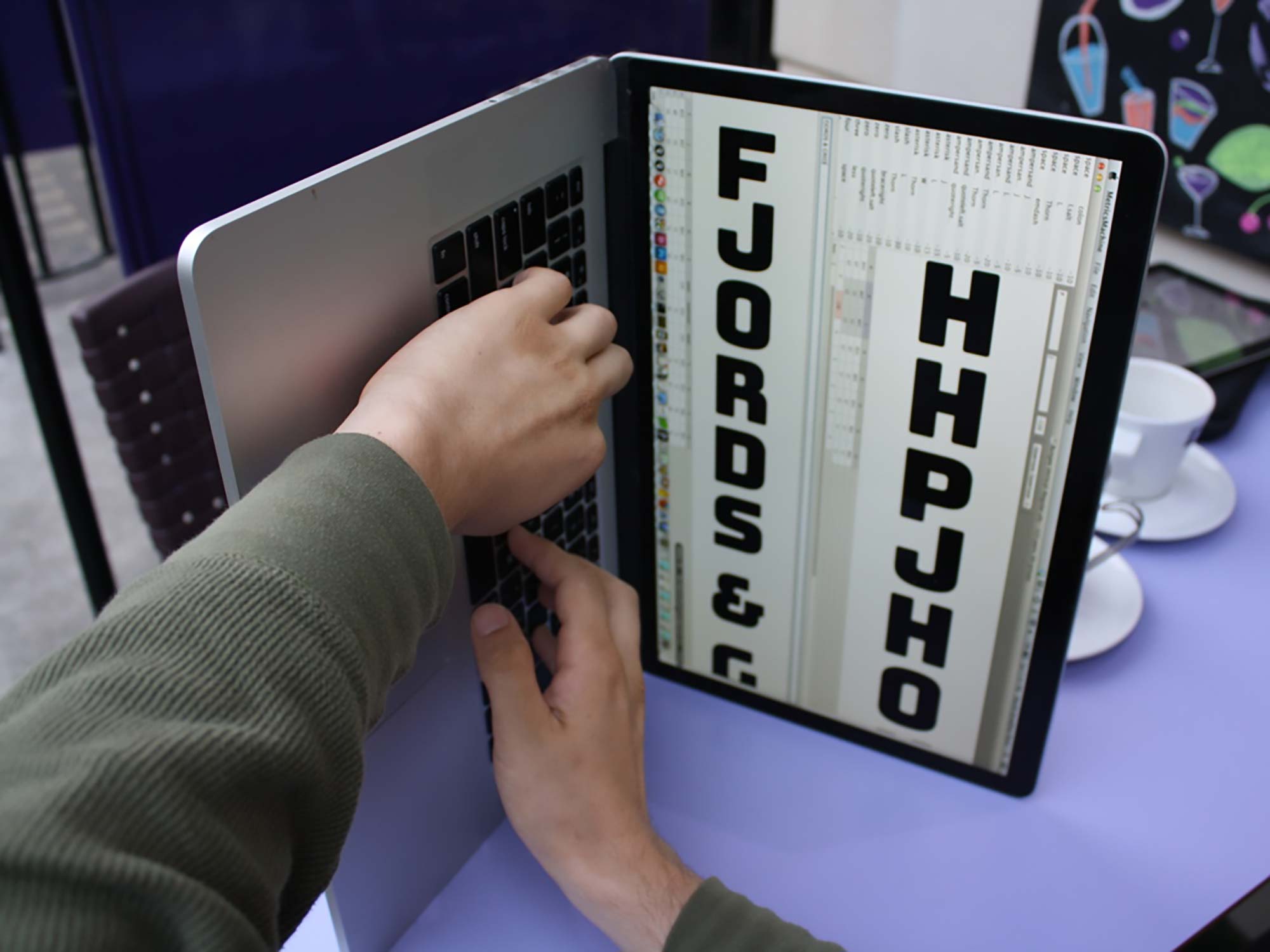
I began by drawing each of Bungee’s letterforms on its side, rotated 90° counter-clockwise. This allowed me to use horizontal tools to make a vertical design, but also presented me with some unusual design challenges. You can use this rotated version of Bungee in applications that cannot take advantage of Bungee’s OpenType vertical capabilities. By rotating the text box 90° clockwise, you can simulate vertical text in almost any environment.


Color
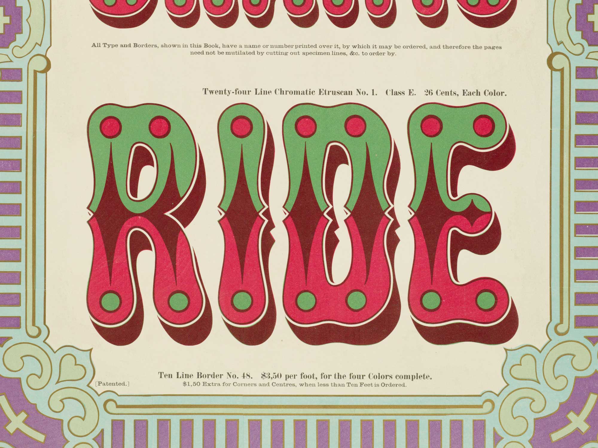
Chromatic Etruscan No. 1 from Wm. H. Page & Co.’s 1874 book of chromatic type specimens.
Chromatic fonts are nothing new: sets of wood type intended for overprinting were produced as early as 1841, and quickly became a popular way to add visual interest to posters and broadsides. Today we find ourselves in a renaissance of chromatic type, with many incredibledigitalfonts released each year that come with layers for chromatic typesetting.
Bungee comes in four layers: Regular, Inline, Outline, and Shade. You can mix and match these styles and their ornaments to create a variety of chromatic effects. In desktop apps, you can style each layer separately, and overlay them when you are finished. On the web, you can create layers using absolutely-positioned content in your ::before or ::after pseudo-class, or use bungee.js to do the heavy lifting for you.

For times when layering is not an option, I drew a separate set of five black-and-white fonts that are designed to fly solo. Since these fonts don’t require any advanced features, they will work effortlessly in any app or environment. These five fonts are also available on Google Fonts.
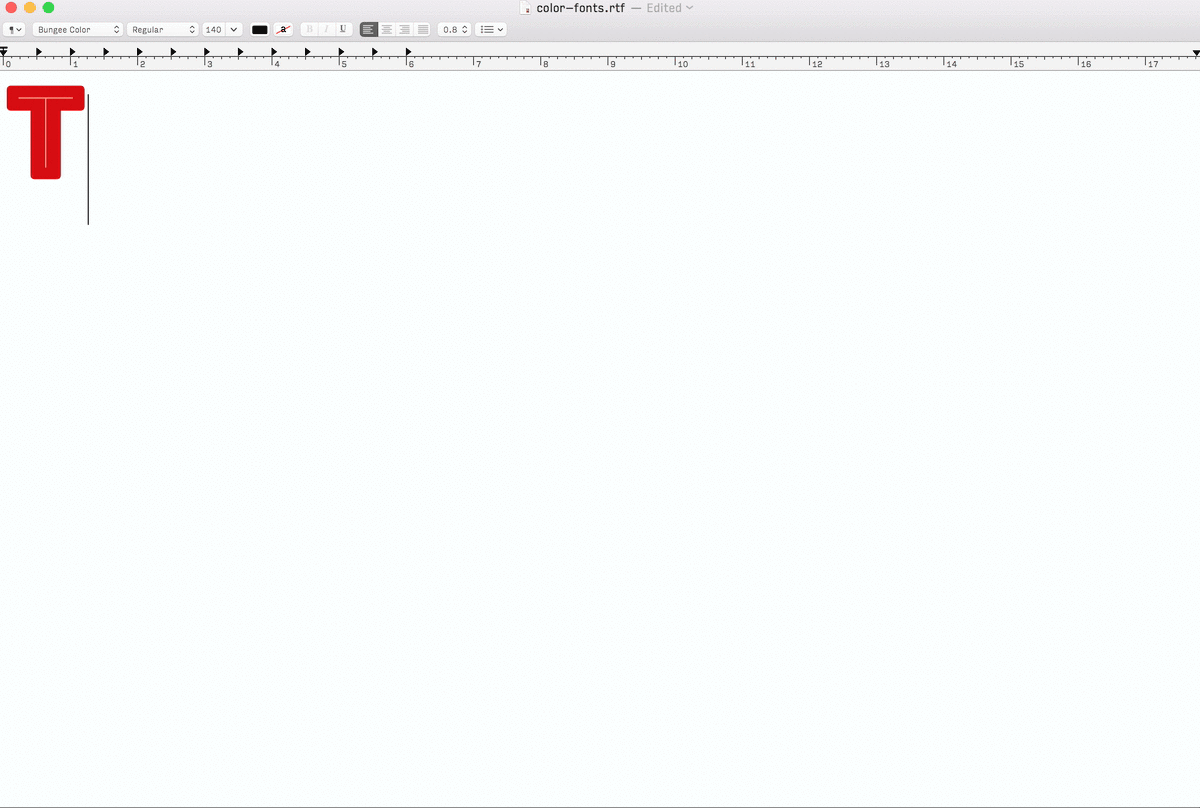
Bungee is also available in three flavors of true OpenType color fonts: OT-SVG, COLR/CPAL, and SBIX. These fonts store color information inside the font itself, so it is possible to create chromatic effects even in the most basic typesetting environments. This technology is still developing, and support for color fonts is far from universal. Still, I am excited about the possibilities, and I hope that Bungee Color will help designers and developers explore and expand upon what color fonts have to offer.


Bungee’s stylistic alternates include simplified Deco forms, unserifed forms of I and L, and vertical ligatures for double-II and the Dutch IJ. Bungee also ships with a collection of arrows, pointing hands, and background shapes that are inspired by the shapes and decorations on old commercial signs. Some of these background shapes will connect to form decorative banners, while others are meant to encircle a single letter.
Bungee in Use
From Fonts in Use


![Be[rlin] Iran’s Voice flyer](https://assets.fontsinuse.com/static/use-media-items/176/175413/thumb/635d3447/@2x/IMG_2865.jpeg)


Thanks
Thanks to support from Google and The Font Bureau, Bungee is released under the SIL Open Font License, meaning that it is completely free and open-source.
Making Bungee has been a great way for me to play with emerging font technologies. I sell most of my fonts commercially, but I belive Bungee is well-suited to a libre license because of its focus on emerging features like chromatic layers and vertical writing. Bungee was part of Microsoft’s early experiments with color fonts, and I hope that as a libre font, it will continue to encourage experimentation and development in this area. More widespread use of color fonts and vertical text will lead to better support, and I want Bungee to be a resource for designers and developers, professional and amateur alike. (If you wish to support my work, consider purchasing one of my retail typefaces!)
This responsive webpage was created by Nick Sherman, Chris Lewis, and me. Like Bungee itself, its layout can switch from vertical to horizontal (depending on the dimensions of your screen).
Special thanks to Dave Crossland, Rob Giampetro, and Omer Ziv from Google; David Berlow, Sam Berlow, Kent Lew, Cyrus Highsmith, and Jill Pichotta from The Font Bureau; Frederik Berlaen for his tools and support, Jens Kutílek for RoboChrome; Roel Nieskens for spelunking in Bungee Color; Microsoft’s Typography team for their early work on Bungee Color; Emily Richardson for coming up with the name; and Jon Corum, John Downer, John Kramer, Indra Kupferschmid, and André Mora, for their thoughtful feedback and advice during the design process.