February’s font of the month: Megavolt
A new semester just began at Massachusetts College of Art & Design, and with it, the typeface design course that I teach.
In my class, the first project is always pixel fonts. Drawing beautiful curves can be annoying and time-consuming, especially for a beginner, so to start we set that aside and build letters out of tiny blocks. It’s kind of like a typographic sketch: students rough out a vocabulary of shapes, quickly explore variations on the theme, and get an overview of the type design process in a fraction of the time it would take to draw a conventional typeface. (If you want to give it a shot, FontStruct is a great place to start.)
A few weeks ago, as I was preparing my course materials, I decided to put myself in my students’ shoes and mess around with a pixel font of my own. I truly didn’t expect this exercise to lead anywhere, but in a low-res environment, where it’s possible to draw as fast as you can think, it becomes a game to puzzle out how all the different shapes will fit together. And this one turned out to be a puzzle that I simply couldn’t put down.
Megavolt prototype, quickly rendered in pixels.
Diagonal strokes in pixel fonts are always a challenge because it’s difficult to avoid the jaggy staircases created by going against the grain of the pixel grid. But rather than avoiding those staircases, I leaned into them, adding diagonals to letterforms wherever I possibly could.
I could have let this remain a pixel font. After all, I love them and have a great appreciation for expansive systems like Elementar and Bitcount, for Toshi Omagari’s explorations of arcade game fonts, and for Alanna Munro’s broadcasts where she occasionally creates pixel fonts in Animal Crossing. But with Megavolt, I became more interested in the potential of so many diagonals than I was in the pixels themselves, and the jaggies distracted from that so they had to go.
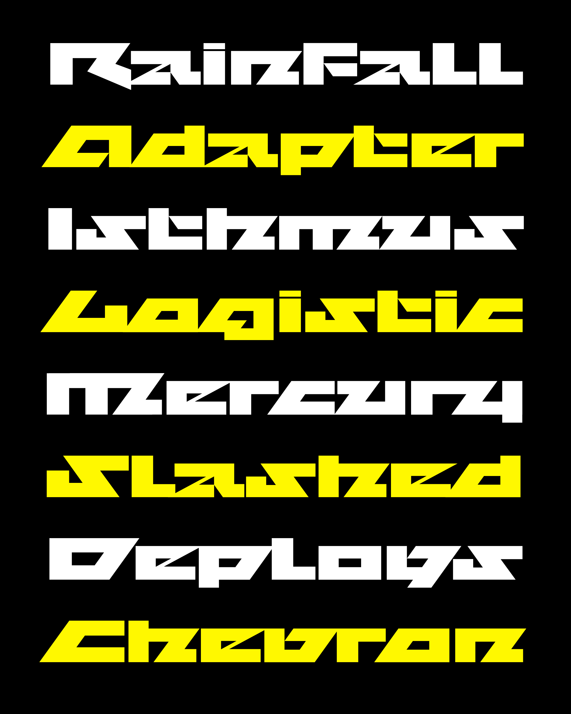
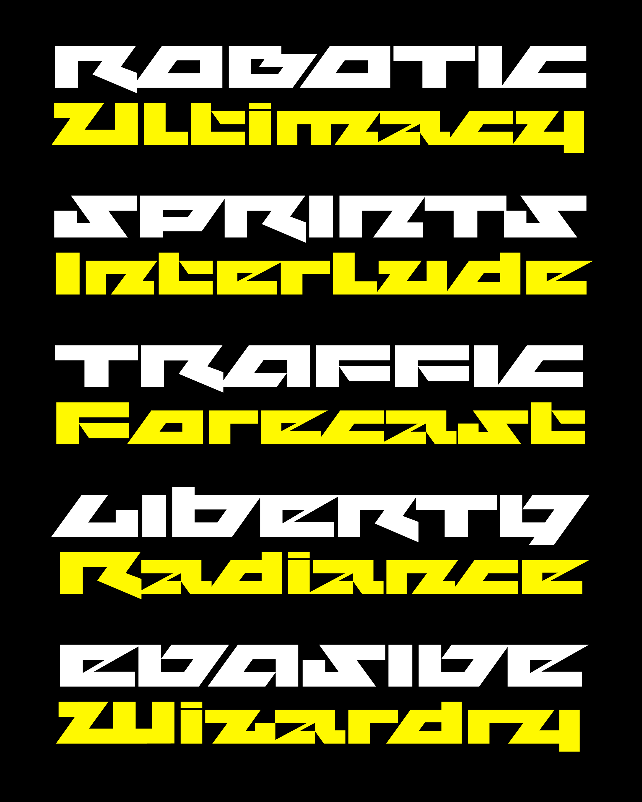
So I converted the pixely blocks into outlines, added some optical correction to the proportions and stems weights, and changed the 45° staircases to sleek 54° diagonals...essentially the typographic equivalent of “Zoom in...now, enhance.”
With that, the design of the typeface became a different kind of geometric game, with me rotating and rearranging triangles and trapezoids as if they were tangrams. I didn’t bother adding curves; as I said before, they’re annoying and time-consuming!
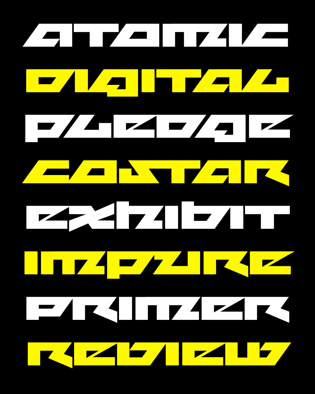
I was so busy inside this game that it took me a while to step back and ask myself questions like, “So what’s the point of this font?” and “How would anyone use it?” Megavolt’s vocabulary of shapes is incredibly basic, but it’s funny how easily simple shapes pick up unplanned connotations and associations when put in the context of the greater typographic landscape.
For some reason, I had it in my head that this had the vibe of the old Reebok logo and the legendary typeface Motter Tektura. But then of course I looked and they were completely different. I thought about the irreverently angular typefaces of Benoît Bodhuin and the blocky angularity of ’70s designs like New Zelek and Checkmate. But where I feel this typeface really belongs on the poster for an ’80s sci-fi thriller or maybe the show of a thrash metal band (see also Metal Lord and Metalista, not to mention pretty much the entire DaFont Sci-Fi category).
I think of Megavolt as a cousin to Megabase, the design I sent out one year ago today. Both are built around a set of incredibly simple rules about shape that I’ve imposed upon the alphabet (perhaps uncompromisingly so, at the cost of legibility). And both are unsubtle in their sci-fi vibes: Megabase takes a funky, bright view of the future, typical of sci-fi in the ’60s and early ’70s, whereas Megavolt embodies the darker, harsher, and edgier directions that sci-fi took in the decades that followed.
As far as metal goes, I confess it’s not a topic I know a ton about (guess I was more of a ska kid 🤷). So I was grateful to Nick Sherman for helping give me a lay of the land and for providing me with some appropriate listening material as I fleshed out the design. He also observed that Megavolt might be even less legible than Fit, and as far as I’m concerned, that’s an achievement unlocked!