Press

Writing something about my typefaces?

I’m excited for you to cover my work! 😊 On this page you’ll find materials that you are most welcome to use in your piece, including images, links, and short descriptions of my type families.

You are welcome to check out the fonts themselves using my free testing license, and press passes for my Font of the Month Club are available upon request.

If you have used one of my fonts on an exciting project, I encourage you to submit them to Fonts In Use. And if you have any questions I can help answer, please don’t hesitate to get in touch!

DJR headshot
Photo by Norman Posselt

David Jonathan Ross, short bio

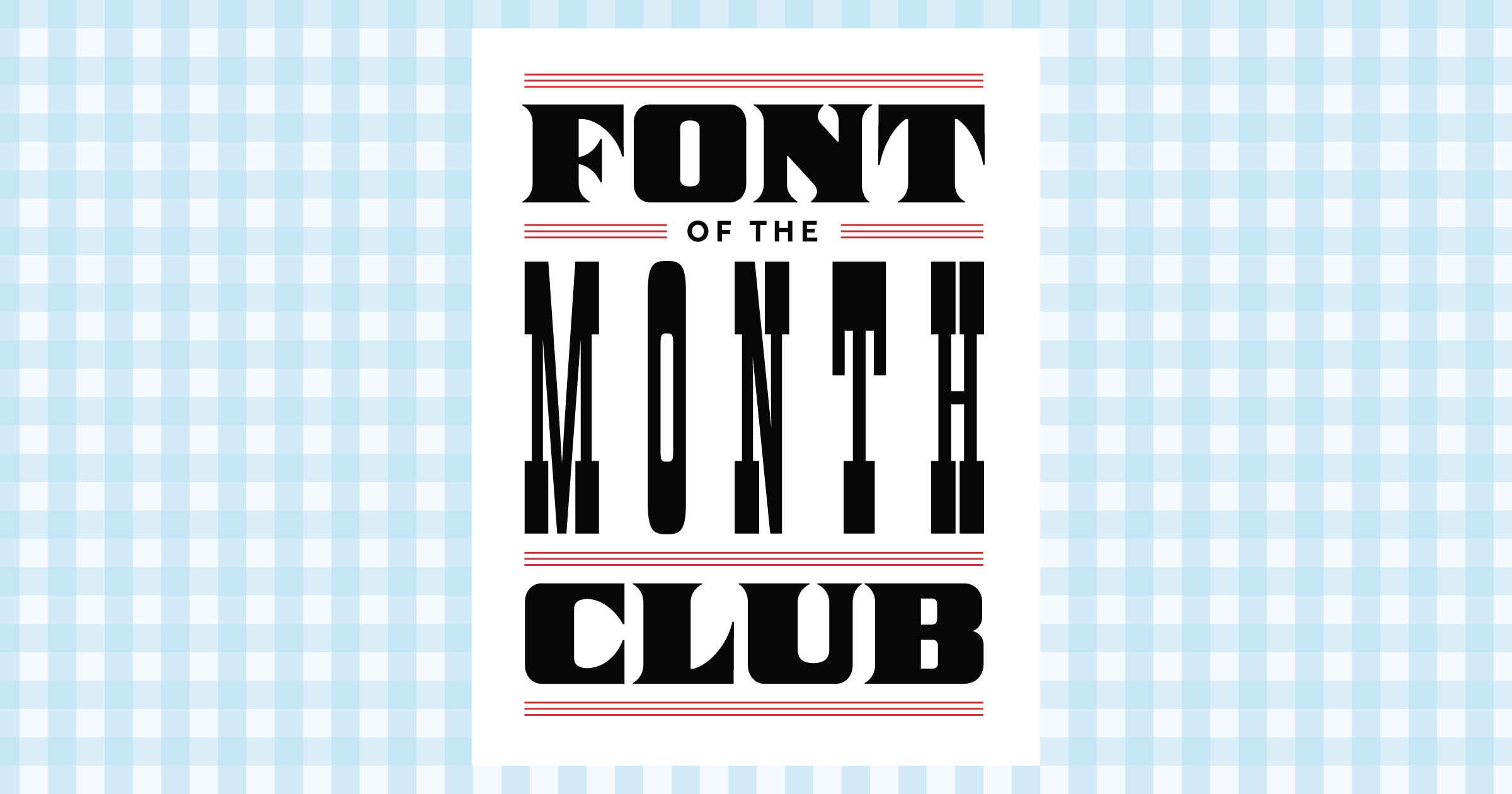
David Jonathan Ross draws letters of all shapes and sizes for custom and retail typeface designs. A native of Los Angeles, He began drawing typefaces at Hampshire College and joined The Font Bureau in 2007 where he honed his bézier-wrangling skills. Now he lives in the woods of Western Massachusetts and publishes his typeface designs at his own foundry, DJR, as well as working on projects with Type Network and developing unusual display faces for his Font of the Month Club.

For a longer bio, see my About page.

Selected interviews:

Font of the Month Club

Font of the Month Club image

Join the Font of the Month Club and get a new font in your inbox every single month for a year! Each font is lovingly designed and produced by David Jonathan Ross. Fonts of the month will include some of my experimental, standalone type design projects, as well as single styles from my upcoming retail typeface families. By diversifying your font collection with fresh and unusual designs, this club will help you push yourself to use new and interesting type in your work. Fonts are available each month for print, web, app, and e-book licensing at fontofthemonth.club.

Bungee

Bungee image Download as PNG Download as PDF

Bungee is a font family that celebrates the urban sign — it wrangles the Latin alphabet to work vertically as well as horizontally, with separately glyphs, spacing, and kerning for each orientation. It also comes equipped with chromatic inlines, outlines, shades, and ornaments, making it the perfect toolkit to take your text in a new direction. Thanks to support from Google and The Font Bureau, Bungee is released under the SIL Open Font License, meaning that it is completely free and open-source. It is available for download at djr.com/bungee.

Selected Press

Condor

Condor image Download as PNG Download as PDF

Condor is all about the contrast of thicks and thins. In 60 styles spanning multiple widths and weights, Condor is a contemporary take on the high-contrast sans serifs of the Art Deco period. Its steep italic angle and taut curves give it speed, and shimmering thicks and thins give it grace. Condor is designed by David Jonathan Ross and is available for print, web, app, and e-book licensing at djr.com/condor.

Selected Press

Fit

Fit image Download as PNG Download as PDF

Fit is a hyper-stylized series of caps designed with one thing in mind: filling up space with maximum impact. With an expansive range of widths, Fit will take just about any text and fit it into just about any space. From the impossibly narrow Skyline to the gargantuan Ultra Extended, you will find a family rich in panache and expressive potential. Fit is available for print, web, app, and e-book licensing at djr.com/fit.

Selected Press

Forma DJR

Forma DJR image Download as PNG Download as PDF

Forma DJR is a revival of Aldo Novarese’s slick neo-grotesque. Working together with Roger Black and Indra Kupferschmid, David Jonathan Ross studied the original metal type and interpreted the design as a large family with optical sizes, rounded corners, and tapering stems. Forma DJR is available for print, web, app, and e-book licensing at djr.com/forma.

Selected Press

Gimlet

Gimlet image Download as PNG Download as PDF

Gimlet is a funky quirkhorse workhorse inspired by Georg Trump’s 1938 typeface Schadow. At the behest of Nick Sherman, David Jonathan Ross reimagined the oddball serif as an energetic contemporary workhorse, complete with three optical sizes and a flexible set of widths tailored for responsive layouts. A multifaceted series that speaks with a singular voice, Gimlet is a rare find: a typeface that is as funky as it is functional. Gimlet is available for print, web, app, and e-book licensing at djr.com/gimlet.

Selected Press

Input

Input image Download as PNG Download as PDF

Input is a flexible system of fonts designed specifically for code by David Jonathan Ross. It offers both monospaced and proportional fonts, all with a large range of customizable widths, weights, and styles for richer code formatting. Input is designed by David Jonathan Ross and is available for print, web, and app licensing at input.fontbureau.com.

Selected Press

Manicotti

Manicotti image Download as PNG Download as PDF

Inspired by the boisterous wood types of the nineteenth century, Manicotti pushes the reversed-stress French Clarendon style to its decorative extreme. Its thick tops and bottoms and massive slab serifs create an oddly dense typographic texture that is reminiscent of Spaghetti Western films, rugged trails and rowdy saloons. Manicotti has been awarded Certificates of Excellence by Type Directors Club and Modern Cyrillic. Manicotti is designed by David Jonathan Ross and is available for print, web, app, and e-book licensing at djr.com/manicotti.

Selected Press

Roslindale

Roslindale image Download as PNG Download as PDF

Roslindale is a text and display serif that takes its inspiration from De Vinne, a typeface named for the famed nineteenth century printer and attributed to Gustav Schroeder and Nicholas Werner of the Central Type Foundry. De Vinne was an oldstyle that couldn’t shake its Victorian sensibilities, designed in a time that was so immersed in the upright Modern style that folks seemed to forget what diagonal stress actually looked like. Roslindale smooths out the clunkiness of the original and dials up the contrast, flirting with the slickness of 1970s interpretations such as ITC Bernase. Sure it can be a bit cheesy at times, but aims for a creamy brie instead of a stinky bleu. Roslindale is designed by David Jonathan Ross and is available for print, web, app, and e-book licensing at djr.com/roslindale.

Selected Press

Trilby

Trilby image Download as PNG Download as PDF

The nineteenth-century French Clarendon is characterized by its backwards arrangement of thicks and thins — the typically-dominant vertical stems are reduced in weight, letting the big slab serifs create a thick, horizontal, railroad track effect along a line of type. Trilby pushes aside the French Clarendon’s typical showy excess, and focused on the effects of unconventional weight on an open, contemporary letter structure. It comes across as cuter and quainter than your average slab, and transcends mere novelty as a wholly useful contemporary design with offbeat charm and subtle wit. Trilby is designed by David Jonathan Ross and is available for print, web, app, and e-book licensing at djr.com/trilby.

Selected Press

Turnip

Turnip image Download as PNG Download as PDF

Turnip is a coarse and down-to-earth bookface. The typeface plays off of the tension between round, doughy outer forms and crisp, angular inner counters. Turnip looks back to faces like Bookman and Cheltenham, which set heavy text and have a rustic simplicity. Any text set in Turnip will surely have some crunch. Turnip is designed by David Jonathan Ross and is available for print, web, app, and e-book licensing at djr.com/turnip.

Selected Press