February’s Font of the Month: ECWC Standard & Slight Chance
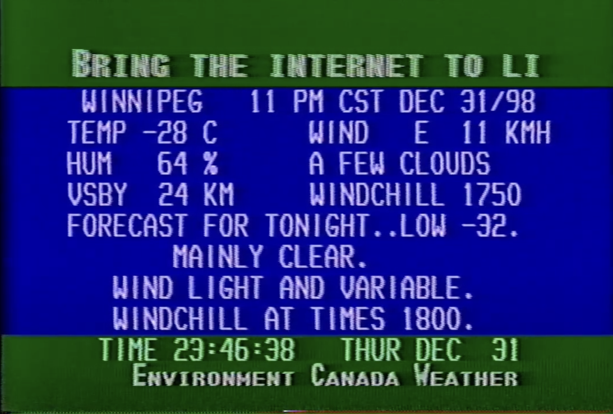
A still from the Environment Canada Weather Channel, Greater Winnipeg Cablevision, 1998
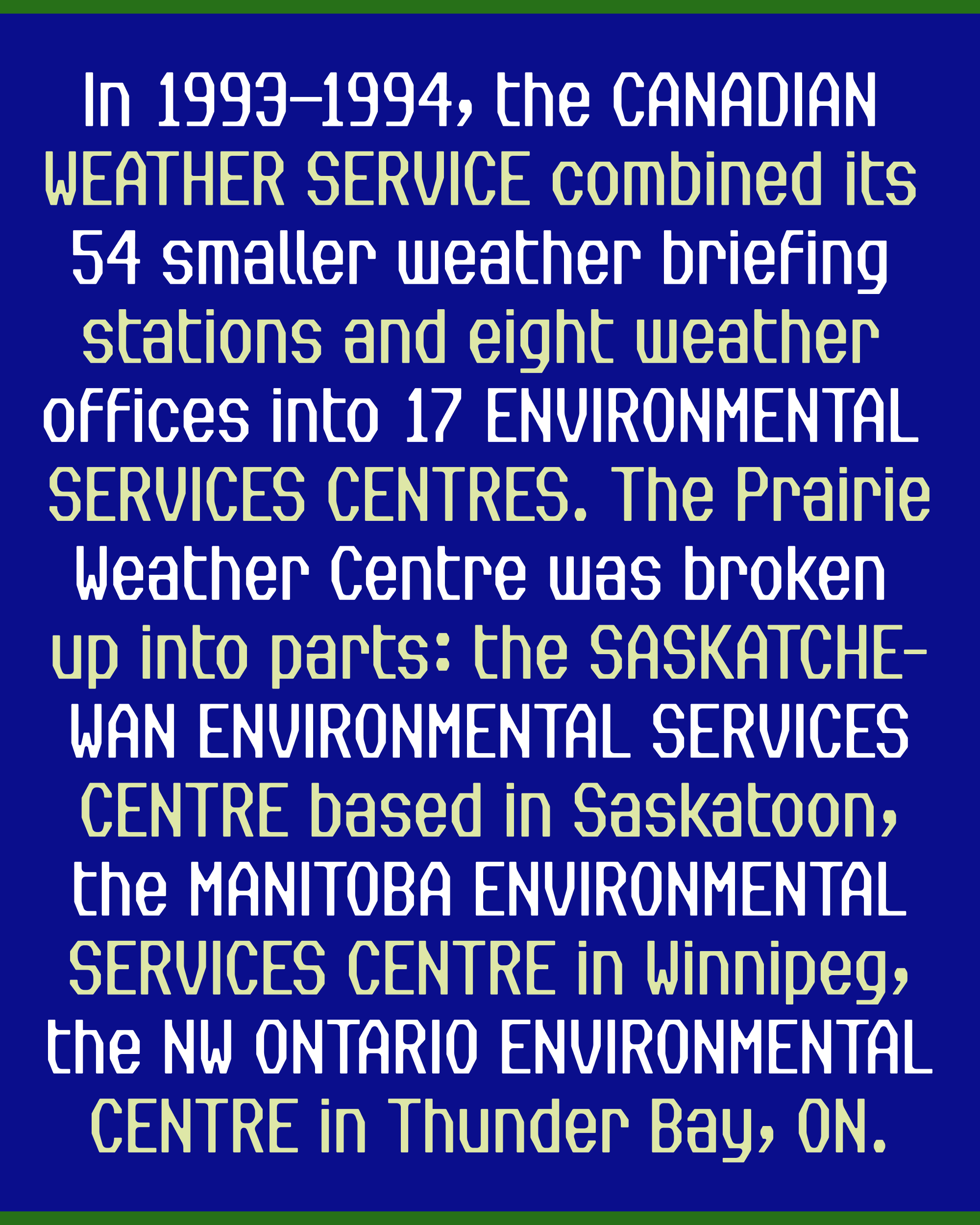
Watching the first cable TV weather channel in Winnipeg, Canada, was a very analog experience—Videon Cablesystems simply pointed a black-and-white camera at the dials on the machines at the local weather station. Viewers would sometimes tune in and see insects crawling on the equipment!
But in 1975 (fifty years ago!) Videon replaced this antiquated approach with an entirely digital weather readout, developed in collaboration with Environment Canada, which they claimed was the first of its kind in the country.
The layout was designed by Gary Krushen, an engineer at Videon, and featured a condensed, monospaced all-caps sans serif set against a blue or reddish-brown background, with green bands above and below. Shortly after, Winnipeg’s other cable company, Greater Winnipeg Cablevision, got in on Gary’s idea, and offered a similar service for their subscribers. It was based on the same basic design, but ran on different hardware and employed a thinner, more angular font than the original.
My type revival for the ECWC simulator
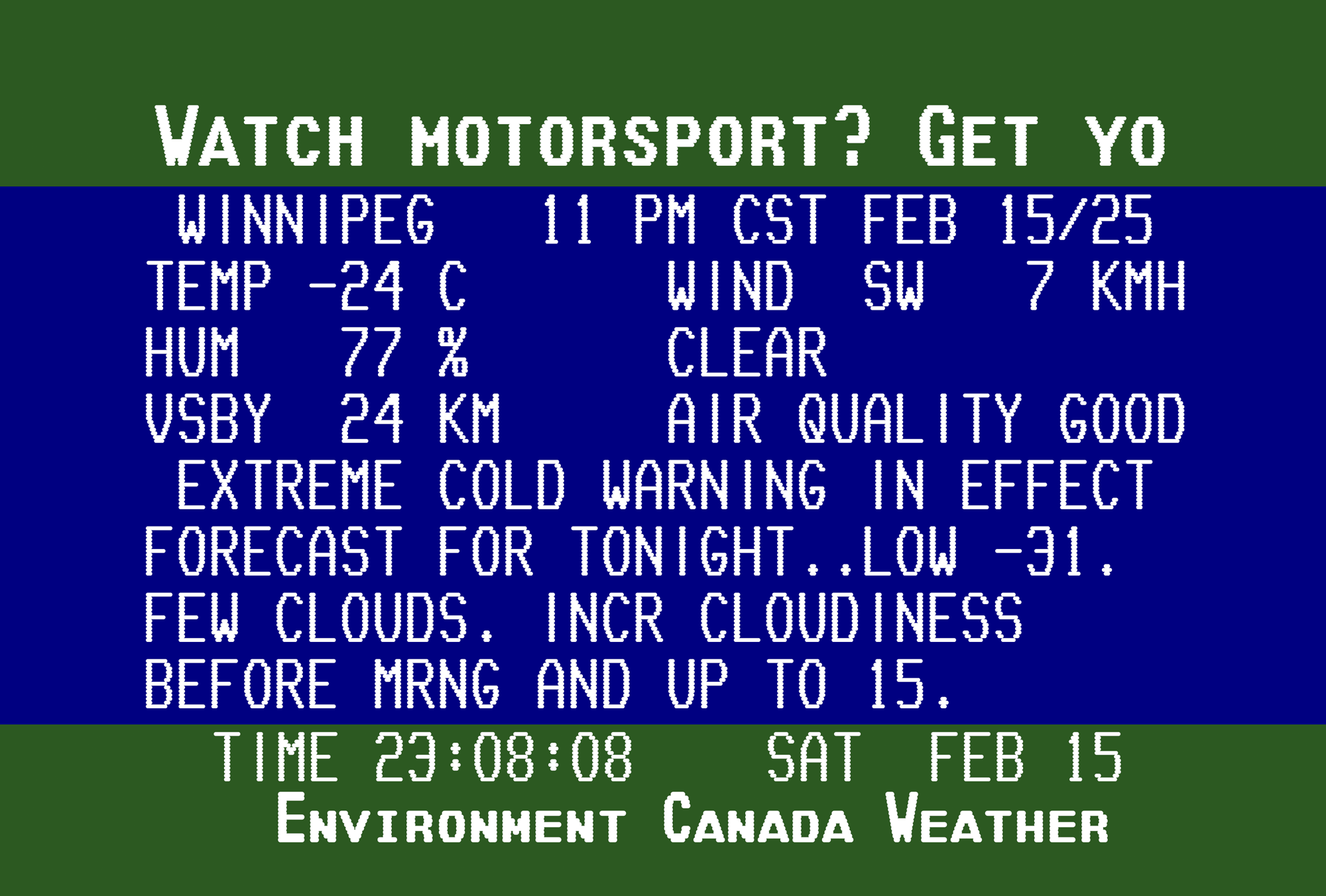
Last year, I was contacted by Matt Hadden and Mark J. Szymanski, weather channel enthusiasts who maintain an Environment Canada Weather Channel simulator that livestreams the current weather conditions in the style of the channel as it appeared in the 1990s. Since launching the livestream in 2021, they have reached thousands of viewers who fondly remember having the channel on in the background of their daily lives. “From what I'm seeing in the chat,” Matt says, “it’s bringing back a lot of nostalgia for a huge range of age groups. I see people in their 40s all the way up to their 70s/80s giving their stories and memories about the original channel.”
Matt and Mark couldn’t find any specifics about the make and model of the computer that was running at the time, or who might have produced the fonts that were available on that system. But they knew one thing: getting the font right was a key factor in capturing the precise look they know and love.
We presume that the original fonts were bitmap fonts, but opted to render the letterforms as horizontal bands, capturing a bit of the scanline edges that you might have seen on a CRT television set from the era. At the same time, we tried to avoid going too far down the retro rabbit hole—recordings like the image up top also show the deterioration of a decades-old VHS tape, but our goal was to have the type appear as crisp and fresh as it would have looked in the 90s on a new-ish TV with a clear signal.
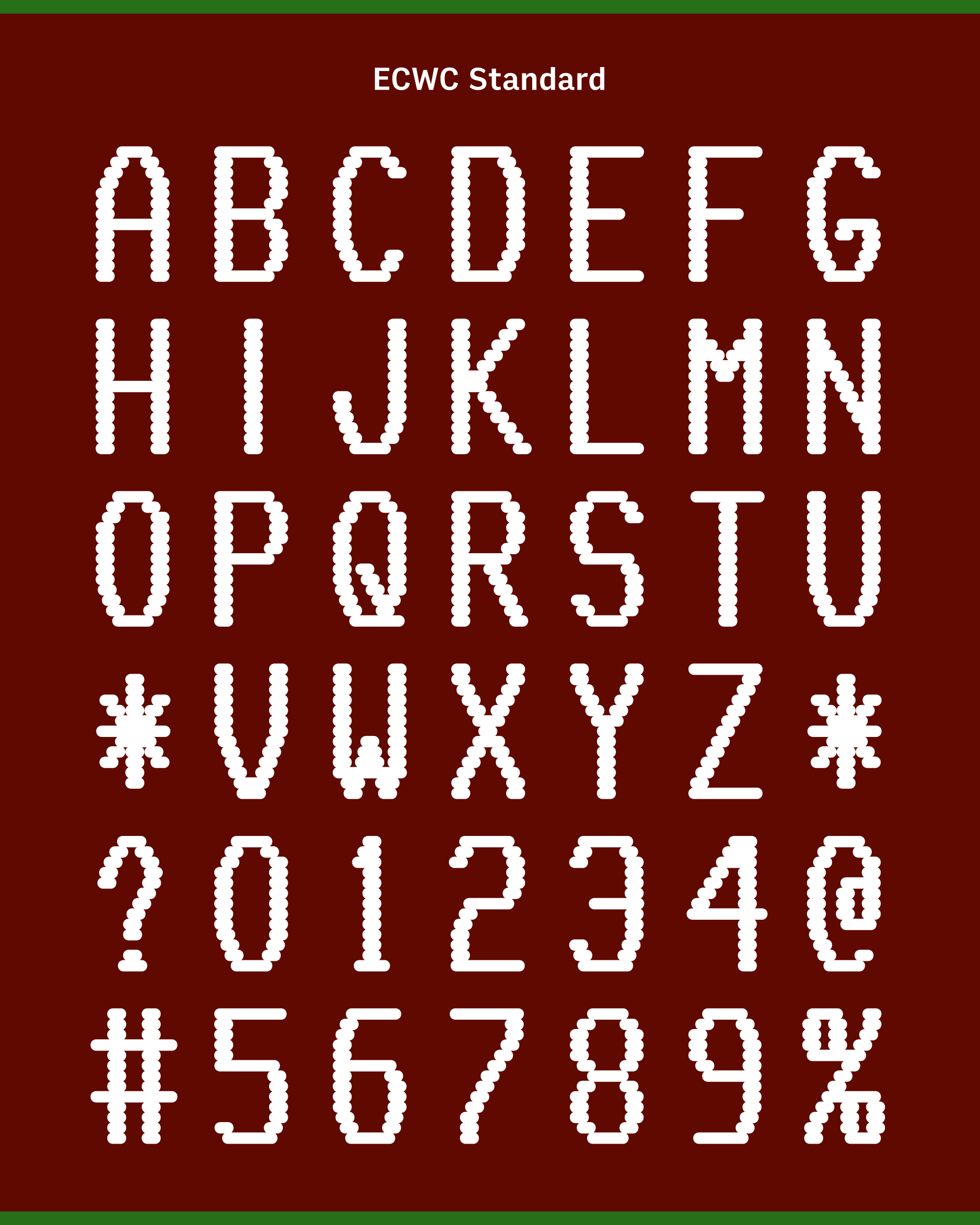
Aside from that one interpretive choice, I tried to provide them with as faithful a revival as I could. I worked with the limited character set of the original, and preserved details such as the subtle asymmetry of O and A, the serif on the crossbar of G, and a 3 that looks more like a Cyrillic Э.
Matt and Mark are now using the new font, called ECWC Standard, in their livestream. And in keeping with the rest of their codebase, I made it available on GitHub under an open source license.
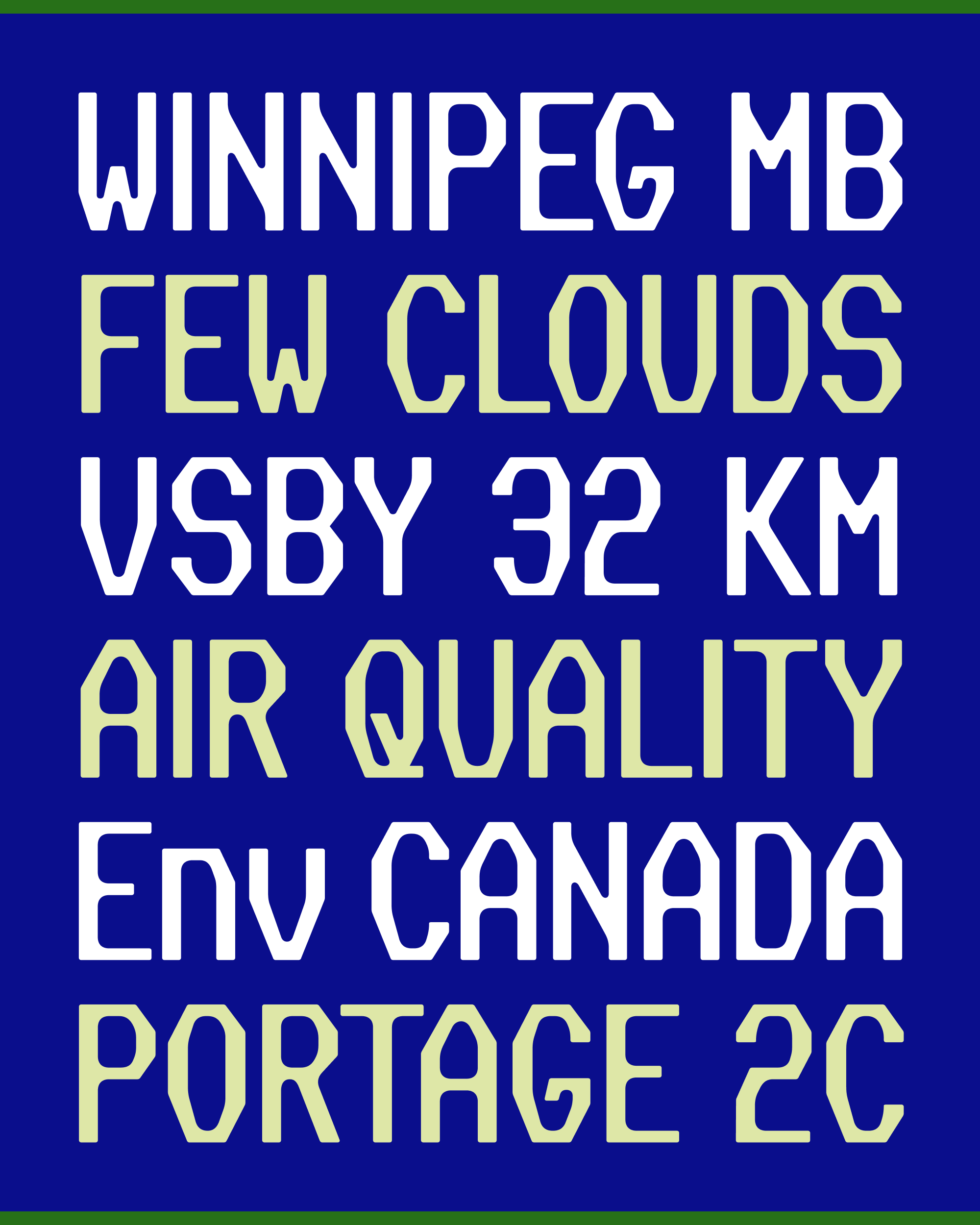
But wait…there’s more! After sending my revival to Matt and Mark, I couldn’t shake the feeling that there was more I could do with this incredible source material, so I undertook a freer interpretation of the design. In a nod to the weather reporting phrasebook, I’ve named it Slight Chance.
No longer worried about 100% fidelity to the original, I built out the design to my usual character set, made monospaced and proportional versions, and invented an accompanying lowercase for the design.
I set aside the scanlines approach and explore different ways that I could evoke the worn, slightly-degraded texture of the letterforms as they endured cable transmissions and cathode ray tubes. I arrived at a design system that contrasts gummy, amorphous interior shapes with a harder-edged, octagonal exterior. In a weird way, it’s a distant cousin to the chamfered Grecian style of wood types.
Oh, and if you noticed that the text at the top and bottom of the simulator uses an entirely separate font with small caps, then you have an idea on where the design can possibly go from here!