August’s Font of the Month: Megazoid
On a conceptual level, geometric shapes endow letters with a timeless beauty, transforming them from handmade marks into emblems of mathematical ideals. But on a practical level, building up letters out of circles and squares is just really, really awkward.
In most geometric sans serifs, the job of the type designer is to smooth out that awkwardness, introducing optical compensations and refinements in order to achieve a unified result. And in the past decade, “geometric sans” has become a catch-all term for clean, general-purpose sans serifs with disparate influences (including humanist and grotesque) and varying degrees of connection to pure geometry.
I’ve never felt like I had much to add to this genre, and over the past fifty (!) months of the club I’ve mostly steered clear of it. But this month I’m psyched to send you Megazoid, a chunky geometric sans serif that feels equally at home on a guitar amp as it does on an interstellar satellite. And while I’ll concede that recent trends have made the geometric sans feel a bit safe and boring, Megazoid is here to remind you that geometry can be raw and weird and anything but.
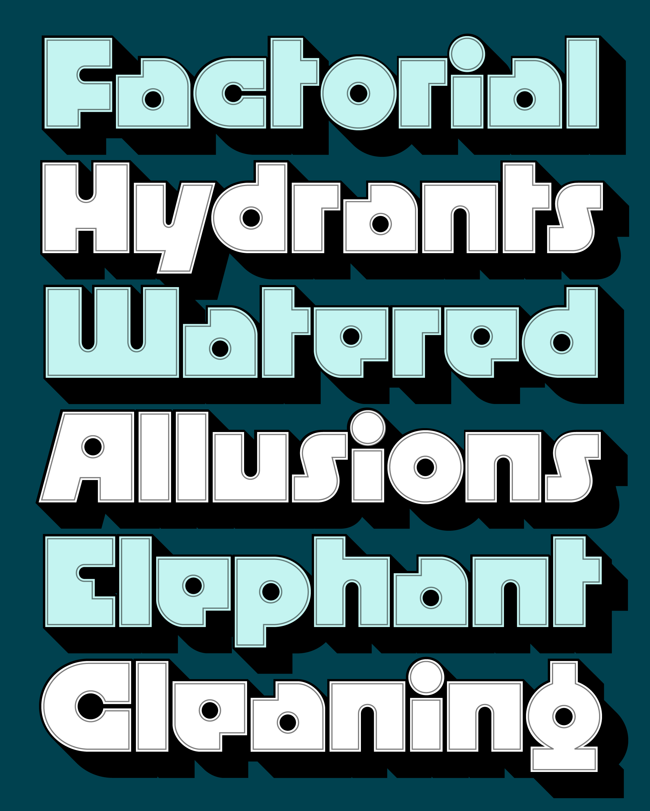
Megazoid pits square and circle against each other, contrasting blocky exteriors with counterforms that are mostly circular and cylindrical. This juxtaposition recalls the classic Radio Shack logo and its distinctive retro-futuristic vibe, but Megazoid leans towards corners over curves maybe 25% more often. This gives Megazoid a distinctive squarishness that sets it apart from the more figurative, stroke-based designs in this genre (I’m thinking Blippo and Pump, or recent entries like Bonkus, Marvin Visions, and Nichrome.)
At the same time, Megazoid avoids going into complete abstraction by not getting as heavy or extreme as designs such as Baby Teeth, Ginger Snap, Morro, Shotgun, and Strand. Instead, it bridges the gap between figurative strokes and abstract shapes, essentially functioning in the space between the super-literal Futura Extra Bold and the hyper-stylized Futura Black.
I really enjoyed playing with the tension between slick and clunky. It was a challenge to puzzle out how to make the more figurative shapes like s and o play nice with weirdos like a and e, even when their texture and color are totally dissimilar.
And you won’t find much in the way of triangles in Megazoid. Rather than introduce more symmetry, I took a page from Avant Garde and drew A, V, Y (and alternate M and W) as asymmetrical trapezoids that add a touch of off-kilter dynamism to the otherwise static design.
I didn’t plan this, but I’m really happy that Megabase, Megavolt, and Megazoid have formed a family of sorts, each one exploring a different mode of sans serif with heavy science fiction connotations. They all have plenty of non-sci-fi potential as well, not to mention a link to the phototype and dry-transfer typefaces of the 1970s.
A glance at any Letraset or Photo-lettering catalog is enough to tell you that this style lends itself to outlines, shadows, and textures. So I totally encourage you to go all out! Outline it, inline it, and offset it to create groovy drop shades à la Papirtis Pink Mouse. I held off on making a tricked-out color font (for now) but I did include Fill and Shade styles to give you a little head start.
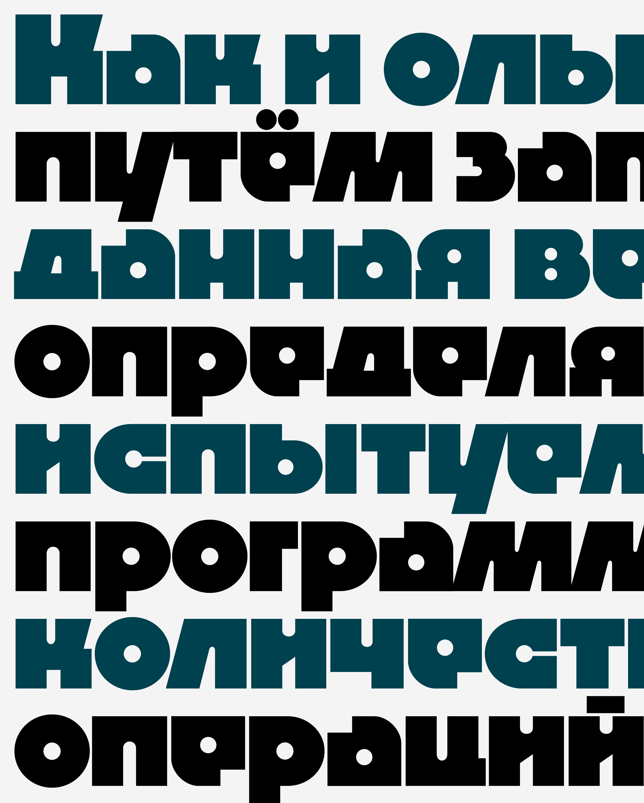
You’ll also find that I was particularly indecisive this month and left in a slew of stylistic alternates for you to explore. And last but not least, I also explored a Cyrillic version of this design which I found to be particularly fun. Many thanks to Jovana Jocić for critiquing the Cyrillic, as well as to Eben Sorkin, Mathieu Triay, and Donny Truong for their comments on this design.