December’s Font of the Month: Pappardelle v2
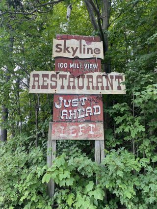
Skyline Restaurant, Marlboro, Vermont
This summer, my wife Emily and I were passing through Southern Vermont and we stumbled upon this A+ sign on the side of the road. The forest was starting to overtake it, and we almost missed it. We quickly pulled into the brewery that now occupies the Skyline Restaurant building, placed an order for pizza and beer, and walked back a quarter mile to get a closer look.
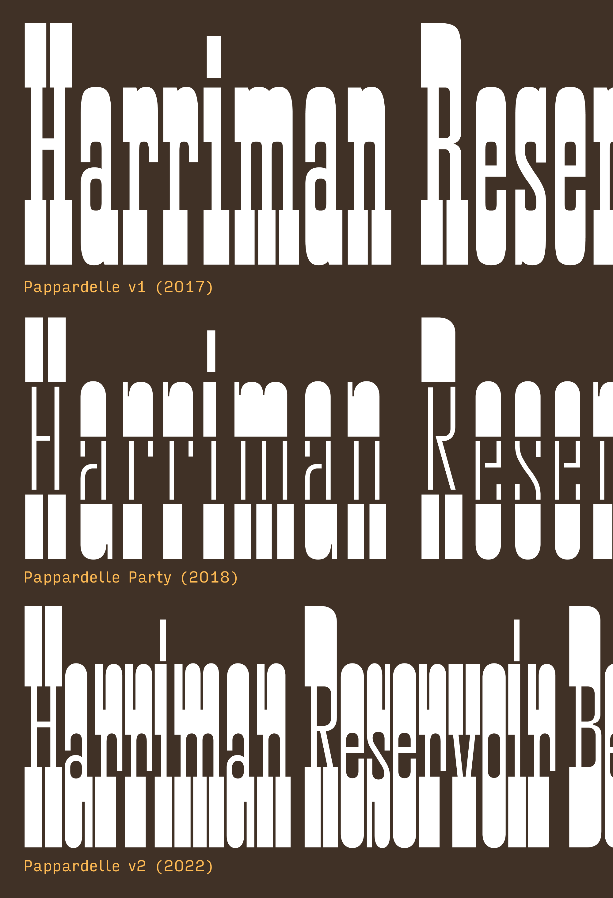
Unsurprisingly, my first thought was, “I should make a font like that.” But then I realized, I already have a font like that! Pappardelle, released October 2017, was my take on the 20th Century French Antique, directly inspired by Herbert Matter’s midcentury logotype for Knoll furniture.
When I first drew it in 2017, Pappardelle was my jam—I even used it in the Font of the Month Club’s original logo. But it always felt like it was more fun for me to make than it was for anyone else to use; even though it’s ostensibly a Display font, it felt too straight-down-the-middle and throwbacky to have any freshness or spark. I typically try to put a damper on “look at me” energy in my typefaces, but Pappardelle needed exactly that. So this month I’m sending you Pappardelle v2, a top-to-bottom overhaul of my beloved little French Antique.
The first thing I did was bump up the x-height and make the thick horizontals a whole lot thicker. In the caps, they went from roughly a quarter of the cap height to a third. These new proportions and increased density feel closer to the Condensed French Antiques made by Wood Type manufacturers in the second half of the nineteenth century. The thin vertical strokes and geometric curves are closer to Pappardelle Party, the stencil color variable experiment I made in 2018. And like Pappardelle Party, the curves are now less organic and more geometric; it’s easier to see the point at which straight segments become curves.
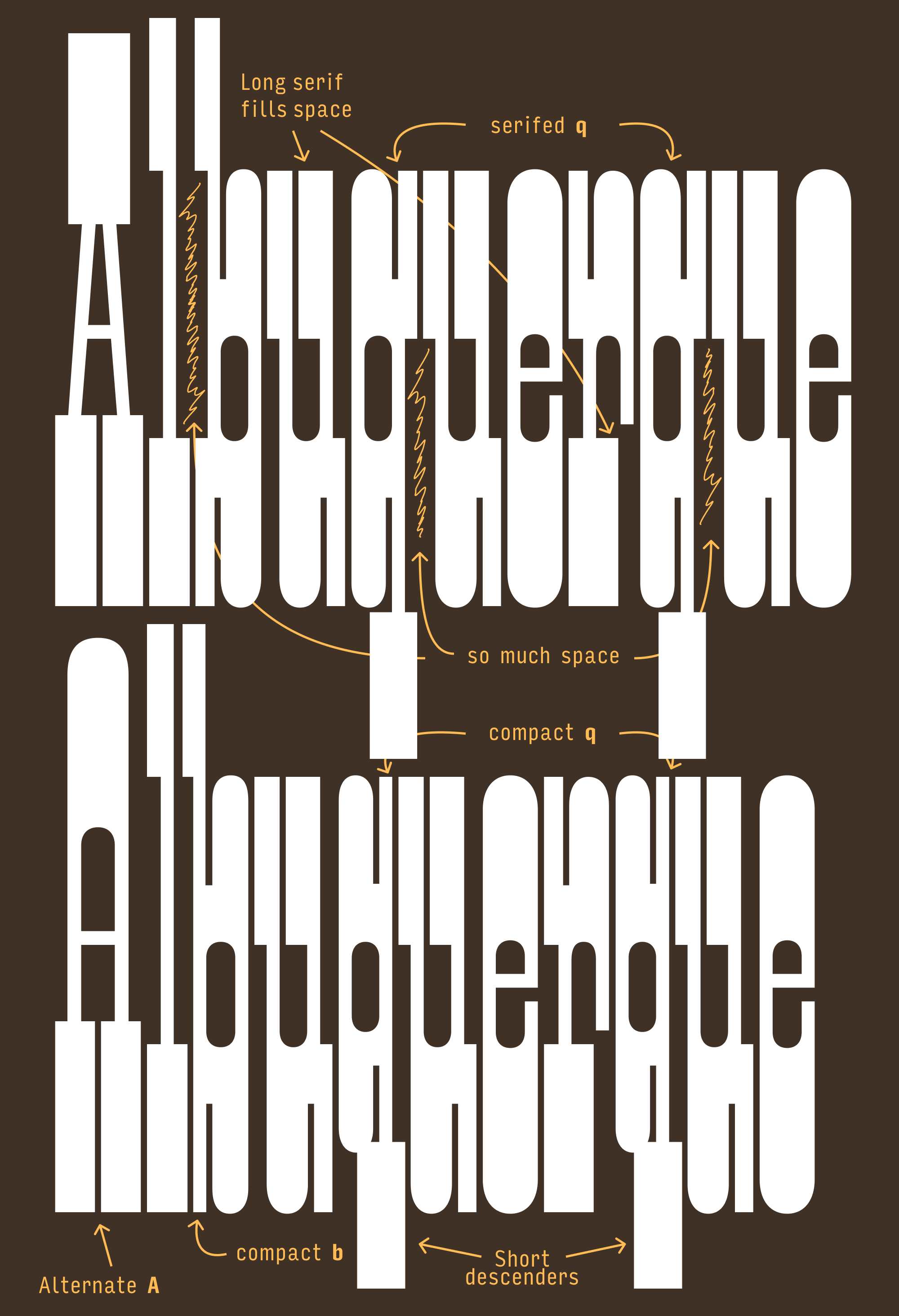
I also decided that I didn’t need to stick so close to historical precedent. I made the vertical serifs in L, T, etc. as long as I could, and let the crossbars of E and F extend out to the outermost edge of the letterform. I also separated serifs from curves by adding elongated inktrap-like divots to a majority of the lowercase and a handful of the uppercase (C, G, S). Not only do these divots make the letters more readable, they make them feel even more elongated than they actually are. Letters like M and N get their own type of divot when slab serifs collide with their diagonal strokes.
Horizontal stress is always a bit of an awkward fit with the Latin script, and tension arises when some letters (like H) get overrun with super-thick serifs and others (like O) don’t. The serifs in this style carry so much weight that everything is thrown off balance, especially in letters like E or p which have serifs on one side but not the other.
One solution would be to reduce the serif length. But it’s a Slab Serif font...the serifs are kinda the point! The old Pappardelle used judicious letterspacing to alleviate some of this tension, following typographic convention by letting the serifs pack closer together and giving more breathing room to the round characters (compare man and ese in the image above.) This tracked-out feeling was nice in logos (like Matter’s logo for Knoll), but caused the headlines to lose some punch.
Now, the new Pappardelle packs tight. You can still track it out if you want to, but by default it will set taut, frenetic headlines. I only cared about one thing when spacing this typeface: making as many 8-unit gaps between serifs as possible, balanced letterspacing be damned. The result is so simple it’s essentially spaced like wood type: the H sidebearing is 4 units, the O sidebearing is 4 units, and pretty much every other letter follows suit.
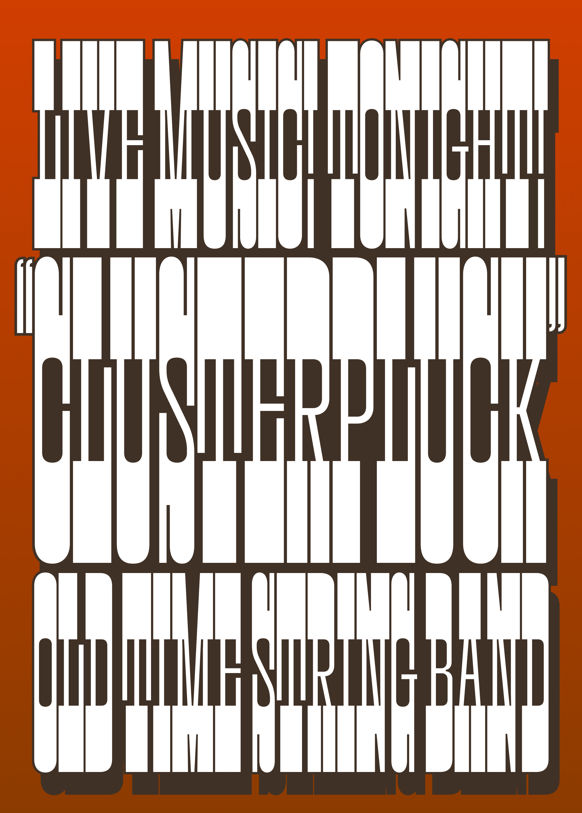
In the uppercase, this creates dense bands and the top and bottom of each line, something I’ve seen referred to as “the railroad track effect.” The 8-unit gaps between letters creates a rhythm that punctuates these bands, which is further reinforced by the 8-unit divots and 8-unit gaps within the letters. As you can see in the samples above, I’ve been having fun with drop shades and stroking the outside of the letters at 0.65% of the font size, which ends up being just enough to fill those gaps.
What happens in the lowercase is much more complex…there’s a lot more asymmetry and you really start to feel the push and pull between serifed and unserifed shapes. Serifs ascend and descend to disrupt the railroad track effect, and overhanging/underhanging serifs jut out into the space of the next letter and disrupt the spacing.
Mostly, I decided that this is a feature, not a bug—the imbalance only adds to the typeface’s newfound frenetic energy—but I did take some small steps to mitigate these disruptions. I tweaked serif lengths slightly to compensate for asymmetry, and employed contextual alternates to help minimize spacing in especially tricky letter combinations. And I added stylistic alternates with short descenders that help out when you want to pack lines closer together. (You can also let lines overlap…the nice thing about horizontal stress is that the tops and bottoms of letters are not necessary for legibility!)
This didn’t turn out anything like that sign I found in Vermont, but I did throw in a straight-sided alternate A in its honor. Enjoy it, and have a wonderful December! 🤠