November’s Font of the Month: Warbler Text Bold
In my recent interview with The Weekly Typographic podcast, we talked about the two sides of running a type foundry: making fonts and everything else. Over the past couple months, the everything else got the better of me. This isn’t necessarily a bad thing; I tend to neglect administrative tasks. It was exciting to put some projects in motion for next year and release Serbia-based designer Jovana Jocić’s beautiful rendition of Roslindale Cyrillic.
But I appreciate your patience as I sneak in a small update for November’s font right under the wire. Tomorrow, I’ll be back again with a mailing for December.
Since I released Warbler Text in February, I’ve received more requests for Warbler Text Bold than anything else. It’s not a glitzy request, but I get it. Roman + Italic + Small Caps might be enough to typeset a traditional start-to-finish book, but a more complex document calls for more complex typography to guide the reader through it. And in turn, more complex typography calls for more complex type families. A Bold certainly comes in handy!
But here’s the problem: As I discussed in previous mailings, what I appreciate most about Warbler—and the types William Martin cut for William Bulmer before it—is its quiet, delicate touch, and the quiet, delicate typography that it presupposes. Bolds, on the other hand, tend to be brash. They turn up the volume on a typeface and amplify its features—a caricature of the Roman whose entire purpose is to stick out.
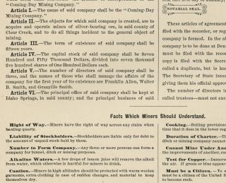
Slab serifs and fat faces used as Bolds, in “Hill’s Manual of Social and Business Forms”, circa 1884. Example courtesy of Kent Lew.
Warbler attempts to channel the last gasps of pre-Industrial typographic style in Britain, before advertising and mass-market ephemera transformed the design landscape. Its source material dates back to 1790, a time when fonts didn’t come with their own Bold variants. And like with Fern, I’ve been reticent to make the family more than it needs to be.
The Bold is really a creature of the 1800s, getting roped into type families only after typographers started throwing separate Fat Faces and Slab Serifs into the typographic mix for visual emphasis, as shown in the image above. There’s a funny anachronism to Bold in any pre-Industrial style, and it can be tough to shake those 19th Century origins: if you take any serif typeface and add enough weight to the vertical stems, it becomes a Fat Face. If you add enough weight to the stems and serifs, it becomes a Slab.
Warblur?
The 19th-century Scotch Roman is not too far off from the Warbler/Bulmer style, and has proven to be widely adaptable to extremes in width and weight. But as the Warbler family grows, I’m more and more determined to set it apart from Scotch Romans. Its relative inadaptability dovetails with my own laziness this month, to become a philosophy of “Minimum Viable Boldness”: what’s the least I could change about Warbler Text to make it function as a Bold?
So I added weight more-or-less evenly to the inside and the outside of the letterforms, and enlarged ball terminals just enough for them not to feel shrunken. I left the serifs alone as much as I could, striving for a thick-thin contrast that was sharp enough to not feel gummy, but low enough to not feel overtly Fat Face-y. I’ve thrown in SemiBold and ExtraBold options as well, so you can choose how much contrast feels right for you.
Warbler Text Bold ended up being defined more by what I don’t want it to be than by what it I do want it to be. I don’t know if that’s a good thing or not, but honestly I like a little friction in my design process. Display Italics are next on my list, but I’ll probably continue to resist a Display Bold (and certainly a Text Bold Italic) until the need presents itself (or someone pays me to do it 😜).
I hope this small addition makes Warbler Text a richer, more utilitarian option for your complex texts.