March’s Font of the Month: Warbler Banner
The moment I sent out last month’s mailing about Warbler Text, I started to feel self-conscious. I was happy with how the typeface came out, but I had only tested it in a very specific setting (20px running text, on screen), and I started to wonder about how it would fare in other, larger contexts.
Scalability is one of the primary attributes of a digital font, but things can get awkward when the desire to make type big bumps up against typefaces that weren’t meant to get big. Feeling a bit mischievous, I hacked around with a variable font that forces Warbler to stay below 15pt. This is a bad idea for the record, and what I should have been doing is channeling that momentum into a true cut of Warbler for large sizes.
This club is all about variety. I like to mix it up and usually I wait six months or a year between sending out variants of the same family. But I hope you’ll bear with me, because this month I’m breaking my own rule! Here is my progress on Warbler Banner.
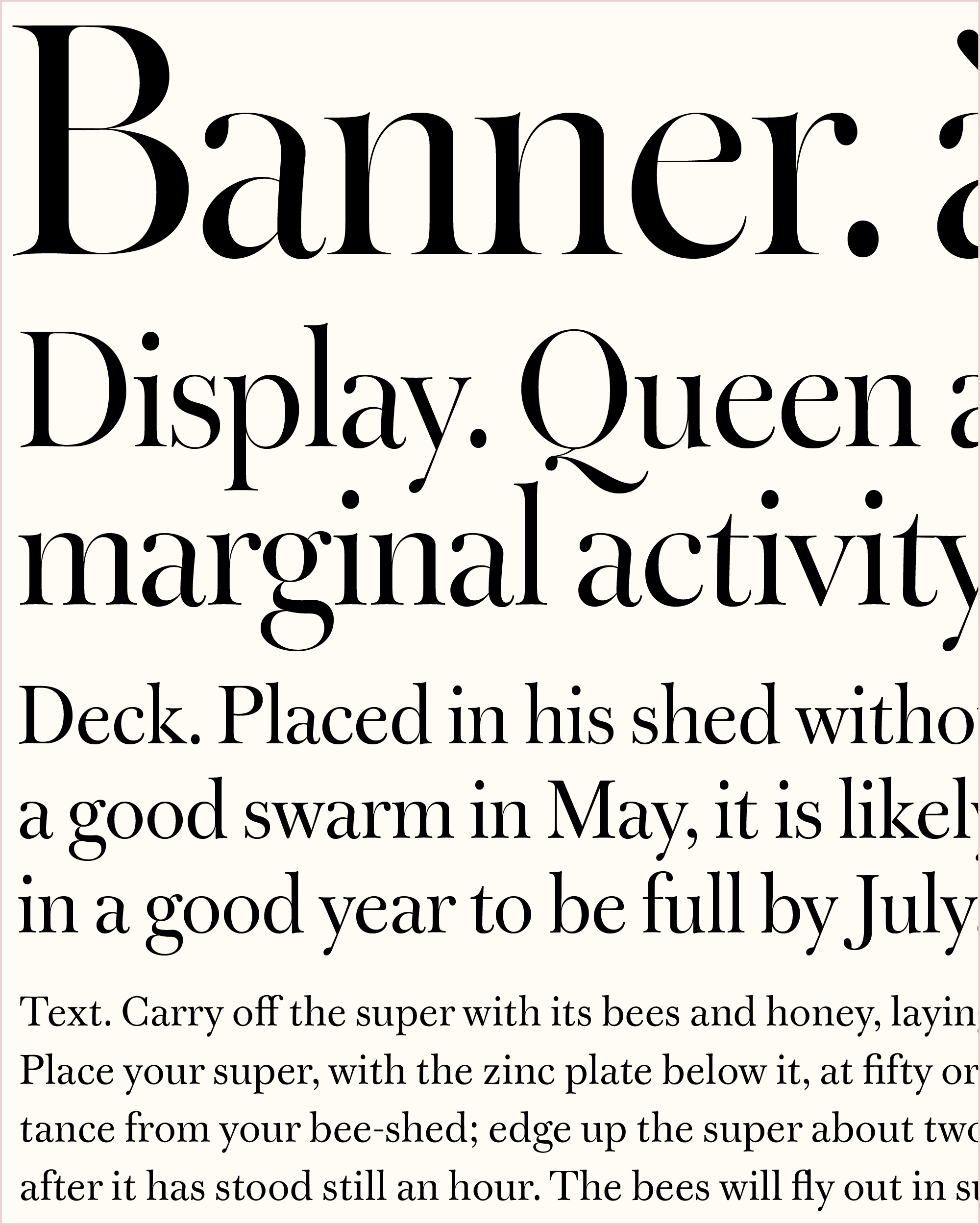
I’m actually including a few new styles of Warbler: a 96pt Banner cut for massive titles, a 48pt Display cut for headlines, a 24pt Deck cut for subheads, and a variable font that encapsulates all the space between Banner and Text—those point sizes are just suggestions. These are still very much in-progress (as far as I was able to get in the short month of February), and I imagine the design will continue to change as I adapt the small caps and Italics from the Text version and add a Bold in the future.
I’m still on the fence about whether it’s more effective to derive a display cut from a text cut, or vice versa. My own library is split: Roslindale and Forma started as displays, so I had my full range of expression to explore their personality and flavor before taming them for smaller sizes. Meanwhile, Gimlet and Fern began as small-size cuts, so I could focus on making sure they had good bones before spending any time polishing up the fancy little details.
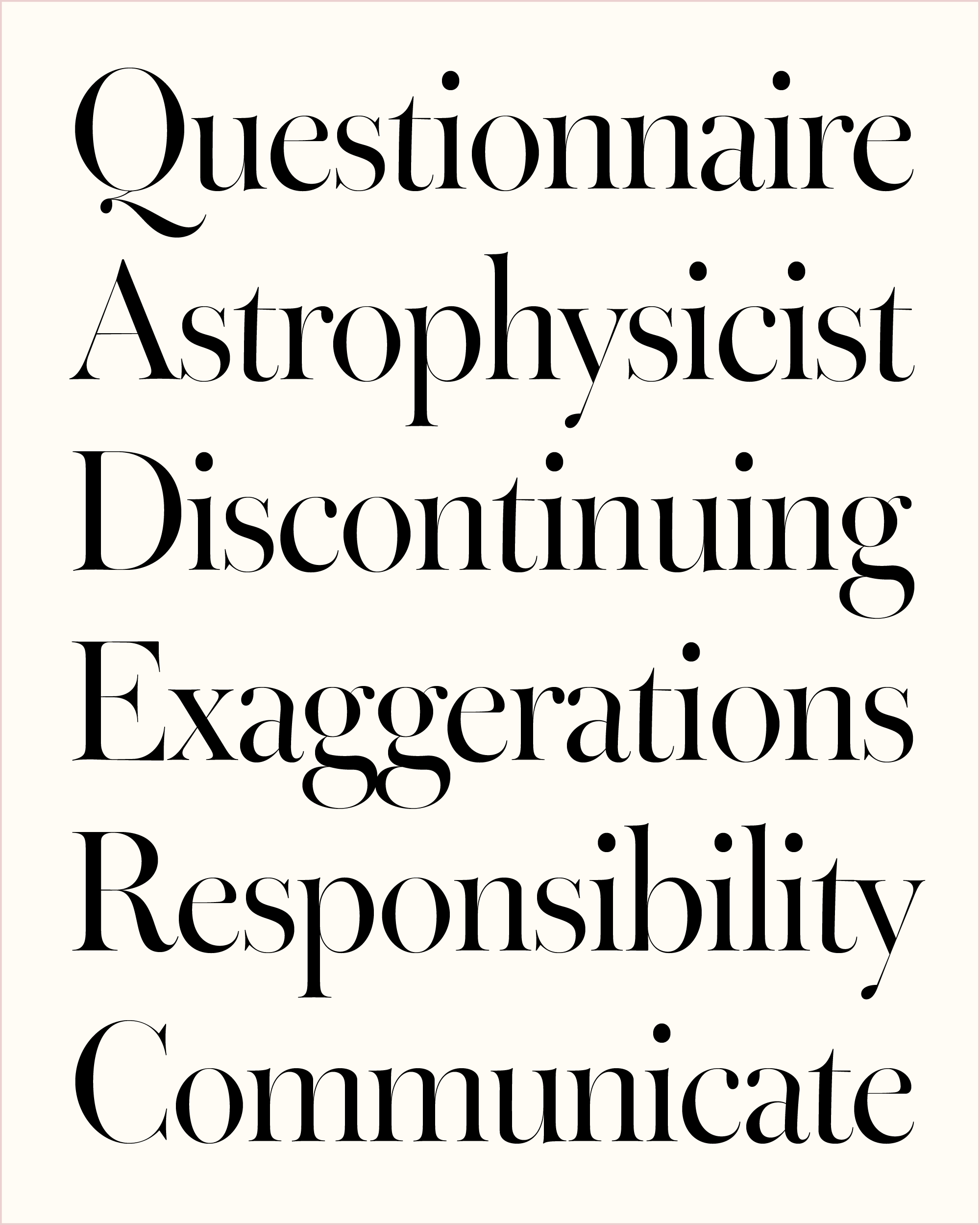
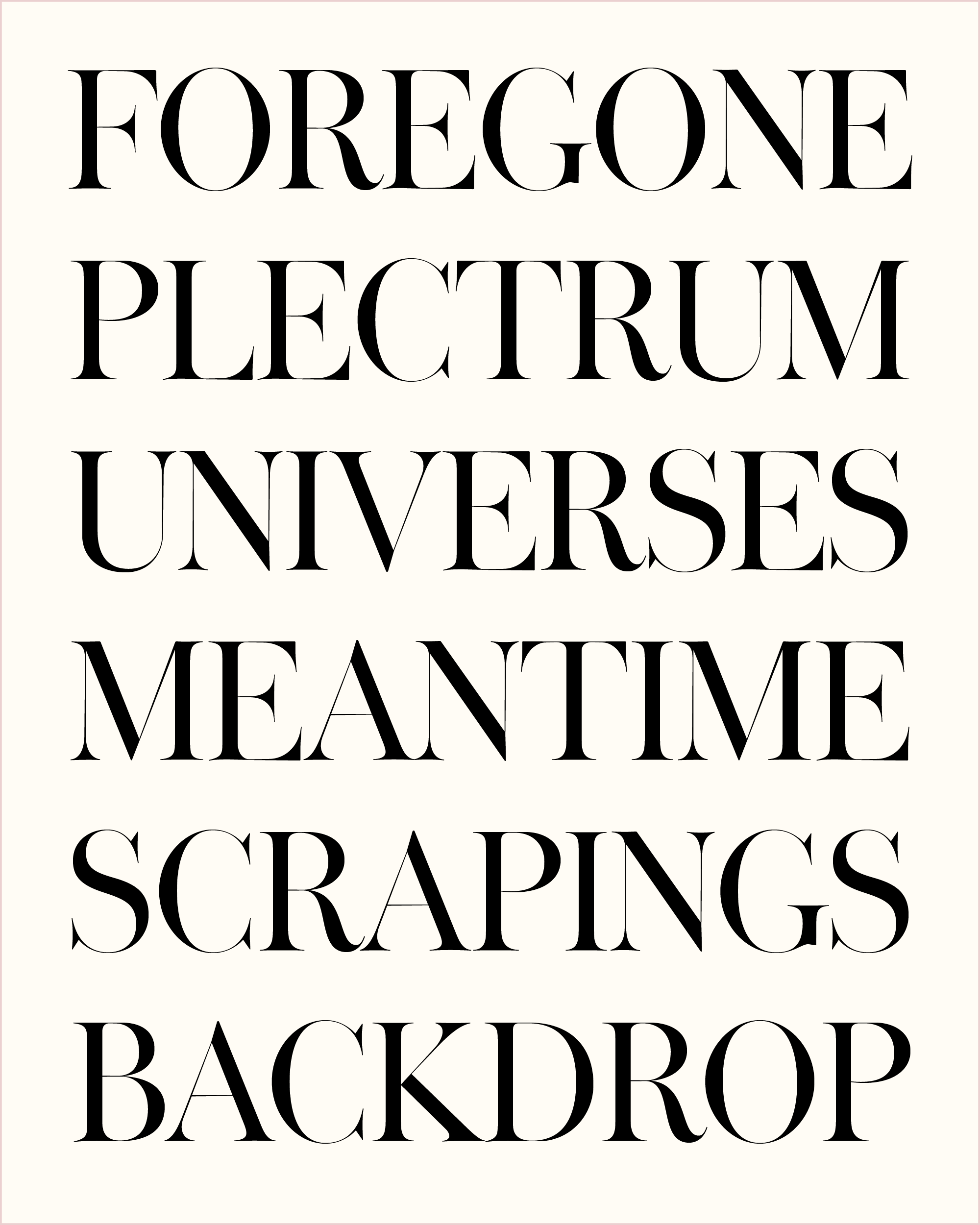
If Forma is my most subtle take on optical size, Warbler is probably my most extreme. The x-height gets noticeably smaller, ascenders and descenders get noticeably longer, proportions get noticeably narrower, and the thick/thin contrast gets not-just-noticeably but dramatically higher.
The trouble is, the more contrast I add, the sharper the serifs get and the more I start to lose that lighter touch that I loved so much about the types that William Martin cut in 1790. It starts to feel more like a Modern than a Transitional, so I did what I could to counteract this and preserve Warbler’s delicate nature. It’s a display cut, so I want it to sparkle—the trick is to make it sparkle in a way that’s not flashy.
I played a lot with Warbler’s line quality to “slow down” the typeface so it feels more brittle and elegant than it does forceful or dynamic. Curves and bends don’t go directly where they need to go, but meander a bit instead…see the bottom of e or the shoulder of n. Ball terminals and vertical serifs are a little smaller than I’d usually make them. The proportions are a little irregular, retaining Martin’s wide L and T. And letters like a, g, and t are allowed to lean, adding a little wobble to the “picket fence” of vertical stems.
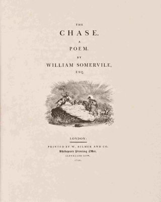
Looking back at William Bulmer’s title pages from the 1700s and 1800s, I saw that the letterforms aren’t the only thing that exercise restraint: the entire typographic palette has a distinctive lightness of touch. Everything is nice and airy, with plenty of margins and letterspacing, and absolutely no sign of borders, ornaments, or even lowercase! (Contrast this with the decorative showings of Benton’s twentieth-century revival.)
In the typographic vacuum of these title pages, size becomes *the* crucial element of the visual hierarchy. So even though the Warbler family is far from complete, I like that there is precedent for achieving great results with a limited palette. Our contemporary typographic environment is far less restrained, but I hope that Warbler can help you find moments of quiet in your typography, and new ways to use optical sizes in your designs.