April’s font of the month: Roslindale Deck
Roslindale Deck is April’s installment of Font of the Month Club. As always, you can sign up for as little as $24!

So...I’m in a bit of a slump at the moment, creatively-speaking. And with everything going on in the world right now, I’m pretty sure I’m not alone.
I try not to get too worried about slumps; I’ve been working from home for over a decade, and I’m familiar with the way my productivity ebbs and flows. Usually, I find that the best way to deal with this kind of thing is to just keep working through it, focusing on tasks that are more time-consuming but less creatively-demanding so that I can still get things done as I try to find ways to refresh.
Right now, I’m in spring cleaning mode, revising and expanding some families that I’ve started but then left for too long. (I haven’t done a full-family release since January 2017, so it’s probably about time I get to work on some of this stuff!) And as part of that spring cleaning, I’m sending you one of the more recent additions to the Roslindale family: Roslindale Deck. It’s maybe not the most exciting Font of the Month I’ve ever sent out, but I hope it can make up for that by being a genuinely useful and usable addition to your font library.

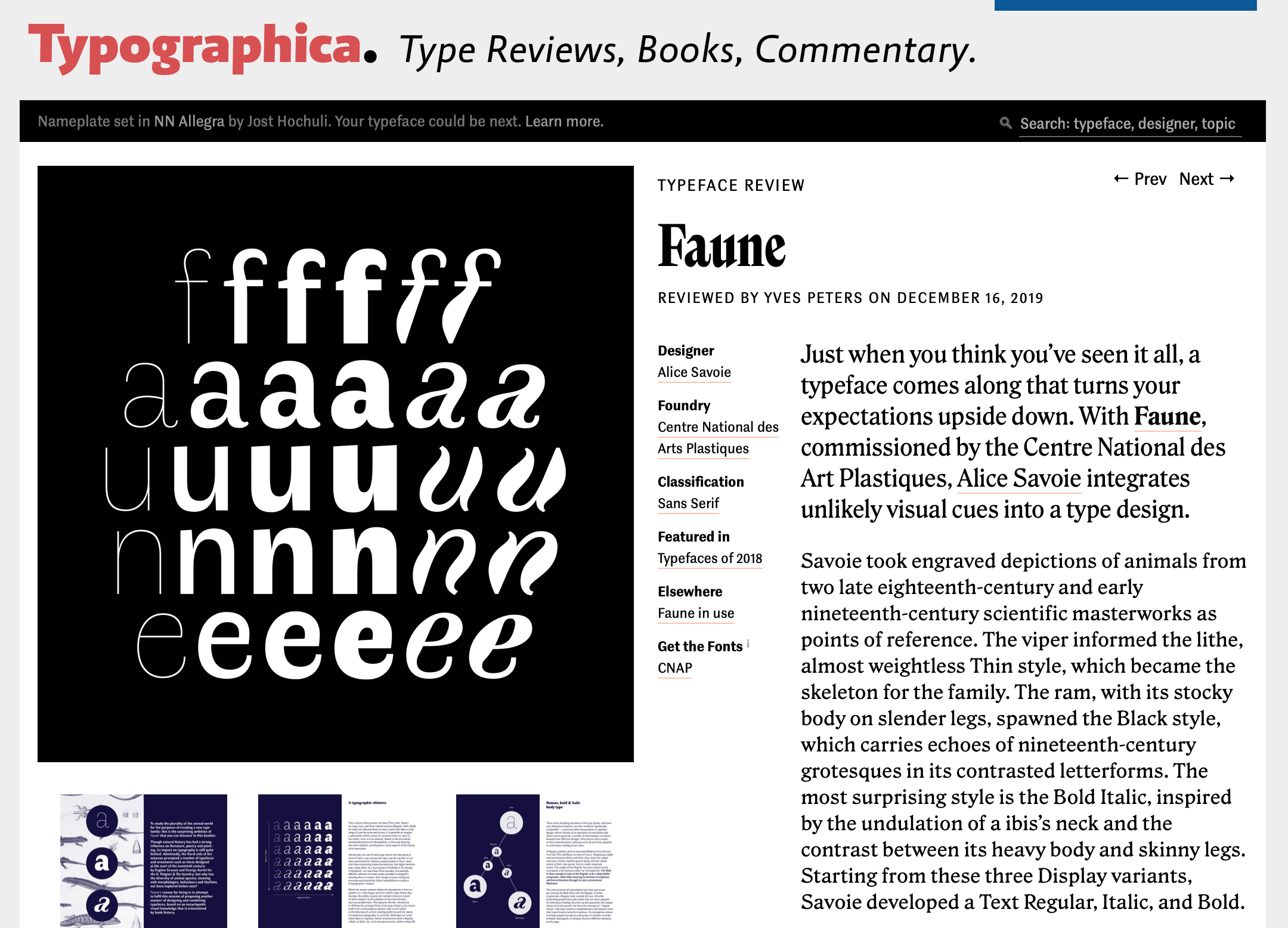
My work on Roslindale Deck began several months ago, when Stephen Coles used Roslindale Text for the body text of Typographica’s Favorite Typefaces of 2018 (a worthwhile read, by the way!). We thought that the text font looked nice and sturdy at smaller text sizes (say, 10–12pt or 14–16px), but started to look really clunky in the introductory paragraph that is set slightly larger (15pt or 20px). But this size is far too small for Roslindale Display, which is really optimized for headlines more than twice that size. The solution? Something in between.
Deck (or Dek) fonts have long been used by editorial designers for subheads and short summaries that sometimes appear directly below the headline of an article. They are optimized to cover the nebulous middle ground between text (extended reading at small sizes) and display (short bursts of reading at large sizes).

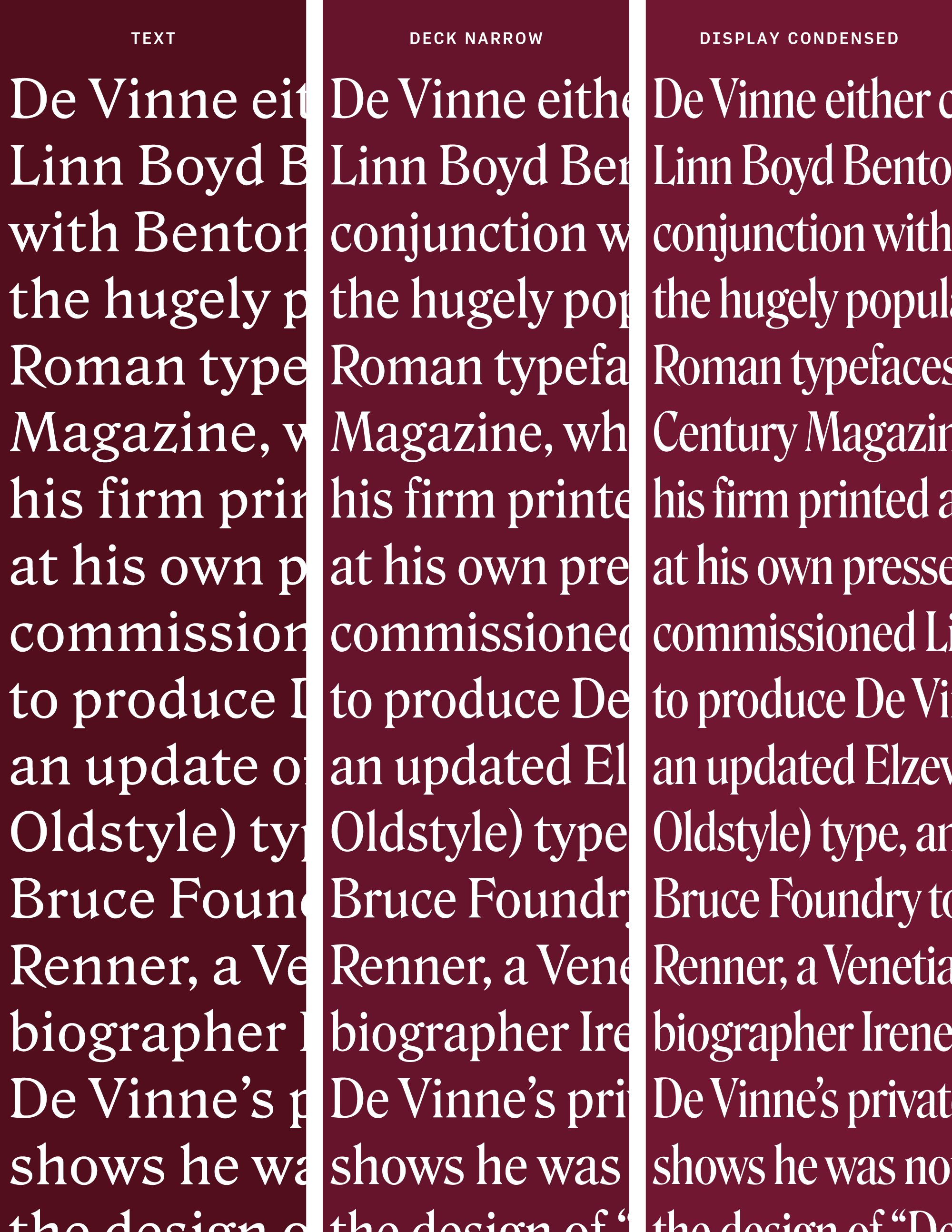
Roslindale Deck is narrower and tighter than Roslindale Text, with a higher contrast between thicks and thins. Most of my time was spent making small tweaks to the pre-existing Text and Display families until I was happy with the interpolations between them.
Deck optical sizes are still relatively rare outside of editorial design—something that I hope will change as variable fonts with an Optical Size axis become more widespread. Even though they may have started with a relatively specialized use in print newspapers and magazines, it seems to me that there are numerous use cases for medium-size-optimized fonts in contemporary typography, from the large text sizes used in many single-column blogs to blurbs, embedded tweets, and advertising copy.

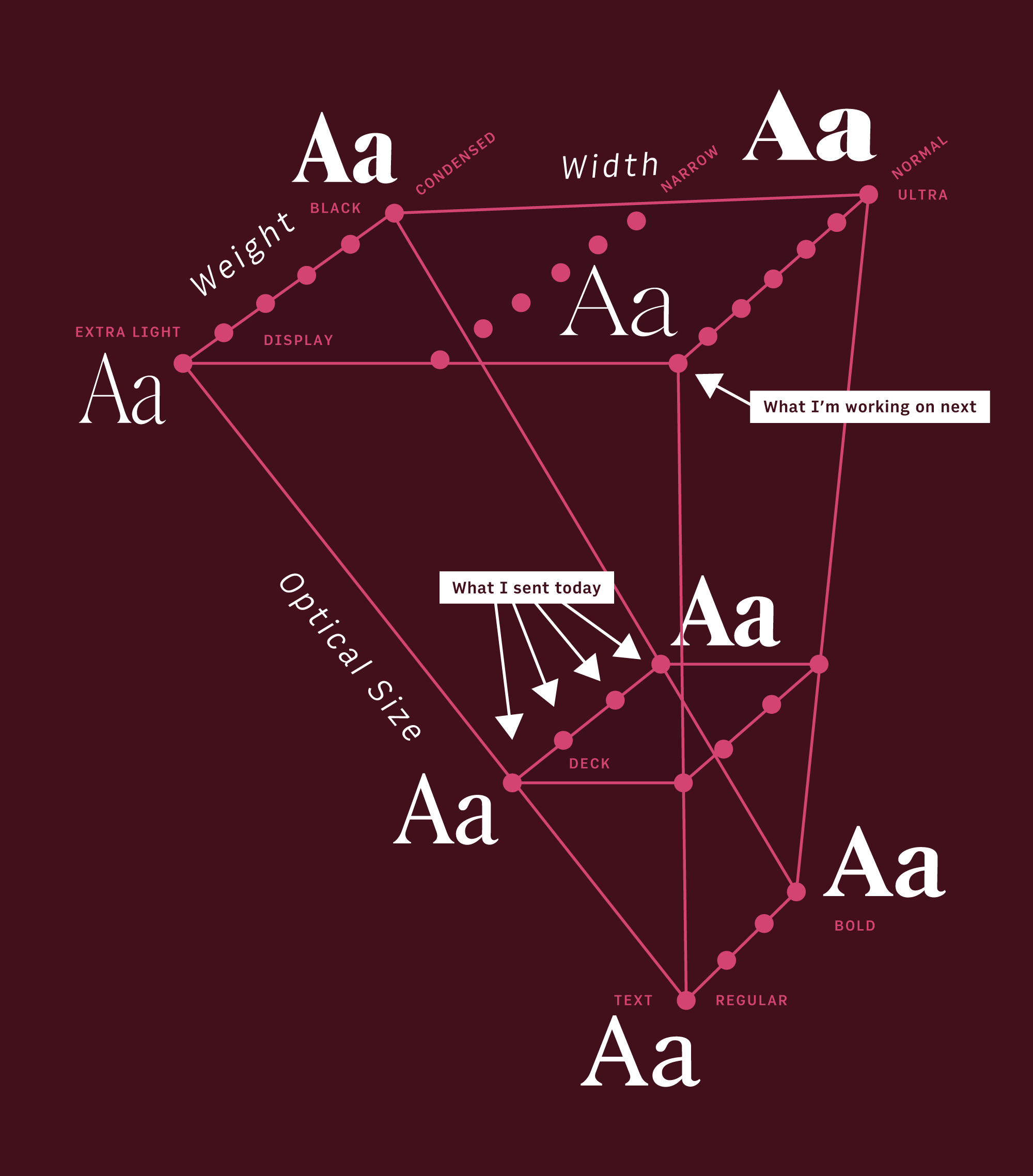
The overly-complicated family map above shows how I am working to expand Roslindale’s irregularly-shaped designspace. The goal of having a family that travels across weight, width, and optical size (also with italics!), but without widths or weights that I don’t feel are necessary. If you have the Roslindale Display and Roslindale Text back issues already, I’m happy to send you a demo variable font if you want to try it out.
As far as that slump goes, one of the other things I try to do is to focus my creative energies elsewhere for a little while. And right now, that elsewhere is the mandolin, which I have been learning how to play over the past year—I’m taking lessons, even now, via video chat. I’m still pretty bad at playing it, but at least I have my future album cover taken care of! 😜
