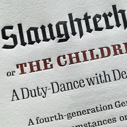
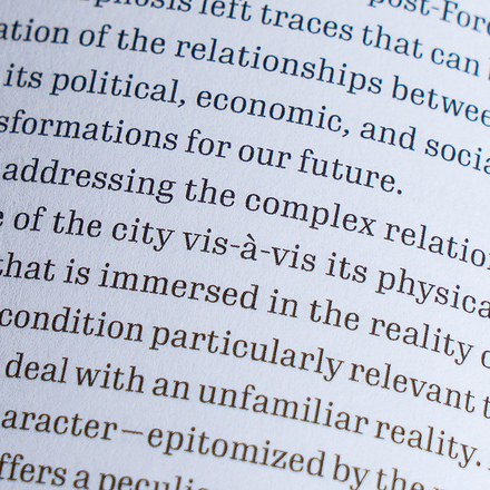
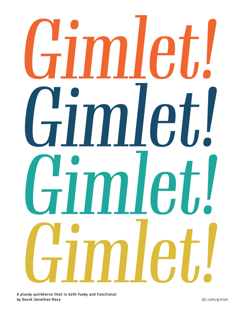
Gimlet draws its inspiration from Georg Trump’s 1938 typeface, Schadow. At the behest of Nick Sherman, I reimagined the oddball serif as an energetic contemporary workhorse, complete with three optical sizes and a flexible set of widths tailored for responsive layouts. A multifaceted series that speaks with a singular voice, Gimlet is a rare find: a typeface that is as funky as it is functional.
Your Friendly Quirkhorse
In The Long Goodbye, Raymond Chandler writes, “a real gimlet is half gin, half Rose’s lime juice, and nothing else. It beats martinis hollow.”
Gimlet is half Schadow, half imagination, and nothing else. And like its namesake beverage, Gimlet is a little tart, a little sweet, and can really pack a punch.
Granted, Gimlet is infused with more individuality than you might find in your typical workhorse. But I have gone out of my way to make sure that Gimlet’s charm doesn’t detract from its usefulness as an all-purpose serif. Gimlet Display is certain to turn heads with its high-contrast superelliptical forms, while the hardier Text and Micro series will work to enliven your text in more subtle ways. Plus, each optical size of Gimlet comes in four widths, so you can achieve the right fit for your text on any page or screen.
Yowza! These figures aren’t just tabular...they’re fabular!
A Dialogue with Schadow
Many great typefaces of the first half of the twentieth century were pillars of Modernism, unifying the alphabet in harmonious and cohesive systems. Schadow is not one of them.
Schadow is a typeface that walks the line between unusual and unusable. Its quirky details, wild shapes, and brash letterforms are chaotically and inconsistently joined together into an alphabet. Released over the course of 14 years, each style of Schadow has characters that take on entirely different forms than the rest of the family. In the end, the only thing that really ties this typeface together is an essential quirkiness that is just so Schadow.
Nick Sherman sent me a copy of Georg Trump’s monograph, Vita Activa, and asked me to take a closer look at the design. We discussed its diversity of forms and its unique voice, and he convinced me that there was something special in there that I could use as a jumping-off point for a new typeface. Gimlet is the result of a multi-year odyssey to make sense of its madness.
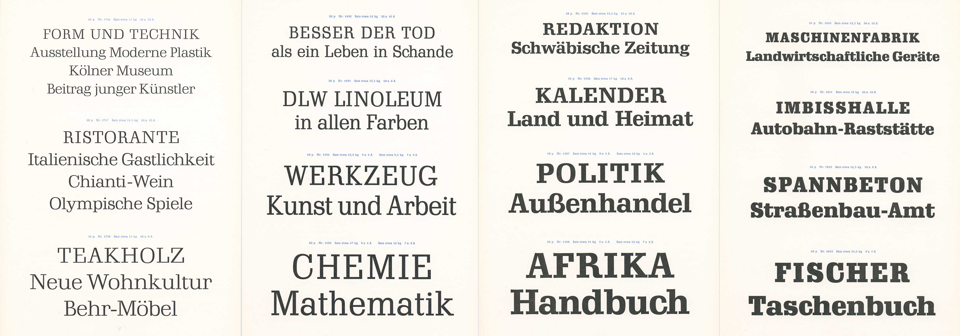
Gimlet is a direct response to Schadow’s esoteric spirit. Nick and fellow Schadow-enthusiast Indra Kupferschmid acted as my guides, helping me understand Georg Trump’s one-of-a-kind design. They advised me on which of Schadow’s features I should scrap, which I should reinterpret, and which I should steal outright.
While Gimlet owes much to Schadow, it also possesses its own distinct energy. Where Schadow feels cool and vaguely geometric, Gimlet is bright and organic. Where Schadow has moments of unevenness or rigidity, Gimlet is consistently personable and self-assured. Where Schadow lacks cohesion as a family, each style of Gimlet is part of a large, unified designspace, ready for the contemporary demands of text.
Widths for Text
Any typographer knows that setting text on a narrow measure can be tricky. It doesn’t matter if we’re talking about the columns in a printed newspaper or a responsive website on a mobile device: line length changes everything.
As typography responds to a narrow environment, doesn’t it make sense for the typeface to respond as well? For this purpose, Gimlet offers four closely-graded widths for its Text and Micro sizes, helping you to set the best text on any measure.
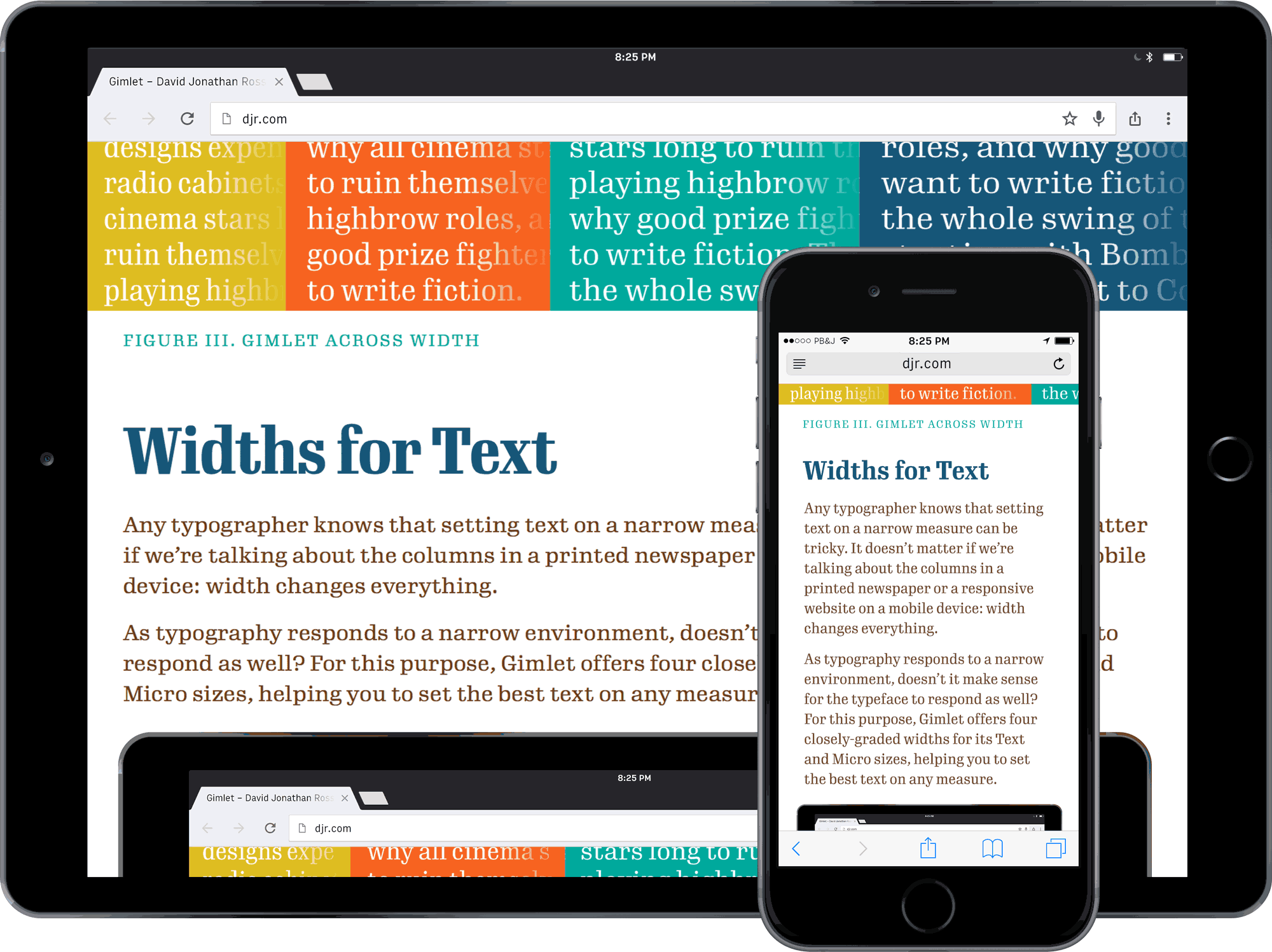
I recommend starting with Gimlet’s wider styles; they are nice and roomy, and give your text a chance to breathe. But if you find yourself short on space, you can call in a ringer like Gimlet Text Condensed and squeeze in an extra word or two per line. And these variants are perfect for the web, where they can respond to varying viewport widths using media queries (resize this page for an example).
An Irrationally Rational Italic
In the Modernist 1930s, the traditional cursive forms of the Italic felt passé when compared with the resolute, sloped forms of the sans serif Oblique. Serif faces, even bookfaces like Jan van Krimpen’s Romulus, began to abandon cursive Italics in favor of a sloped Roman design. Schadow’s Italics acknowledged this trend, but Georg Trump couldn’t resist adding a few outbursts of cursive in characters such as g and x.

Today, sloped Romans don’t have the same cachet, reminding us less of the Modernism of the 1930s and more of the bad desktop publishing of the 1990s. My first instinct was to ignore Schadow’s sloped romans altogether and give Gimlet a “true” italic. I gave it a shot, but it just didn’t sit right with this design.
I decided to take Gimlet’s Italics in the opposite direction and doubled down on Schadow’s eclectic starting point. The result is an unusual mix of sloped Roman forms (like a, n, and p) and exuberant cursive ones (like g, v, x, and z). Stylistic alternates allow you to fine-tune the cursiveness of the Italic, and its narrower body sets it apart from upright Roman text.
Fun fact! Gimlet’s widest character is the parts per mille sign. It’s kinda like the percent, but represents parts per thousand. You’ll probably never use it!
Gee whiz! Gimlet’s lowercase g is modeled after the open form found in Schadow, but it has tamed the crazy curves of its predecessor. It is distinctive, but not distracting.
Get Gimlet!
Gimlet is available as 112 fully-featured OpenType fonts, ready for licensing on desktop workstations, websites, e-books, and mobile apps. Each style contains text figures, tabular figures, small caps, fractions, and stylistic alternates — everything that you would expect from a hardworking typeface. Gimlet offers support for all major European languages that use the Latin alphabet.
Gimlet Elsewhere
-
Gimlet at Type Network Hosted webfonts and larger licenses
-
Gimlet at Fontstand Free trials and inexpensive desktop rentals
-
Gimlet at Adobe Fonts Easy integration with Adobe Creative Cloud
Additional information
- PDF Specimen
- Character showing
- Desktop Format: OpenType CFF Format (Postscript OTF)
- Web Formats: Web OpenType Font Format (WOFF & WOFF2)
- App Format: OpenType TrueType (TTF)
- Language Support: Latin, Western & Eastern European
- Cases: Uppercase • Lowercase • Small Caps
- Figures: Lining • Tabular Lining • Text • Small Caps
- Other: Superiors • Inferiors • Fractions
- Stylistic Alternates: Potbelly ‘a’ • Cursive ‘e’ (italics) • Cursive ‘f’ (italics) • Roman forms (italics) • Single-story ‘g’ • Serifed ‘Q’ • Alternate umlauts • Alternate ampersands
- Don’t see what you need? Get in touch!
