MEGAZOID celebrates the awkwardness of raw geometry.
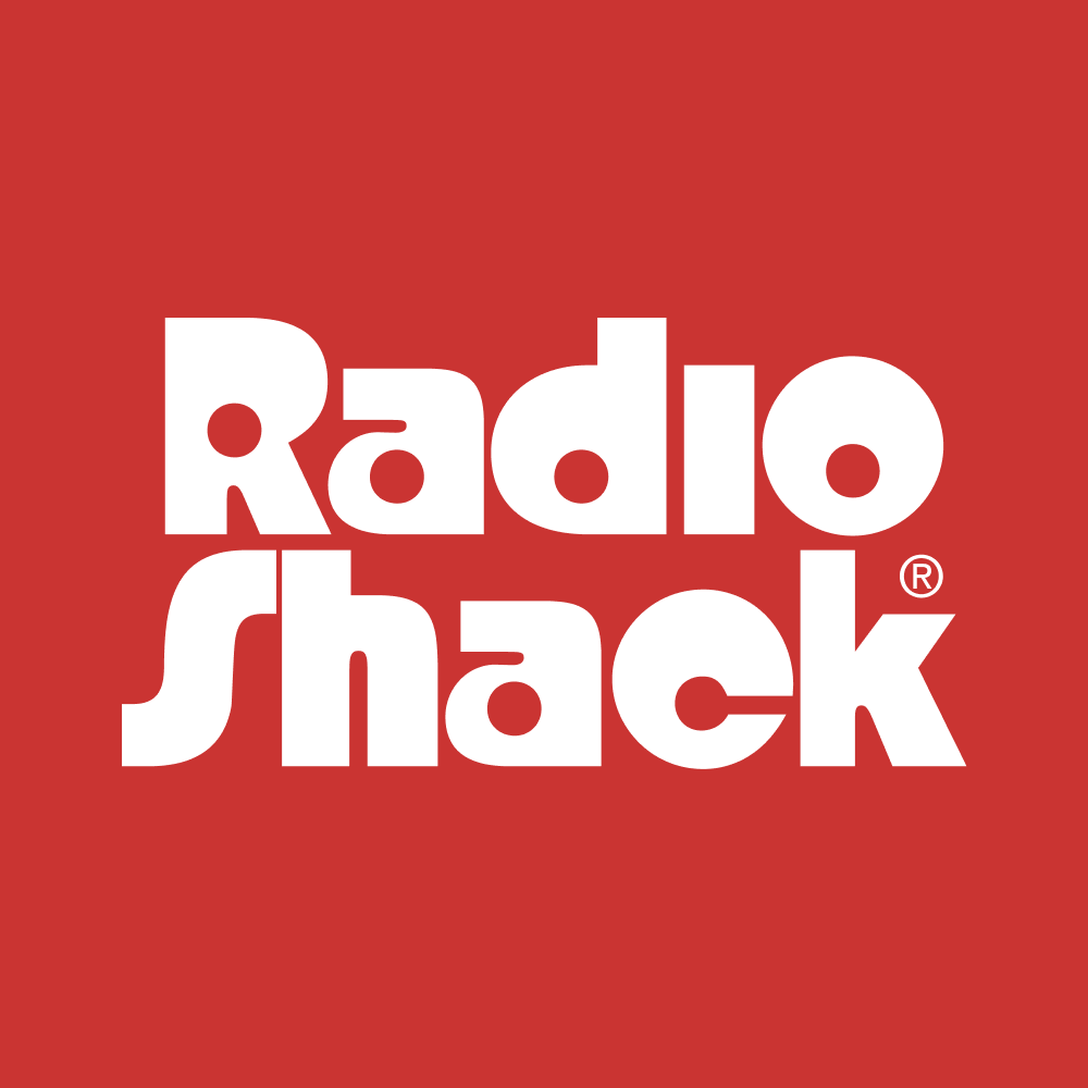
Megazoid pits square and circle against each other, contrasting blocky exteriors with counterforms that are mostly circular and cylindrical. This juxtaposition recalls the classic Radio Shack logo and its distinctive retro-futuristic vibe, but Megazoid leans towards corners over curves maybe 25% more often. This gives Megazoid a distinctive squarishness that sets it apart from the more figurative, stroke-based designs in this genre (I’m thinking Blippo and Pump, or recent entries like Bonkus, Marvin Visions, and Nichrome.)
At the same time, Megazoid avoids going into complete abstraction by not getting as heavy or extreme as designs such as Baby Teeth, Ginger Snap, Morro, Shotgun, and Strand. Instead, it bridges the gap between figurative strokes and abstract shapes, essentially functioning in the space between the super-literal Futura Extra Bold and the hyper-stylized Futura Black.
I really enjoyed playing with the tension between slick and clunky. It was a challenge to puzzle out how to make the more figurative shapes like s and o play nice with weirdos like a and e, even when their texture and color are totally dissimilar.
And you won’t find much in the way of triangles in Megazoid. Rather than introduce more symmetry, I took a page from Avant Garde and drew A, V, Y (and alternate M and W) as asymmetrical trapezoids that add a touch of off-kilter dynamism to the otherwise static design.
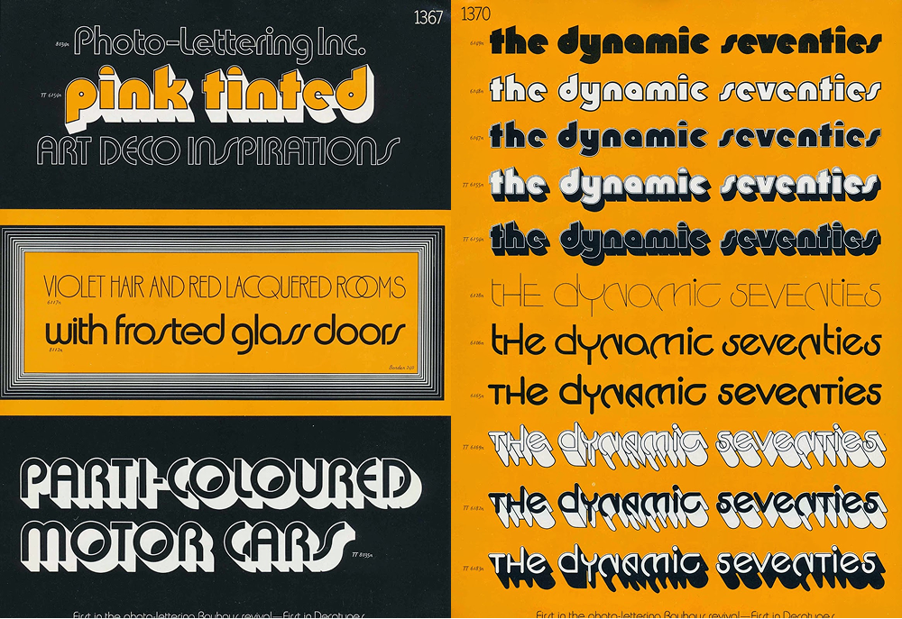
I didn’t plan this, but I’m really happy that Megabase, Megavolt, and Megazoid have formed a family of sorts, each one exploring a different mode of sans serif with heavy science fiction connotations. They all have plenty of non-sci-fi potential as well, not to mention a link to the phototype and dry-transfer typefaces of the 1970s.
A glance at any Letraset or Photo-lettering catalog is enough to tell you that this style lends itself to outlines, shadows, and textures. So I totally encourage you to go all out! Outline it, inline it, and offset it to create groovy drop shades à la Papirtis Pink Mouse. I held off on making a tricked-out color font (for now) but I did include Fill and Shade styles to give you a little head start.


Megazoid was designed by DJR, with variable shade layers scripting done by Connor Davenport. This webpage was designed by Loud Room.
Special thanks to Jovana Jocić for Cyrillic feedback, Donny Truong for Vietnamese feedback, and Eben Sorkin and Mathieu Triay for their comments on the design.
Are You Ready?
Megazoid Elsewhere
-
 Megazoid at Type Network
Hosted webfonts and larger licenses
Megazoid at Type Network
Hosted webfonts and larger licenses
-
 Megazoid at Fontstand
Free trials and inexpensive desktop rentals
Megazoid at Fontstand
Free trials and inexpensive desktop rentals
-
 Megazoid at Adobe Fonts
Easy integration with Adobe Creative Cloud
Megazoid at Adobe Fonts
Easy integration with Adobe Creative Cloud
Additional information
- PDF Specimen
- Desktop Format: OpenType CFF Format (Postscript OTF)
- Web Formats: Web OpenType Font Format (WOFF & WOFF2)
- App Format: OpenType TrueType (TTF)
- Language Support: Latin, Western & Eastern European • Latin, Vietnamese • Cyrillic
- Cases: Uppercase • Lowercase
- Figures: Lining
- Stylistic Alternates: Simplified a, g, q • i / j with square dots • i / j with small dots • More diagonals • Flipped diagonals • Upright S / Z • Square alternates • Rounded d • Rounded E • Rounded e • Flipped t • Mathieu’s G • Turn On Filled Forms • Turn Off Filled Forms
- Don’t see what you need? Get in touch!