January’s Font of the Month: More Ottavio!
As promised, here I am at the end of January with some new lighter weights for Ottavio! Thank you again for your patience as I worked to get caught up to my usual schedule.
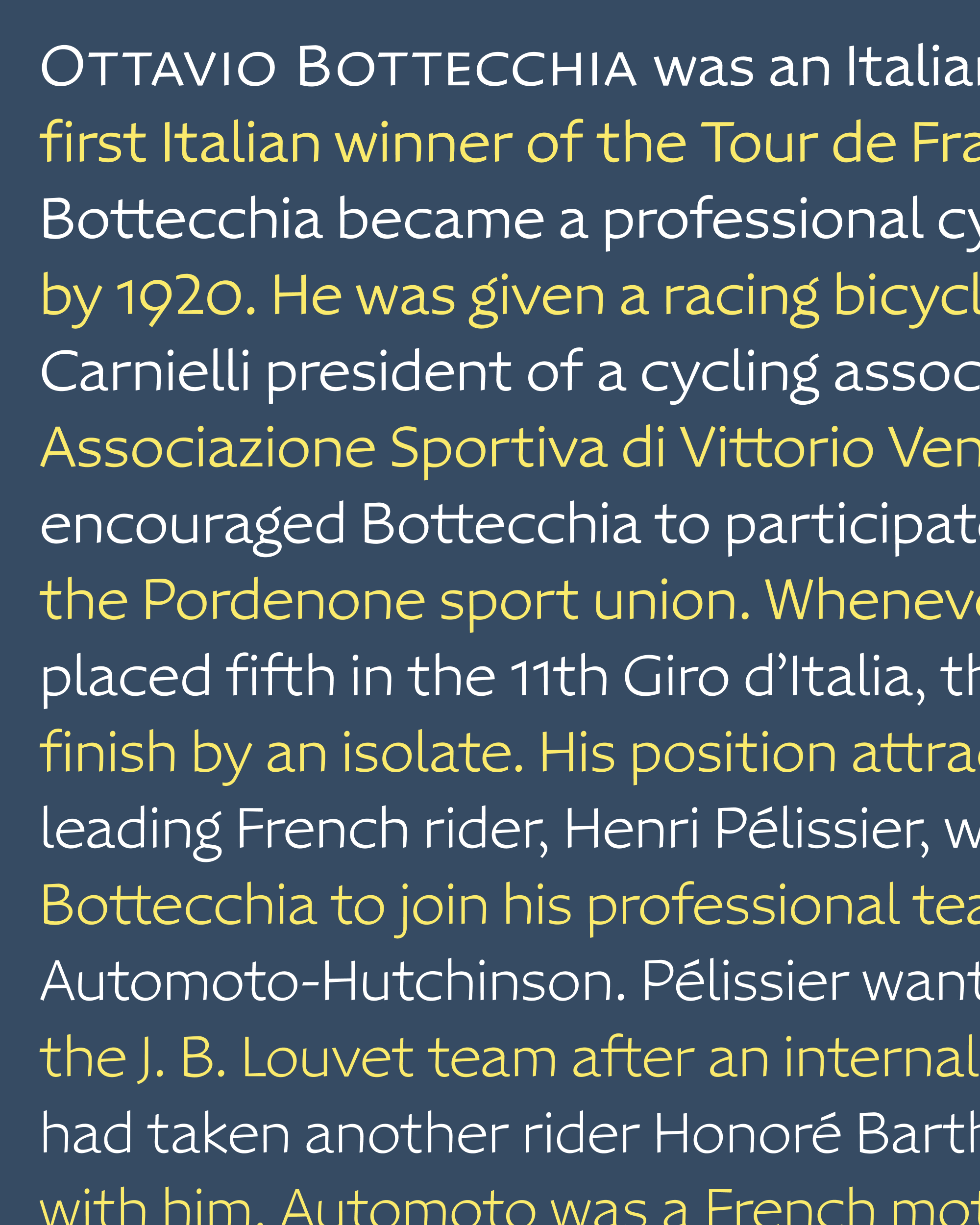
I’ll keep this one quick. In the two weeks since I wrote you last, it dawned on me that I might be doing this thing I tend to do, where I make a font that sits in the valley between Display and Text. Ottavio’s namesake won the Tour de France, but should the font be a sprinter or a long-distance cyclist? Was I selling Ottavio short if I didn’t at least take a stab at optimizing it for extended text?
So I did another thing I tend to do a lot: I fired up Type-X and started using the font everywhere in my daily life...my email, my browser, notes to myself, you name it! (And yes, I styled my links as small caps, an homage to Practical Typography.)
As I used the font, I started tweaking the letter-spacing and font-weight directly in the browser until it started to feel more like something I would actually want to read. From there, I could move to my font editor and apply those changes more thoughtfully.
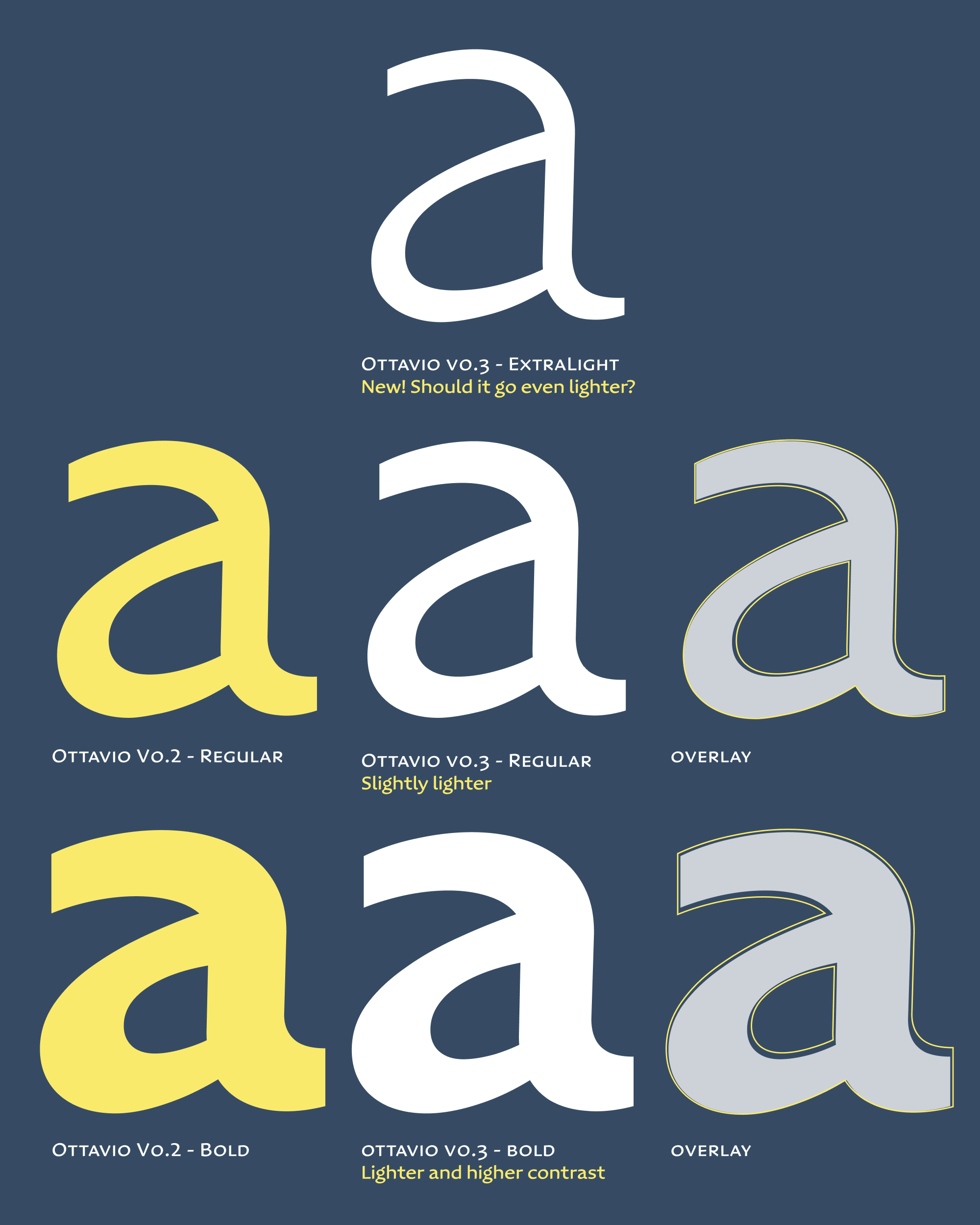
Ottavio’s original Regular weight felt too heavy and too tightly-spaced at text sizes. Fortunately, now that I have an ExtraLight pole to interpolate from, it was no problem to lighten the Regular by 7% and recalibrate the rest of the weights to follow.
I liked that Ottavio’s diagonal axis and thick/thin contrast really shine through in the new Light and Extra Light weights. But, it made the Bold I did recently feel low-contrast by comparison. I didn’t want heavier weights clogging up at small sizes anyway, so I also also added a bit of contrast to the Bold and Extra Bold, on top of the weight change.
I know this month’s offering is just a small update, but I hope it is at least a little interesting to see how these minute changes add up to meaningful design enhancements.