December’s Font of the Month: Ottavio Bold and Italics

Last July I shared the story of Ottavio Bottecchia, two-time winner of the Tour de France. I loved the response from the cycling enthusiasts among you, seeing photos of your Bottecchia brand bicycles, and hearing about your excitement for the sport and Bottecchia himself.
Bottecchia won his yellow jerseys in 1924 and 1925, which means we are now entering the second year of the centennial celebration of his achievement. So I figured it was a good time to keep things rolling with Ottavio, the font I designed for his great-granddaughter, Caterina Piatti. After all, a typeface inspired by family should be available as a family!

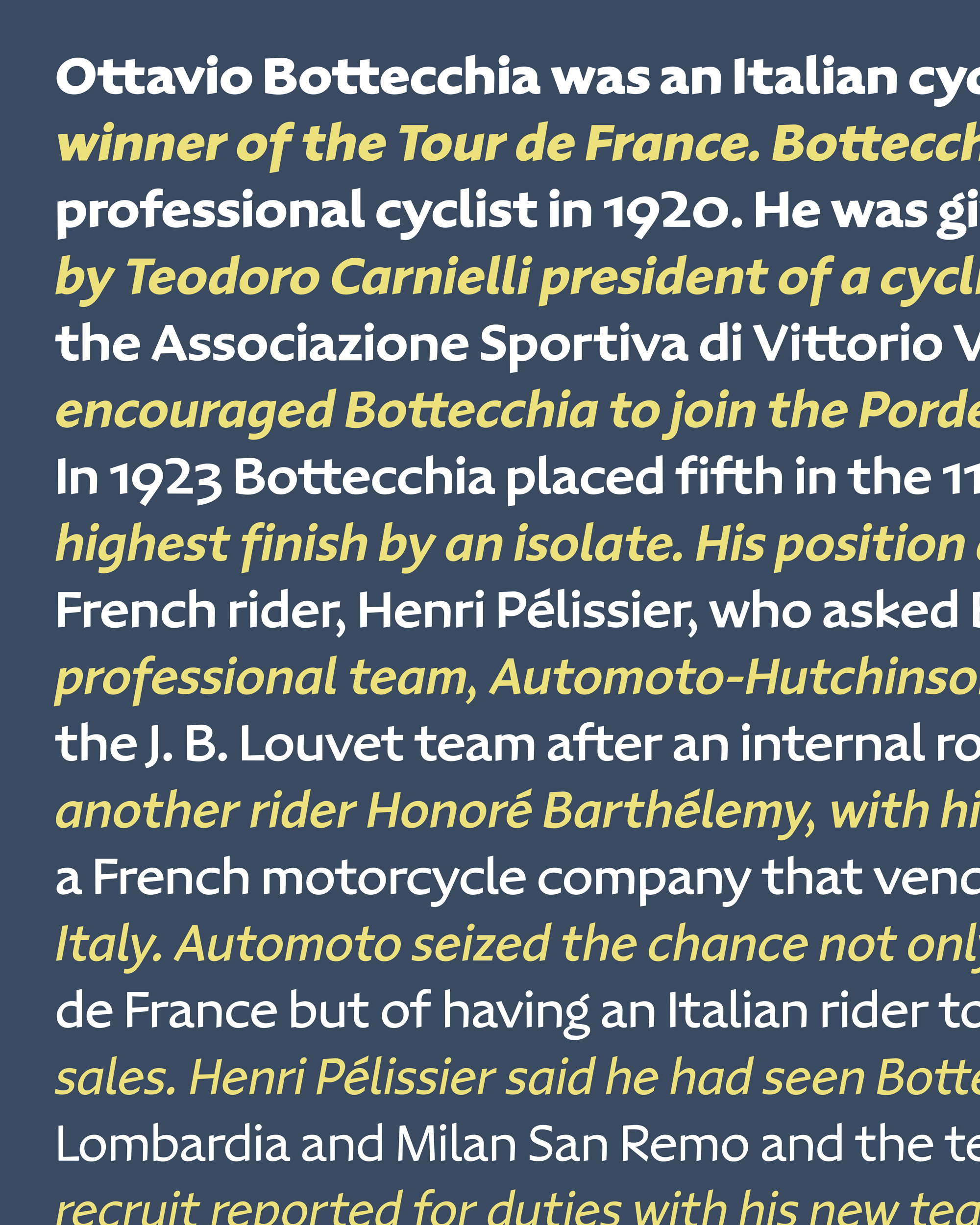
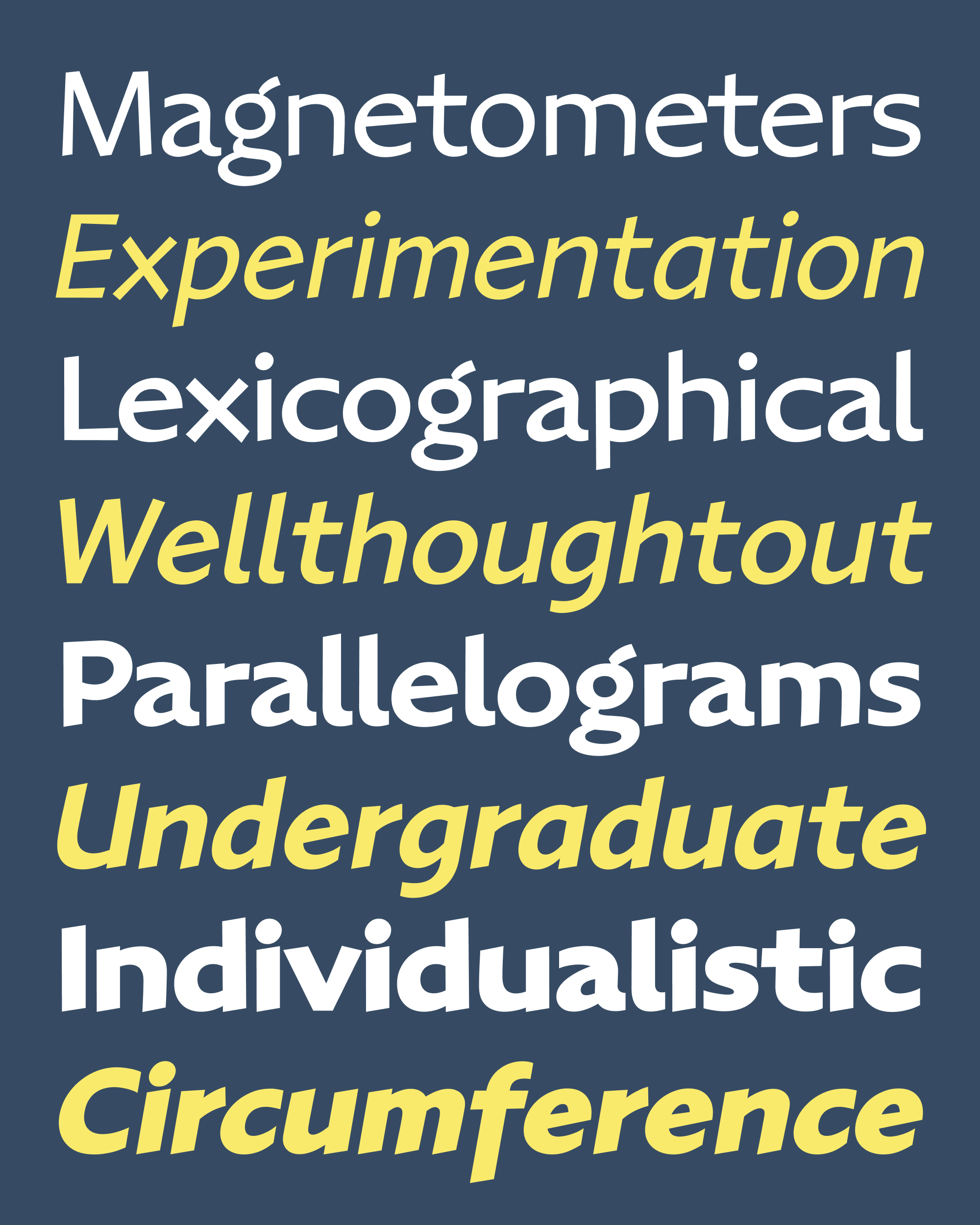
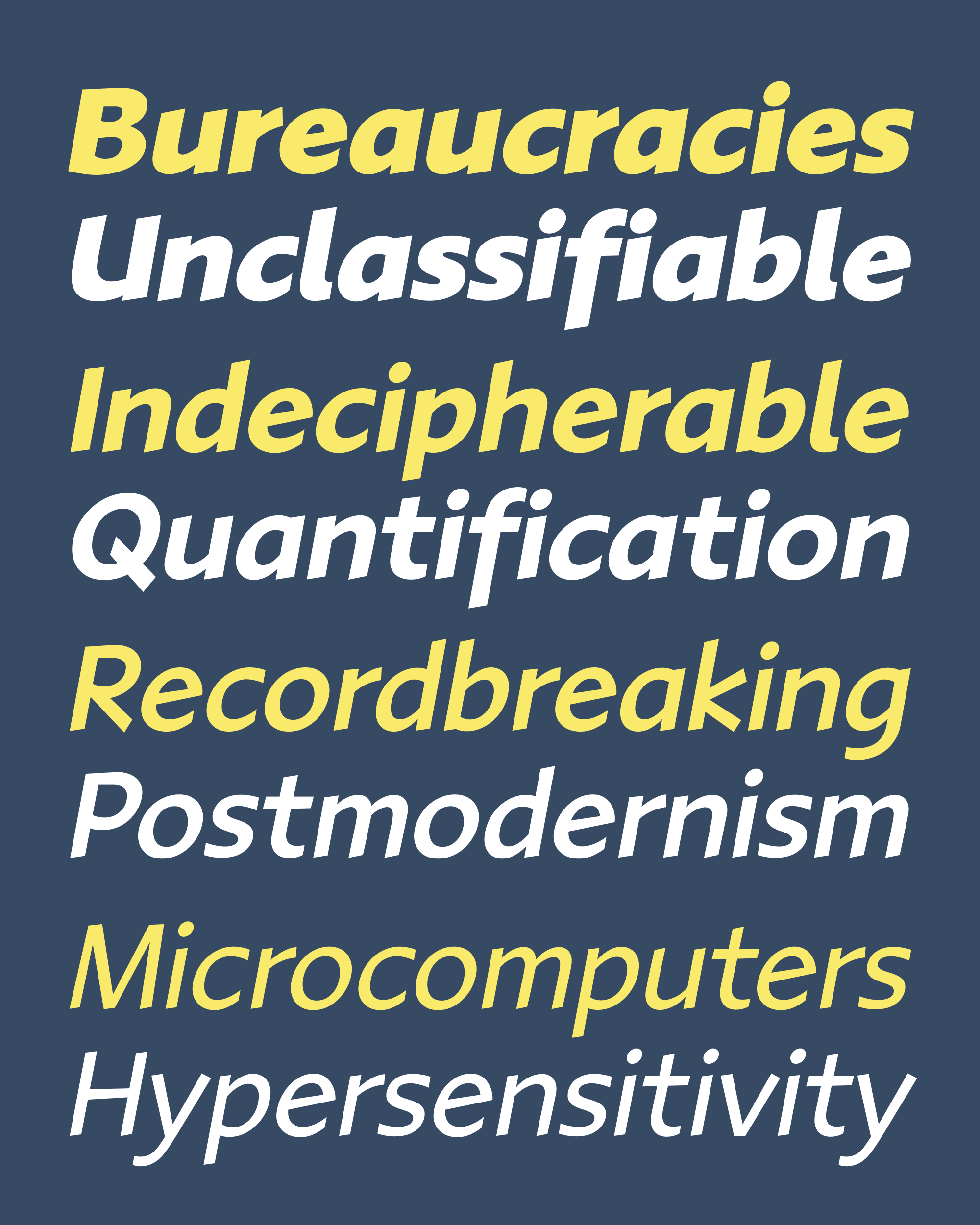
In this update (Ottavio v0.2), I’ve added three new weights (Medium, Bold, and ExtraBold), small caps, and Italics. The immediate reason for this expansion is to give Caterina more to work with in her designs commemorating the anniversary. But I also wanted to use this opportunity to feel out this design, put it through the paces, and see how Ottavio’s loose, dynamic shapes react to being emboldened or italicized.
It’s tricky to find the perfect moment to expand a single style into a family. On one hand, I want to keep things small and agile for as long as I can, so I can make changes quickly and easily and firm up the core design before blowing it up into thousands of glyphs across multiple variants—I know all too well the feeling of inertia that can set in once a family gets big and every small change becomes a heavy lift.
On the other hand, I know how instructive the experience of drawing a bold or italic can be (small caps maybe not so much 🙃). Moving towards the extremes of weight, width, or slant requires exaggerating certain design features until they reach a breaking point, which can reveal what is working and what isn’t in the core design.
With Ottavio, I navigated a delicate back-and-forth between expansion and retraction. I started with the Regular, took a little detour to try out a handful of glyphs in different weights, and then set those aside and went back to the Regular again. A while later, I did a quick foray into Italics, quickly slanting and condensing the letterforms to get a sense of what it might feel like. Then I scrapped that and went back to the Regular again, and so on. The key was to not invest so much time in any of these detours that I would be sad to delete them later!

The Italic you see here is probably the fourth or fifth iteration that I worked on, and it might not be the last. Since sending you Roslindale Variable Italic way back in 2019, I’ve gotten in the habit of separating cursiveness and slant when I draw italics.
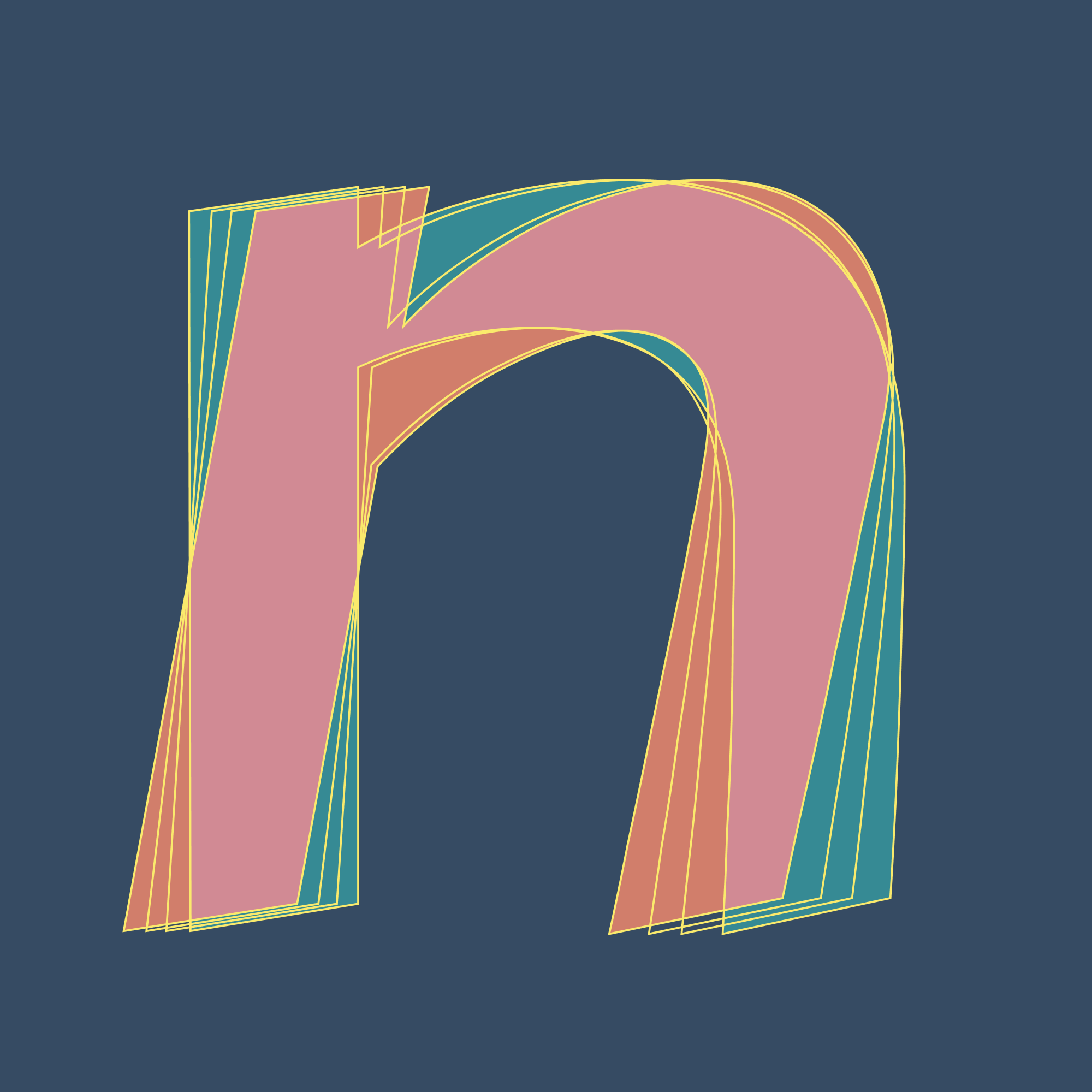
I started by drawing alternates in the Regular that are upright shapes with italic features, such as the cursive shoulders in m/n/u, the single-story a and g, and the descending f. After that, I made everything narrower, mechanically slanted it, and made the italic alternates the default glyphs. As a final step, I cleaned up the curves to account for the distortion of the slanting process. This makes it easy for me to delete the italic knowing I can somewhat-painlessly reconstitute it from the alternates later on. And it allows the italic to exist in the same interpolating designspace as the upright, combining a fluid transition in slant with an abrupt transition in cursiveness.
I feel that there is a perception that a type designer goes through the alphabet, drawing each glyph as a perfect outline, one at a time. For me, the reality is much looser and messier, with much more trial and error, roughing in and cleaning up. Maybe this is too nerdy of a metaphor, but my family-building process is less like a JPEG image that loads from the top down, and more like a Progressive JPEG where a blurry image gradually gains detail. And for Ottavio, I think the picture is starting to become clear.

Perhaps it wasn’t the wisest choice to work on a big family expansion when I’m already behind on my monthly schedule, and I do appreciate your patience as I work to get caught up. If you don’t mind, I think my plan will be to keep pedaling through Ottavio and send you some lighter weights at the end of January, and then something new in mid-February. Then I can try to get back to sending you stuff closer to the beginning of the month…I will feel a whole lot better about my life once that happens!
