May’s Font of the Month: Extendomatic
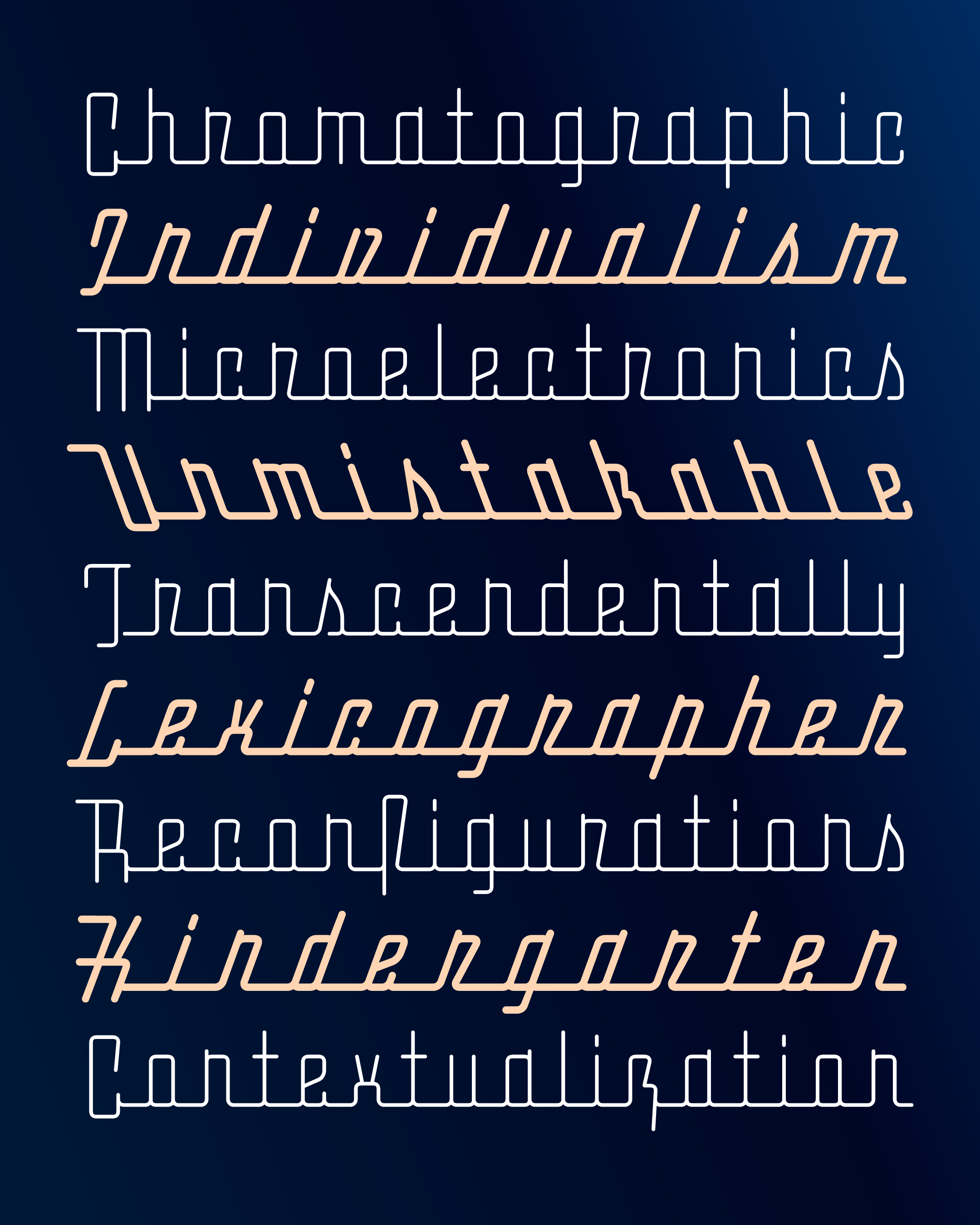
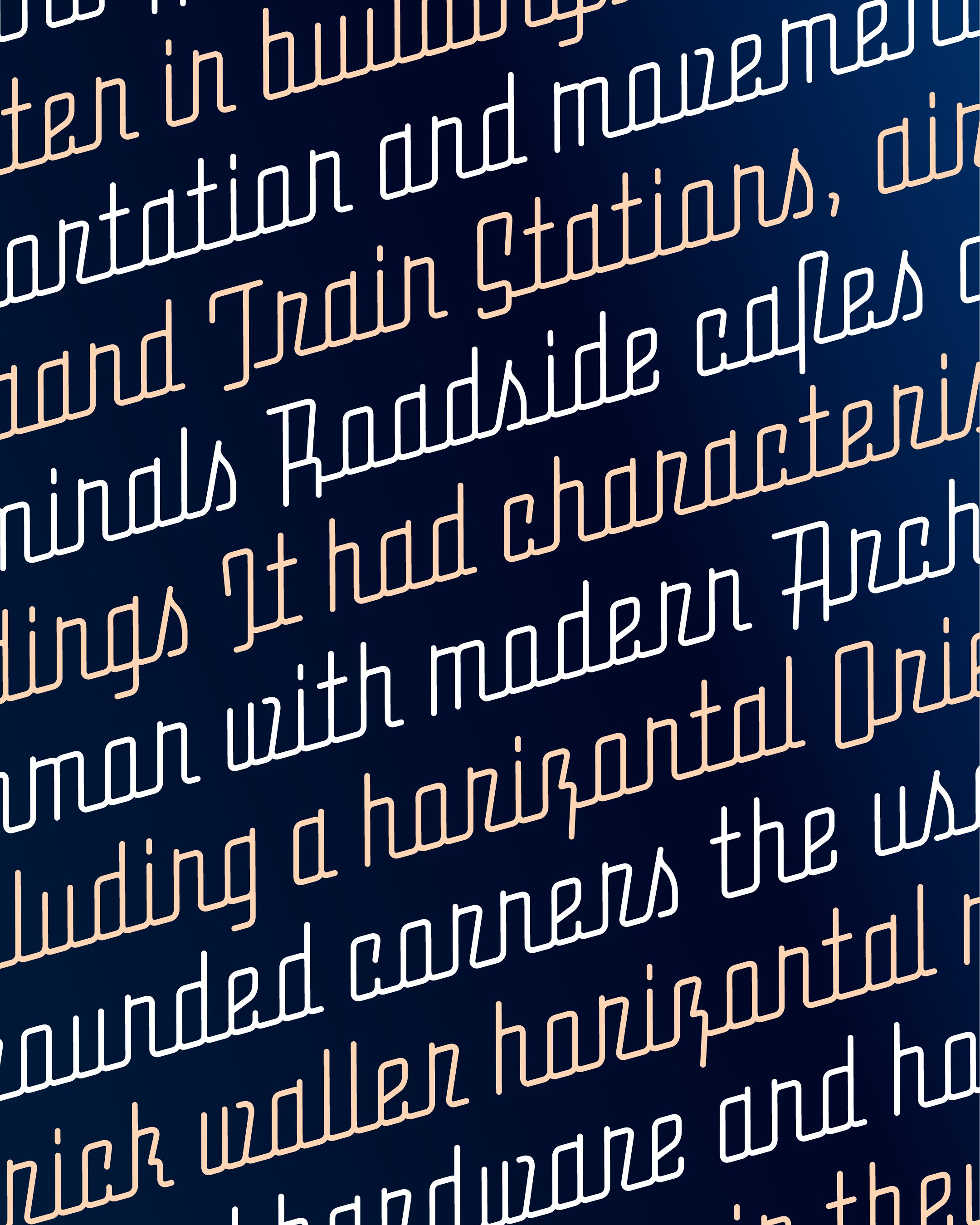
Sometimes I like to think that letterforms are made up of skin, muscle, and bone. There are typefaces that have conventional skeletons, but do something exciting with the way weight builds up around the skeleton (muscle). Others play with surface-level attributes like line quality and roughness (skin), but don't do as much with weight or proportions. And for some, the focus is primarily on the skeleton itself, relying on unusual proportions or letterform constructions to set the typeface apart.
Extendomatic is a typeface that is all about its skeleton. I started this design in 2015 while living in Los Angeles. My wife Emily and I spent many weekends exploring LA’s residential streets and documenting the cursive signage of its many “dingbat” apartments. Standing on a sidewalk in Manhattan Beach, I found myself admiring the exaggerated baseline of the “Sounds of the Sea” sign, pictured below, and that’s what got me drawing. But the typeface quickly shifted towards a more Streamline look, abstracting away any hint of the handmade and relating more to the Deco stylings of early mid-20th-century cars and appliances.
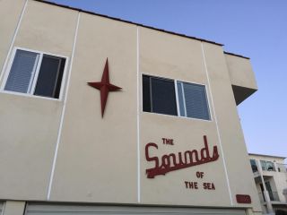
Sounds of the Sea, Manhattan Beach
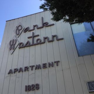
Park Western, Los Feliz
Over time I found myself less interested in taking this design in an overtly Retro direction, and more interested in doing some sort of geometric deconstruction of the style. Of course, there are plenty of great typefaces out there already that run this gamut (Raceway, Frigidaire, FIG, Orion), but I tried to steer clear of those while designing this font, and follow where the geometry was taking me.
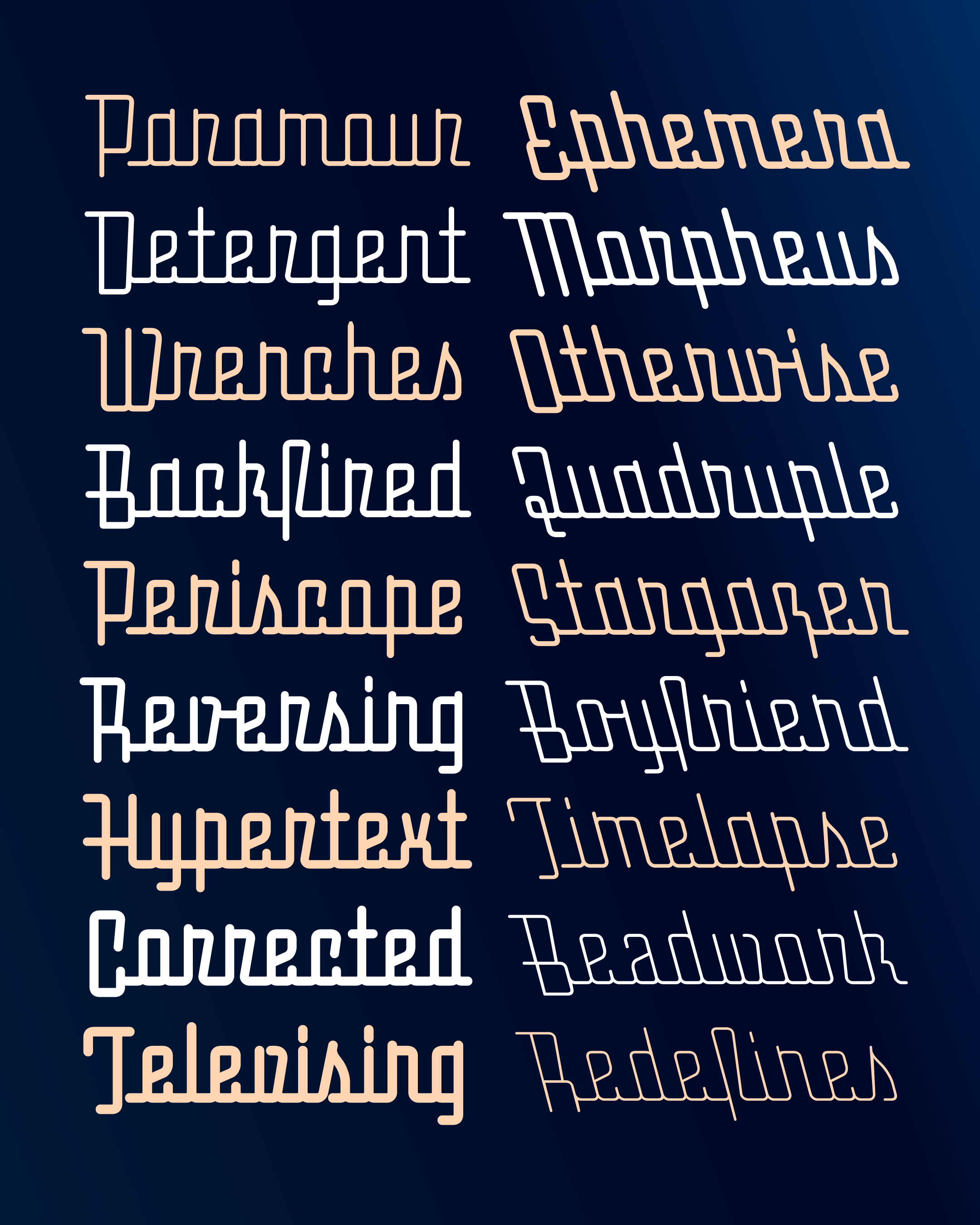
Over the years, this typeface has gone through several iterations: slanted vs. upright, thick vs. thin, narrow vs. wide. And a lot of questions remain: Do the round corners help pull this typeface out of the Retro category, or should I go beyond the skeleton and think about weight, contrast, and edges a bit more? Should every word begin and end with a long baseline, or is it a good thing that I’ve employed special alternates to limit them at the beginning and end of each word? I feel like I’m still in the process of exploring this space and figuring out what works and doesn’t work, and now with Extendomatic’s variable font, you can do that with me!
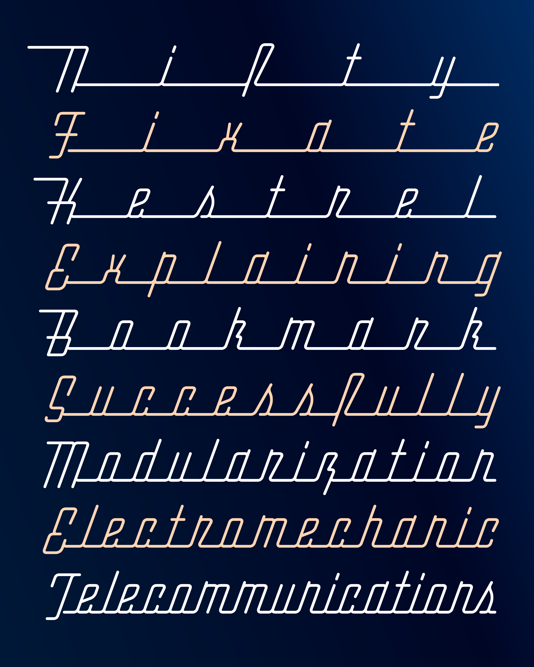
Extendomatic’s variable font can vary in stroke weight and slant 20° to the left or to the right, but it’s the tracking axis that steals the show. Tracking a connected script is rarely a good idea, but this variable axis extends the baseline as it spaces out the letters. This allows the letter spacing to increase tenfold while the letters still stay connected, and helps Extendomatic live up to its name. (I’ve designed the underscore (_) and overline (‾) to act as snap-on extenders, in case you want to go even further 😅).
And finally, a couple technical asides:
There seems to be some rendering issues in Adobe apps when the typeface gets super-wide, and some alternate difficulties when you try to use multiple tracking values within the same word (you can always disable contextual alternates to get a more predictable result).
This variable font is unlike any other I’ve sent before because it isn’t anchored by drawings at every corner of the designspace. Instead, I’m using this as an experiment to see how much I can trust the variable font renderer to calculate shapes automatically when two or more axes are employed simultaneously (I’ve already notice Slant+Weight causing some slightly wobbliness, for example). It’s sort of the variable fonts version of “Here be Dragons”...I know these locations exist on my map, but I can only guess what’s actually there!