January’s Font of the Month: Klooster Thin Lowercase
This month I’ve made a pretty straightforward update to a far-from-straightforward typeface. Exactly one year ago, I sent out Klooster Thin, a set of spry uncialesque capitals with energy to spare. This time, I’ve gone ahead and added a brand new lowercase, which I hope will open up possibilities for using this relatively niche design.
Klooster is based on the uncial hand, a script that was popularized many centuries before the existence of the lowercase we use today. So the entire concept of a “lowercase uncial” is anachronistic at best, and this expansion is in some ways a work of historical fiction.
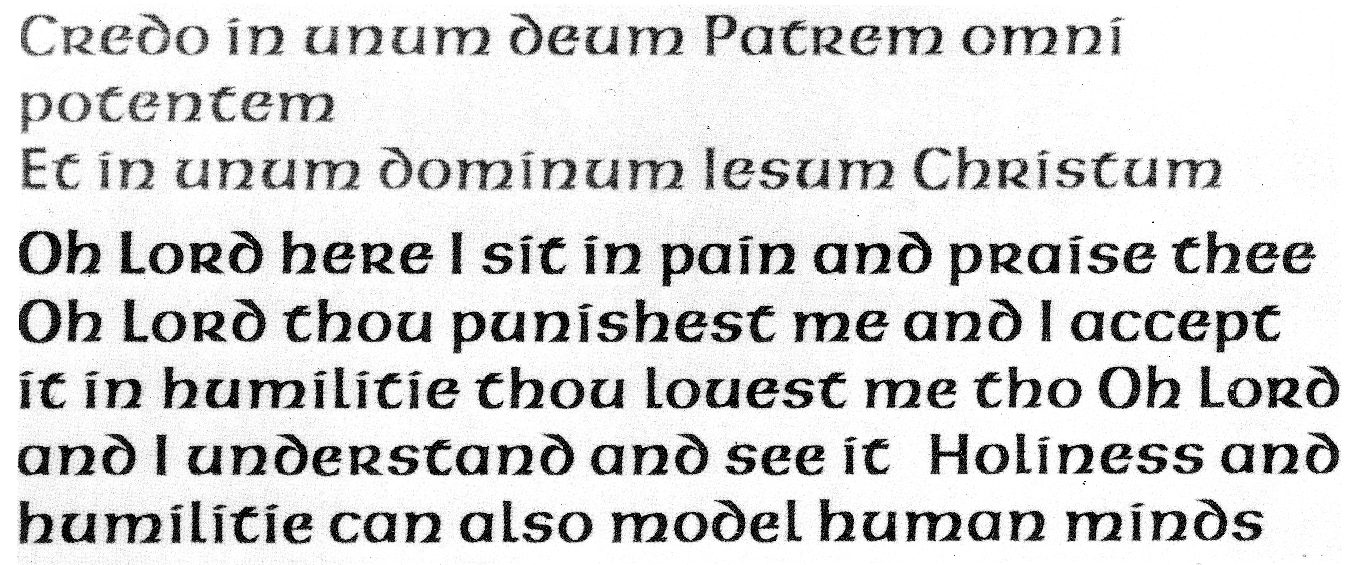
Klooster is far from the first typeface to explore a bicameral uncial. As demonstrated in Dan Reynolds’s excellent piece on Victor Hammer, uncials often functioned as a “lowercase” intended for running text that would be paired with Roman capitals or even enlarged initials (to be used as versals or drop caps). But unlike American Uncial, Klooster leans more towards uppercase already, so this precedent didn’t feel quite right.
Without the burden of historical authenticity, I had the freedom to think of uppercase and lowercase not as two distinct alphabets but as a single sliding scale. Instead of going back in time to Roman capitals for Klooster’s second case, I turned the dial a few notches forward to a fully-evolved lowercase.
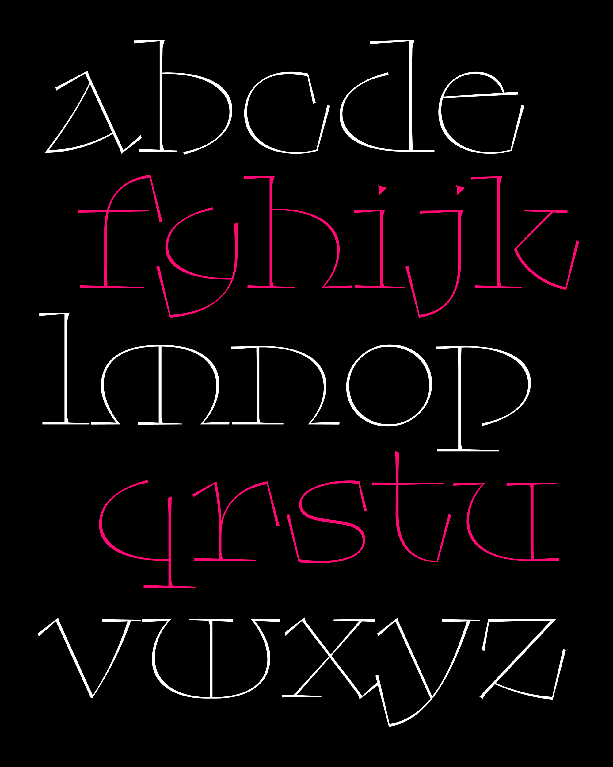
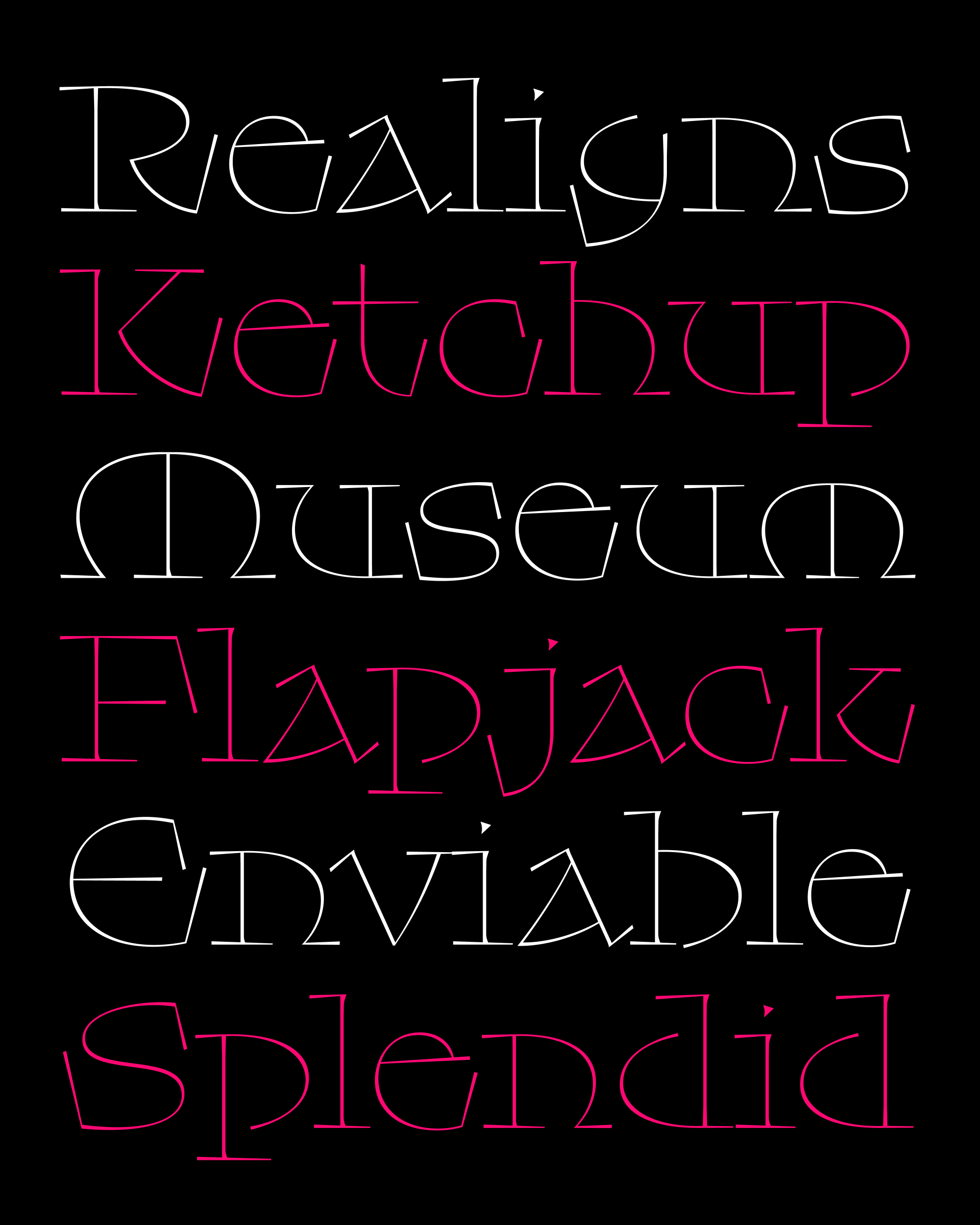
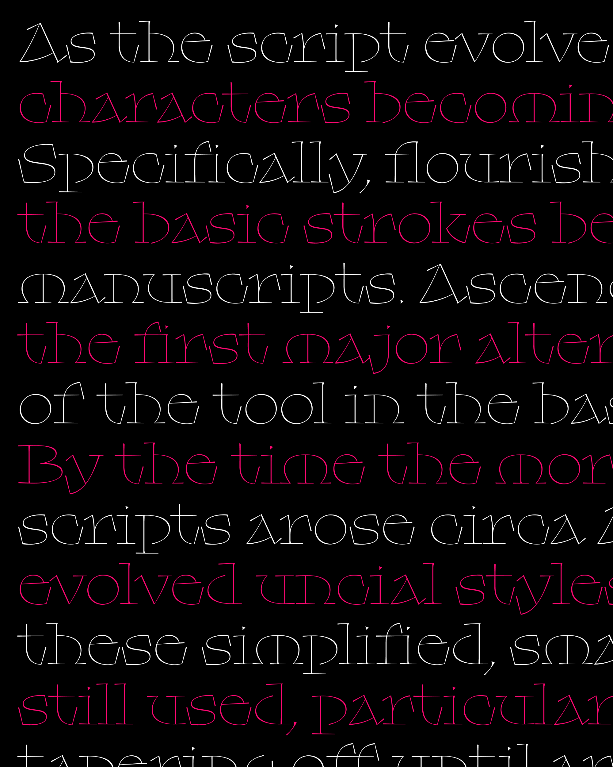
Klooster’s lowercase preserves the extremely long serifs and snappy, elastic curves of the original caps, and it introduces new proportions, prominent ascenders and descenders, and even more rounded forms.
Some forms had to change radically; b/d/p/q took on “ball-and-stick” constructions with flat joins and large apertures that give them a bit of a Blue Island vibe. But because Klooster’s “uppercase” already incorporated so many lowercase elements, the construction of most letters didn’t need to change very much at all. If O/o and Z/z can have the same form in both cases, why can’t H/h or M/m work that way too?
I’m especially happy with how a, e, and g came out; they sit on a weird precipice where you can see both lowercase and uppercase in them at the same time, almost as if it is an optical illusion.
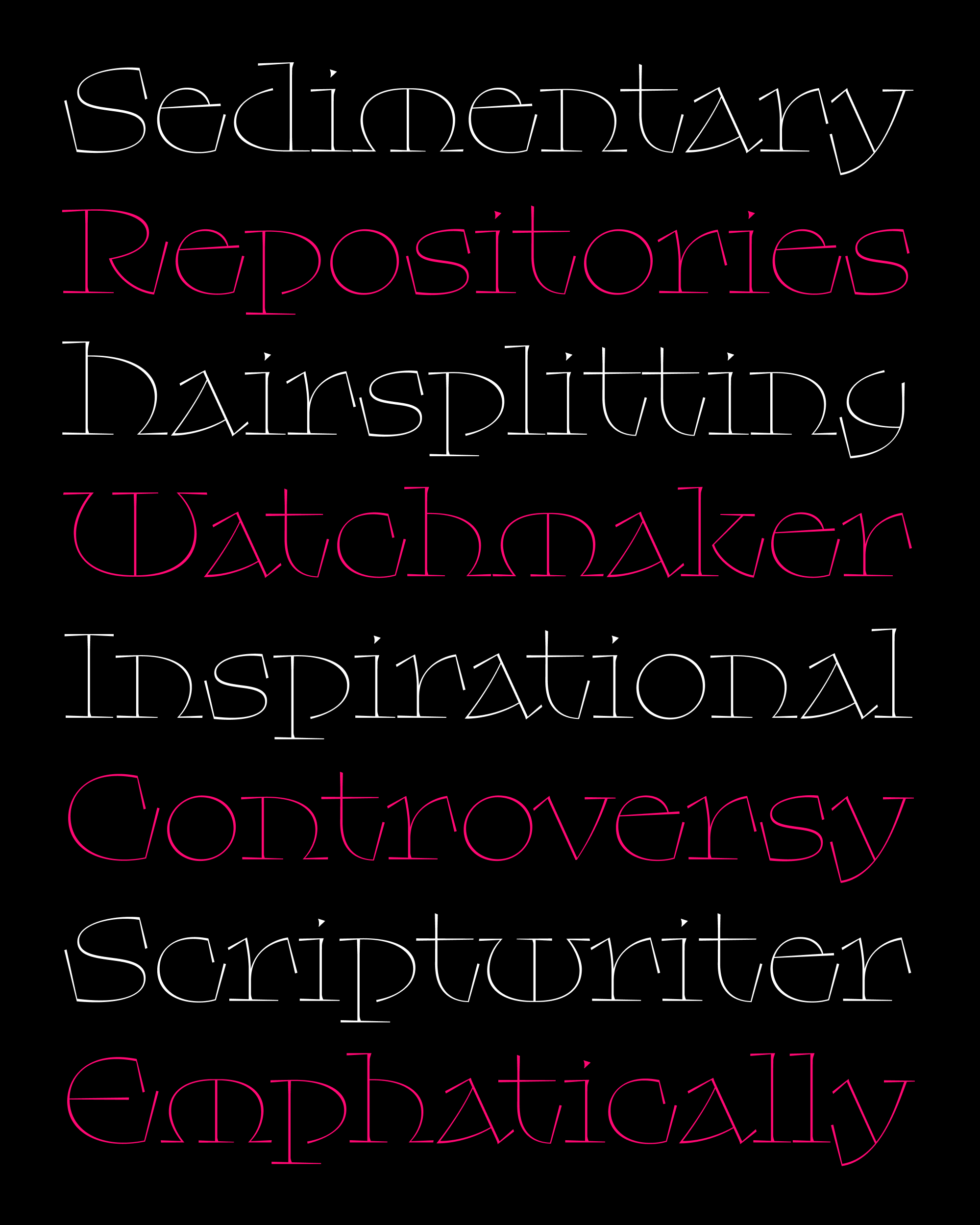
The last little family of letters that I’ll call out is f/j/r/t, which gave me the most trouble by far. In typefaces, these letters are often drawn narrower than you’d expect, in order to avoid spacing problems. Helvetica, for example, slices f/j/r/t on the vertical despite having horizontal terminals everywhere else.
I initially took the same approach in Klooster, shortening the vertical serifs significantly so that letters would tuck underneath f and pop over j. But in the end, I decided that the elongated vertical serifs are such a crucial part of this particular design that I could not part with them...to hell with even spacing! I think the width and distinctive swing of these four letters contributes a lot to Klooster’s off-kilter rhythm, which I hope goes to show that uneven spacing is not always the same as bad spacing.
The last three months here at the club have featured a Roman rustic, a blackletter, and an uncial: three styles that I like to think are as vital today as they were in antiquity. And I’m always happy to hear if there are any other families you’d like to see updated in 2022, or any new styles you’d like to see explored. I hope your new year is already off to an excellent start! — DJR