December’s Font of the Month: Bradley Initials DJR

Without a doubt, I am a sucker for a nice drop cap. I’ve always been charmed by them in print layouts, and Jessica Hische’s Daily Drop Cap demonstrated that they can be equally powerful onscreen. They offer the reader a hearty typographic welcome and invite them in to a block of text. Plenty of my club fonts would make for great drop caps, but until now, none of them were designed explicitly for that purpose.
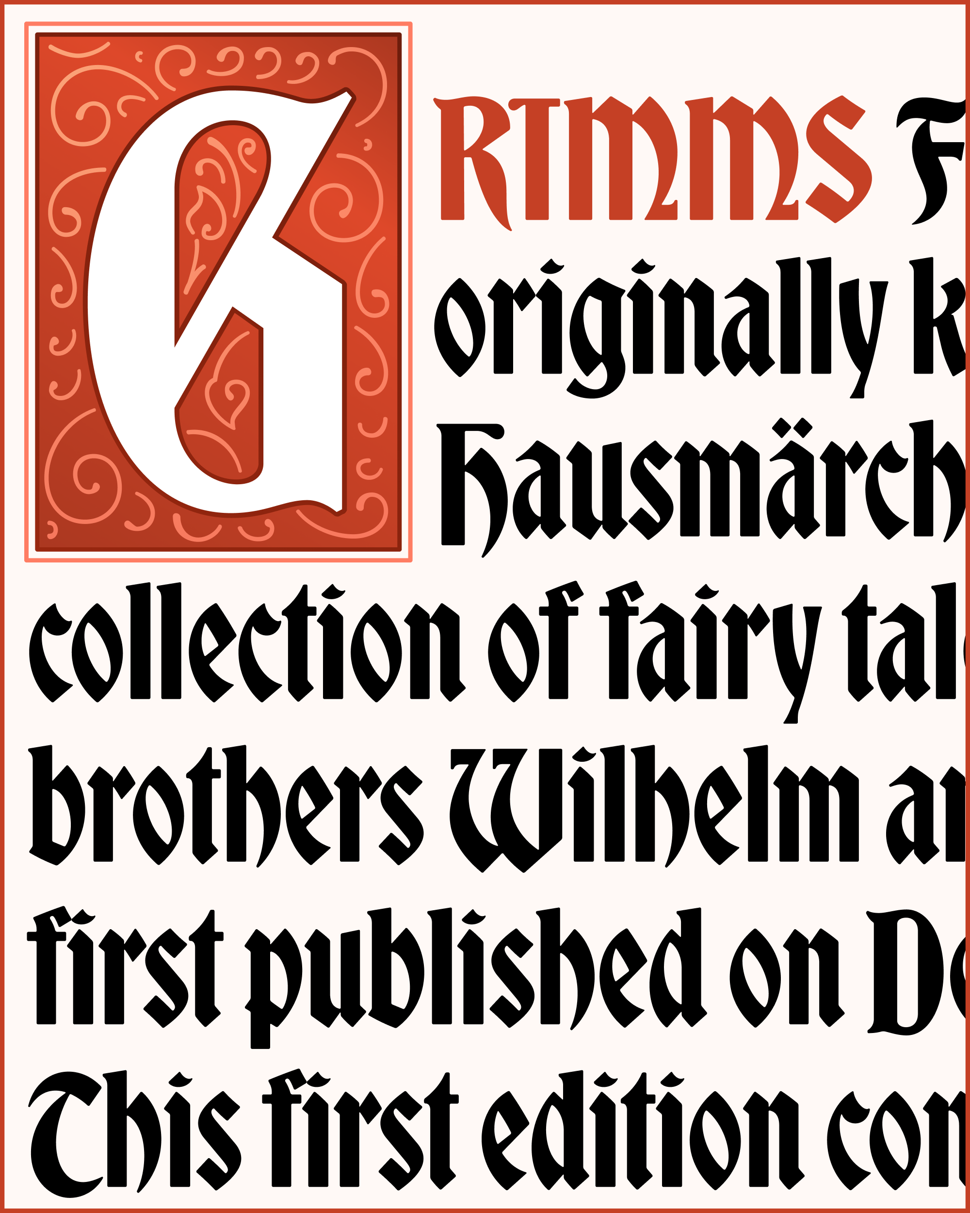
This month I’m sending you my revival of Bradley Initials, a set of ornate drop caps designed as a companion to Bradley, the “fairytale blackletter” that I revived for the club in September 2018. It was based on lettering by renowned illustrator and designer Will H. Bradley, and published by American Type Founders in 1895. (As its Fonts in Use entry points out, this is not to be confused with Bradley Ultra Modern Initials, which was designed by Bradley in the 1930s and later digitized and expanded by Glenda de Guzman, a.k.a. Maria Glenda Bellarosa.)
These Bradley Initials really drive home the typeface’s storybook vibes, and it bugged me that they weren’t a part of my revival. So each year since 2018, as December approached, I would always think, “This would make a fun December font!” But then I would try to wrap my head around the quietly intricate linework in these initials, get overwhelmed, and proceed to work on something else.
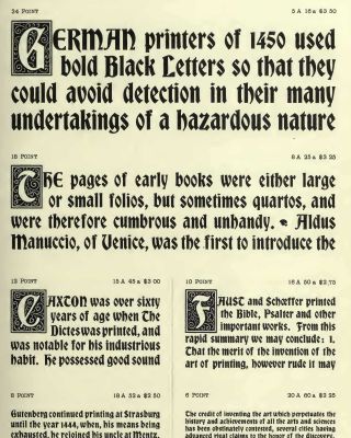
Bradley and Bradley Initials, as seen in the American Type Founders Specimen of Printing Types, 1897
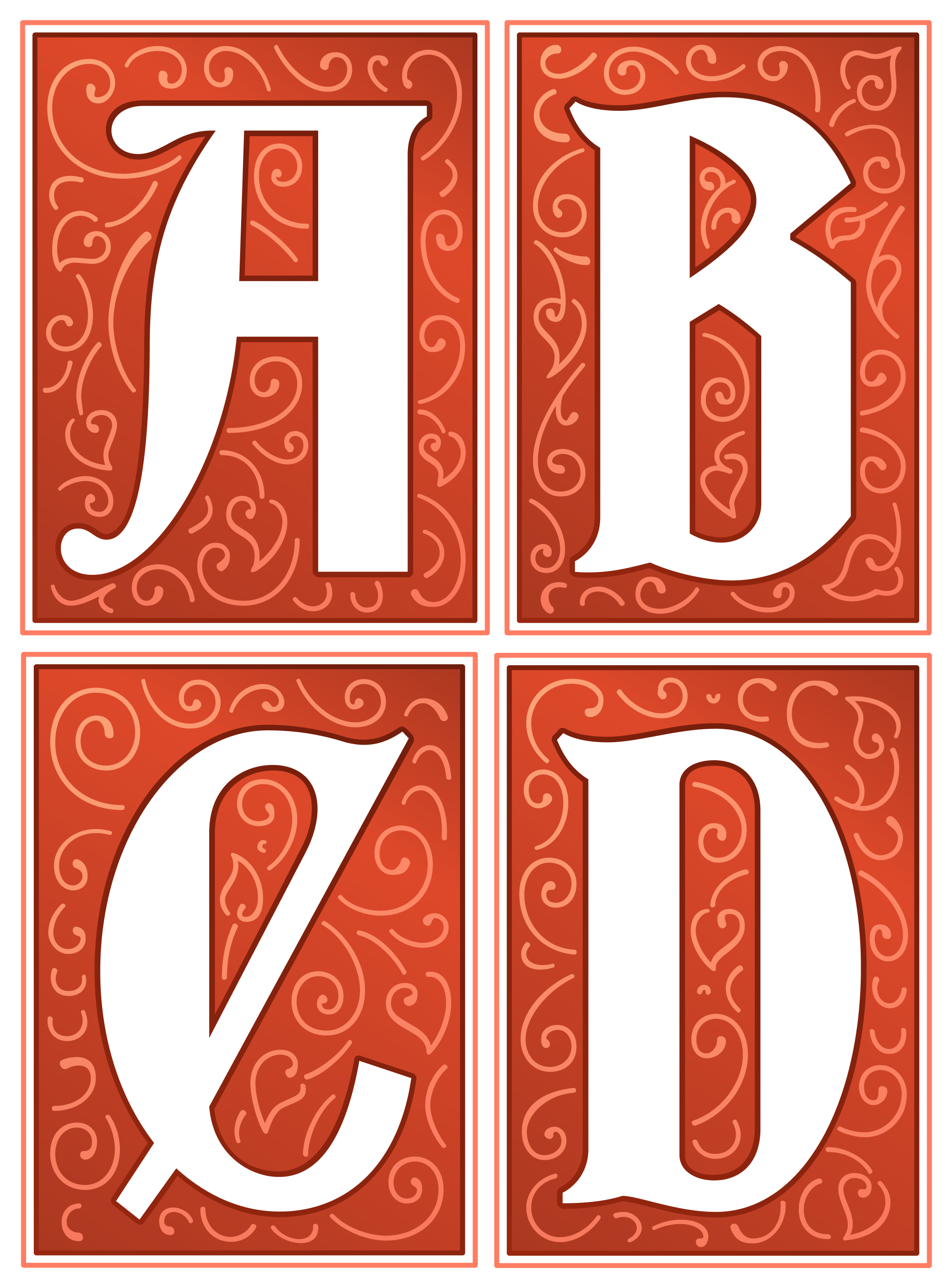
The intricate linework is what sets this font apart from being just a bunch of letters in boxes. It walks the line between abstract and horticultural, with spiralesque stems and heart-shaped leaves. But unlike the Fern Ornaments I sent you earlier this year, these leafy brambles were not built around a typographic system. Instead, they take a calligraphic approach: each letter is really its own little illustration, and each line is improvised in order to fill the available space. What unifies them as a system is a consistency in stroke weight and tapering that would come from a writing implement.
A reasonable person might have started digitizing Bradley Initials by autotracing it, but that would have left me thinking about these lines as shapes rather than as strokes. I tried using computer-generated vector spirals as a starting point, but they ended up looking too precise and not handmade enough. So in the end, I accepted that the only way out is through. I set up my own digital “writing implement” using a plugin called LTTR/INK and drew each little squiggle myself (by my last count, A–Z contained 842 of them).
The process was somewhat mind-numbing but there is something strangely relaxing about doing a task that requires 1% thinking and 99% doing. And spending so much time with each letter led me to appreciate the variations in the original; Some are more curly, others are more swirly. What I ended up with is a hybrid of the 54pt and 42pt sizes that were shown in the 1912 ATF Specimen Book.
This was also an opportunity to play with my old friend Color Fonts, which I’ve neglected this entire year. The default palette is based on the colors in the aforementioned ATF specimen, and I’m sending you a handful of alternative palettes as well (since font-palette support is still in its infancy, I’m sending these as separate fonts as well.) Of course, you can always use my Color Font Customizer to roll your own, and if you want even more flexibility, you can assemble it layer-by-layer using the Bradley Initials DJR Layers variant...the Frills layer is kinda fun to use on its own!
The last thing I’ve included in this mailing is a color font in the next-generation COLR v1 format, which allows for SVG-like features such as gradients, but without the inflexibility and large file size of images embedded into the font. Support for it is still very limited, and my proof-of-concept is still very rough, but it’s exciting to think about color fonts being more flexible and easier to use in the future!
Bradley Initials will complement my Bradley revival for sure, but I’m hopeful that you’ll find these versatile versals will work with a wide array of styles, spicing up your editorial spreads and greeting cards for Decembers to come!
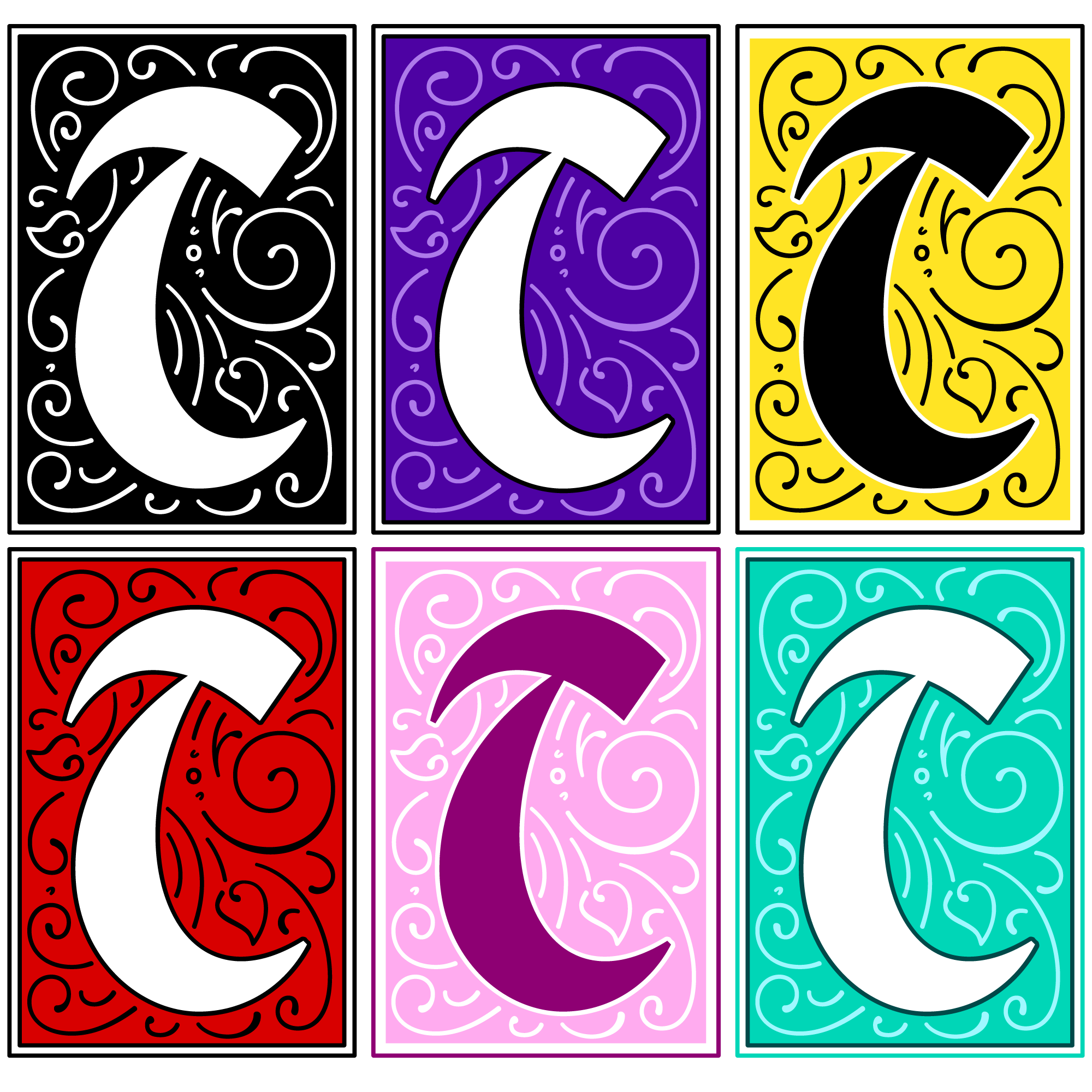
Bradley’s alternate preset color palettes: Black and White, Royal Purple, Bumble Bee, Classic Red, Lilac Blossom, and Seafoam.