June’s Font of the Month: Rhody Wide

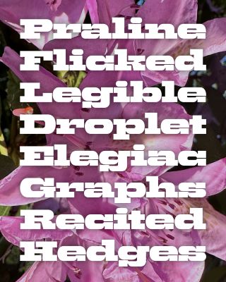
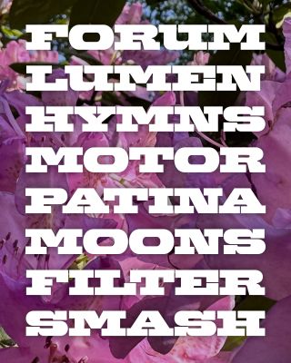
Ahhhh, June! Here in Western Mass. things are in full bloom, and as I write this I am sitting on my deck in a bathing suit under the large pink blossoms of our big rhododendron (pictured throughout).
Distracted by the nice weather, and busy shepherding a few big type families toward the finish line, I had no idea what to send you this month. Too much project management and troubleshooting, not enough actual drawing of letterforms. So for the club, I wanted to find something low-stakes, where I could decompress by adopting a “don’t think, just draw” mentality.
It turned out the answer was blooming right outside my window! As our rhododendron began to bloom, I picked up my old friend Rhody where I left it in 2018, and this month I’m delighted to send you a new clipping: Rhody Wide.

Because it has been half a decade since I’ve written about this typeface, please allow me to reintroduce it to you: Rhody is a mechanical slab serif with too many slabs for its own good. It was inspired by a calendar with extra-slabby lettering that I encountered in the Mölndals Stadsmuseum, outside of Gothenburg, Sweden, and until now had one width and five weights.
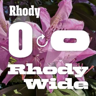
Aside from the gratuitous slabs on letters like a and e, its other prominent feature is its straight-sided curves. In the original design, round letters like O are shaped like a stadium, with tight curves on the top and bottom and vertical lines on either side. This feature helps condensed letters pack together like a picket fence, but doesn’t make much sense when the letters have to be wide.

So in the new Wide version, I took that elongated stadium shape and flopped it on its side: the sides are curved and the top and bottom are flat. Thinking systematically, this is kind of a weird move. Wide and narrow don’t interpolate elegantly, if at all, and this approach required a total redraw of nearly every character…it’s almost an entirely different typeface.
Fonts can contain these complex hierarchies of weights, alignments, and relationships, but in the end it all comes down to whether the shapes feel like they work together. And in this case I thought that preserving an overall feeling of rigid, streamlined geometry, rather than any specific shapes, was enough to hold the family together.

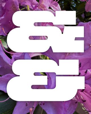
I tried to let feelings be my guide on this one, and wasn’t compelled to stay loyal to the original font (t, r, U, K, and X all have significant changes in form). I enlarged the inktraps and divots in vertical serifs in C, S, and G, to intensify the “bite” of those shapes, and I flattened out the spines of S and &, to amplify the harshness of the geometric curves. Perhaps most significantly, I departed from the relatively even proportions of the original, and let each character get as wide as I felt it wanted to be.
Lately, I’ve been browsing jazz album covers, and I love how many of them use wide slabs to embody the “long and low” midcentury style. I’d love to see more layouts like this today, but I get that wide fonts are hard to use, especially in mobile-friendly layouts. I still think they’re a great way to add something unexpected to slugs, subheads, or even short titles…especially in something in a film or presentation when you have the space.
