July’s Font of the Month: The Rest of Bild
This July, I’ve been thinking a lot about the surprisingly large role that frustration plays in my design process. I got fed up with my lack of progress on the font that I had planned to send you earlier this month, and decided to scrap it. This has officially put me behind schedule—I’m sneaking in its replacement today (just under the wire!), and I expect to deliver August’s font later in the month as well.
Frustration can certainly grind things to a halt, but it can also serve as a fuel that propels projects through periods of doubt and uncertainty. Many of my fonts sit around in a mostly-complete-but-can-I-really-call-it-finished? purgatory...sometimes for years! It can take an angry moment—“Why the heck is this font still sitting around like this?”—to give them that final push out the door.
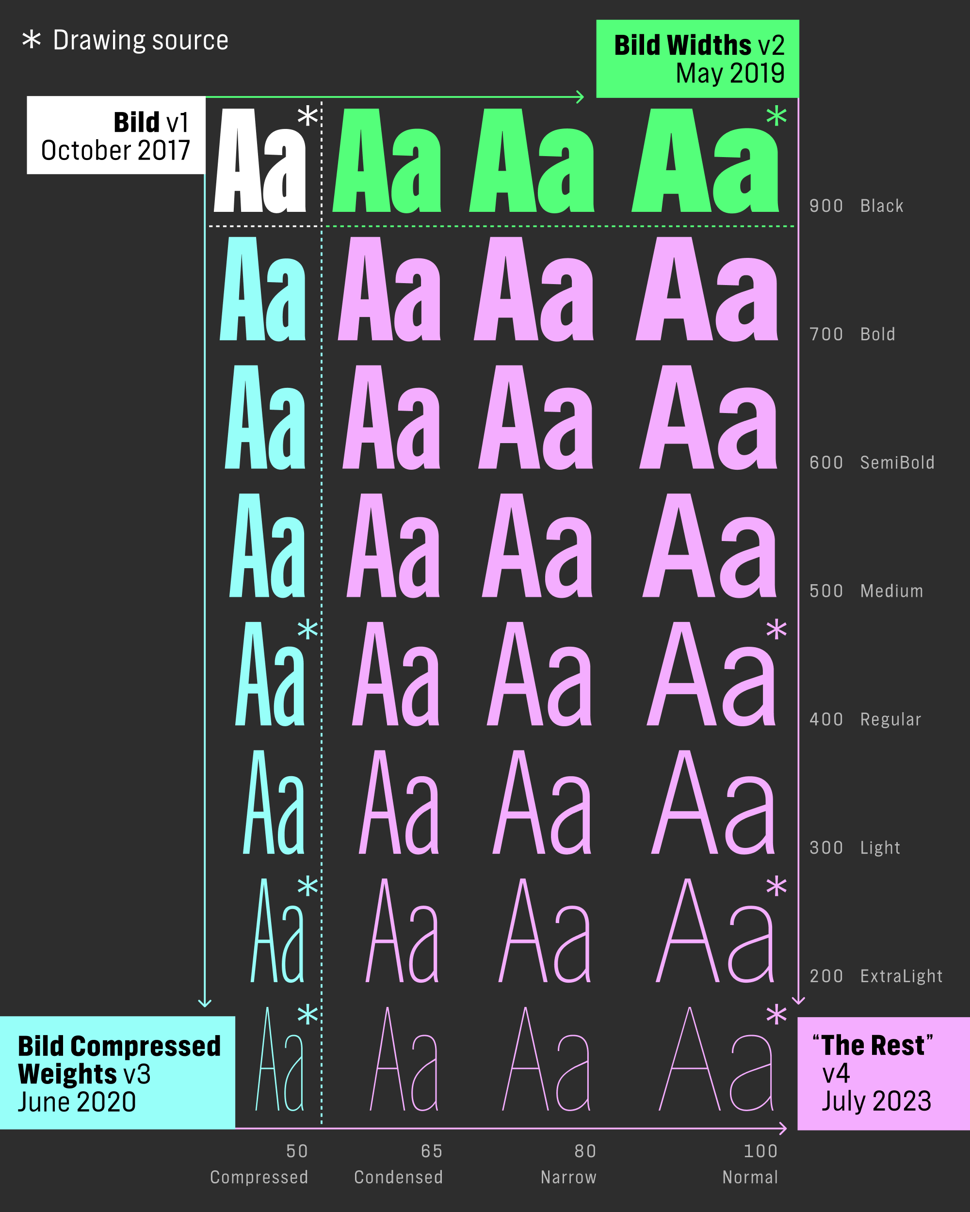
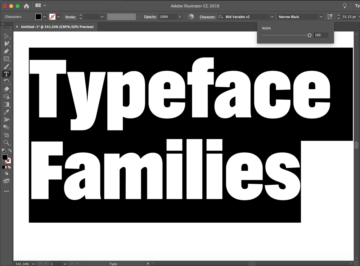
Since its last update in 2020, Bild has existed as a disjointed almost-family: after starting as a single Black Condensed weight, I expanded it first as a series of widths in one weight, and again as a series of weights in one width. Recently, I’ve gotten a few requests for more Bild, and I had to ask myself: Why the heck is it still sitting around like this?
This month, I’ve finally added Bild’s missing fourth corner, uniting Bild into a single series and fleshing out the wider/lighter side of the designspace. I present to you: The Rest of Bild.
Named by Indra Kupferschmid and prompted by Sam Berlow nearly a decade ago, Bild follows in the footsteps of the “black sheep” styles of the classic mid-20th century workhorse Trade Gothic. While most of Trade Gothic’s design resembles Benton’s News Gothic/Franklin Gothic (see also the recent HEX Franklin), its Bold and Bold Condensed No. 20 are more rigid, with straight-round shapes and not-quite-horizontal terminals on letters like G and C.
Bild imagines an alternate universe where an entire family is built around these straight-sided outliers. I tried to retain the clunkiness of these styles but without any grittiness; I wasn’t going for a warts-and-all revival of early 20th century headline types like Alternate or Railroad Gothic.
At the same time, I wanted to leave in enough inconsistency for Bild to remain a little pedestrian, with notably less mechanical sparkle than, say, Nickel Gothic Condensed. This is maybe a weird thing to say about fonts that I like, but the Trade Gothic outliers have a beautiful dullness to them, and I think part of the reason I’ve put off this update for so long is because I’ve never been sure how to capture that.
Like last month’s Rhody, straight-sidedness is a crucial part of this design. As Bild’s shapes widen and its O becomes more circular, I looked for ways to accentuate that feature. I avoided letting the round shapes get too wide, and I played a lot with the curve tension and stroke angle in letters like p/d/b/q to reinforce the stop-and-go momentum of these shapes; their bowls needed to feel like three separate gestures instead of one continuous curve.
Bild’s multiaxis variable font also includes several feature variations carried over from the previous versions, hard swaps among the smooth interpolations. This includes a T with tuck-under kerning, a Bold i/j-dot that snaps to the cap height or the ascender height depending on the width, and a Q that gains a cross-through tail in its lighter weights.
After years of hemming and hawing on Bild, I gotta say I am relieved to see it unified into a coherent family. I don’t know…maybe I need to get frustrated more often?