March’s font of the month: Dattilo DJR Expansion
One of the most common questions I get about Font of the Month Club is, “Do you actually start and finish every font within the span of a single month?”
The answer, of course, is no. Instead, I’m constantly juggling a bunch of projects in the air at once. Some are mere ideas with a few glyphs sketched, while others are nearly complete but in need of some polish. Then, it’s just a matter of choosing something that I think I can whip into shape by month’s end.
I’ve always had a hard time looking at the same font week in and week out, so I love being able to bounce back and forth between different projects. When I return to a font after some time away, I get to see my work with fresh eyes, and I do my best not to forget where I left off.
Dattilo DJR is one of several projects that I’ve left in the air for way too long. I sent you its lightest weight fifteen months ago, and I’ve hardly touched the family since...until now. 😉
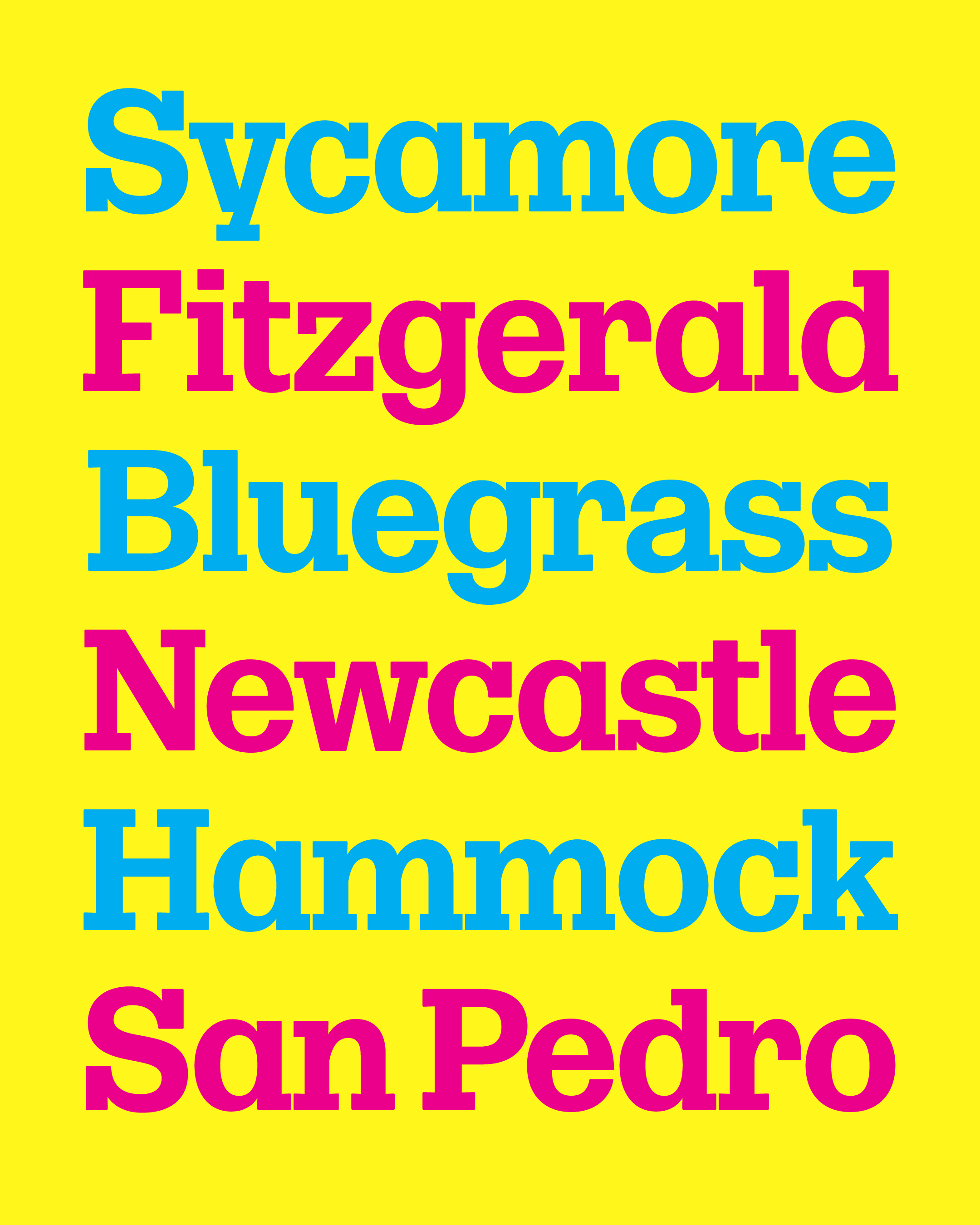
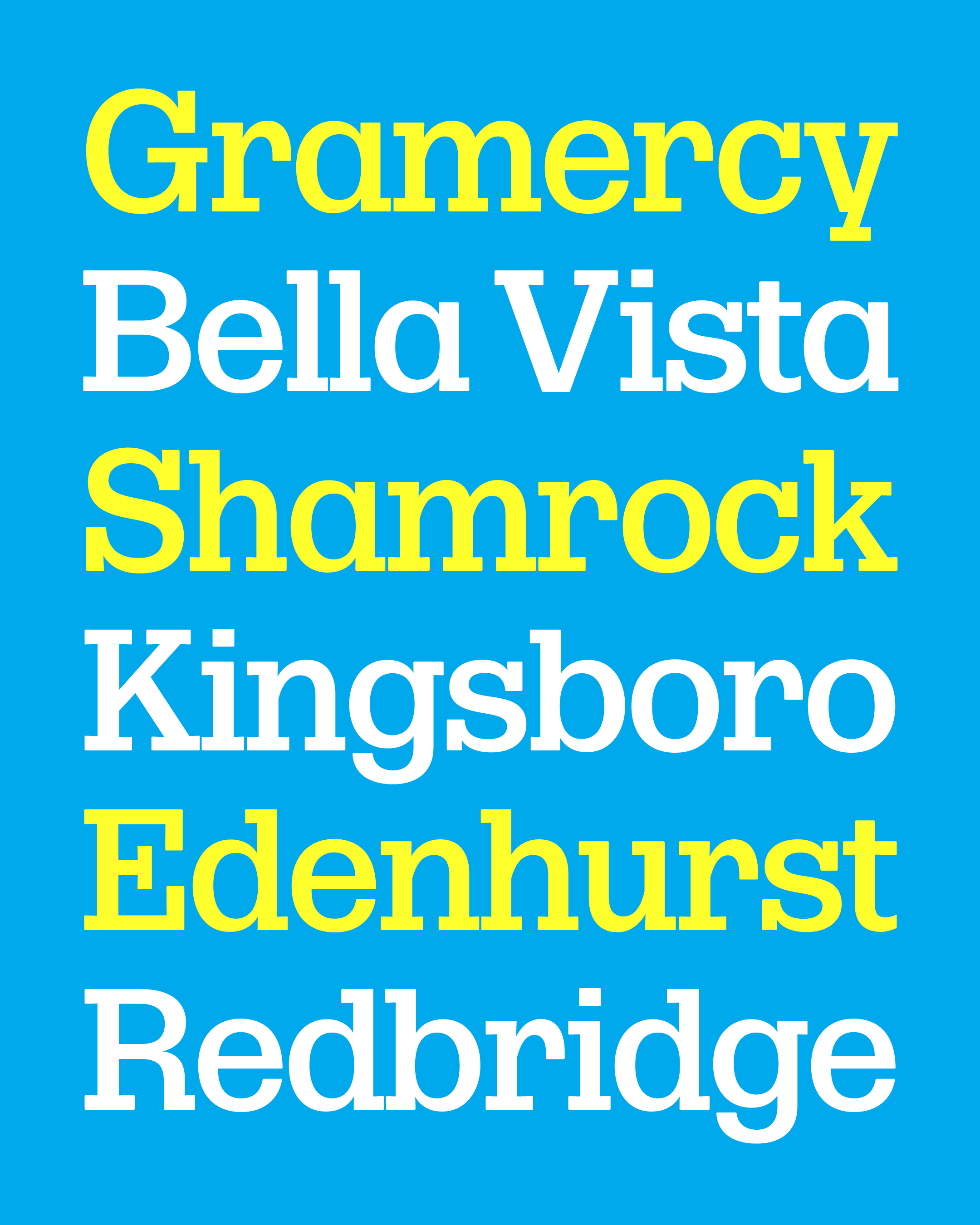
Dattilo DJR is a revival of Dattilo, designed by a committee of prominent Italian designers and released in the early 70s by the Nebiolo foundry. I think of it as the slab serif cousin of Forma, which I digitized under the art direction of Roger Black and released in 2016.
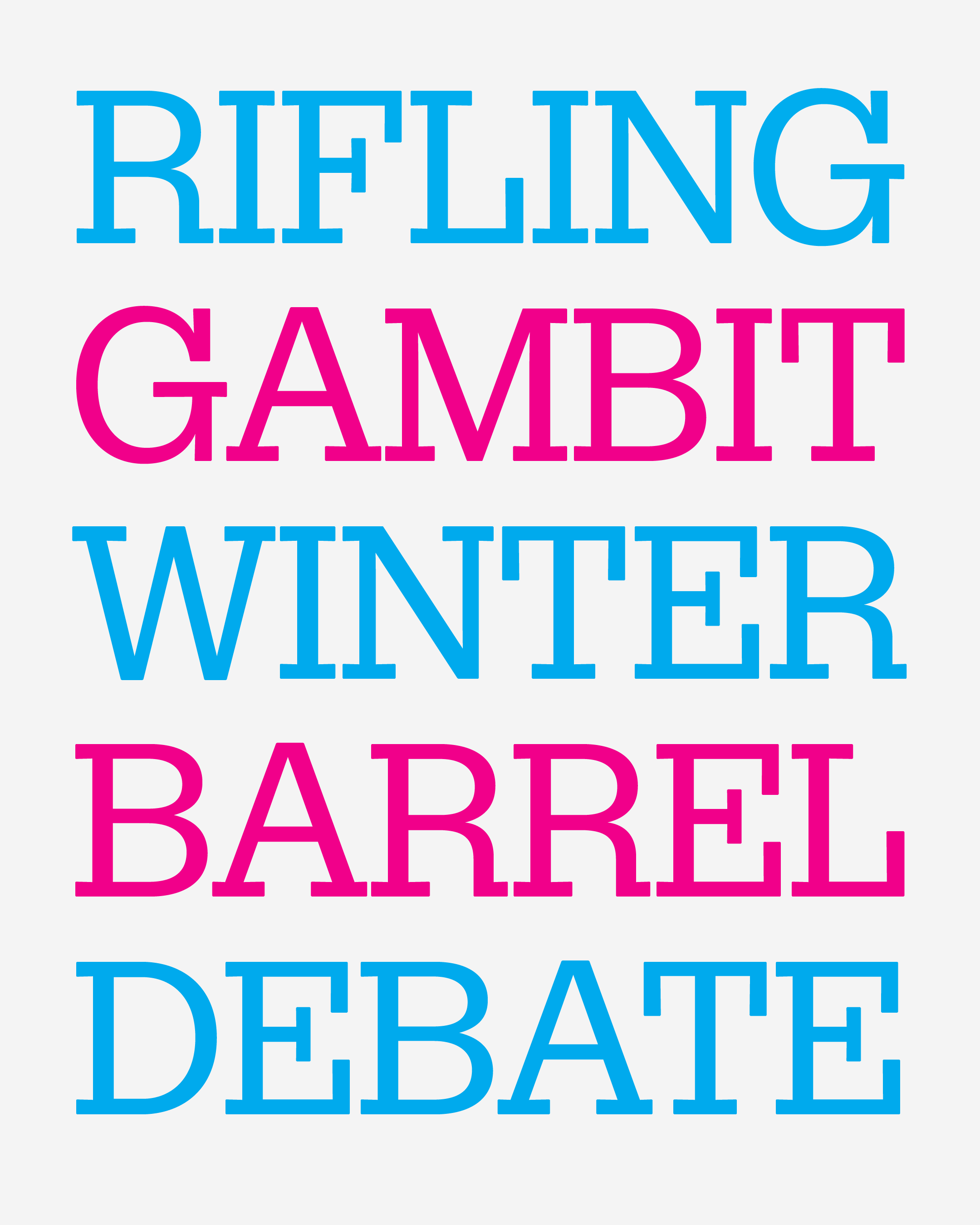
This month I’m sending you a beta variable font that covers the heavier end of the Dattilo designspace, as well as four static weights: Regular, Medium, Bold, and Black.
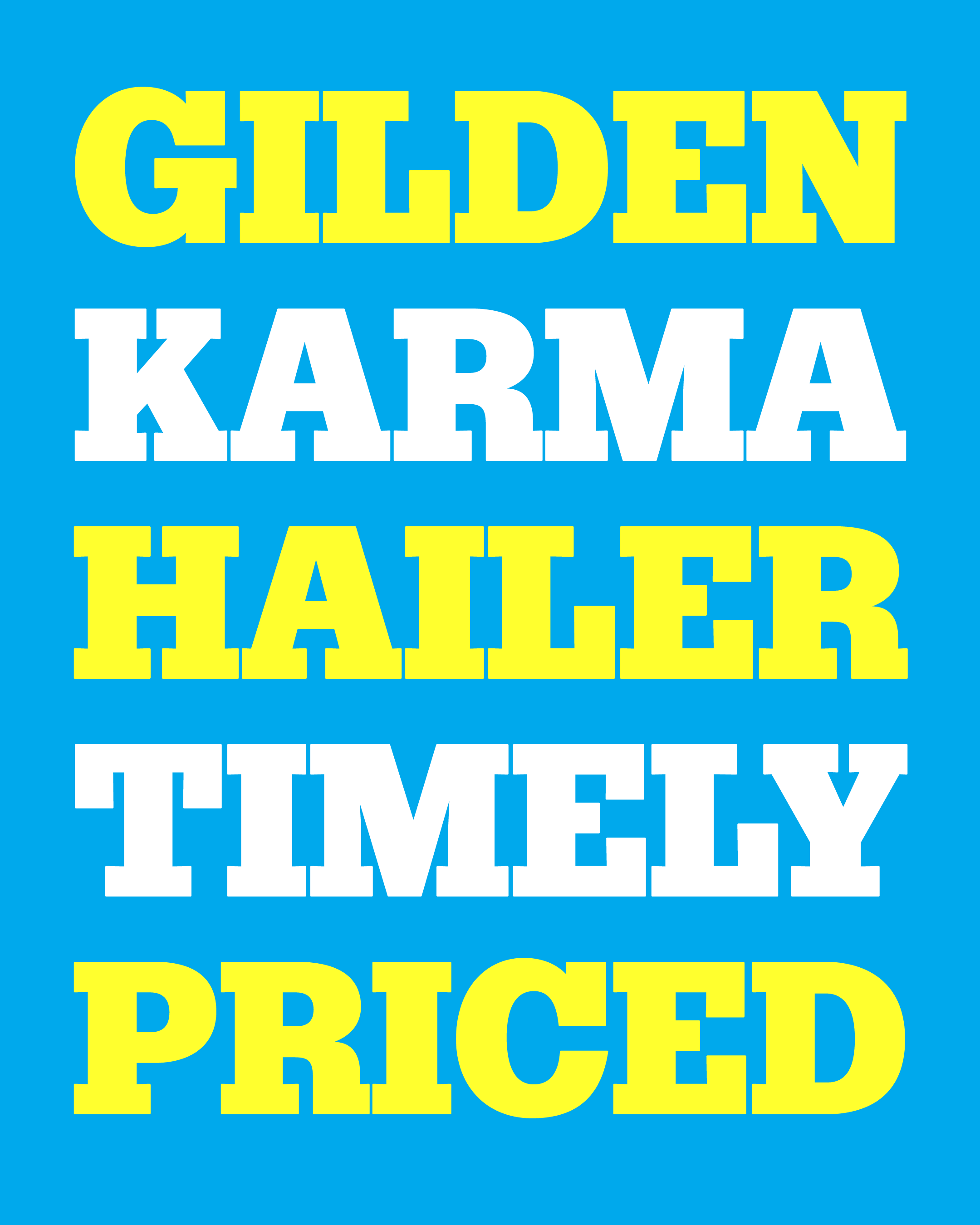
This “Banner” cut of Dattilo DJR is spaced for large display settings, leaning in to the tight-but-not-touching ethos typical of display type in the early 70s. I tried to keep the essential shapes true to the original, and then drew them with rounded corners and slightly-tapering serifs to keep them the same imperfect, ink-blotted world as my digital Forma.
In many ways, the slab serifs turn Dattilo into a much more specific design than Forma is. With a higher contrast of thick and thin strokes, its heaviest weights are perhaps the most individualistic of all. While many contemporary typefaces in this style would warrant a “measure twice, cut once” mentality, I tried to trust my eye a bit more than my ruler in order to prevent the typeface from feeling too pristine or overly-manicured.
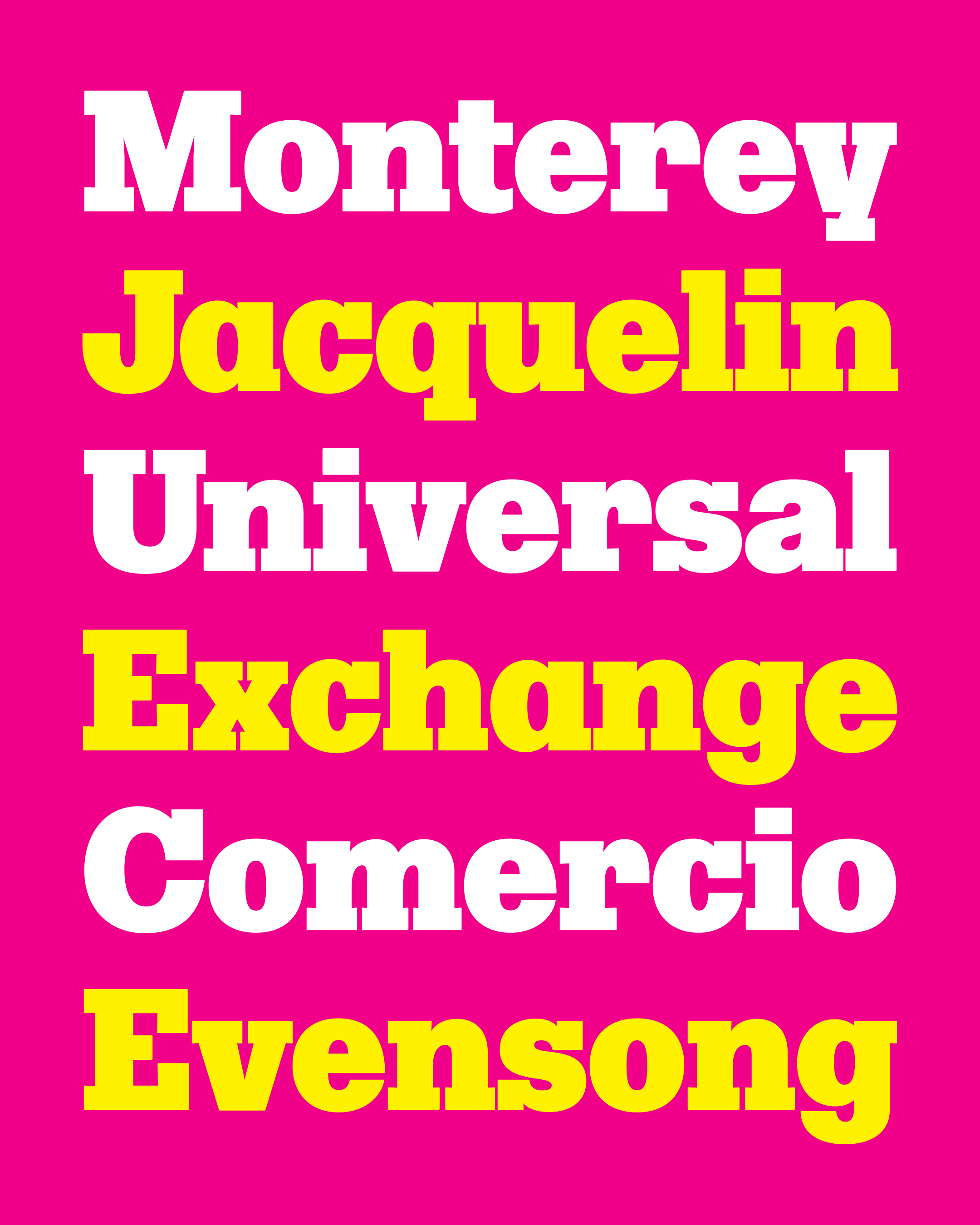
I am happy I finally found the time to return to this Dattilo revival, and I hope you find an interesting way to put it to use! (And don’t miss that alternate two-story a!)
Even today, it feels like something of a rarity to find a slab serif built on a neo-grotesque model (like Forma or Helvetica). It’s more organic than geometric; it’s more clean and soft than it is harsh or industrial. To me, it just feels like a breath of fresh air.
