September’s Font of the Month: Gimlet Sans Optical Sizes
At the very end of 2020, I issued Gimlet Sans Blah, which is probably my silliest font to date. It uses a little OpenType trickery to replace all text with “blah blah blah”, helping the user get some distance from messaging apps (like Slack) and unwind a bit, while still remaining logged in.
But this jokey font revealed a serious limitation of the Gimlet Sans expansion I sent out earlier that month: those four letters (and one wordspace) didn’t look great at small sizes! I didn’t bother mentioning it at the time, but I had actually modified the forms in Gimlet Sans Blah to make them feel a bit less cramped when used in a text or interface setting. The x-height got larger, the letterspacing opened up, and thus, the idea for Gimlet Sans Optical Sizes was born.
I’ve been working on a few UI fonts for clients in recent months. Each time we’ve had to figure out how to address legibility/accessibility concerns without boiling out every last bit of personality from the typeface. So I’ve been asking myself a lot recently, how far can you stretch a design before it stops feeling like that design? And conversely, how much personality can you get away with in a font made for small sizes?
Size-specific adjustments in type are a pretty subjective thing, but they generally follow the same playbook. As a font gets smaller, it gets looser, airier, simpler, and more obvious. A small-size font is a ruggedized font…details need to get exaggerated or they need to disappear.
That being said, it feels like we are turning a corner in small-size typeface design. It once felt like open forms were the key to a great UI font (Lucida, for example), but with better rasterizers and higher screen resolutions, many of the common UI fonts out there today have closed apertures, including San Francisco and Roboto. My hope is that this is a stepping stone towards more diversity and expression in small-size text.
You tend to see optical size variants a lot more often in serif fonts, where changes in thick/thin contrast, serif sharpness, and proportions tend to be more radical or even showy (take the changes I made to Warbler Banner several months ago).
As a sans-serif, Gimlet Sans already had a lot going for it in terms of small-size-friendly attributes: it was low-detail and relatively low-contrast, and already had a decently-high x-height. Much of its off-kilter charm comes from its wide stance and exaggerated underbites, so I didn’t have to worry about anything being too narrow or subtle.
But it did need something. So just like I did with Warbler Text, I grabbed my trusty HTML test page and custom stylesheet and I started changing stuff and testing it. And while I did, I’d ask myself two questions: Does this change genuinely make the text a little easier to parse? And, does this still feel like Gimlet Sans?
So much of typeface design is about the trial-and-error process of figuring out “recipes” that transform one style into another. What I mean is something like this: Increase the x-height and lowercase width by nearly 10% while maintaining the existing stroke width. Then, loosen the letterspacing by roughly 100 units and increase the gaps of the pothook terminals by 20–30 units, including the distance of dots and accents to the base letter.
At a certain point, the system breaks down and I have to shift my focus towards managing the details. It turned out that round-sided shapes needed to gain a little more letter-spacing than straight-sided ones. The taller lowercase letters couldn’t tuck underneath capitals like T and F anymore, so I created untucked alternates to manage the transition.
I tried to keep as many distinctive Gimlet-y quirks as I could, but I did have to part with some along the way. The pothook of the lowercase f got to be way too crowded in the now-reduced ascender space, and I begrudgingly replaced it with a simpler form. The t’s pothook, on the other hand, didn’t feel as disruptive, but there’s a simplified alternate in case you disagree. I even toyed with the idea of throwing in high-legibility alternates into the mix, including a Verdana-style serifed capital I and a lowercase l with a tail (which both felt sufficiently quirky and Gimlet-y to me!)

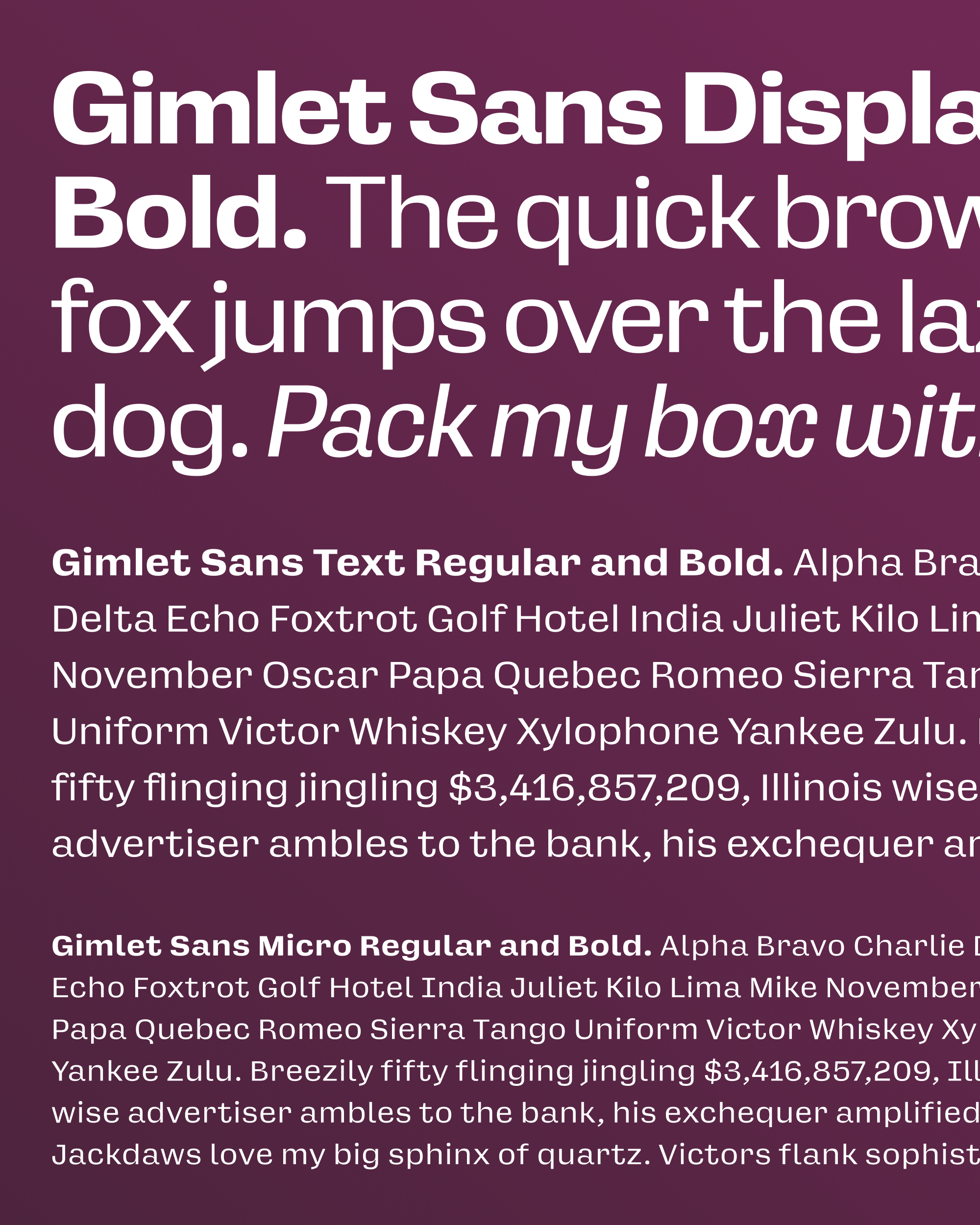
This month’s download contains a bunch of fonts. You get the new Micro size (optimized for 9pt and below), a Text size (optimized for 10–13pt), and fresh cut of Gimlet Sans Display (previously “Gimlet Sans”), which has various improvements such as tighter spacing, OpenType alternates, tabular figures, and (*gulp*) a few bug fixes—thanks to the club members who reported them!
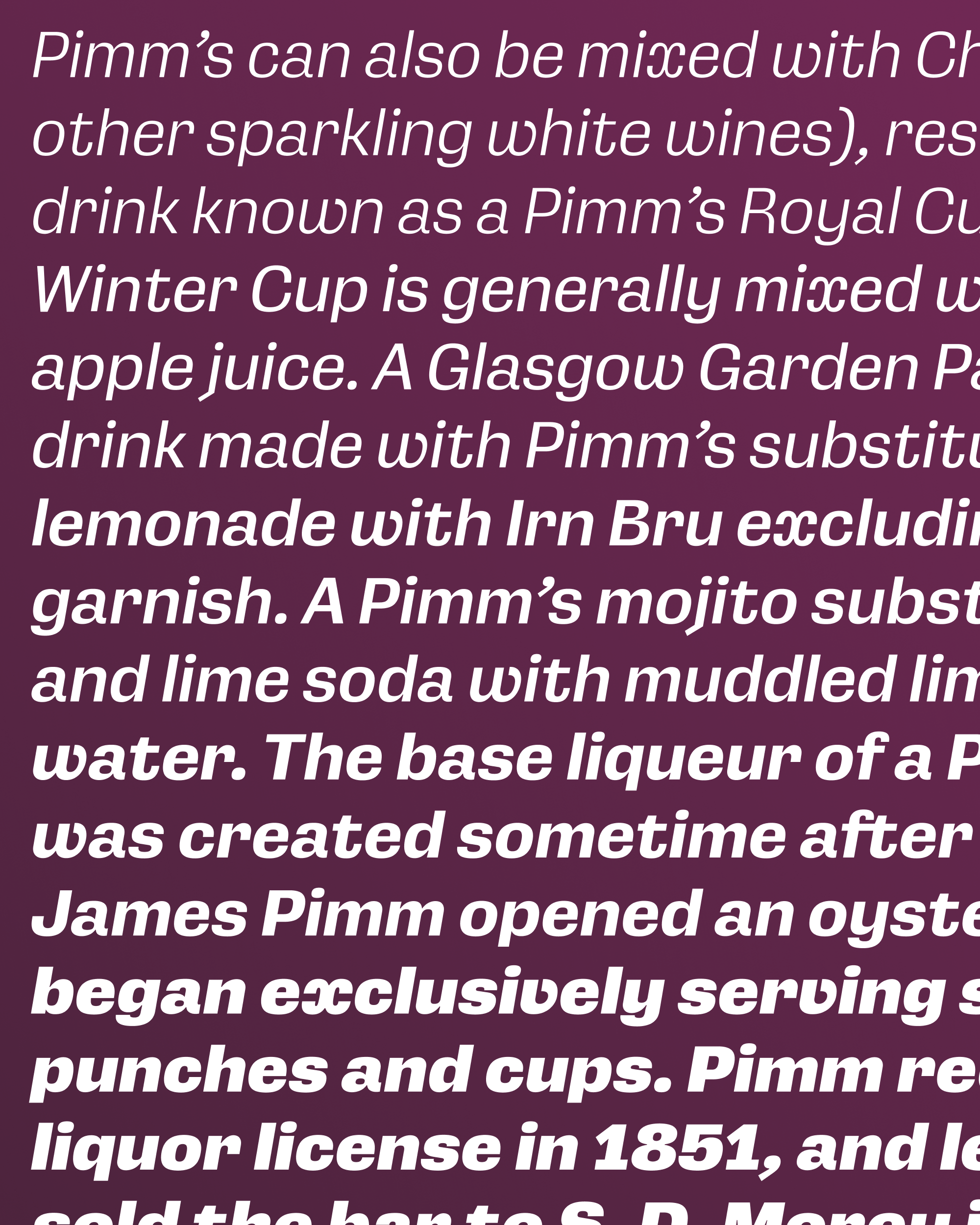
And it finally has Italics. Instead of shooting for a more flowing Italic, I stuck with the approach I used for Gimlet Serif, which follows Schadow’s unusual mix of oblique Roman forms and exuberant cursive outbursts. It features a round v and w, and I even managed to shoehorn in the notorious x, which is essentially a backwards c glued to a forwards c. It’s weird, but it’s not overly-crowded and definitely not subtle. I figured I might as well see if you’ll let me get away with it! 😆