February’s Font of the Month: Warbler Text
The first time I ever picked up metal type was in Barry Moser’s letterpress course. The assignment was simply to typeset my name, and the case of type I ended up in front of was Morris Fuller Benton’s 1928 typeface, Bulmer.
The design of Bulmer was based on the types cut by William Martin in 1790, for the English printer William Bulmer. Martin likely trained at Baskerville’s foundry, and as Patricia Cost writes, “Martin’s design seemed to bridge the gap between the Baskerville and Bodoni types—it was more condensed and contrasty than Baskerville, but less mechanical and modern than Bodoni.” (I guess this makes it a transitional Transitional?)
A page from Poems by Goldsmith & Parnell, 1795. Image © The Trustees of the British Museum.
Since that day in the letterpress shop, I’ve had an affinity for this style. Maybe it was the tactile experience of holding letterforms in my hands, and maybe it was Martin’s gentle (maybe even genteel) approach to the Modern serif. There’s something placid and comforting about this lighter touch, especially when compared to the vigorous, authoritative Scotch Romans that would follow it.
I don’t see Bulmer often in current use, and I don’t think I’ve ever seen it used onscreen. I suppose that makes sense: social media tends to reward eye-catching display designs, and this style’s delicacy doesn’t pack much of a punch if you’re just scrolling by it quickly. But Martin’s types are filled with small, subtle gestures that will grow on you after a while, and that’s what I tried to tap into in my interpretation, Warbler Text. Don’t get me wrong—I love a sharp, expressive serif as much as the next designer—but my hope is that this little throwback can help remind us of their softer side.
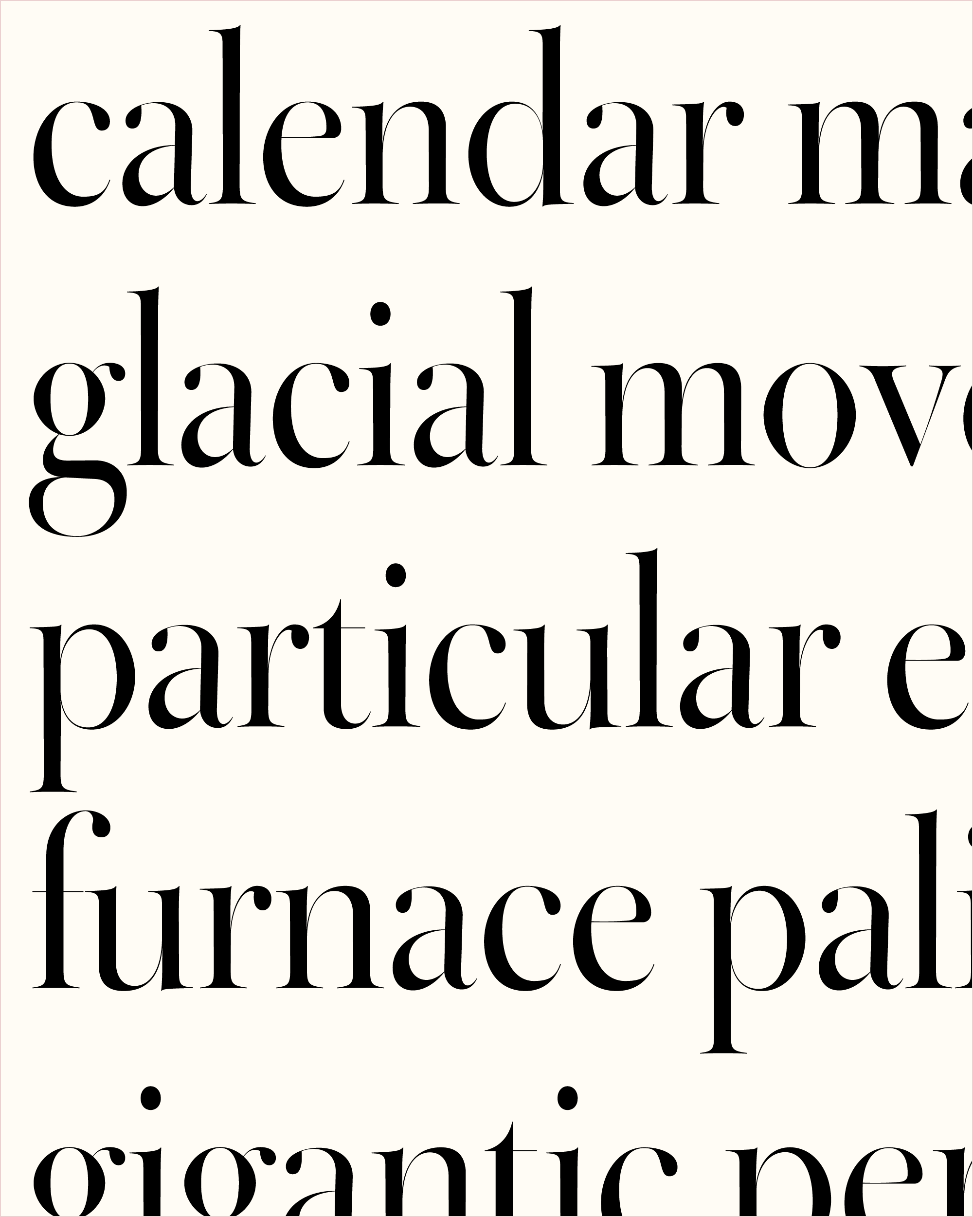
I spent a lot of time debating how to make Warbler’s small gestures big enough to telegraph at text sizes (à la Dwiggins’s M Formula), without becoming so big that they felt like a caricature. I’m talking about the swing of the a, and how its bowl rises a little before it falls. About the low waist on the k, how the g leans back a little, and how the weight of the t and e sags a bit in the lower-left.
And I’m thinking about more systemic things too: the slightly-too-heavy capitals, the slightly-too-small small caps, the slightly-too-spaced-out numbers. How the different angles of the italic lowercase make it dance a little, and how even a handful of the Italic caps (J/K/N/T) get cursive forms. And I finally got to use the life-hack of flipping the Italic J to make a pound sign (£)—so satisfying!
Overriding my browser’s fonts with custom stylesheets and Type-X.
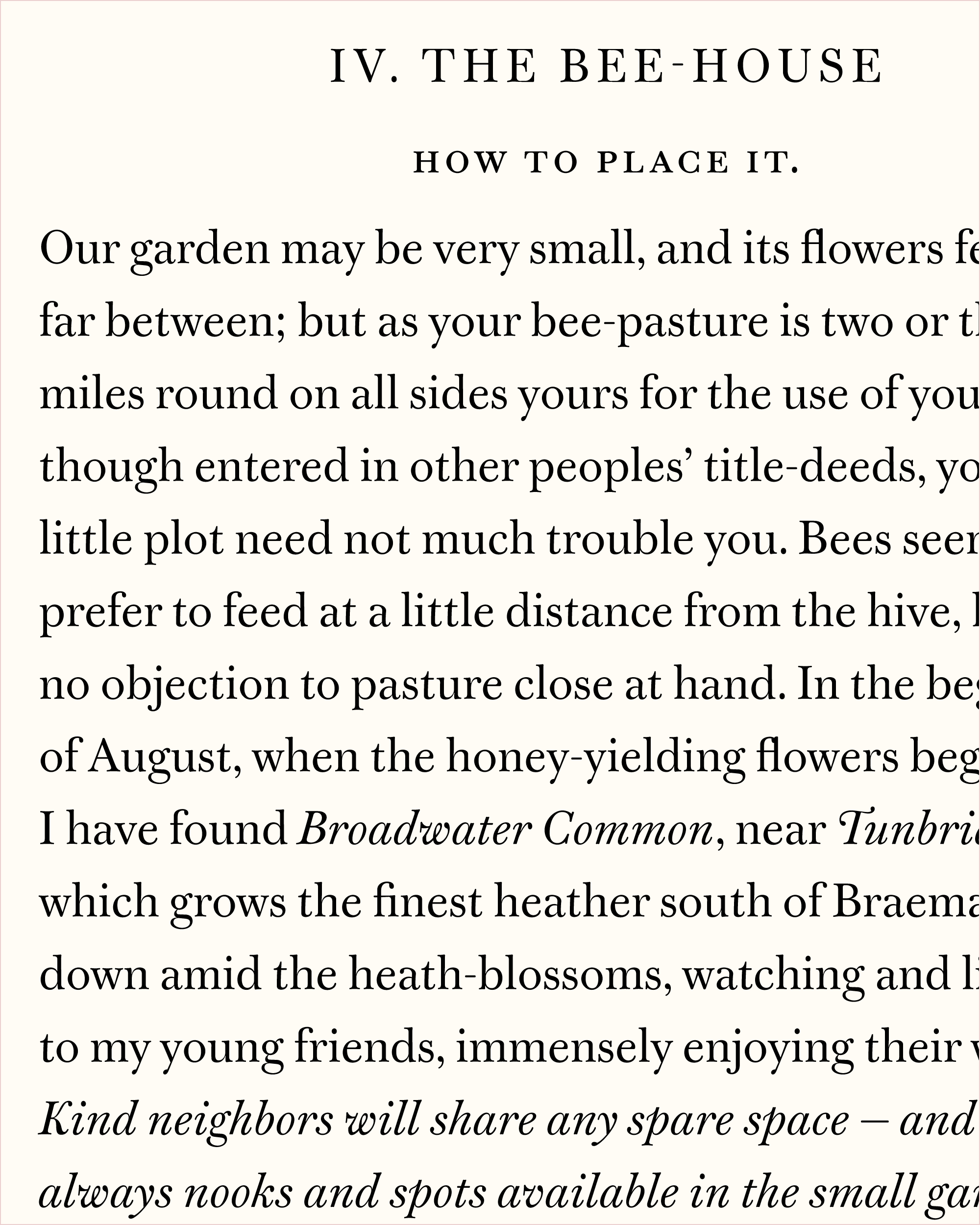
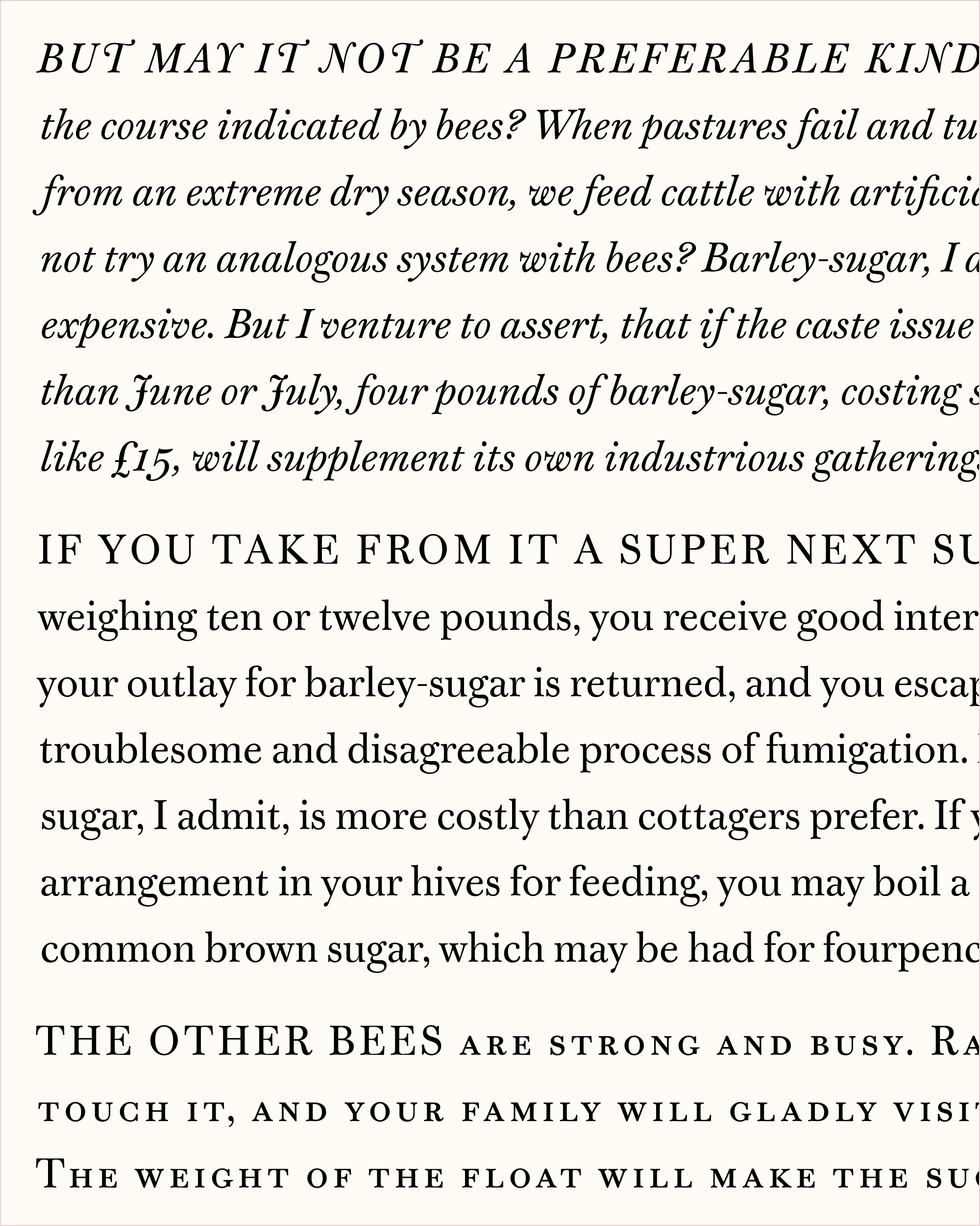
My goal with Warbler Text was to spend more time using it than I spent making it. To narrow my focus, I decided that 20 pixels would be the onscreen target size for this font, and used a custom stylesheet to override my browser fonts so I could do all my reading in it. There were periods where I was regenerating a new version every five minutes or so, just to see how my small changes would play out at the target size.
Watching how my computer rendered the shapes helped me measure the effects of my changes. I took screenshots and zoomed in on the pixelated letters to see if my moves were enough to flip a pixel from black to grey. This helped me take general, unanswerable questions (“Is this noticeable enough?”) and turn them into specific, achievable goals (“Does the spine of the a swing enough to flip some pixels from black to grey when set at 20px on my MacBook Pro Retina Display?”).
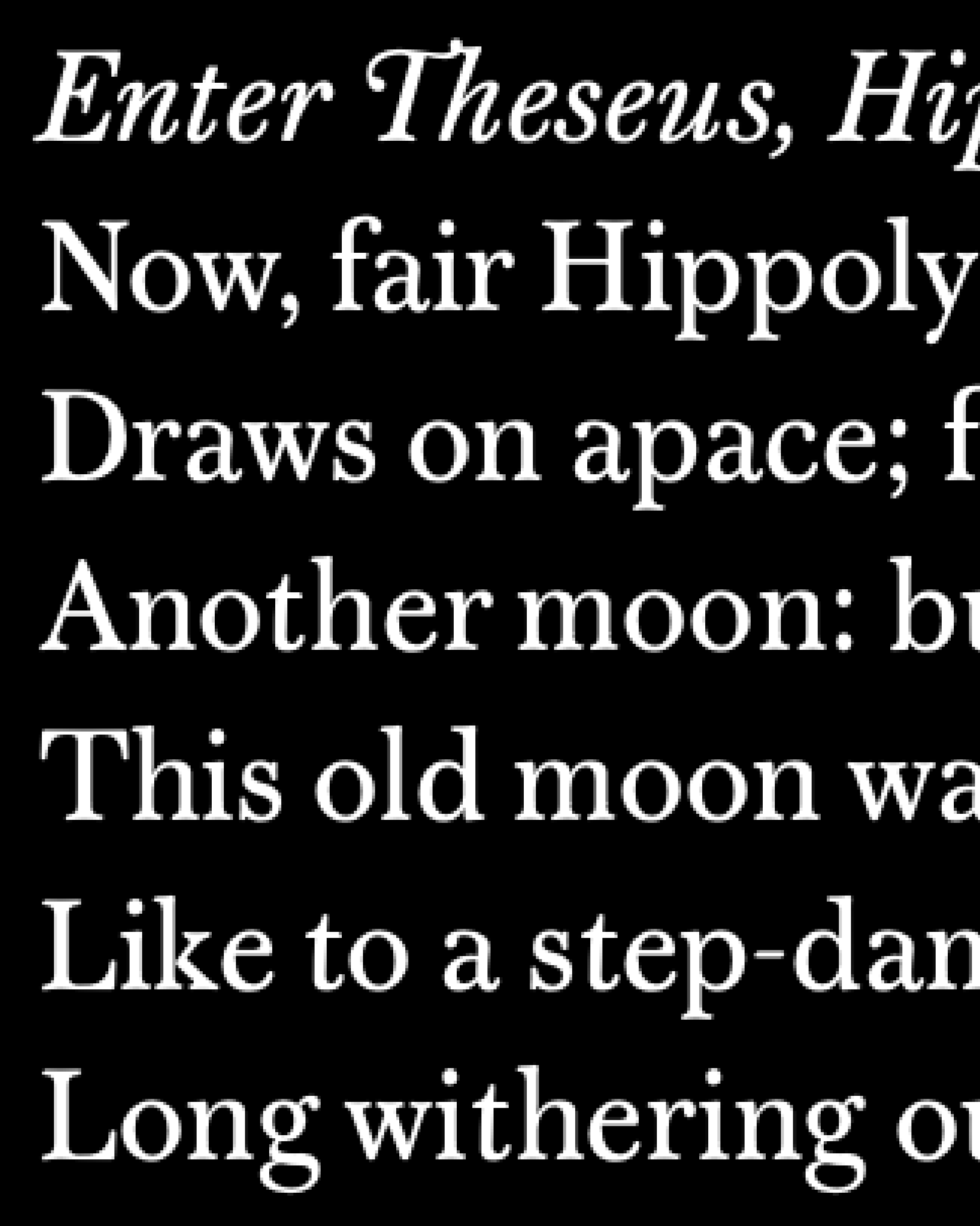
A screenshot of Warbler Text at 20px (enlarged)
It has been a while since I’ve drawn a new text face for the club, and I’m grateful to the members I corresponded with who encouraged me to work on one. I will admit that even with all the small gestures I mentioned, I’m worried that you might think this typeface is too conservative…and maybe it is! I wonder if the next step might be to move to the opposite end of the spectrum and work on the display side of things (below is a sketch I did a few years back). In the meantime, I hope you find the time to spelunk around what I hope is a quite usable text face, both onscreen and elsewhere!