December’s Font of the Month: Map Roman Compressed Lowercase

Map Roman is based on the lettering of MacDonald (Max) Gill, particularly the style he employed on the many illustrated maps he created in the first half of the twentieth century.
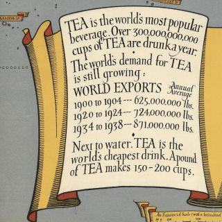
The vast majority of the letterforms on these maps are capitals, but if you look closely enough, there are certainly samples of lowercase to be found. Unfortunately, most of these struck a different tone than I had gone for in my interpretation—I leaned more towards the formal elegance of his titling caps found at large sizes, while his lowercase tended to be smaller, looser, more calligraphic, and even a bit plucky.
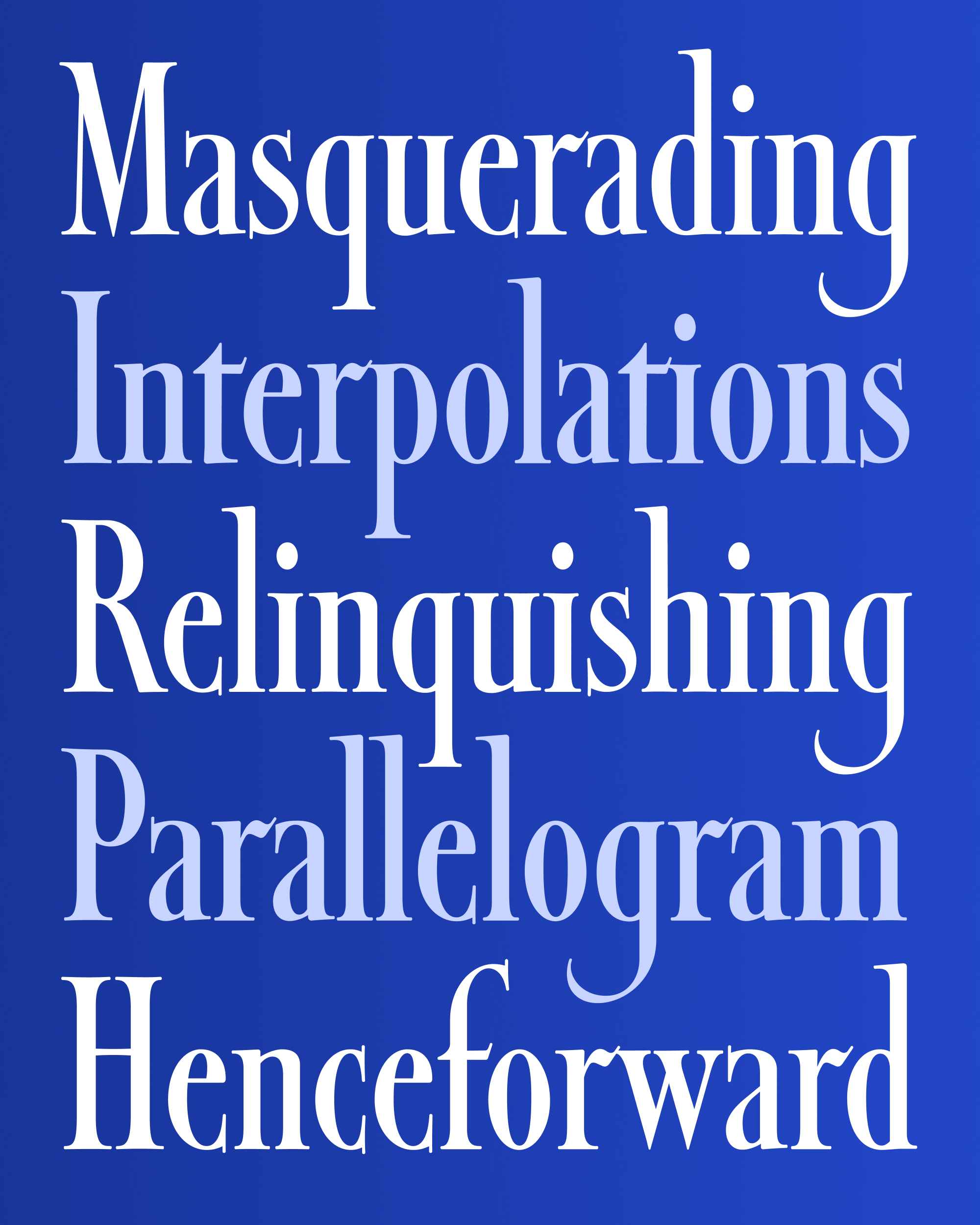
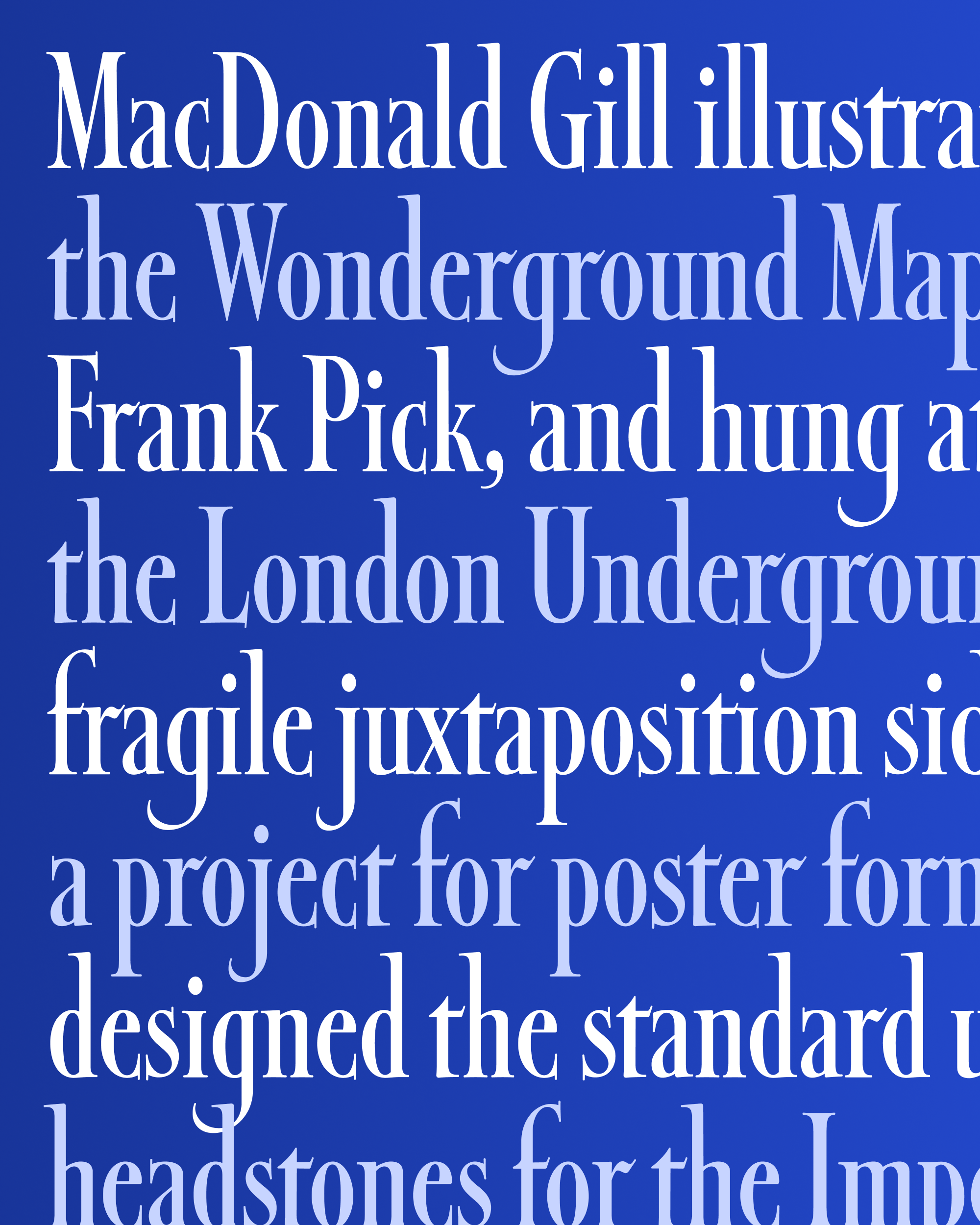
The lowercase I’m sending you today attempts to thread the needle between the constructed typeface that I made and the lively, humanistic lowercase that Gill drew. I’m wrestling with the notion that my “fontification” process may have distilled away too many of the handmade details from the original (no ball terminals! 🙀) and introduced too many new ones (the vertical serifs on a and e, for example). But I did work to preserve the overall spirit of Gill’s lowercase, with extra-long ascenders and descenders, unique flat connectors for p/d/b/q, and hints of calligraphy, from the extra wiggle of r to the thick crossbar and outstroke on f and t.

Detail from Tea Revives the World, MacDonald Gill, 1940
The tension between typographic and calligraphic is perhaps best illustrated by the ascending f and descending j. Typically I think of these letters as part of the same family, but here I’ve given the f (and other ascenders) a more typographic treatment while the j (and g and y) are endowed with graceful calligraphic swashes.
I can’t totally tell whether embracing this tension is a good thing, or just a weird impulse from my sleep-deprived brain. (My twin daughters are now five weeks old, by the way, and are doing great!) But consider this a first draft, and a sign of more swashy things to come for Map Roman.
