August’s font of the month: Map Roman
Map Roman is a great replacement for titling fonts like Perpetua Titling or Trajan, and is available for as little as $6 with a yearlong membership, but just for three more days! Sign up for the Font of the Month Club today to get your copy. Here’s a bit more about the design:
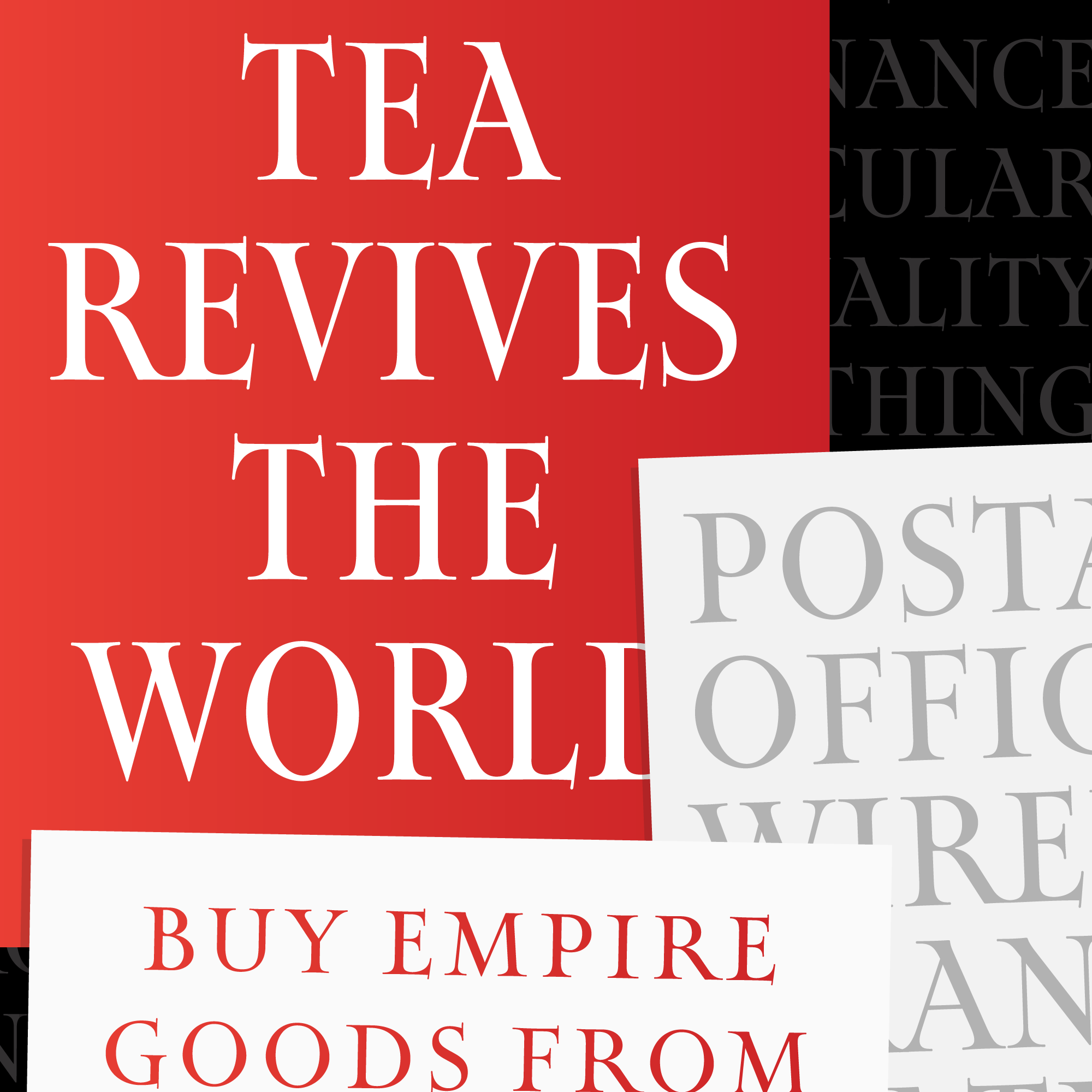
A while ago, on my way from Los Angeles to visit my brother in San Diego, I made a quick stop at the Map and Atlas Museum of La Jolla. It’s in an unassuming spot in an outdoor mall, but the collection was impressive and spanned many centuries of mapmaking. I spent much of my short time there admiring the illustrated maps of a twentieth century British graphic artist named MacDonald (Max) Gill, but I was in a bit of a rush and didn’t really have time to read the blurbs or make anything of his name.
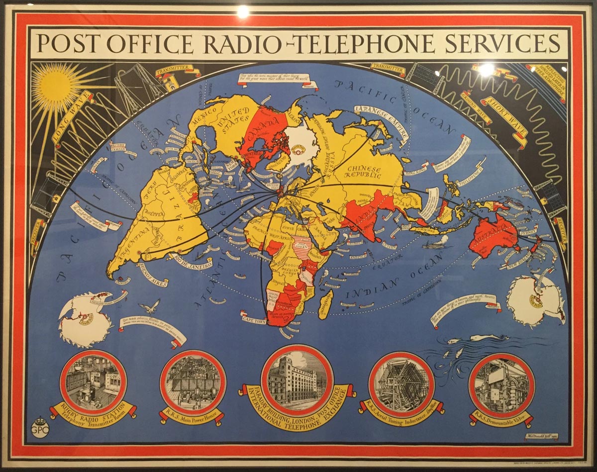
It wasn’t until recently that I decided to work on a titling font in this style, so I dug up the photos that I took at the museum and tried to learn more about these maps and and the artist behind them. And it was only then that I found out what some of you might already know: MacDonald Gill (known as Max) was the younger brother of Eric Gill, famous for his stone carvings and type designs but a problematic figure today due to the sexual abuse that he committed during his lifetime.
Knowing this, it is easy to see the clear similarities between the lettering on Max’s maps and Eric’s work, not to mention he similarities to the calligraphy of their mutual friend Edward Johnston. And while this relationship certainly remains in the font I sent to the club, I deliberately chose not to refer to work by other artists, relying only on the maps and my own intuition.
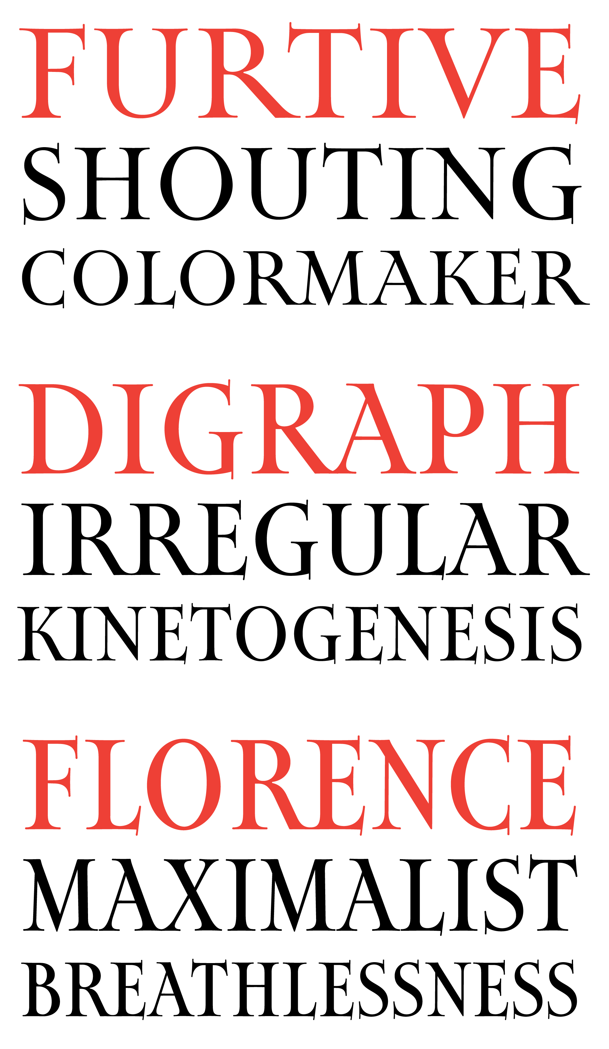
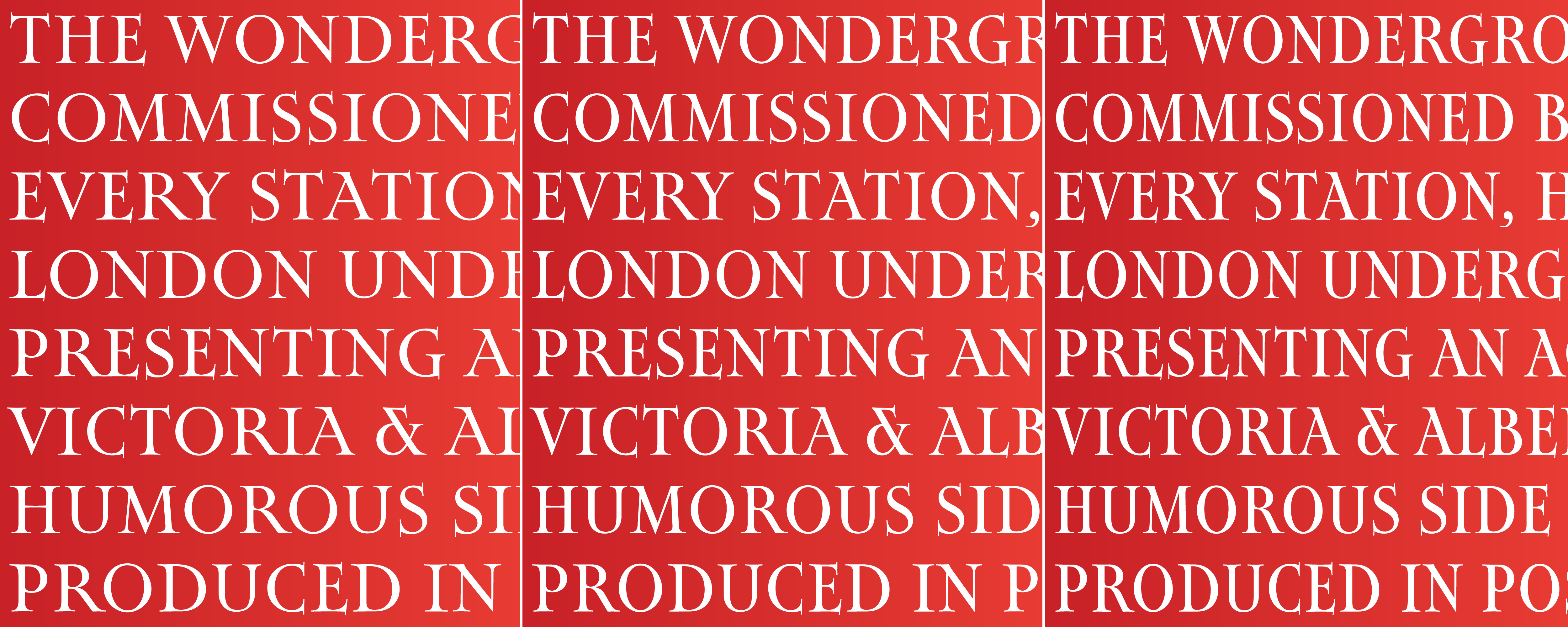
Map Roman is my attempt to distill this elegant lettering style into a typeface for titling. It is characterized by classic proportions and end strokes on the vertical serifs that extend below the baseline and above the cap height. The drawing style is a bit on the loose side for me; I left inconsistencies in stem weights and serif lengths and tried to draw the curves so that they snapped with elasticity.
Map Roman does not try to simulate hand lettering, but it does borrow a few tricks of the trade. Here you can see how the font elongates K, R, and L to subtly fill space next to gappy letters.
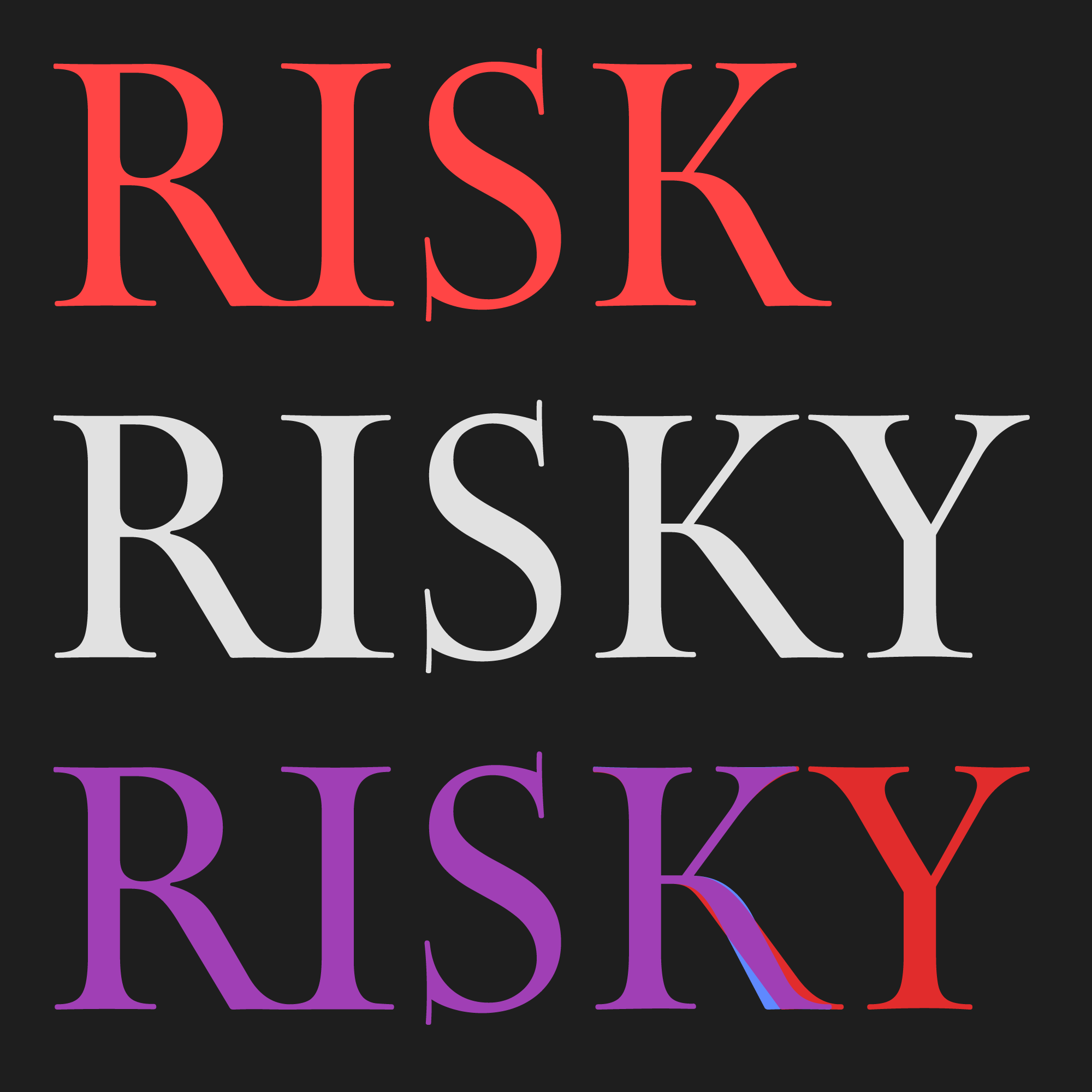
Map titling requires that words are sometimes squeezed into crowded spaces, and Max caps adapted to a variety of different widths. So I was especially excited to make Map Roman a bit squeezable, and to overcome the tension of classic letter proportions (where letters occupy the space they need to occupy) and realities of narrower titles (where words have to fit in a certain space). And if you all like what I’ve got so far, I’d be interested in taking it even narrower in the future...
I’ve also learned that the exhibit I saw is part of a larger trend of renewed interest in Max Gill’s work. My hope is that this typeface can continue this trend in some small way, inviting you to incorporate a bit of the charm of Max’s maps into your own work.