January’s Font of the Month: Glyptic DJR Lowercase
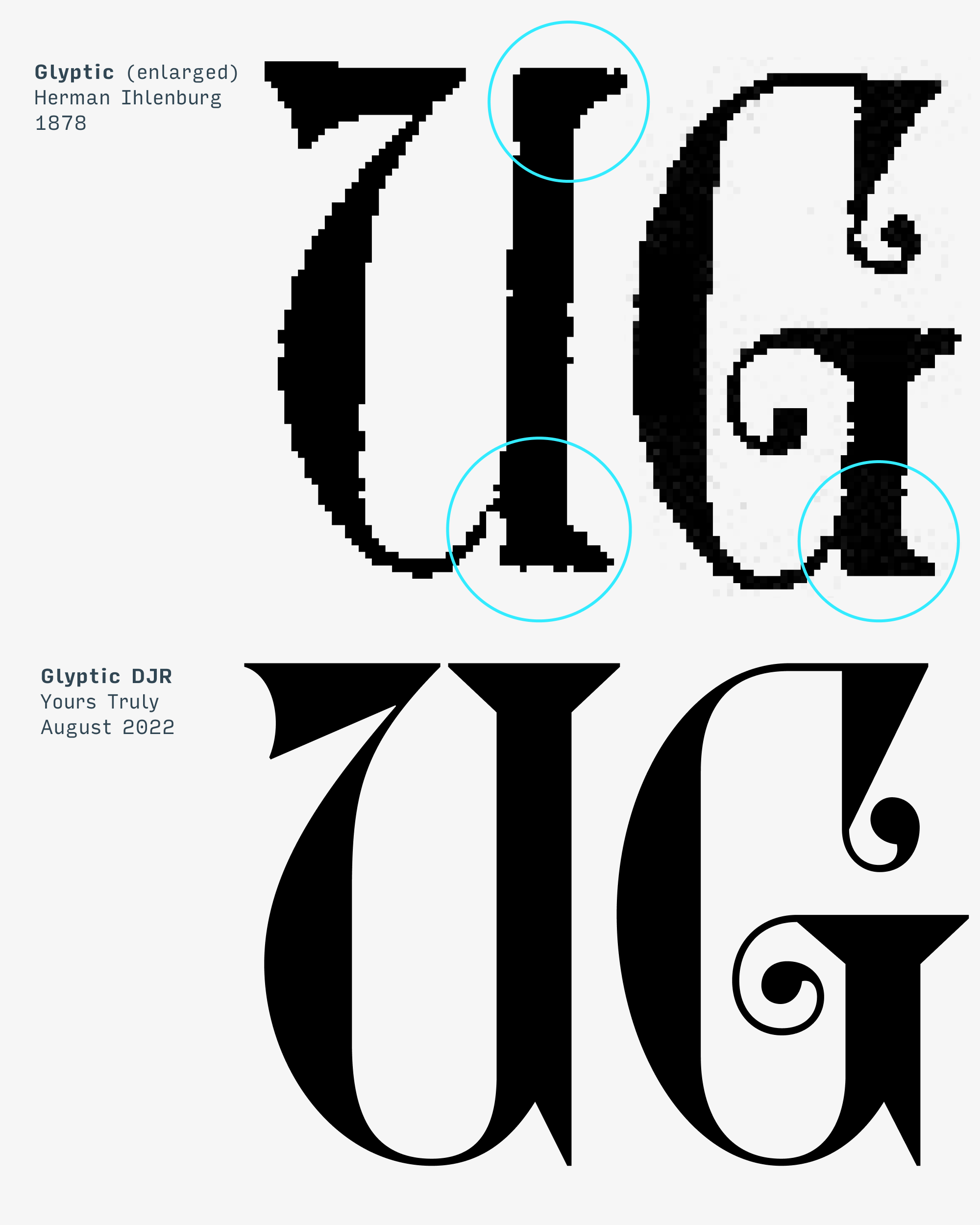
This month’s update started with a sneaky little change I made in August. I love Herman Ihlenburg’s Glyptic, but its U felt off to me. There’s something stilted and overly-mechanical about the squared-off left edges of the vertical stem, and I didn’t like how all the serifs seemed to push out from the letter’s center.
So in my revival, I tweaked it. I removed the bottom serif and replaced it with a vertical spike—simpler and still sharp. I did the same thing to G, which already has a lot going on and could afford to be less busy. Then I added a bilateral serif to the top of U, echoing the bilateral serifs you see in the rest of the typeface.
At the time, these seemed like such insignificant tweaks that I didn’t bother to mention them in my write-up. But as I set out to expand Glyptic, I quickly found myself in the middle of a butterfly effect. The new vertical spike, a change I wasn’t even sure was right, became the cornerstone of the update I am sending you today: Glyptic DJR Lowercase.
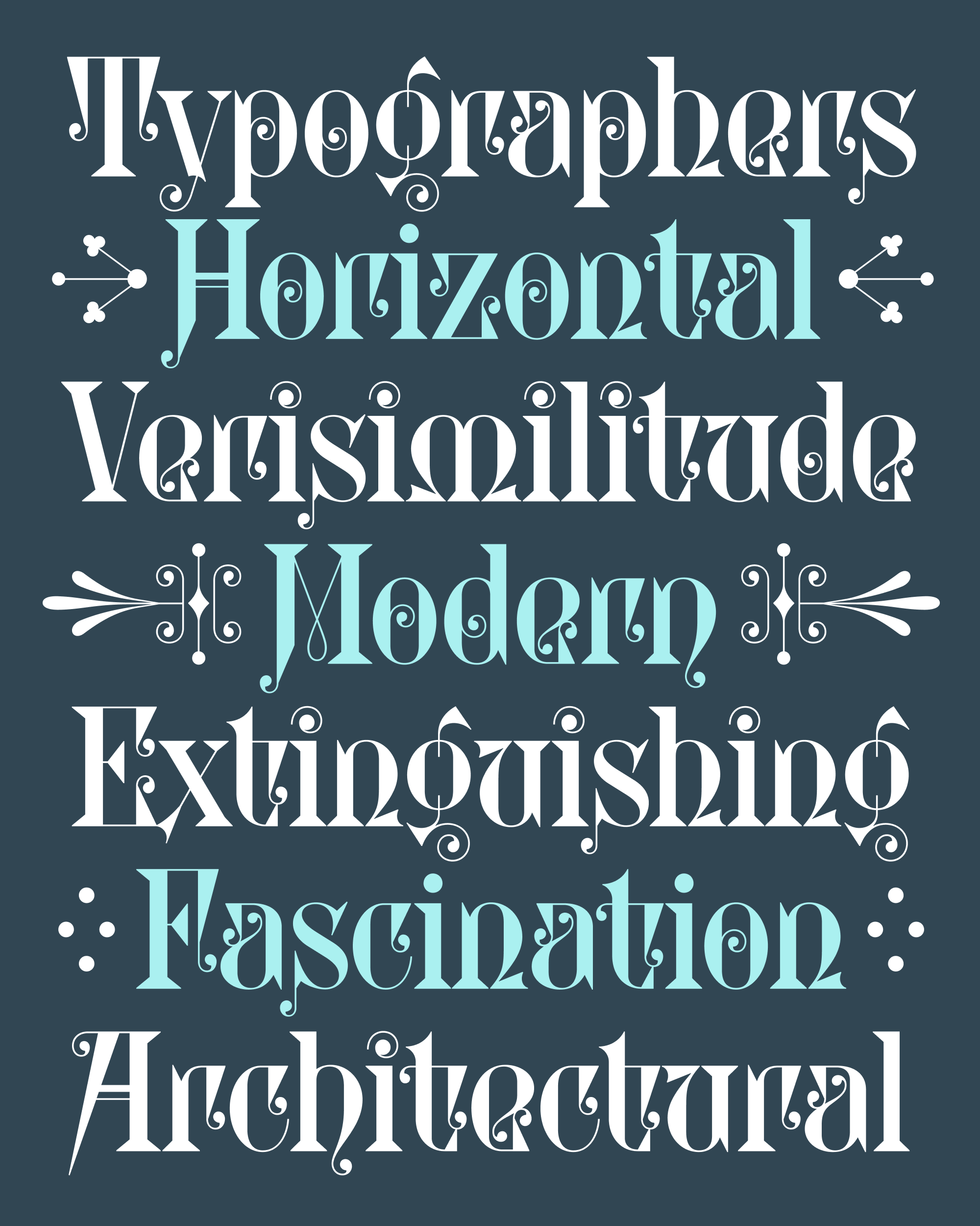
Ihlenburg didn’t design a lowercase for Glyptic (at least that I know of). Fortunately, he was a prolific designer, so there’s no shortage of lowercases for me to reference as source material for the piece of historical fiction I was about to create.
I noticed that Ihlenburg would often use Uncialesque forms in his lowercase, even if they weren’t prevalent in the uppercase. I saw them in softer, more flowing designs like Campanile (see the h, m, and n below) and in more daring designs like Ringlet (see the alternate n in this cover). And I couldn’t help but remember this exact same inwardly-bent curve in Glyptic’s U.
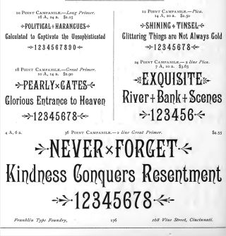
Campanile, as shown in Franklin Type Foundry’s Convenient Book of Type Specimens, 1889.
So, I made Glyptic’s U the starting point for the lowercase, and everything else cascaded from there. Lowercase u follows uppercase U, n is a 180° rotation of u, m is a horizontal mirroring of n, and w is a vertical mirroring of m. And every step of the way, the little vertical spike I added (and the serif I omitted) became a bigger and bigger part of the design.
The result is a kind of semi-serif, where serifs are in some places you’d expect but not in others. The vertical asymmetry made this a tricky design to space—I had to treat letters like p, d, b, and q as if they were sans-serifs for spacing purposes since none of their serifs occur within the x-height. Of the letters with vertical stems, only i and l use a conventional serif arrangement.
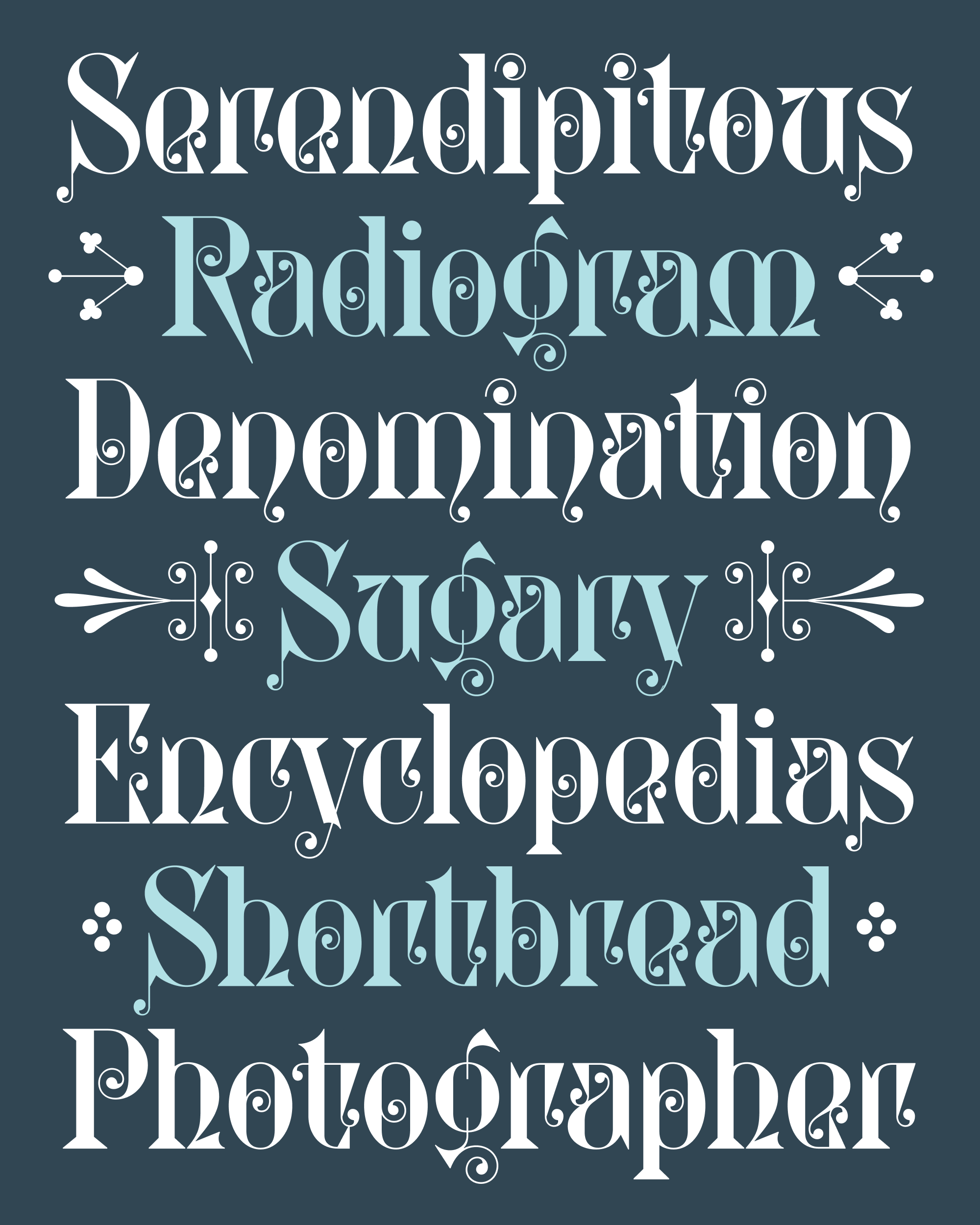
Glyptic gets its chaotic energy by mixing spikes and curls—it’s a strange heightening of the same juxtaposition of sharps and rounds found in Roslindale. So I wanted to ensure that I passed up no opportunity to incorporate my favorite details from the caps: the elongated, scroll-like vertical serifs and the spiral-y curlicues. In a and e, I blended the wedge vertical serifs with a open crossbar / interior ball terminal combo that I borrowed from Campanile…the resulting letterforms are open where they should be enclosed, and enclosed where they should be open!
The pair of letters that vexed me most were f and t, where I felt that it was necessary to include the vertical serif even though it made the letters unusually wide and difficult to read. I tried dozens of variations before landing on a pair that has a ball terminal on the left-hand side too, and an alternate that doesn’t.
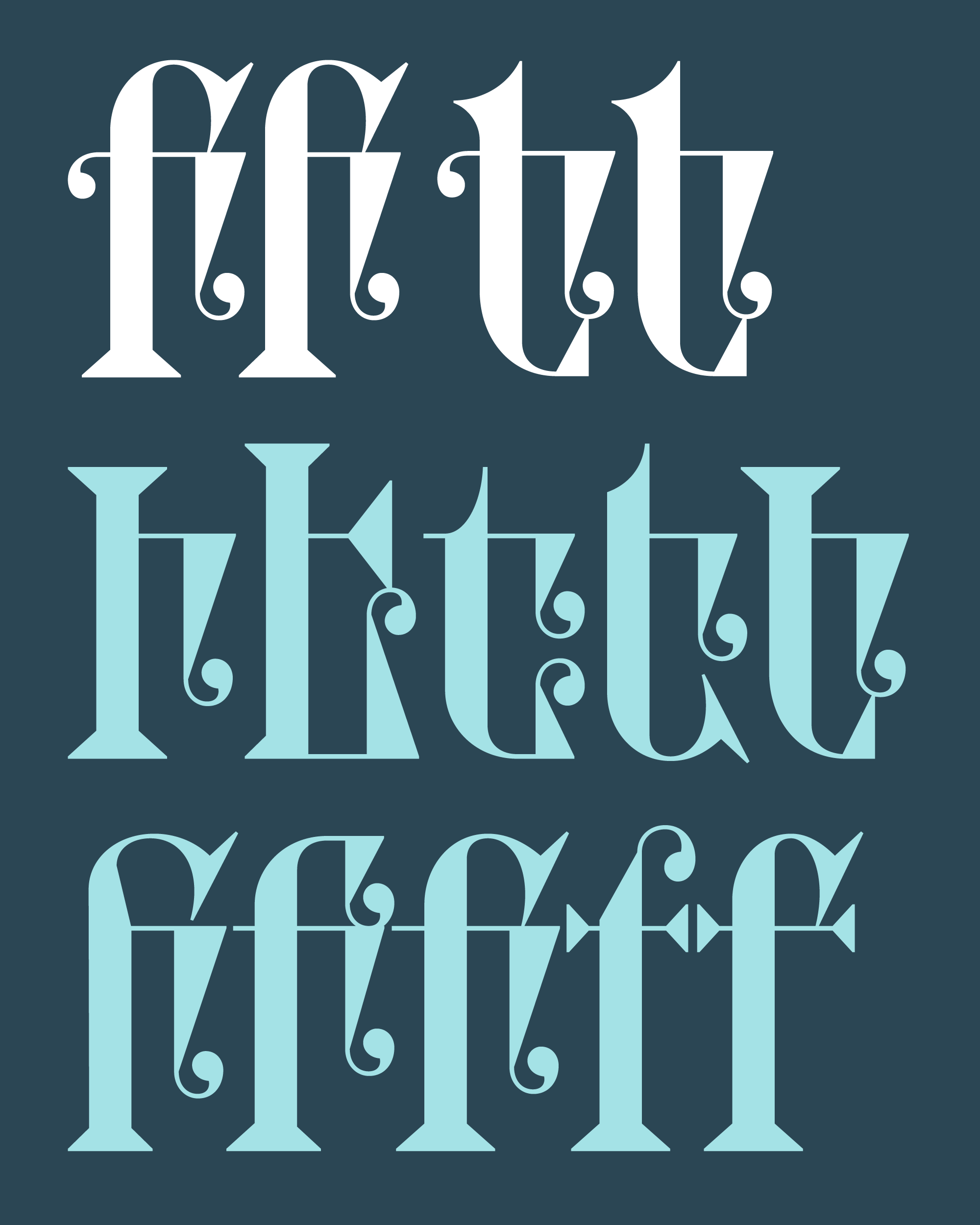
Do I think that this is the lowercase Ihlenburg would have made for Glyptic? Definitely not. But I do think it honors the original design in its own way, preserving Glyptic’s rigidity as well as its eclecticism and whimsy.
I also took this opportunity to add lining figures and decorative borders. If I keep on adding, can I still call it a revival? I’m feeling out where that line is. I get excited when a project stops being a digitization and feels like a conversation… an asynchronous exchange of visual ideas between a thing 145 years old and a thing that is just taking shape.