June’s Font of the Month: Gigawarp
Last month I sent you Megawarp, a sci-fi sans serif centered around the idea of fragmentation. But slicing letters into pieces doubtlessly impacts legibility, and I’ve watched a few people struggle to read the font. So I asked myself…what would happen if I stripped away that central idea, and tried to work from what was left?
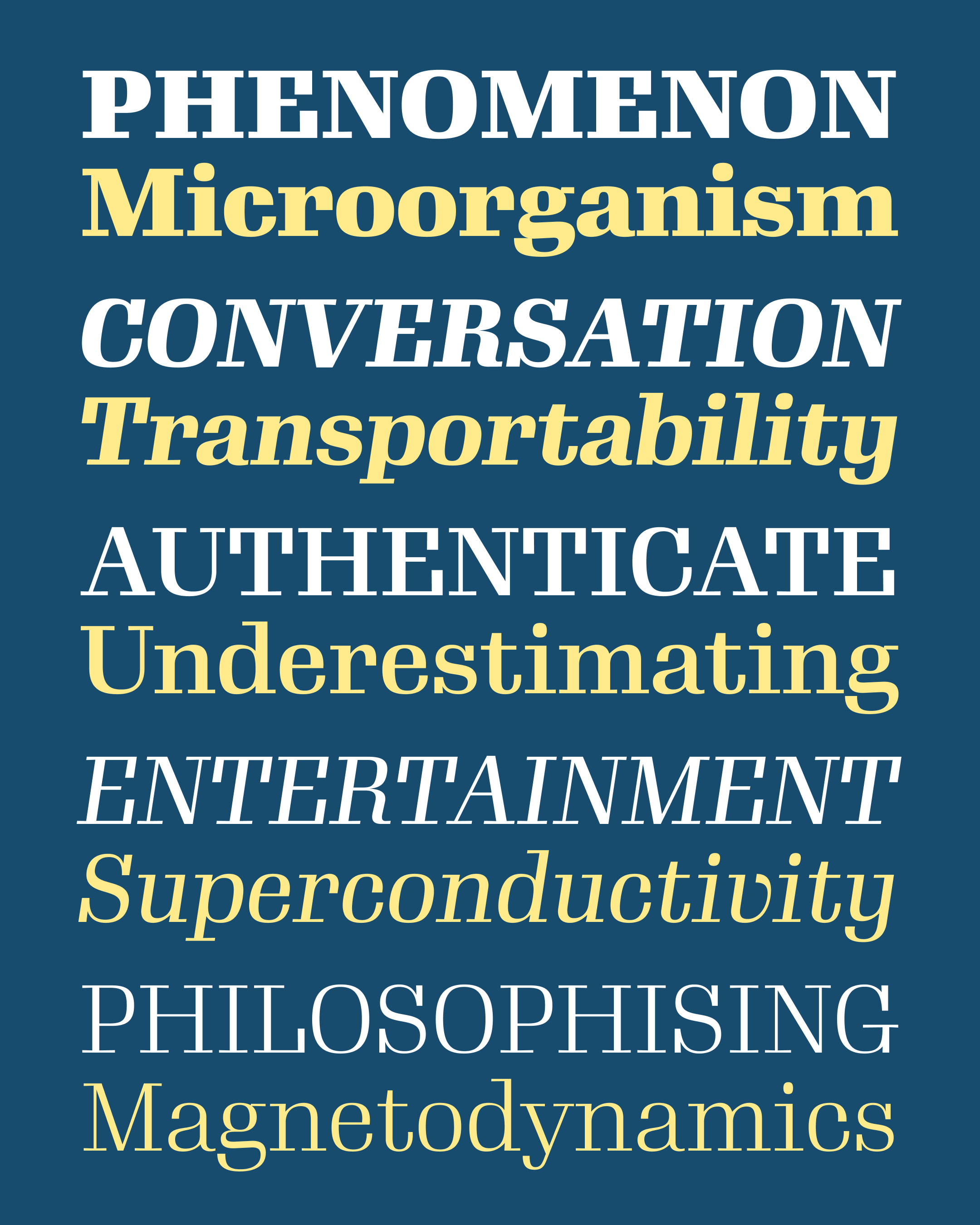
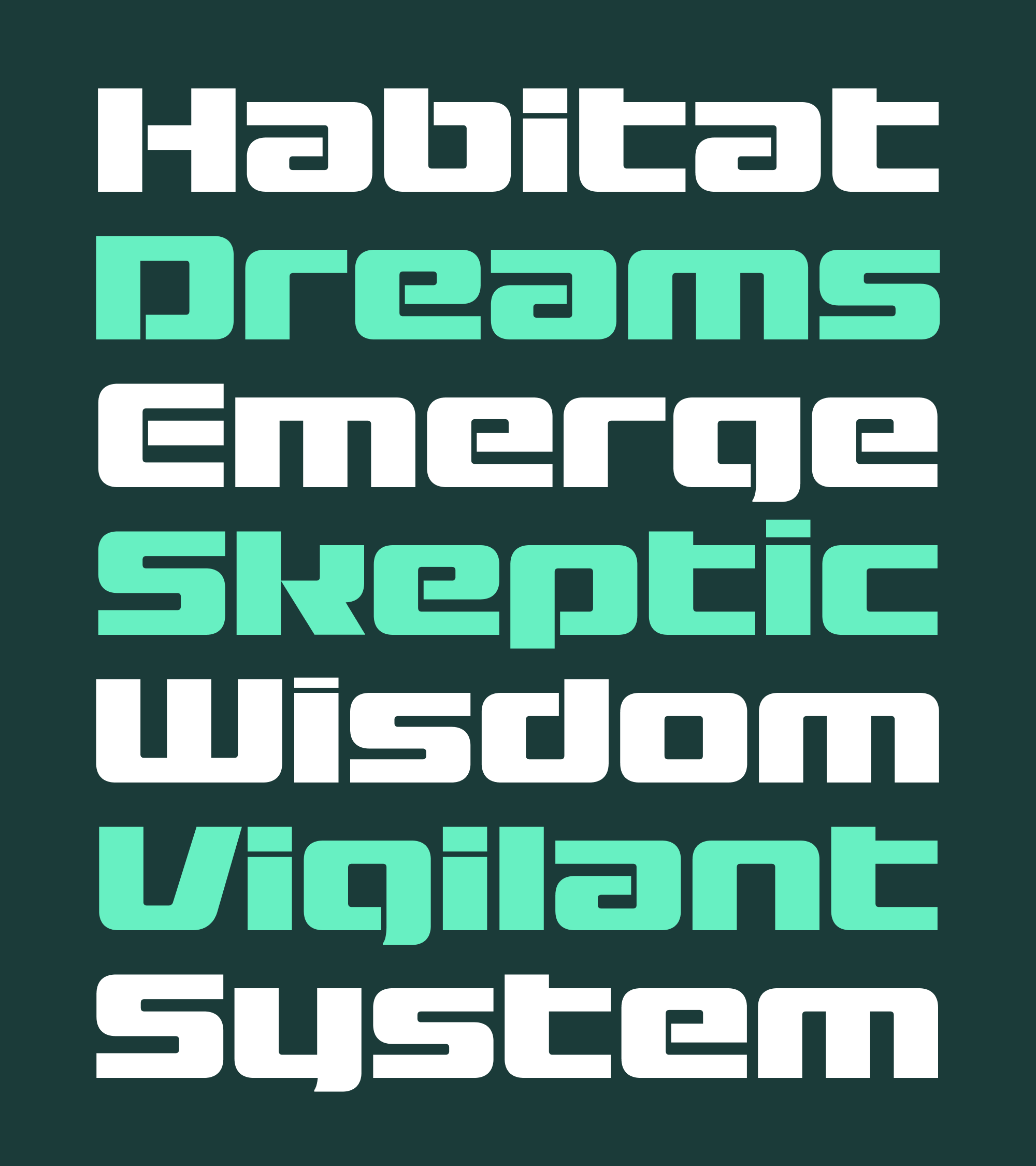
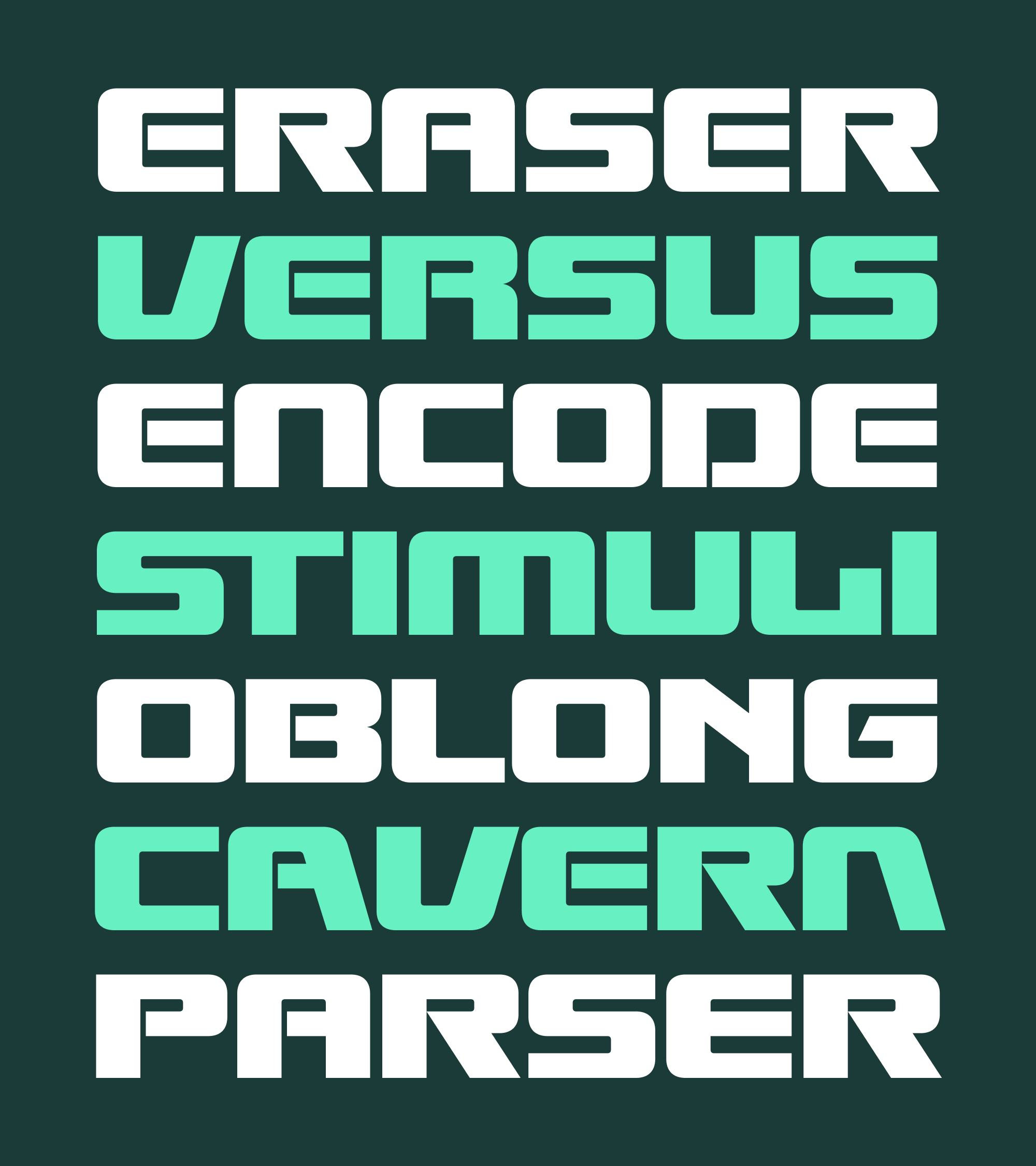
The answer is Gigawarp. It’s bold, it’s wide, it’s modular, and in my opinion, it’s still pretty dang fun. It replaces Megawarp’s system of horizontal slices with a reduced set of vertical slices, most apparent on letters like a/e and p/d/b/q. These slices transform letters with counterforms into a single continuous strip, giving the typeface a wormlike quality that has its own precedent in futuristic design.
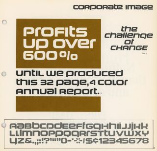
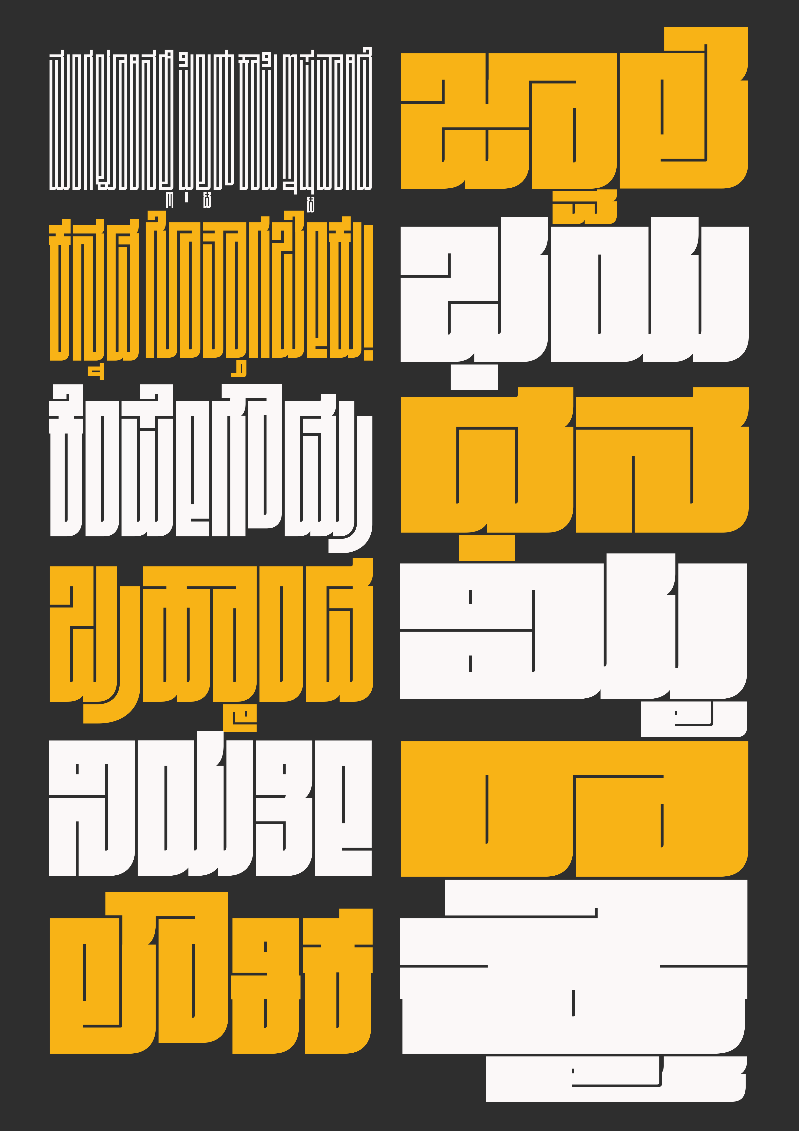
Corporate Image in the Alphabet Innovations Collection, Vol. 4, 1971. Courtesy of Stephen Coles.
I mentioned Corporate Image in my last mailing, but it’s worth calling out again in the context of wormy fonts. Designed by Roc Mitchell as an open-countered, unicase variant of his typeface Corporate, this typeface acted as a roadmap for me as I charted Gigawarp’s course.
Gigawarp still favors bold blocky forms over Corporate Image’s softened squircles, but I largely followed the way it “wormifies” the letterforms, as well as its general approach to unicase. I also borrowed the subtle small curves that help the legibility of descenders like g, j, and y.
Gigawarp’s unicase is by far my favorite part of the design—it feels both ancient and futuristic at the same time, and I love the ease with which uppercase and lowercase work together. Because of this, I decided that I couldn’t let these shapes simply hide inside OpenType features that folks might never see or use. So I’m including a separate Gigawarp Unicase family where you can access these shapes directly from the keyboard.
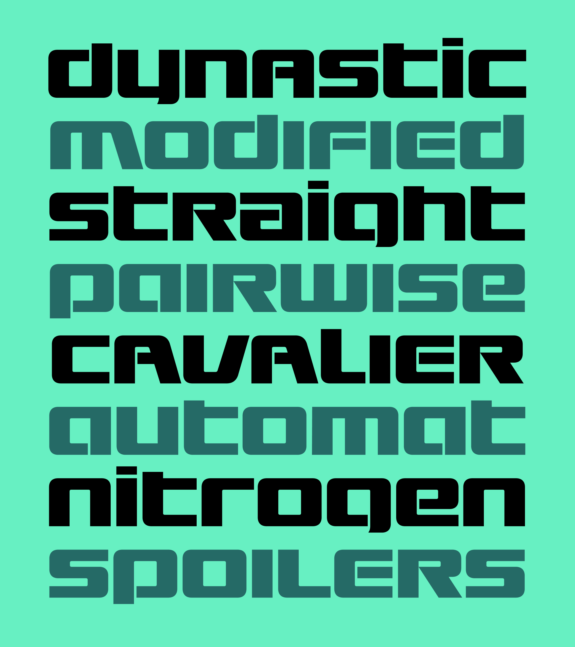
Like Megawarp before it, I had absolutely no filter when adding alternates to this typeface—this time I actually maxed out the twenty specified OpenType Stylistic Sets. New entries include sharp-cornered forms for letters like m/n and a/e, raised i/j dots, and a serifed capital I and L to help address the typeface’s Megaflicks problem. (Thanks to Melvian for pointing out this very serious issue!)
I will probably edit these alternates down into something more manageable at some point. But in the meantime, put on your spelunking helmets!
I should have been using my spare time to get a head start on next month’s font, but I couldn’t stop myself from trying out a Cyrillic and Greek for Gigawarp. Both turned out to be fun puzzles to figure out, as I changed the curved E to avoid conflict with Є (like Buckridge) and drew a majuscule М to avoid confusion with Т, which can take on a m-like form in its italic. Jovana Jocić kindly sent some comments on the Cyrillic, but both scripts are still a bit rough and in need of further review.
Thank you for going down this multi-month rabbit hole with me! I hope that Gigawarp provides an alternative to Megawarp that is more legible, easier to use, and still feels incredibly sci-fi. This series is simple and maybe even a little cheesy, but I continue to have a ton of fun working on it—it’s going to be hard not to design a Kilowarp font for you next month.