April’s Font of the Month: Job Clarendon Narrow

In my career, most font development hold-ups were borne of indecisiveness. I wasn’t sure how to move forward, so I just…didn’t. Job Clarendon, my collaborative effort with Bethany Heck to reinterpret the 19th-century style as a flexible contemporary family, has been quietly growing over the past couple years. But I’ve kinda put the brakes on releasing most of the new styles.
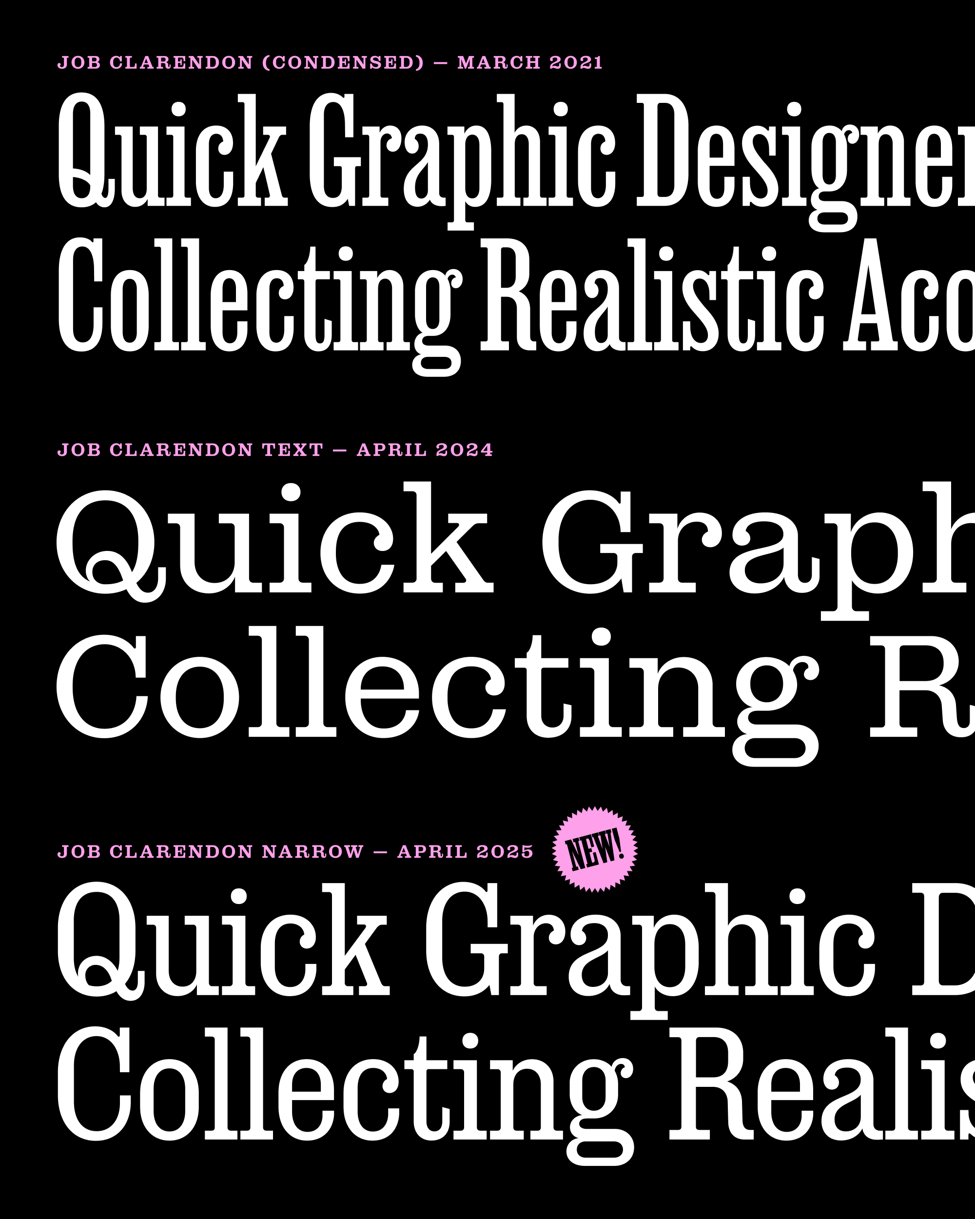
Here’s what has been bugging me: In the majority of the published family, the typically-round letters (C, G, O, etc) have straight sides. But in March 2021, we introduced Bold–Black weights where those sides go completely round, and last year we doubled-down on those round sides in the wider Job Clarendon Text. But in the interpolated styles, this roundness has started to trickle in from the wider, bolder corner.
I call this the “pee in the pool” problem. If I introduce a new design element into just one section of the space, it will begin to seep into the rest of the family and affect it in unexpected (and often undesirable) ways.
This month, I’m sending you Job Clarendon Narrow, a series that should have been a very straightforward interpolation because it’s situated smack in the middle of things that were already complete. But because it sits awkwardly on the fault line between straight sides and round sides, it ended up requiring a bit more TLC than either Bethany or I expected.

Clarendons look good when they’re confidently straight-sided, and they look good when they’re confidently round—there’s plenty of historical precedent for both. But the midpoint, between straight and round, feels a bit indecisive, and I don’t know of many Clarendons that have attempted to bridge the gap. Craw Clarendon Condensed is great, but it’s essentially a squished-down version of the normal width with completely round sides, and no hint of straight-sidedness.
For Job Clarendon, we could have done what most Clarendon families do and simply avoided this width altogether. Or we could have engineered the font with a tipping point where straight forms would magically snap into round forms, bypassing the awkward moment of transition between the two.
But Bethany and I decided that maybe this is not the pee-in-the-pool problem we thought it was. We wondered if we could add additional drawings in the middle of the space to help manage the straight-to-round transition as elegantly as possible. Ultimately, we went with our guts about how much roundness felt right for each weight from Hairline to Black, trying to preserve some of the rigidity and wooden-ness of the original Condensed styles.
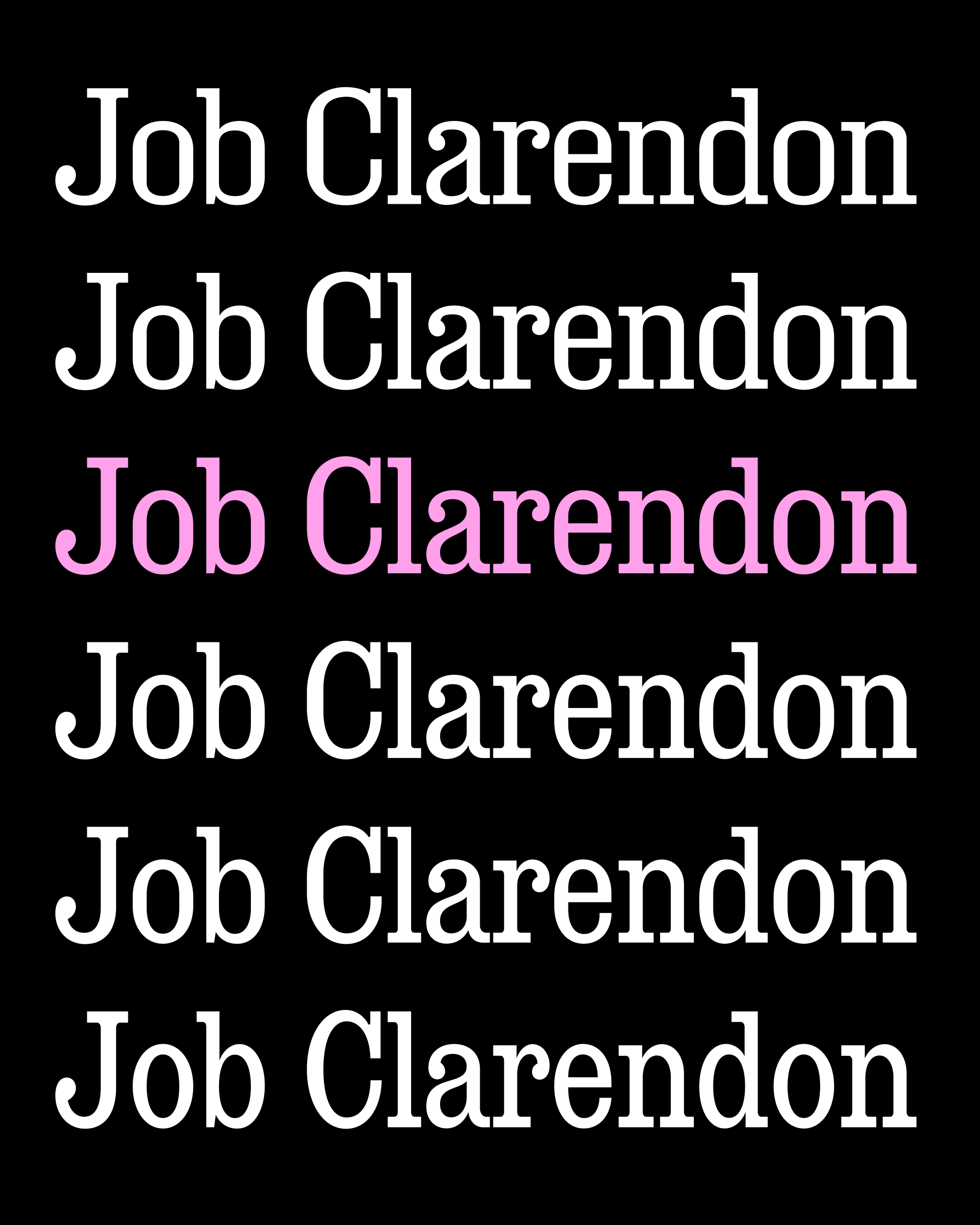
For example, below you can see a spectrum from straight-sided to round options, and where we landed for the Regular weight marked in pink:

Still, I’m excited to hear what you think of this addition! And honestly, I’m equally as excited just to be on the other side of this decision. This was the pain point that was holding us back from incorporating Job Clarendon’s wider widths into the larger designspace, which is the next item on our to-do list.
