March’s font of the month: Job Clarendon
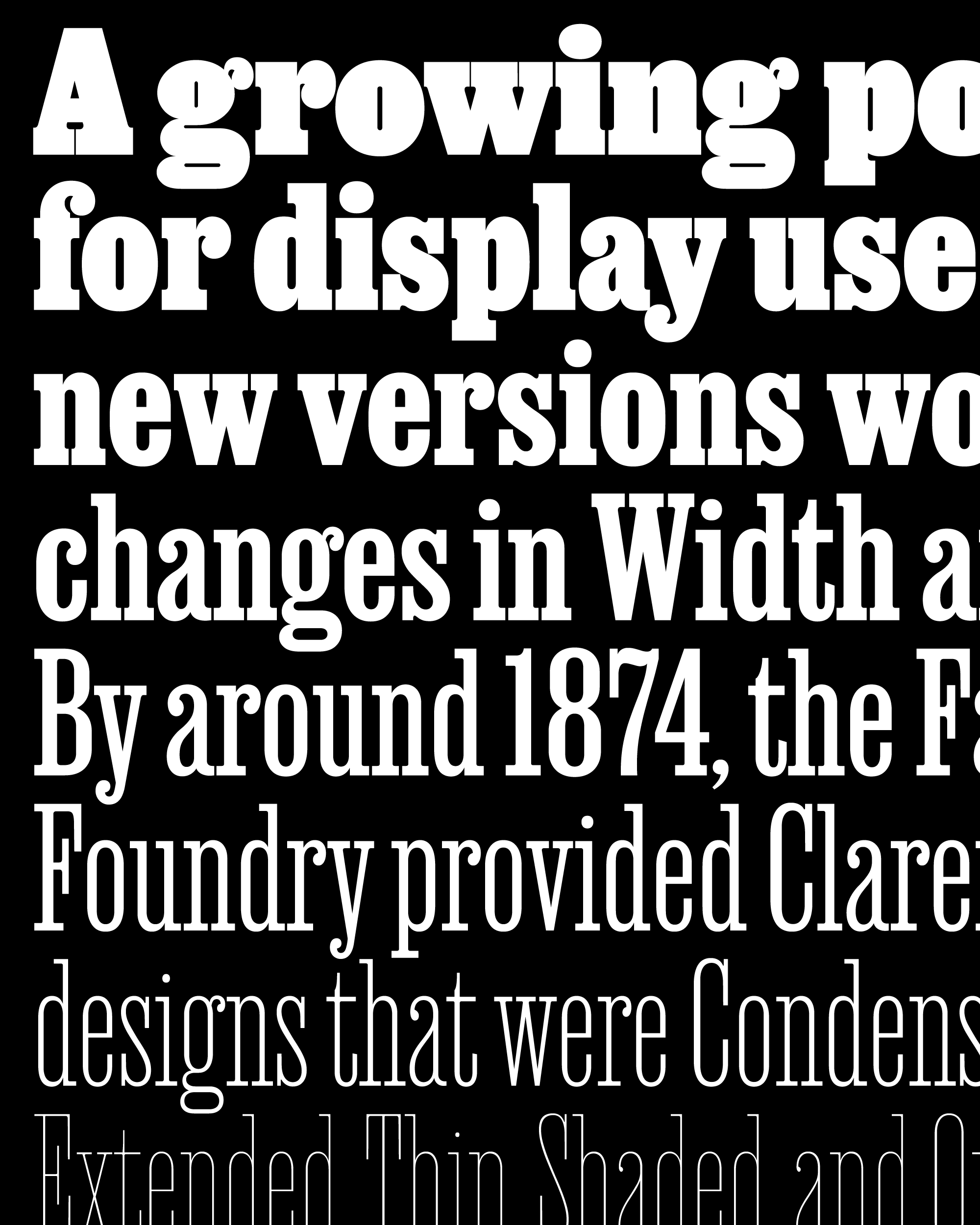
Last August, I shared the Hairline weight from a Clarendon that I have been working on for the better part of two years. A collaboration with designer and writer Bethany Heck, It pulled heavily from the condensed, bracketing-heavy Clarendons of the 19th century, but took the style thinner than those types (cut in wood) could possibly go. This month, again with Bethany’s guidance, I’ve expanded the design and pushed it to the opposite extreme.
Extremes may define the range of a variable font, but I often find that the true challenge is figuring out how to keep things interesting in the middle. Especially in a low-contrast design like a Clarendon, an over-reliance on interpolation can produce bland results. But when it’s managed, I like to think that interpolation can produce a family whose sum is greater than its parts, allowing it to exceed the bounds set by its historical predecessors and find uncharted territory in and around well-worn typography genres.
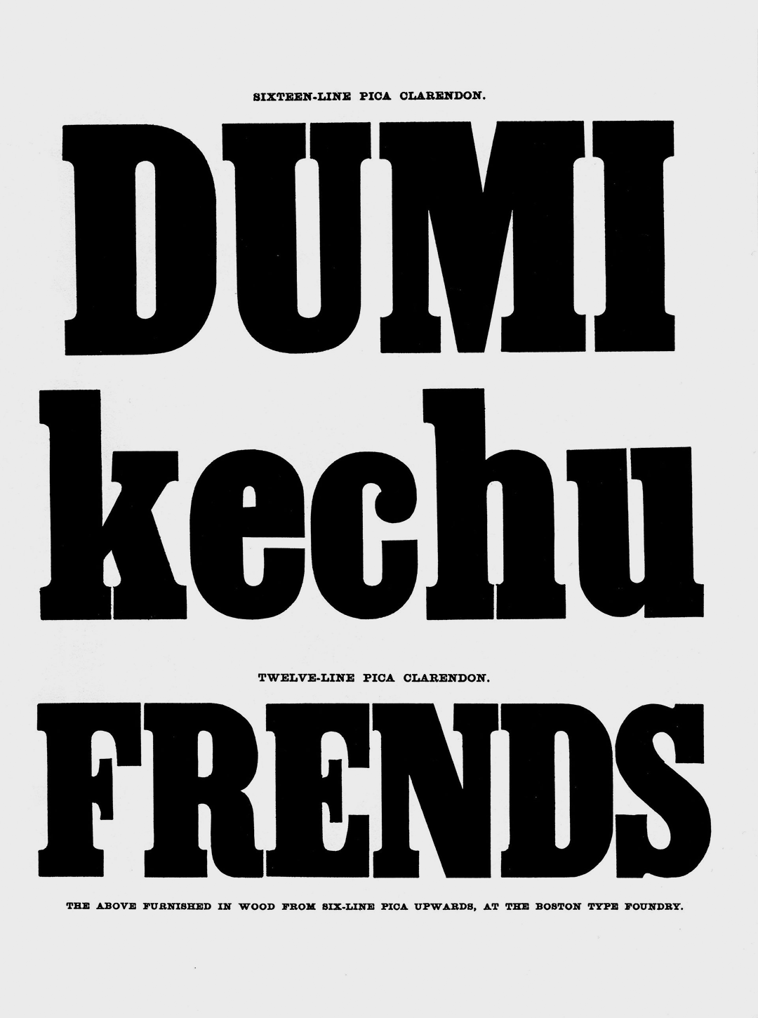
Clarendon wood types from the Boston Type Foundry, 1856. Photo by James Puckett, used under Creative Commons license.
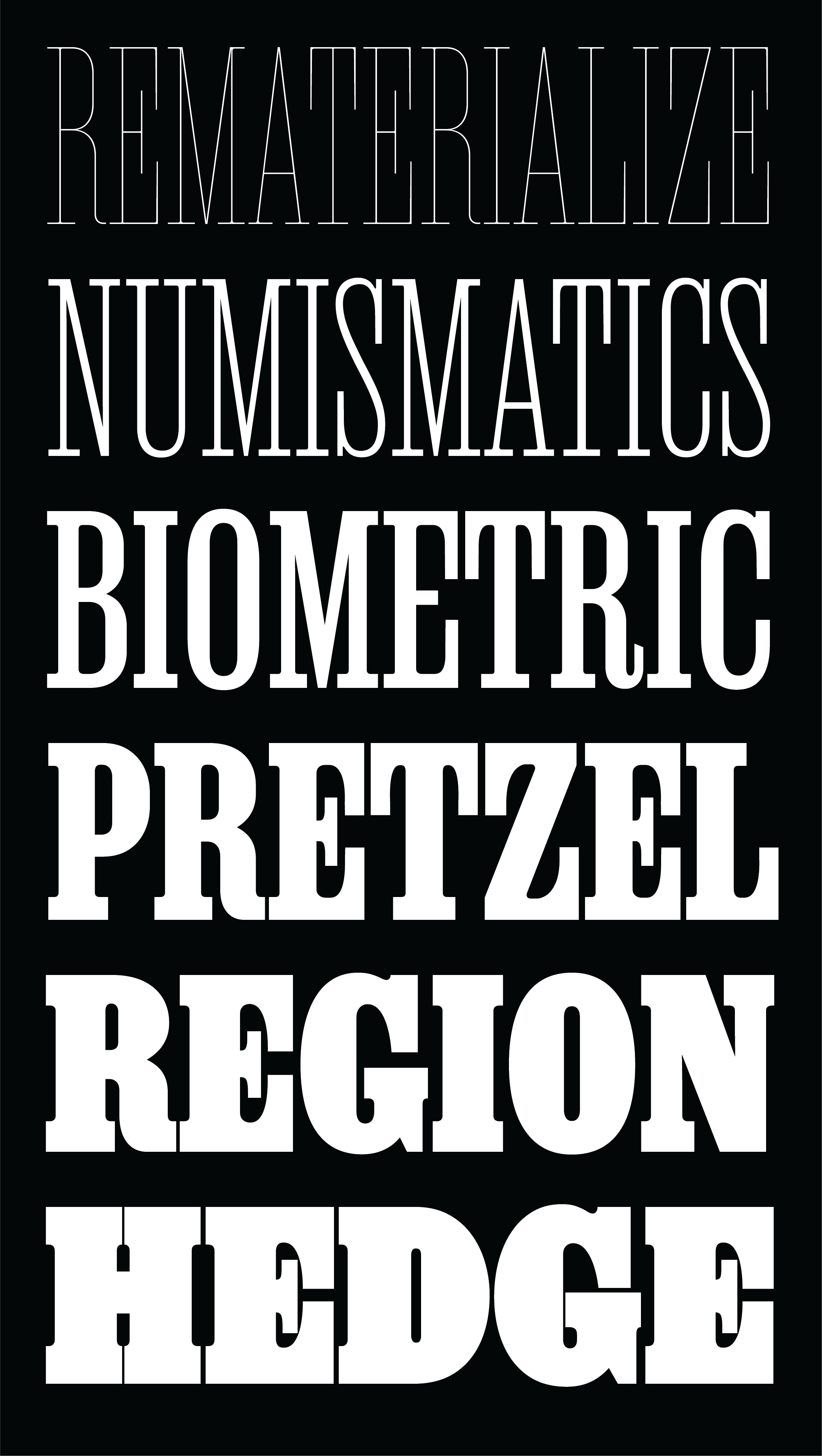
If you were around to receive Heckendon last August, the first thing you might notice is the shiny new name. I’ll let Bethany explain it: “Job Clarendon is an homage to ‘job printing’ – display-heavy designs made for posters and flyers in the heyday of letterpress printing. This style of Clarendons was wildly popular in this genre of work, and I've always been interested in how adaptable they were. The style was fattened, squished and stretched to accommodate lines of text both short and long and type foundries across the globe each found their own unique features to contribute to the Clarendon stew.”
Indeed, adaptability is the name of the game for this typeface. This design changes across weight more than any other typeface I’ve designed (ok, not counting Fit 😉): stems get up to 45 times thicker from Hairline to Black, and the average letterform more than doubles in width. Amidst these radical changes in design, Bethany and I sought to preserve the dense, clunky charm that sets Clarendons apart.
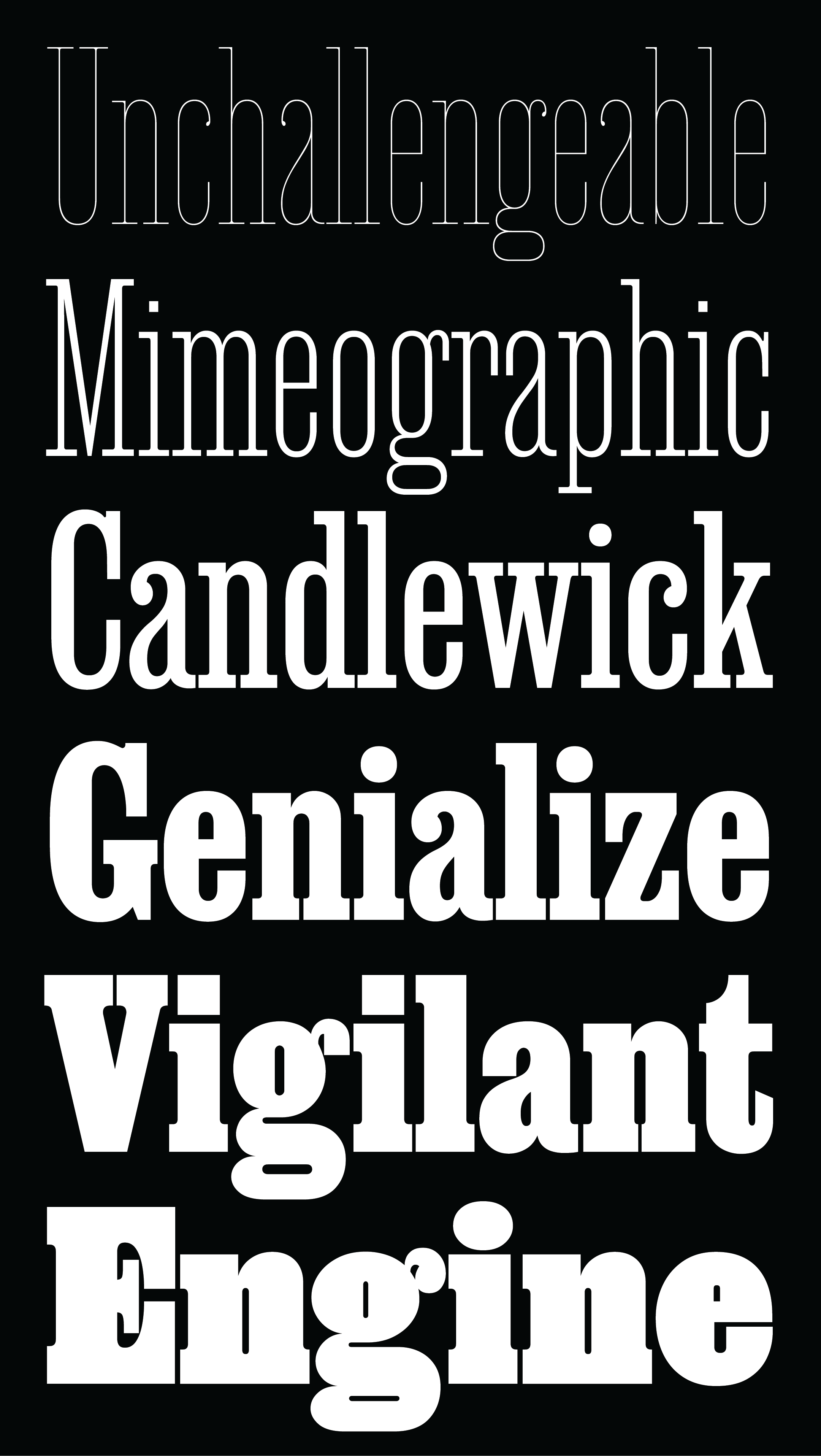
The chasm between Hairline and Black was far too wide to interpolate across effectively, so I incorporated new drawings in the Extra Light, Regular, and Bold weights to act as additional “tentposts” to support the design. This gave us the ability to question each element of the design and how it transforms across weight: At what point do the round characters completely lose their straight sides? At what point does thick/thin contrast get introduced, and how much? At what point does the increasing density force the vertical serifs and terminals in letters like C and S to stop aligning with each other?
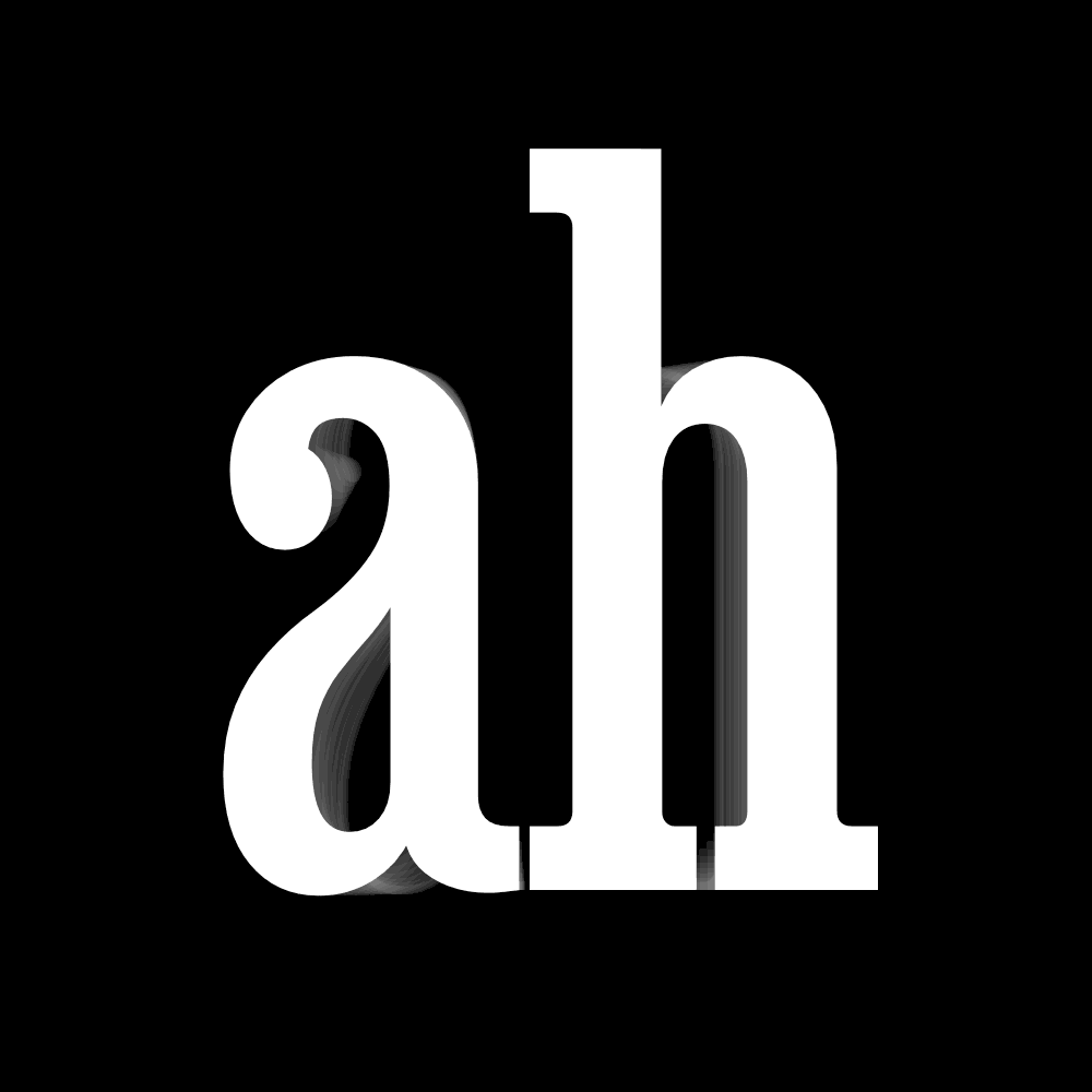
In a low-contrast design where virtually every counterspace is enclosed by inward-facing terminals, letterforms can get clogged up pretty quickly. Bethany and I decided that this clogginess should be a feature and not a bug, so in the Extra Bold and Black weights the letterforms are given license to collide with themselves and each other.
Most of the time these collisions happen gradually, like the terminal of the a that eventually merges with the lower bowl. But we do give special treatment to collisions that involve the inter-serif gap (see h, n, and m). With serifs this thick, the rhythm of these gaps becomes so important, and we didn’t like the idea of them just vanishing into nothingness. So instead, we picked a point in the weight axis and forced them to snap shut.
(I’m not always crazy about animations like this, but it’s an easy way to demonstrate the mix of gradual and snappy transitions.)
So what’s next for this in-progress family? Bethany wants to go narrower, and I think that makes a lot of sense. An Extra Extra Compressed Black will certainly take our concept of intentional clogginess to the next level.
The Clarendon stew is a rich one, with so much variety in wood, in metal, and in Béziers. We hope that you think this is a worthy contribution to the pot, and that you enjoy putting it to use.