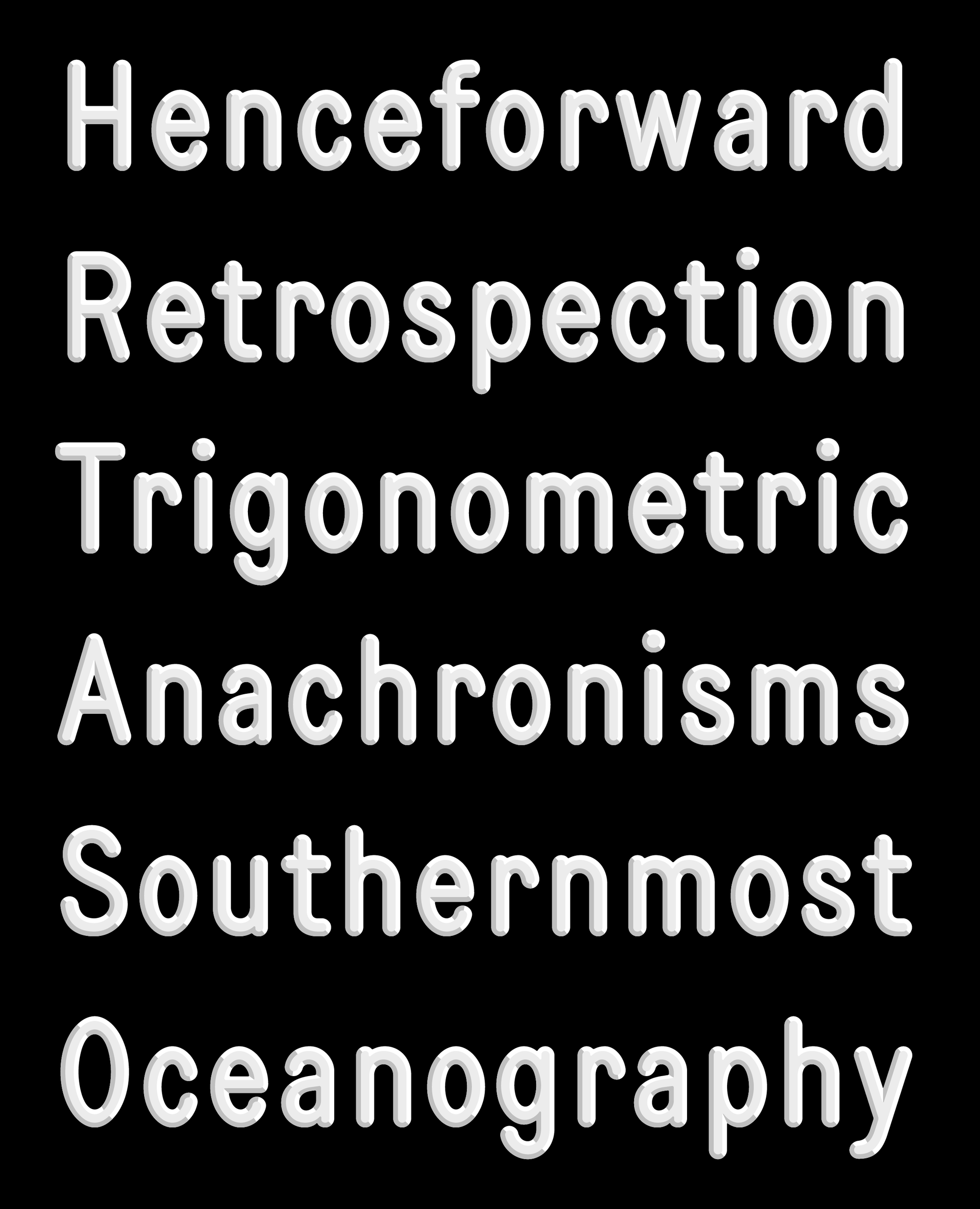
February’s Font of the Month: More Daily Special
A letterboard in Greenfield, Massachusetts, with my reflection in the glass.
After I sent out Daily Special last month, I heard from several club members (including my own spouse!) who suggested that the font could do more to simulate the imperfections of real-world letterboard typography.
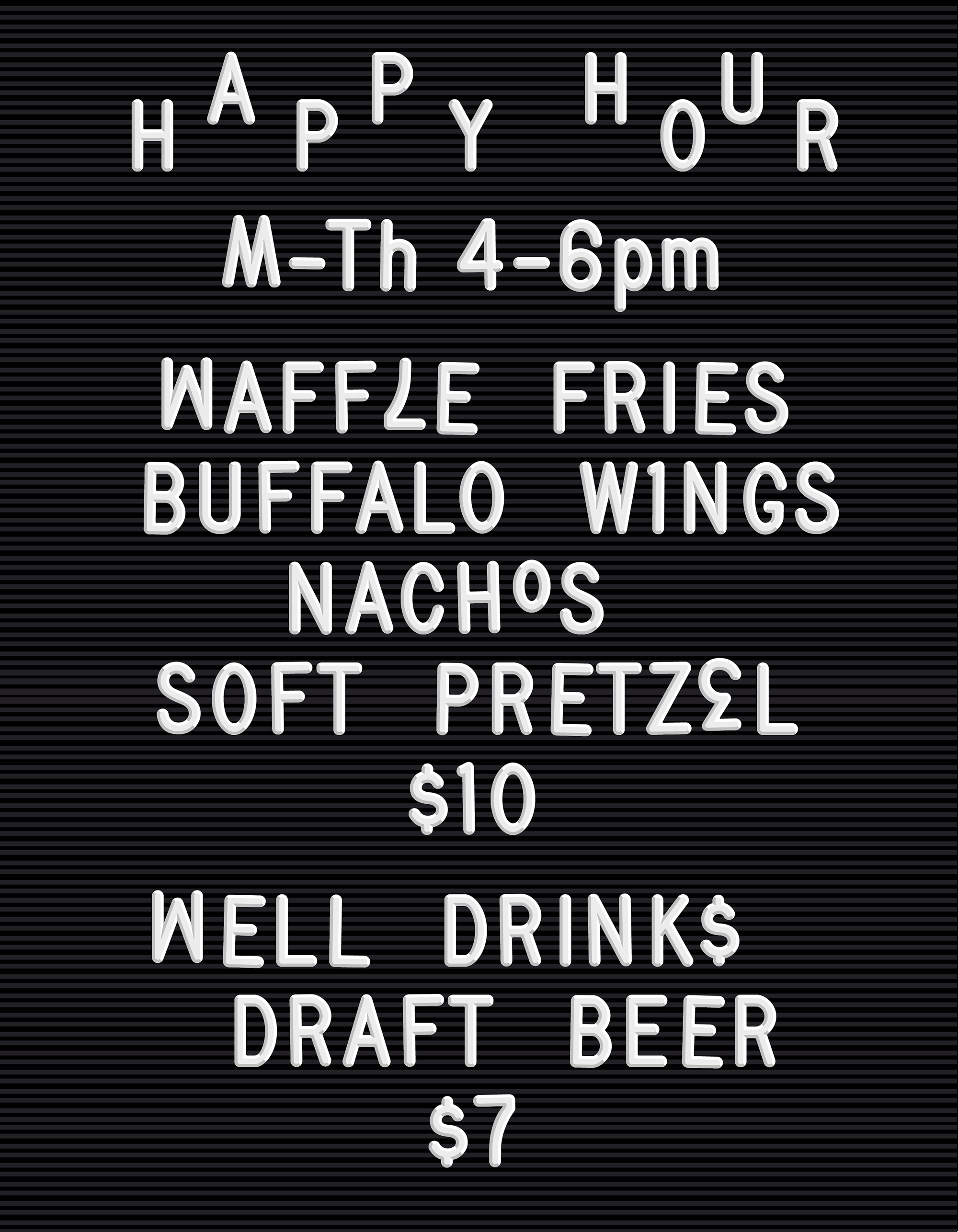
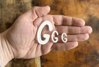
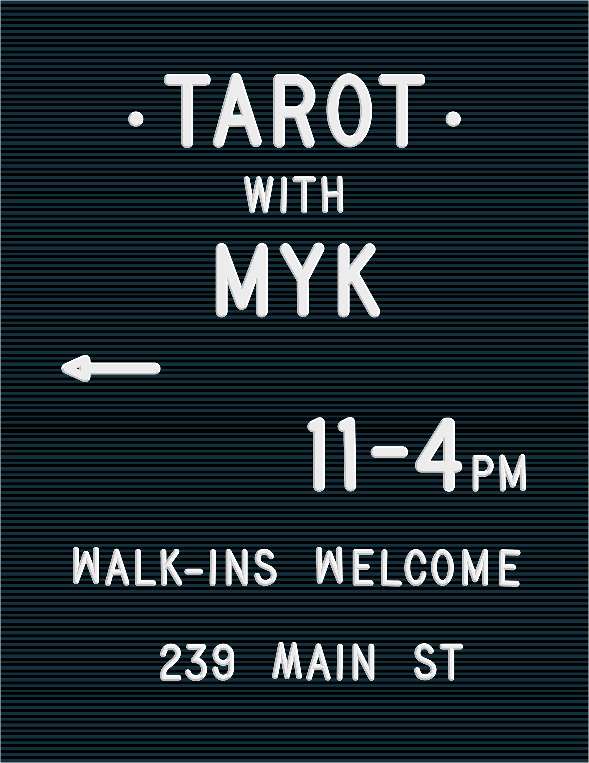
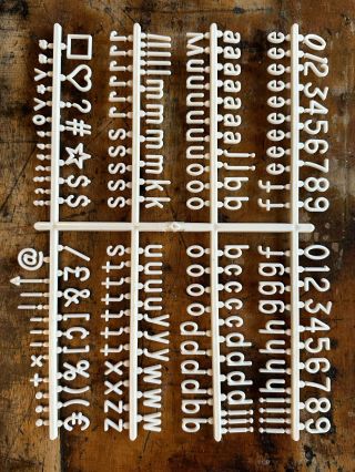
When you set type by pushing little plastic letters into rows of felt, slight misalignments and inconsistent spacing are inevitable. And when you begin to run out of the finite amount of letters you are provided, it’s only natural to improvise—an I becomes a 1, a flipped M becomes a W, and so on.
Your helpful feedback convinced me that physical elements like these are central to the charm of this typographic style, and deserve to be a big part of any digital interpretation. So, with that in mind, I’ve taken another month to make Daily Special even more special.
In this update (uninstall the previous fonts first!), Daily Special’s imperfection engine is governed by OpenType stylistic sets. Stylistic Set 1 shifts around the spacing between letters and rotates every other letter by up to 1.5°. It’s subtle, but it’s enough to throw off the rhythm of the text, giving everything a slightly wobble. (You should feel free to use baseline and kerning adjustments to throw things off even further!)
Stylistic Sets 2 and 3 substitute in similar letters, including flipped ones, as you might do when you’ve run out of the letters you need. This adds a chaotic element to the design, as many of the flipped letters are also vertically misaligned because of how they would sit on the rows of felt. These alternates can get pretty chaotic pretty quickly, so I suggest sprinkling them with care.
Daily Special’s original style approximates Letterfolk’s 3/4-inch letters (in this font, approximately 70pt), where the dimensional bevel accounts for a major portion of each stroke.
As the original plastic letters get larger, their bevel stays the same size while the flat face of the letter becomes much more prominent. To mimic this behavior, I’ve also added optical sizes to the family, allowing you to adjust the thickness of the bevel depending on the font size.
The new Display and Banner sizes correspond to the 1-inch (94pt) and 2-inch (188pt) sizes, respectively. I also threw in some color variable fonts with an optical size axis, because why not? Just keep in mind that these color variable fonts don’t work in all environments, including Adobe apps.
Last but certainly not least, Daily Special now has a lowercase! While the original all-caps design was directly based on Letterfolk’s house style, the lowercase is an original creation. It was commissioned by Letterfolk so that they could use it to produce a separate set of physical lowercase letters that would complement the pre-existing caps.
From a design perspective, the lowercase doesn’t offer much in the way of surprises. But I appreciate that it is able to maintain some sense of rigidity—it’s easy for chunky fonts with round stroke endings to feel soft and squishy.
This turned out to be a much deeper dive than I expected to take into the world of letterboard typography. I hope that these new features—the rotated alternates, the letter replacement, the optical sizes, and the lowercase—make the typeface more fun to use, and create more room for designers to play within this style.