April’s Font of the Month: Club Lithographer v2
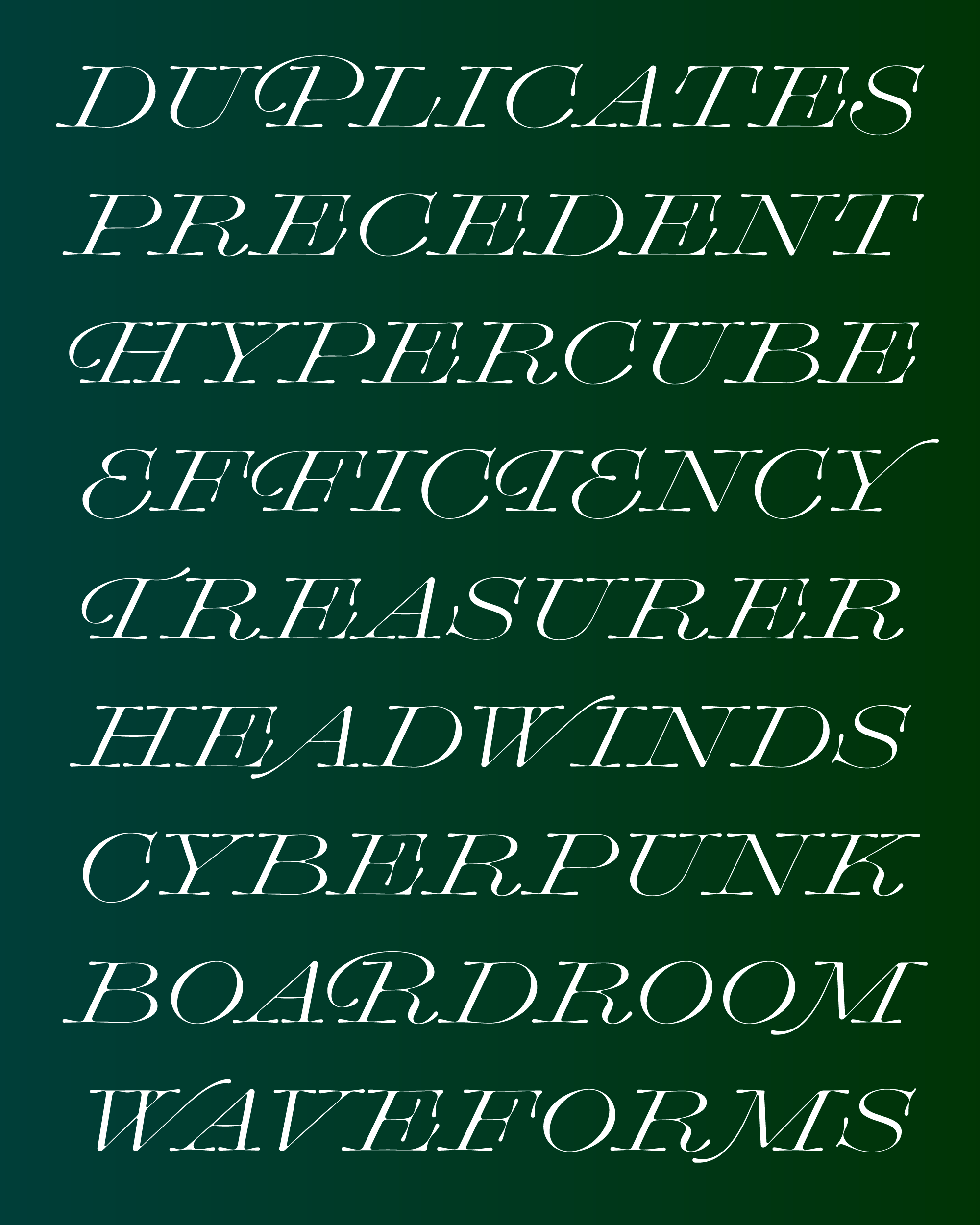
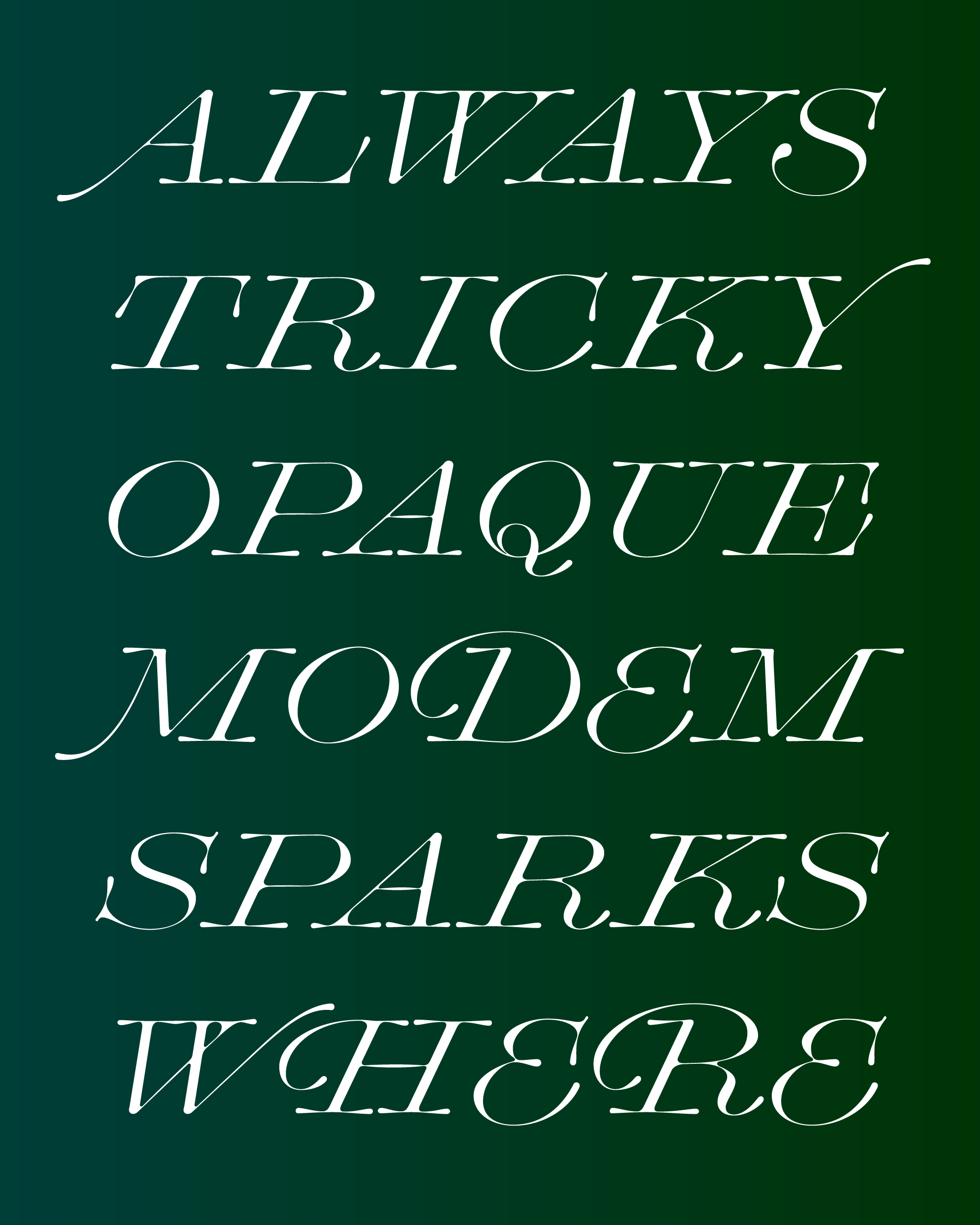
Go ahead and hit your CAPS LOCK key, because this month I’ve added an uppercase to Club Lithographer!
Last November, I sent you my first draft of this eccentric, high-contrast italic, but I wasn’t happy with the capitals so I simply omitted them. Since then, I’ve occasionally poked my head into the font file to mess around with what I started, scratch my head, and try to figure out why they were bugging me so much.
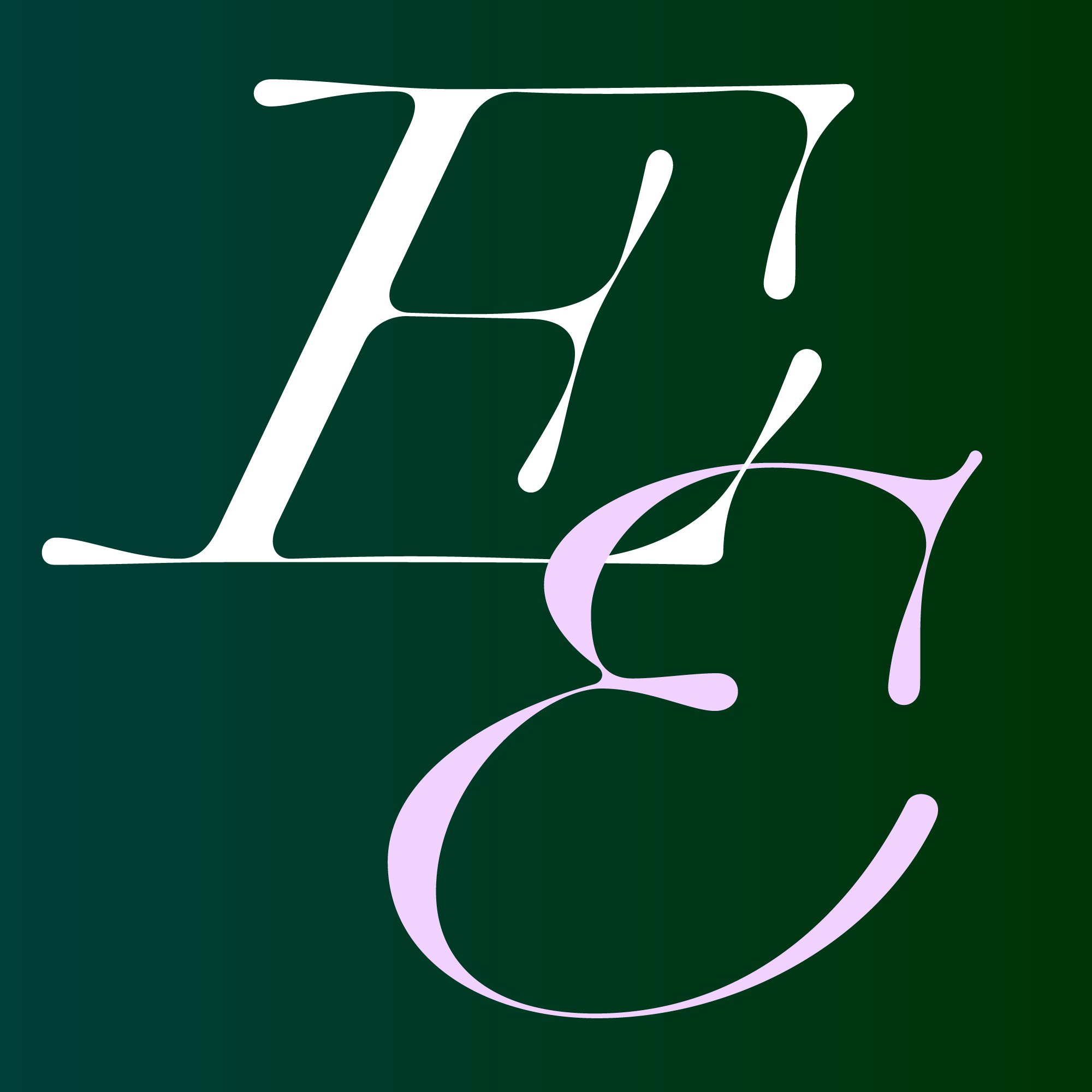
This typeface came about as the result of me riffing on Farmer, Little, & Co.’s Lithographic Italic. I never intended to do a revival or even a reinterpretation of this typeface, but I did borrow liberally from the design, including its wide proportions, extra-long serifs, and steep Italic angle. I made my design a lot more flowing, with loose curves, and blobby serifs. It’s almost as if the letters were formed out of spilled maple syrup...though I might just be thinking this because March is sugaring season here in Western Mass!
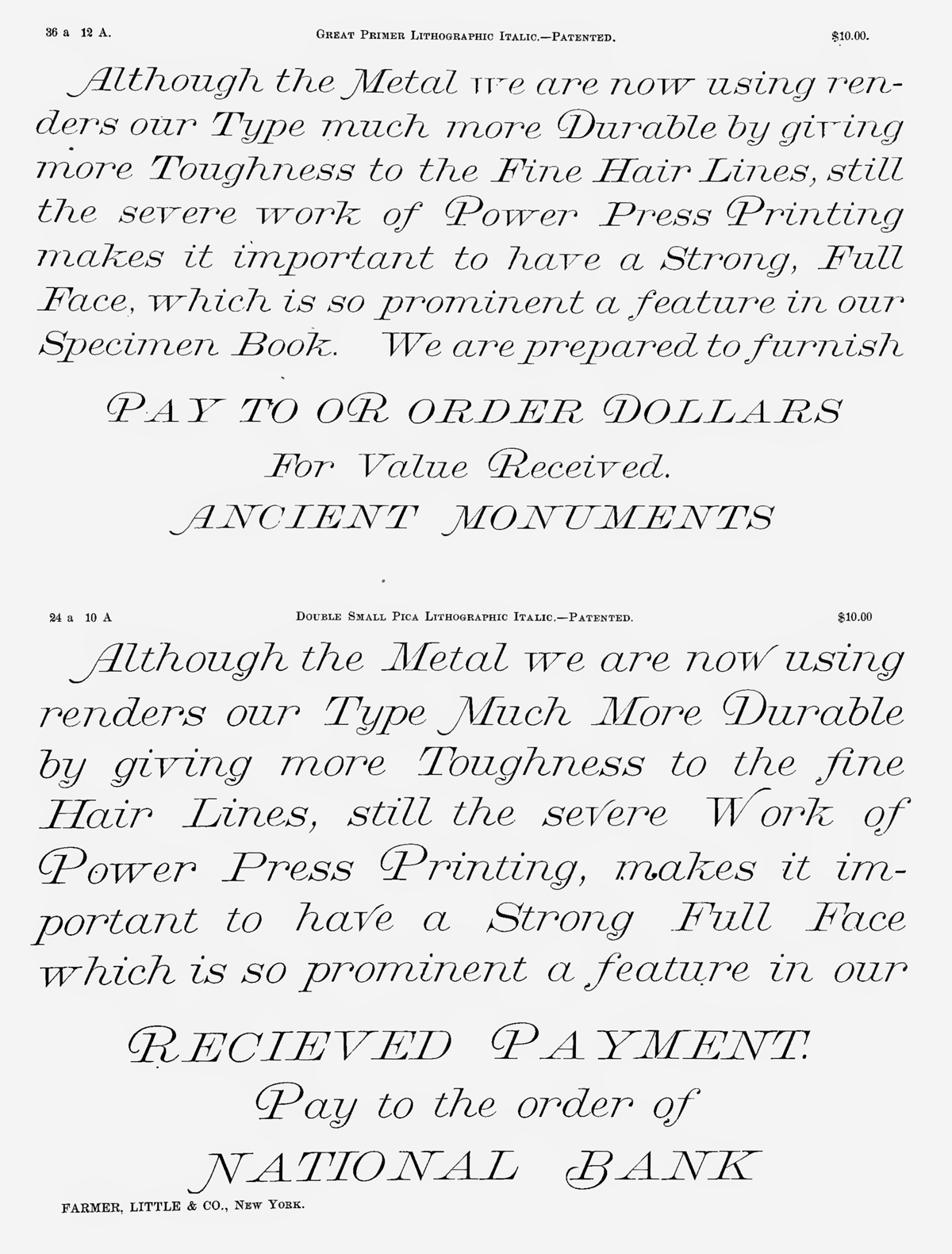
Lithographic Italic, as shown in Farmer, Little, & Co.’s 1867 specimen
All of this proved to be a lot more difficult to achieve in the caps. Capitals tend to be more constructed than their pen-inspired lowercase counterparts—all the symmetry and straight lines and bilateral serifs fight against the free-flowing vibe I was after. Plus, there are just so many more serifs and the caps, and in this design they are so long and distinct that they were starting to get overwhelming.
My original uppercase more-or-less followed the “engravers” style of the original Lithographic Italic, but eventually I decided that they were too sharp and too heavy for this design. So I threw out all the caps I drew last year and started from scratch, this time emphasizing their width and wobbliness.
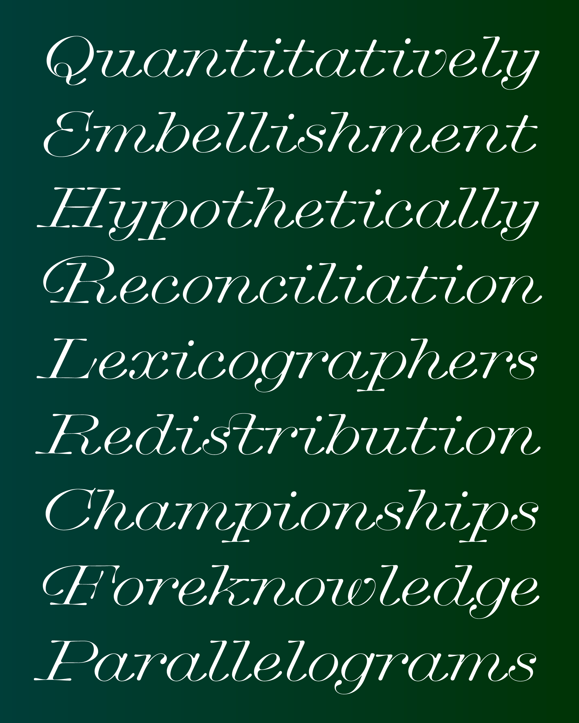
I also took this opportunity to dig up more specimens of Lithographic Italic, and was excited to see the liberal use of Swash capitals in the examples...they even appeared in all-caps settings and in the middle or the end of a word (see “OR”, above). These swash caps succeed in bringing more of the lowercase’s flowing curvature into the uppercase, so of course I couldn’t resist drawing a set of my own.
Swashes are at their best when they are lightly peppered into a document at the typographer’s discretion—you might not get great results if you apply Club Lithographer’s OpenType Swash feature to entire blocks of text. They lend themselves to a “hunt-and-peck” style of typography, where a designer swap in different glyphs for a particular word (traditionally achieved by literally swapping metal blocks, but very possible using the Glyphs palette in a design app).
However, the concept of “lightly peppering” something can be a much trickier prospect when content and styling are separated. I’ve been doing more and more work in HTML/CSS and DrawBot, and it takes a bit more creativity—and sometimes more restraint—to make swashes succeed in a stylesheet- or template-based environment. But I’m convinced you can do it! 😁
As I write this, I’m already regretting not taking the time to add Small Caps and other typographic niceties to this font, and I’m curious to hear where you’d like me to take it next...does it even need an upright companion? In any event, I hope you enjoy this small update and find more utility in this design now that it has a full U&lc set.
Sending you my warmest regards this April! —DJR