November’s font of the month: Club Lithographer
Like many other type designers, I have numerous typographic “sketches” that sit around in a folder on my computer. Sometimes they’ll contain a full alphabet, but usually they’re just a handful of characters...just enough to rough out a developing idea. Every couple months, I’ll crack open one of those files and noodle around for a bit, trying to see if I can get something in the design to click. And if it doesn’t, then usually I’ll forget about it for a while.
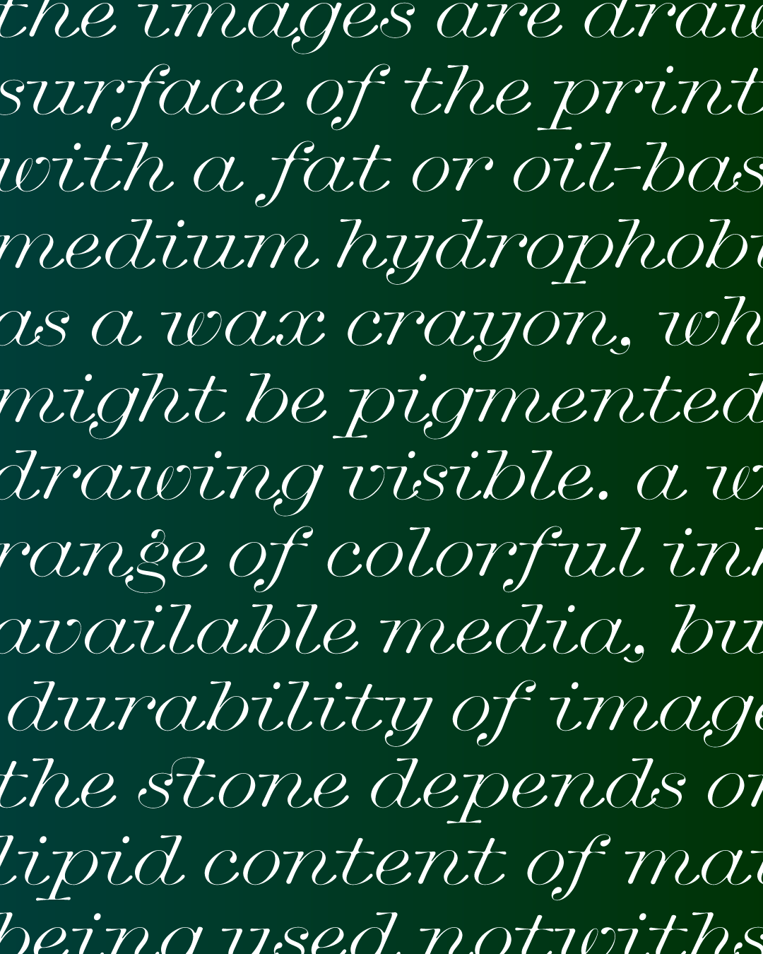
This month I’m sending you Club Lithographer, a sketch I’ve been playing with on-and-off since 2017. It’s a wide-set italic with elongated serifs, blobby outstrokes, and an unusually steep 24° angle. (My italics tend to be in the 10°–15° range.)
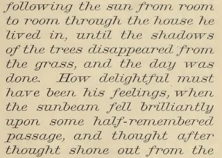
Lithographic Italic, as shown in De Vinne’s 1891 Specimen
As I am wont to do, I started this sketch after seeing something I liked in a Victorian-era specimen book. This time, the spark was Lithographic Italic, credited to Andrew Little and published by A. D. Farmer & Son in 1873.
Ever since the angular chancery cursives of the Renaissance, Italics have tended towards the narrower end of the typographic spectrum. In contemporary use, this helps create a contrasting rhythm between Italic forms and their wider Roman counterparts when they are set together in a block of text.
I think this is why Lithographic Italic feels so refreshing to me: with no Roman counterpart to speak of, there is no need to squeeze. There’s no hint of choppiness or angularity, and you can feel the laconic freedom that each letter has to take up as much space as it pleases.
While Club Lithographer follows its Victorian predecessor closely in its overall proportions, it diverges greatly from the rigid and spartan drawing style of the original. In my rendition, I tried to take advantage of all the extra space to make something curvier and more free-flowing. I played up the expansion contrast present in this style of lettering, letting the weight quickly swell up in the downstrokes in a way that’s reminiscent of the expanding nib of a pointed pen when pressure is applied.
I admit I know very little about pointed pen calligraphy (and most of what I know comes from videos of Erik van Blokland’s pointed pen tool). But what I do know is that serifs and outstrokes in this style tend to be hairlines, where there’s very little pressure on the nib. I decided that the imagined calligrapher behind Club Lithographer should do the opposite, punctuating the beginnings and endings of strokes with expressive blobs.
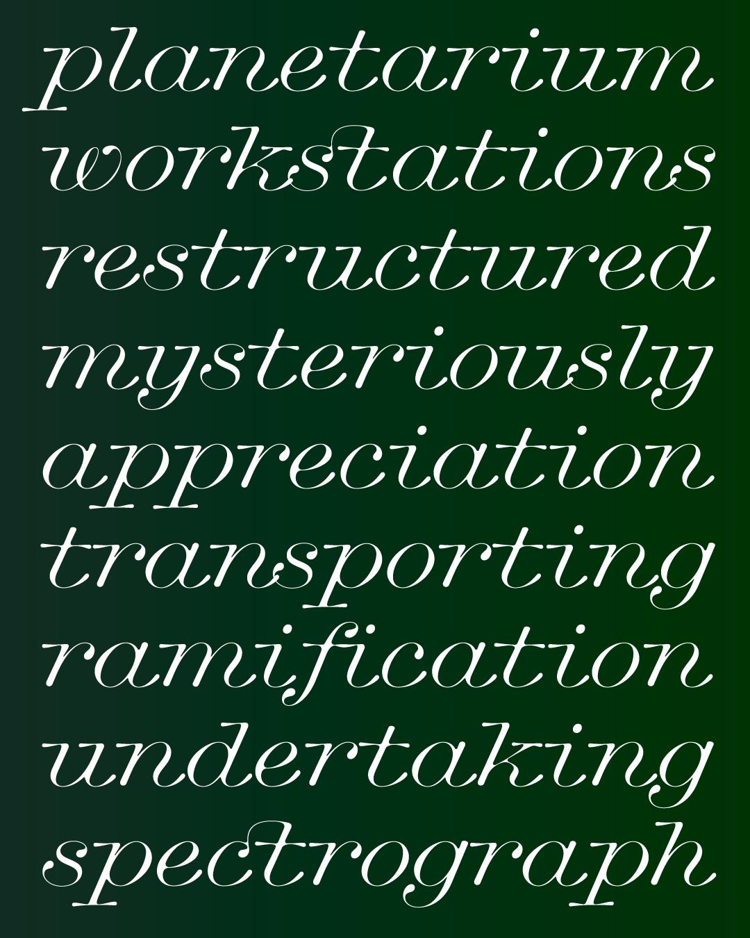
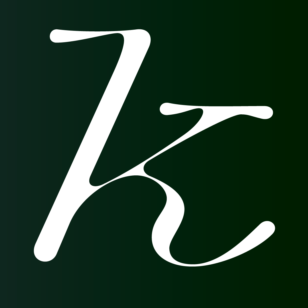
You might have already noticed one conspicuous omission in this font: capital letters. If you want to think of this as a high-concept modernist reduction à la New Alphabet, I’m not going to stop you. If you want to think that I wasn’t happy with the capitals I drew, and was simply more interested in the lowercase’s asymmetry and syncopated rhythms, that might be slightly more accurate.
Either way, I hope you’re able to think of it as a fun constraint in your designs—a challenge to create an unexpected pairing of typefaces, or a challenge to sidestep the need for capitals altogether. 😉