October’s font of the month: Megabase Open
After the big Roslindale update I sent out in September, I figured I would go easy on myself this month and cross off something fun from my to-do list. Megabase has been one my favorite projects to work on this year, and ever since I sent it out in February, I’ve been dying to give it an inline companion.
Megabase Open involved relatively little drawing; I used some tools to help me carve out the space inside the thick strokes while matching the weight of the existing thin strokes. Then I manually cleaned up a few shapes (those tricky corners on A and M, for example), and voilà, it was pretty much good to go.
I could have stopped there; maybe I should have stopped there. But even the most straightforward project provides opportunities to trip and fall into a typographic rabbit hole, and fall I did.
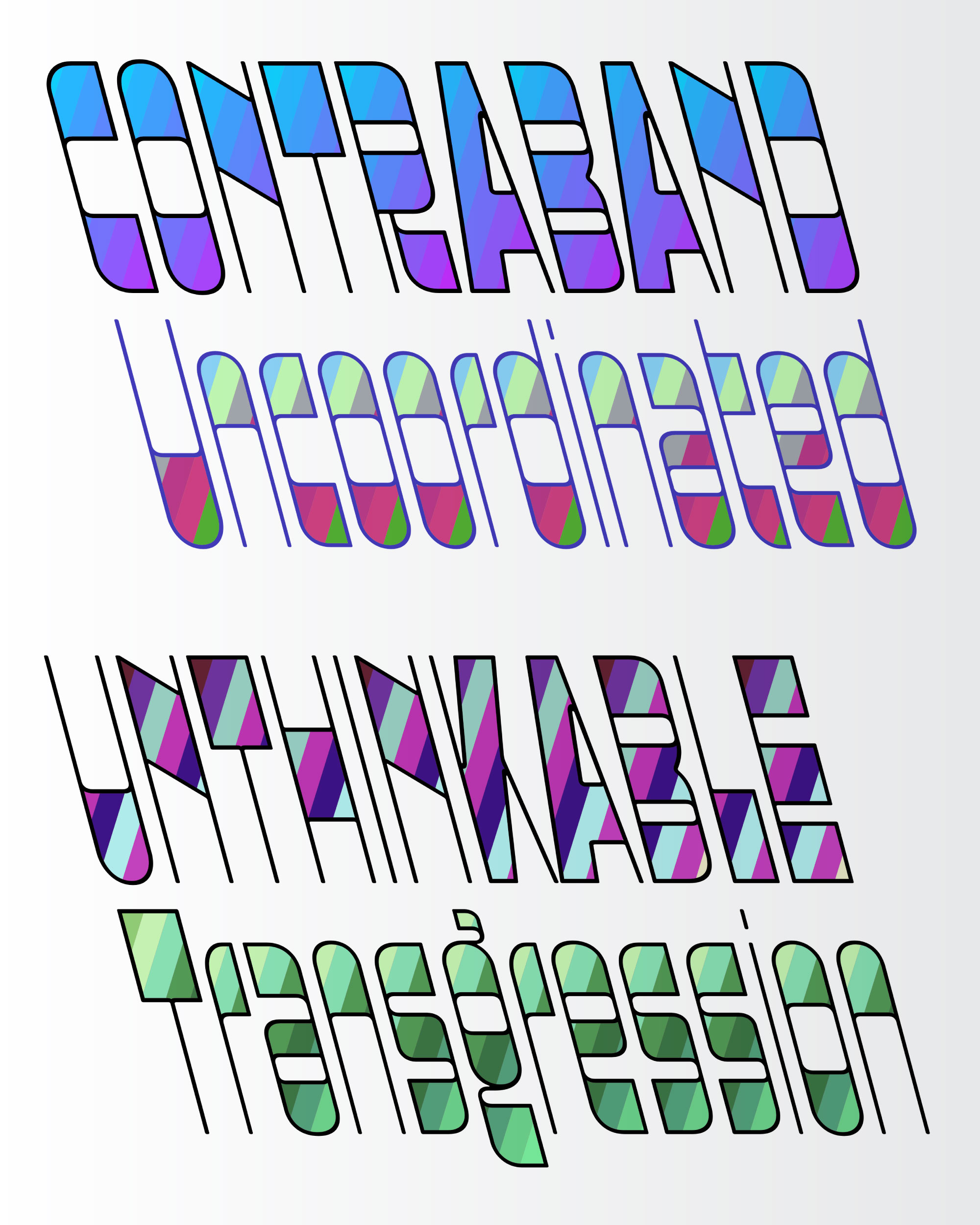
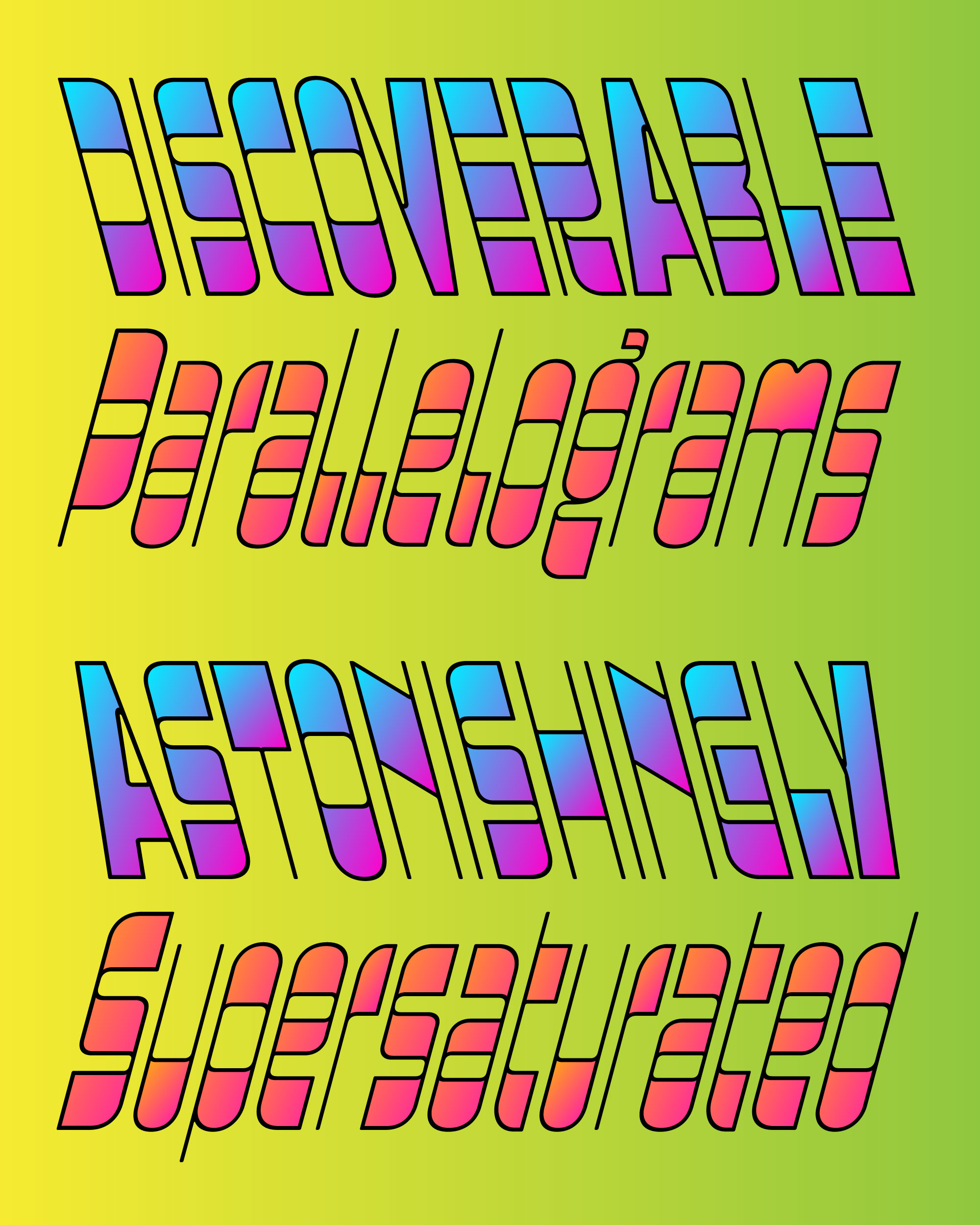
It irked me that Megabase Open doesn’t distinguish between the counterforms of the letters and the interior “cores” of the horizontal strokes. They are all just negative space. I felt I needed something more complex than black and white could offer, and I looked to color fonts to help fill the void...both literally and figuratively!
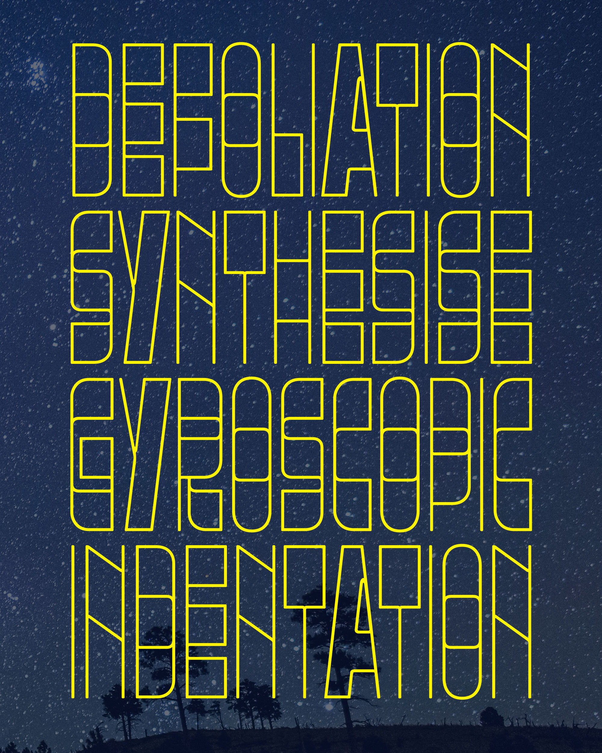
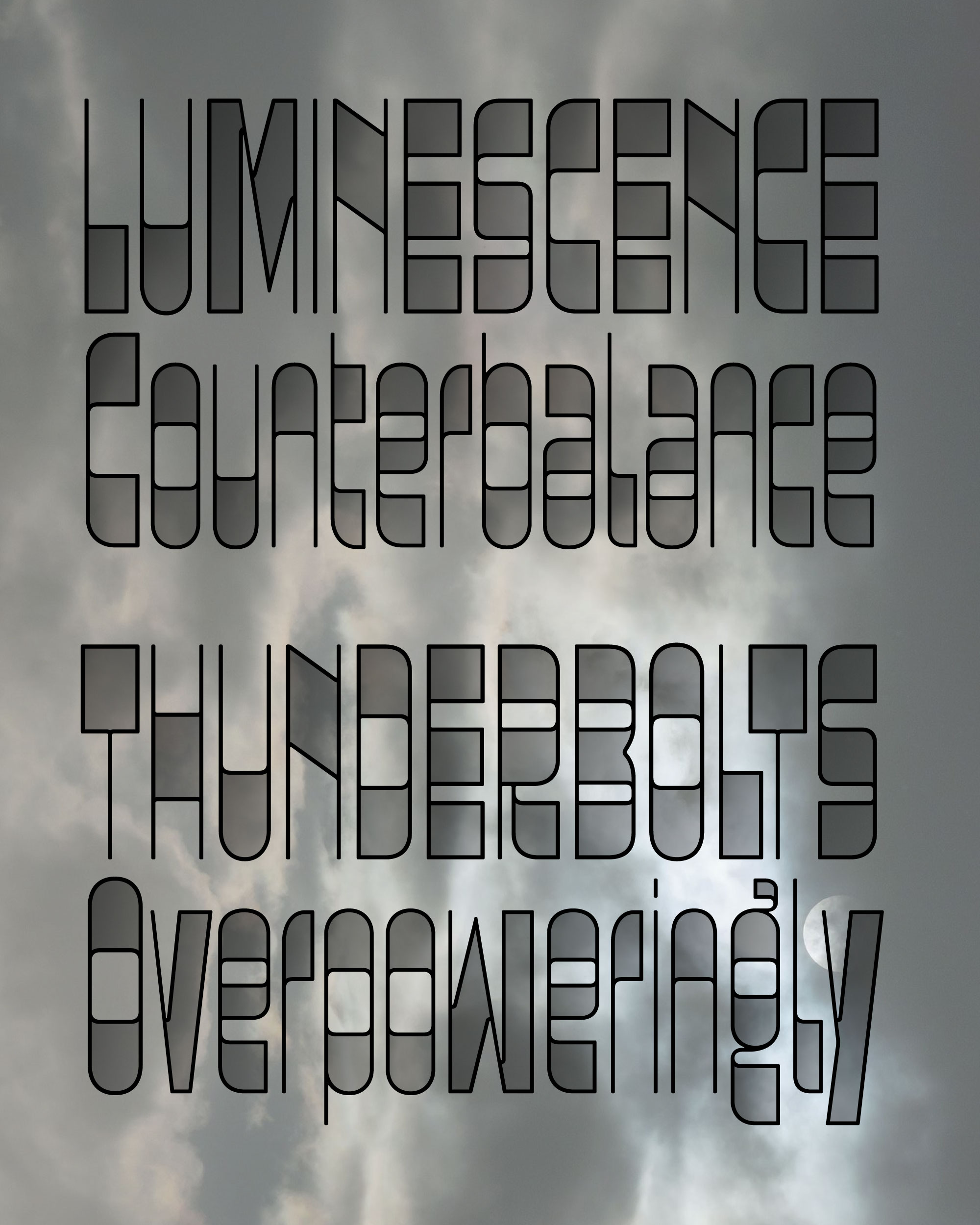
My first instinct was to make a a color font with no color at all. Megabase’s “Fade” style shown above simply plays with the opacity of the interior shapes, letting whatever is behind the type show through the letterforms veiled in a semitransparent grey, simultaneously interacting with the background and sitting on top of it.
Then, a couple weeks ago, longtime club member Agyei Archer happened to mention gradients to me during an unrelated chat, and it struck me that they could be the key to taking Megabase Open to the next level.
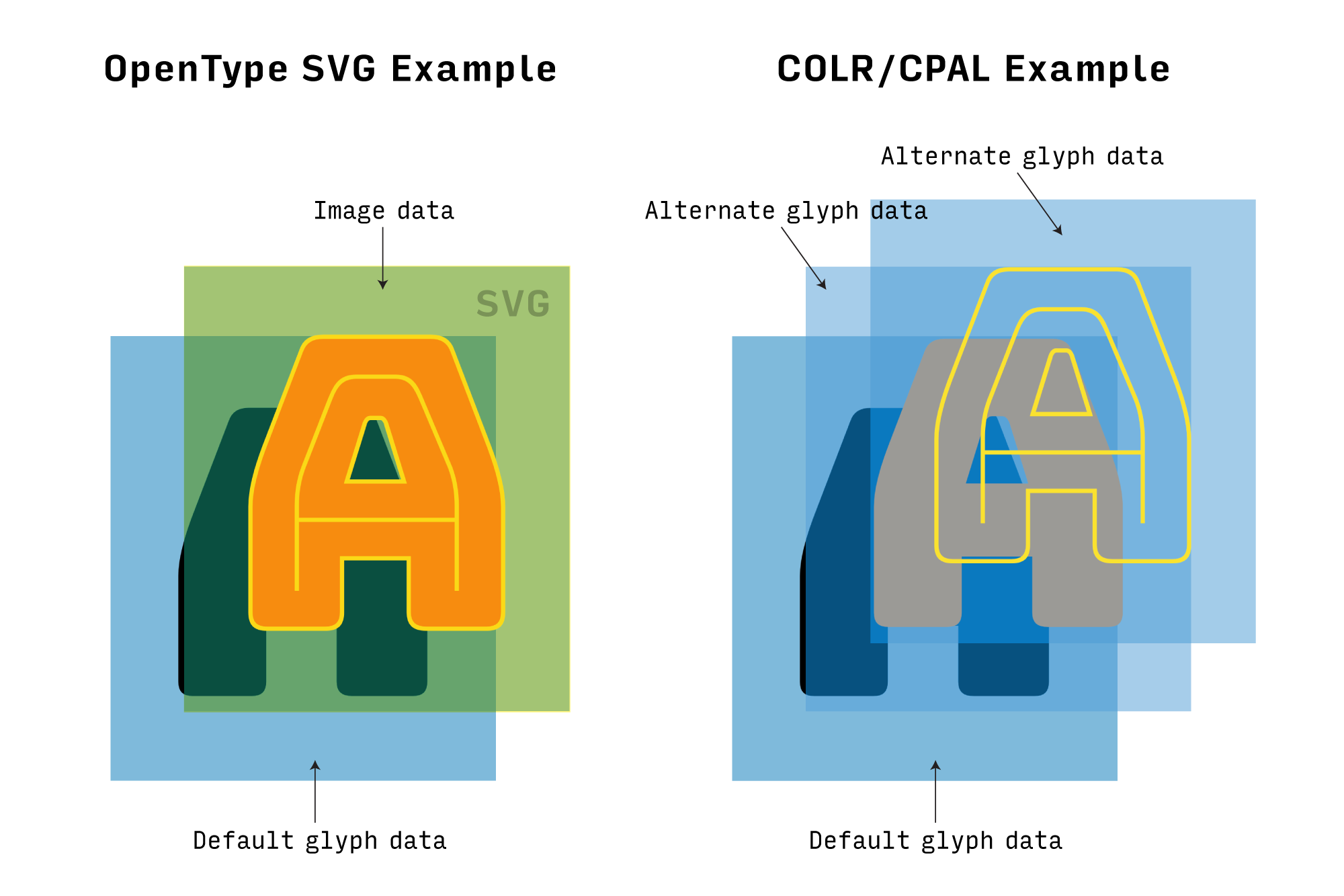
There’s a big problem with gradients, though: color fonts come in a few different flavors, and not all of them support gradients. For example, I know it is possible to include gradients in a SVG image and then embed it into an OpenType-SVG color font, supported in some Adobe apps. But I don’t know of a way to specify a gradient in a COLR/CPAL fonts that builds up layered glyphs by stacking up a font’s native glyph data. (There is a proposal to add gradients to COLR/CPAL, but it has not been implemented.)
COLR/CPAL could really use a catchier name, but it’s the only flavor of color font supported by all modern browsers, and as we’ve discussed in the past, it’s the only flavor of color font that can also be variable. I got a bit carried away running experiments on how I could approximate a gradient in a COLR/CPAL font using only outlines and flat colors.
I settled on an approach that effectively rasterizes the gradient, turning it into a series of narrow stripes of subtly varying colors. With every tiny stripe now stored in the font as an alternate glyph, a font with 800 glyphs turned into 8000. And then, in the spirit of just trying things out, I added a variable slant axis (and I actually kinda liked it).
Was all of this a good idea? Probably not, but you never know until you try. Even though I probably won’t include these styles in the final Megabase family, I’m excited to share them.
Chris Lewis helped me build a demo where you can try out the color variable gradient font, and users with the fonts can use my Color Font Customizer to download their own versions. The randomize button (↺) can yield some pretty intense results! 💈