February’s font of the month: Megabase
Most typefaces strive to set text with an even color. Of course, by “color” I don’t mean red or blue or purple, but rather the “typographic color” that describes the overall texture and density of text on a page or screen. Essentially, even color is what enables a typeface to remain more-or-less consistent regardless of what words are being set.
If even color is the measure of a typeface’s success, then Megabase fails spectacularly. While the horizontal-stress fonts I’ve made in the past use their serifs to balance out the light and heavy parts of the letterforms, this month’s design has no serifs to fall back on.
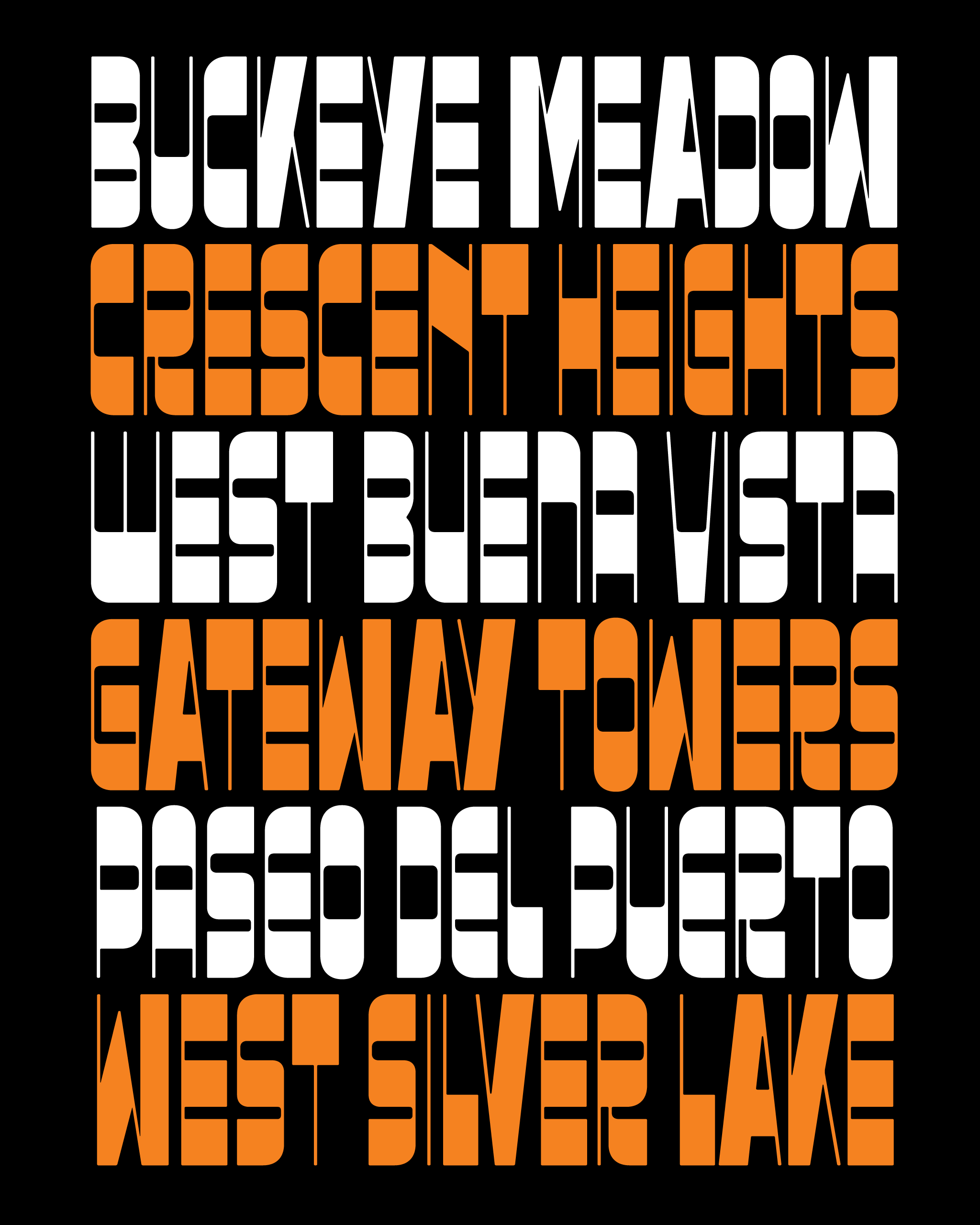
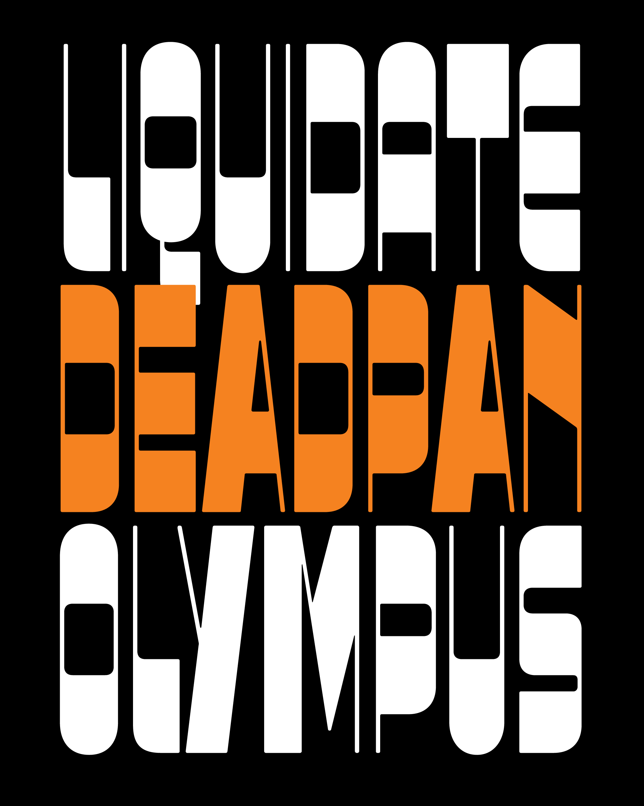
I forced myself to embrace Megabase’s uneven color, allowing top-heavy, bottom-heavy, and diagonal forms to stick out like sore thumbs and interrupt the flow of reading. Some words will have unsightly gaps in them, and others will feel way too heavy. The overall texture is punctuated by black bands at irregular heights, like the music roll from a player piano.
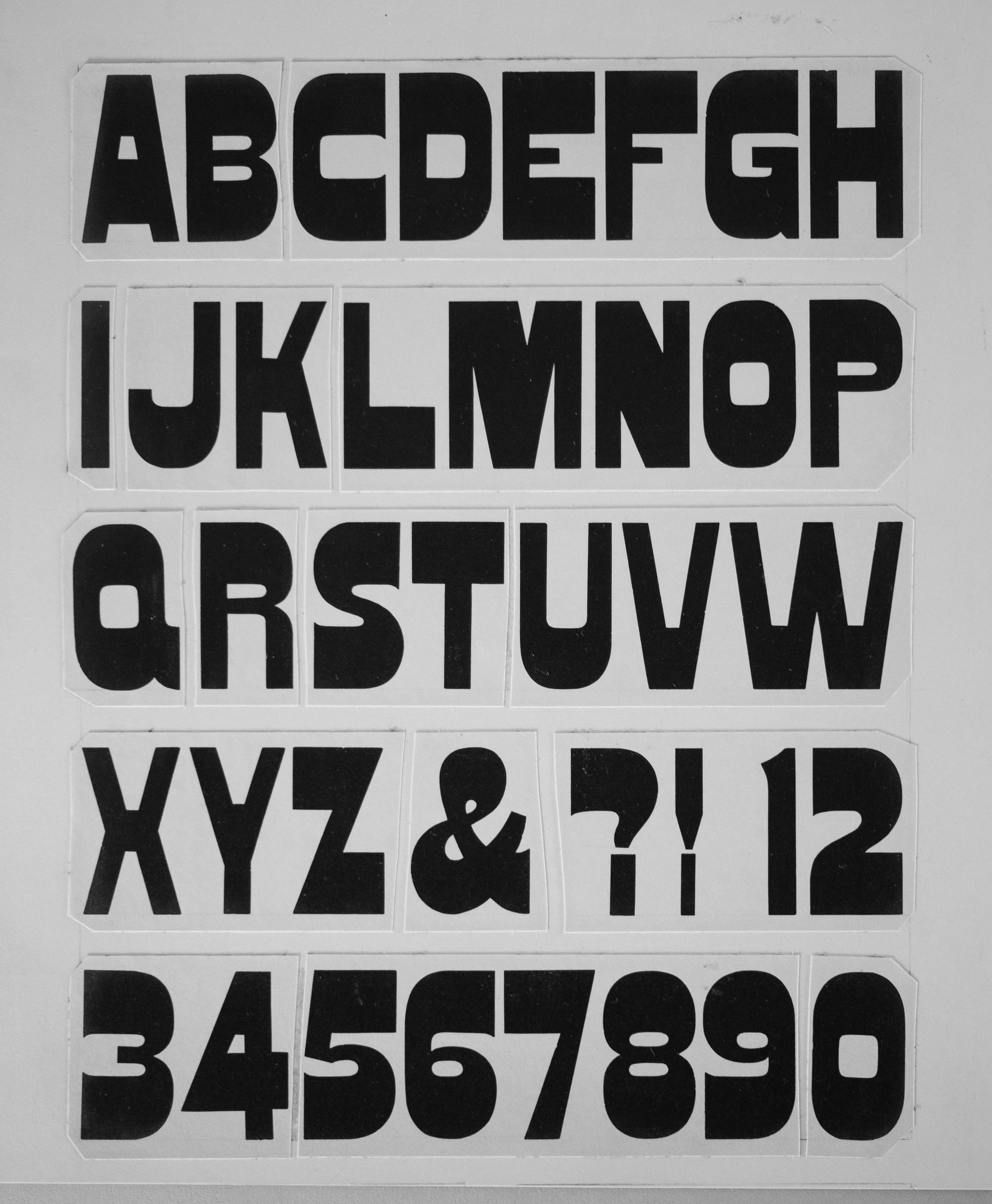
Typeface designers have been trying to solve the puzzle of the horizontal-stress sans since the early days of sans-serif type; examples of “Italians” with the serifs removed go back as far as 1840. I love these 19th-century designs such as Gothic Bold (pictured above), and how clunky and uneven they dared to be.
The genre truly hit its stride in the late 1960s and early 1970s, taking on a new space-age resonance with typefaces such as Sintex, Strada, and Zipper. I don’t think I’m 100% satisfied with any of the individual faces from this era (except maybe Jackson), but I definitely sought to capture some of their funkiness in my interpretation.
Interest in the horizontal-stress sans continues to this day. Recent releases include Anouk, Maelstrom Sans, and Signal Compressed, and just the other week, we learned that Cheee began as an interpretation of Sintex.
I’m not entirely sure what I’m trying to do with Megabase, but I think I’m interested in synthesizing the lumbering unevenness of the 19th-century designs with the slick sci-fi curvature of the 20th-century ones.
While most faces in the genre compensate for their thick tops and bottoms by thinning out the middle strokes, Megabase lets all horizontals remain thick. And unlike its forbears, Megabase uses different thicknesses depending on how busy the letter is: T (one horizontal stroke) is thicker than C (two horizontal strokes), which in turn is thicker than E (three horizontal strokes). This sacrifices horizontal alignment between letters, but adds a nice little bounce as the eye travels across the different heights.
The most volatile part of the design is the diagonal strokes, which abruptly break up the system of thick tops and bottoms. The default diagonal forms follow the example of 19th-century designs, reversing the thick-thin contrast of the modern Roman. These thick vertical and diagonal strokes are super disruptive, but I like how they add a bit of chaos and energy.
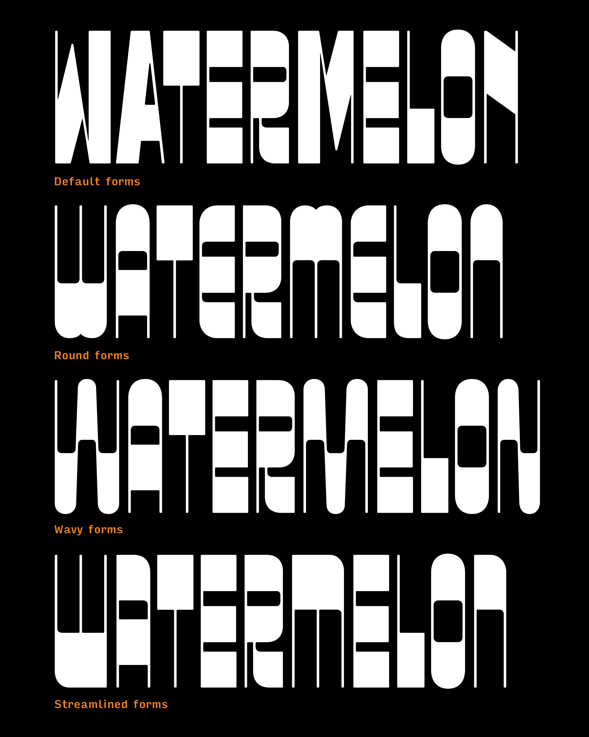
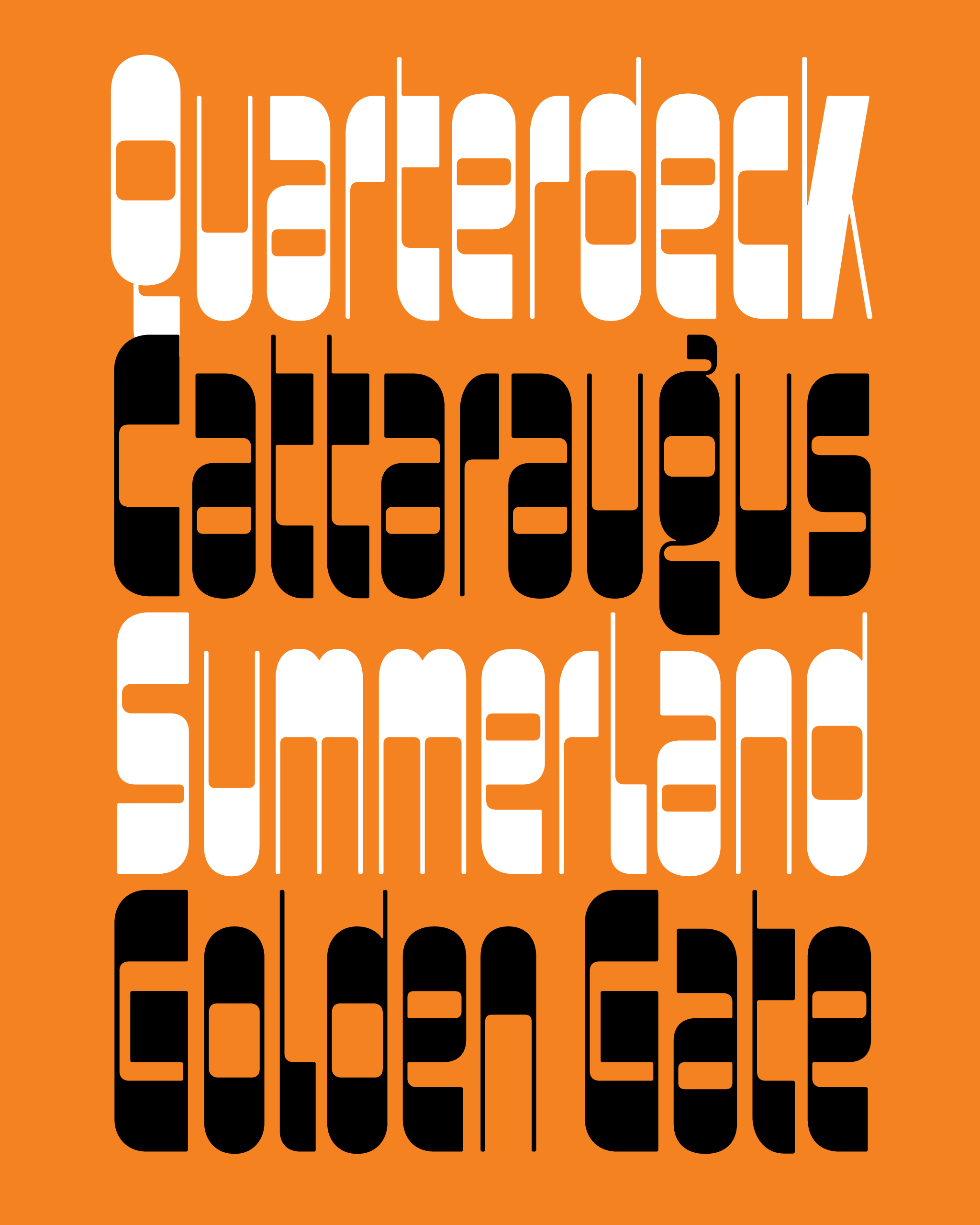
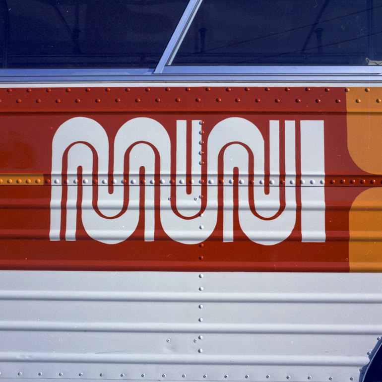
I’ve also included several alternate sets to give you some control over this volatility. The round forms are more consistently horizontal, and have more of that 70s vibe. The wavy forms take that even further by echoing the designs of the Copacabana sidewalks and the MUNI worm logo. Meanwhile, the streamlined forms go in the other direction, introducing hard corners and asymmetry that feel a bit darker and more severe.
Before I sign off, I want to say thank you to Nick Sherman for coming up with the name Megabase, and André Mora for the helpful critique of the typeface.
I hope that you enjoy Megabase, and that it gives you an excuse to explore all of the other wacky and wonderful designs from this little corner of the typographic universe.
Megabase was supplemented by Megabase Open in October 2018 and is related to Megavolt and Megazoid.