July’s font of the month: Tortellini
What follows is an abridged version of the Font of the Month Club’s July mailing:
I’ve named my slab serifs after pastas before, and I’ll probably name my slab serifs after pastas again.
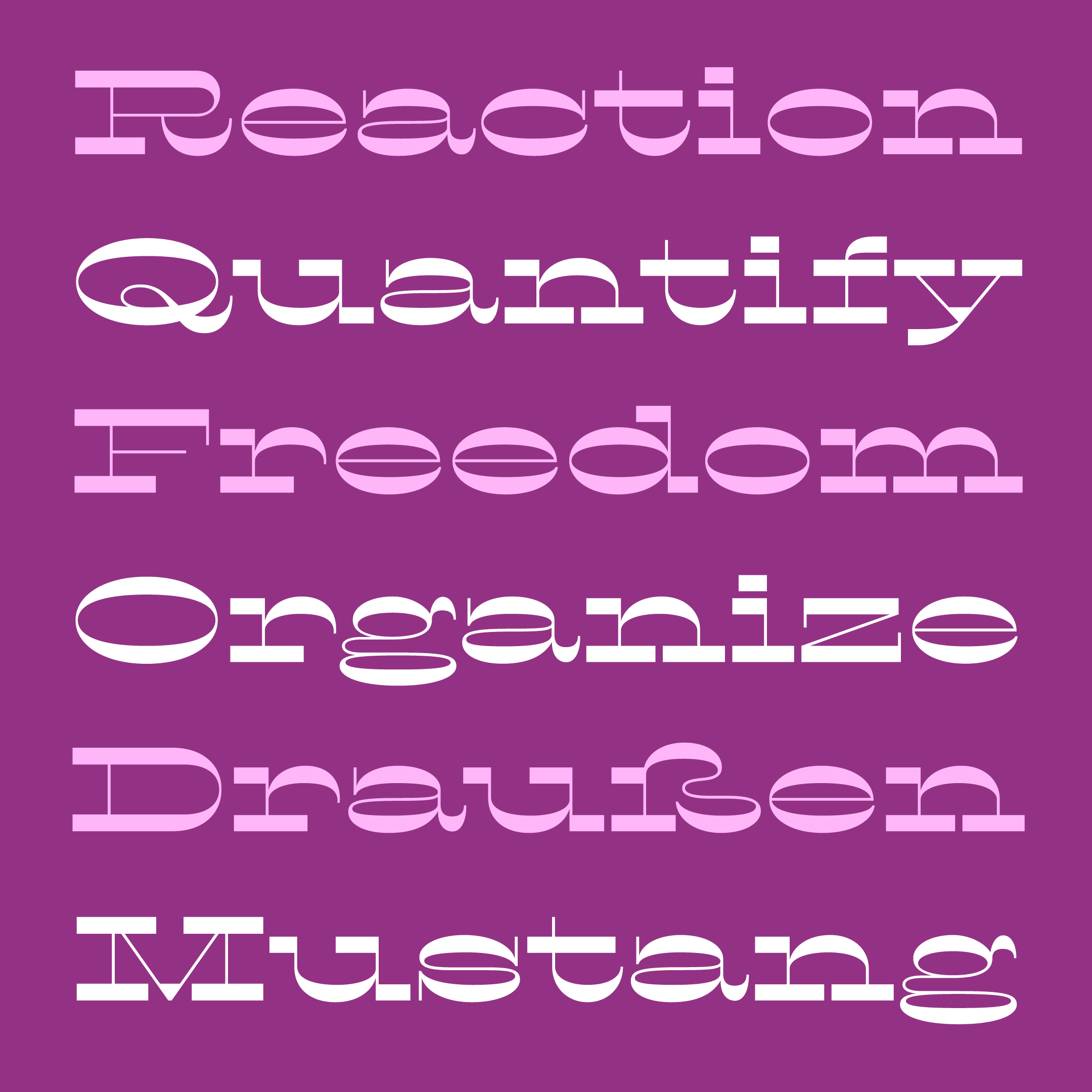
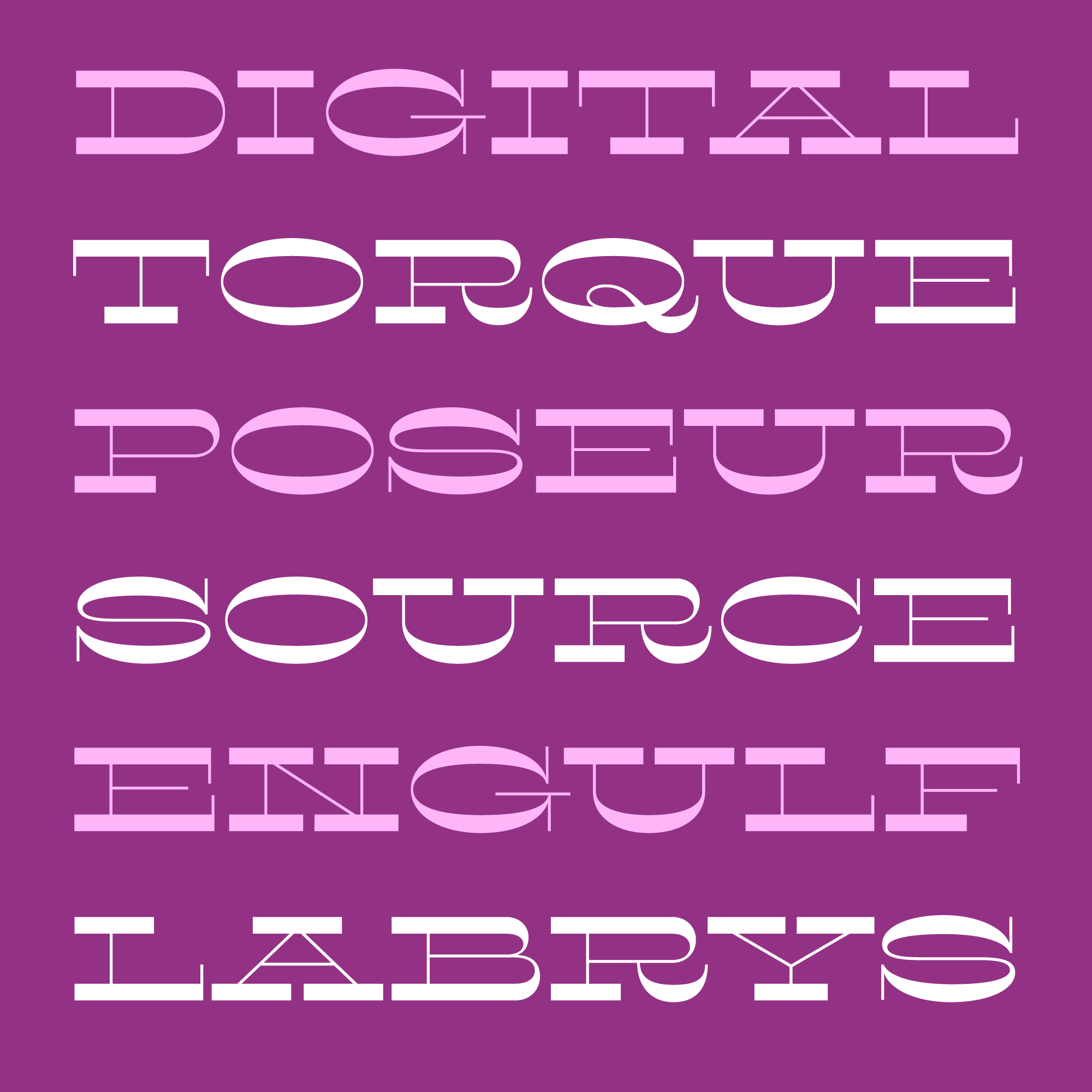
But this month’s font, Tortellini, is different. It goes beyond a mere connection to Spaghetti Westerns and the horizontal-stress “Italienne” style. Like the stuffed, ringlike forms of its namesake pasta, Tortellini is all about the round shapes.
I originally started this typeface intending to make a wide companion for the condensed Pappardelle (Font of the Month, October 2017). But I quickly realized that taking the same concept and making it wider was not going to be nearly as straightforward as I wanted it to be.
As the letters get wider, the slab serifs grow longer. Letters with asymmetrical serifs (like i and u) become even more asymmetrical and start to feel weird alongside the symmetrical letters (like x and o). And because the slab serifs carry so much of the weight in this design, this can throw everything out of whack.
Of course there are several contemporary exemplars of horizontal-stress slabs with a wider stance (Arbor, Brylski, Maelstrom, and Orwellian come to mind). But I decided to go back to the old specimen books and see how 19th-century Extended French Antiques addressed the problem.
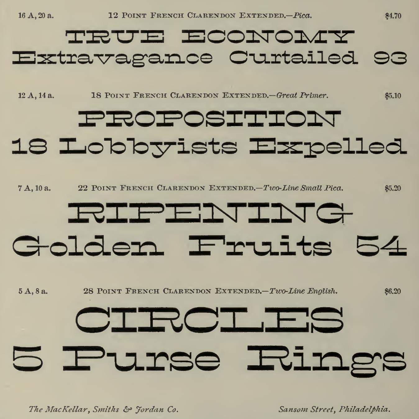
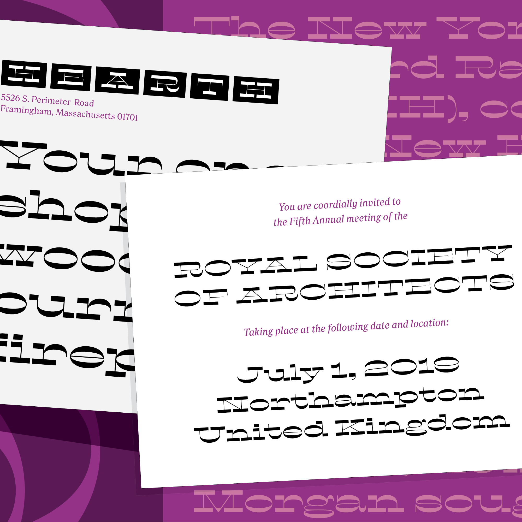
I was surprised by how round the round shapes were, and how off-balance they felt next to the long, squared-off slabs. I was intrigued by how all of these off-balance letterforms managed to come together in a funky, syncopated rhythm (the word “Golden” in the image above is a great example of this).
With Tortellini, I tried to take this unique rhythm and push it further...not only in terms of width, but also in terms of the contrast between ovals and squares. Tortellini’s proportions are wider (and more consistent), its hairlines are thinner, and the curves of its ovals are rounder and more elastic.
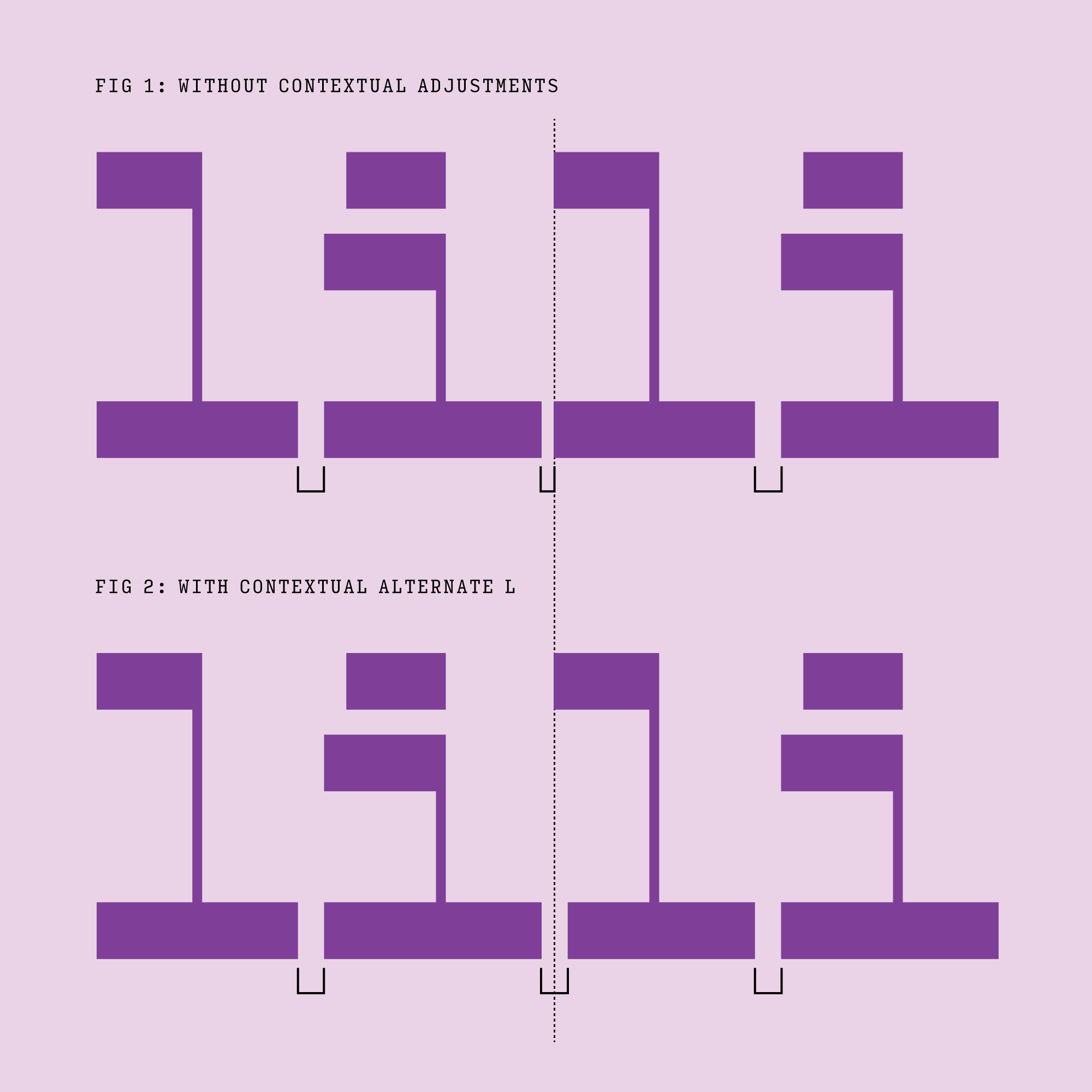
At the risk of getting too nerdy, let’s talk about one last thing: serif gaps.
Bethany Heck recently mentioned to me how important the intervals between serifs can be in slab serif typefaces, especially when the serifs are as thick as Tortellini’s.
It can be tricky to maintain consistent serif intervals while also managing the space between the letters as a whole. For example, in a serif typeface the lowercase l is often spaced tighter than the lowercase i to compensate for the extra whitespace created by the l’s raised serif. However, this has the unfortunate side effect of making the serif gap tighter as well (see Fig. 1, above).
To address this, I’ve included a set of contextual alternate letters to “mind the gap” in certain situations (Fig. 2), subtly shortening certain serifs to maintain both serif gap and overall letterspacing. I don’t think this is a perfect solution, but I thought it was worth a shot!
If you dive into the PDF specimen, you’ll see that Tortellini also comes with a set of alternate diagonals with fewer serifs, as well as some bizarre glyph shapes in the character set...check out the ß!
Tortellini is July’s installment of Font of the Month Club. Sign up this month to get Tortellini, as well as two mystery fonts, for as little as $24!