June’s font of the month: Forma DJR Chiaroscuro

What follows is an abridged version of the Font of the Month Club’s June mailing:
This month’s release is a (relatively) simple one: a pair of unreleased weights from Forma DJR. I have dubbed the set Forma DJR Chiaroscuro because it contrasts the heaviest and lightest weights from the still-growing family (and the Italian origin of the term doesn’t hurt).
After issuing so many serif faces last year, I’ve been making a conscious effort to spend more time in the world of sans. But for any club member who is shocked to receive two “conventional” sans-serifs in a row, please do not worry: weirder stuff is on its way. 😉
I had never heard of Forma when Roger Black commissioned me to revive it. Forma was released in 1968 by the Italian foundry Nebiolo. Forma was more-or-less Nebiolo’s answer to the success of neo-grots like Helvetica and Univers, and they claimed that it possessed a warmth that was missing from other typefaces in the genre. You can read more about the unusual of history of the typeface on Type Network’s minisite, or in this recent history published by CAST.
I released the revival in 2016 as Forma DJR, with five optical sizes and five weights, from Extra Light to Bold. I had toyed around with the idea of pushing the design even bolder than Bold, but never seriously pursued it.
The following year, the branding agency Today commissioned a Black weight for Forma as part of their rebrand of VRT NWS, the news outlet for Belgium’s Flemish-speaking national broadcaster. Type Network did a great write-up of the rebrand, and I cannot tell you how satisfying it is to see Forma’s numbers in use for the weather forecast! ⛅️
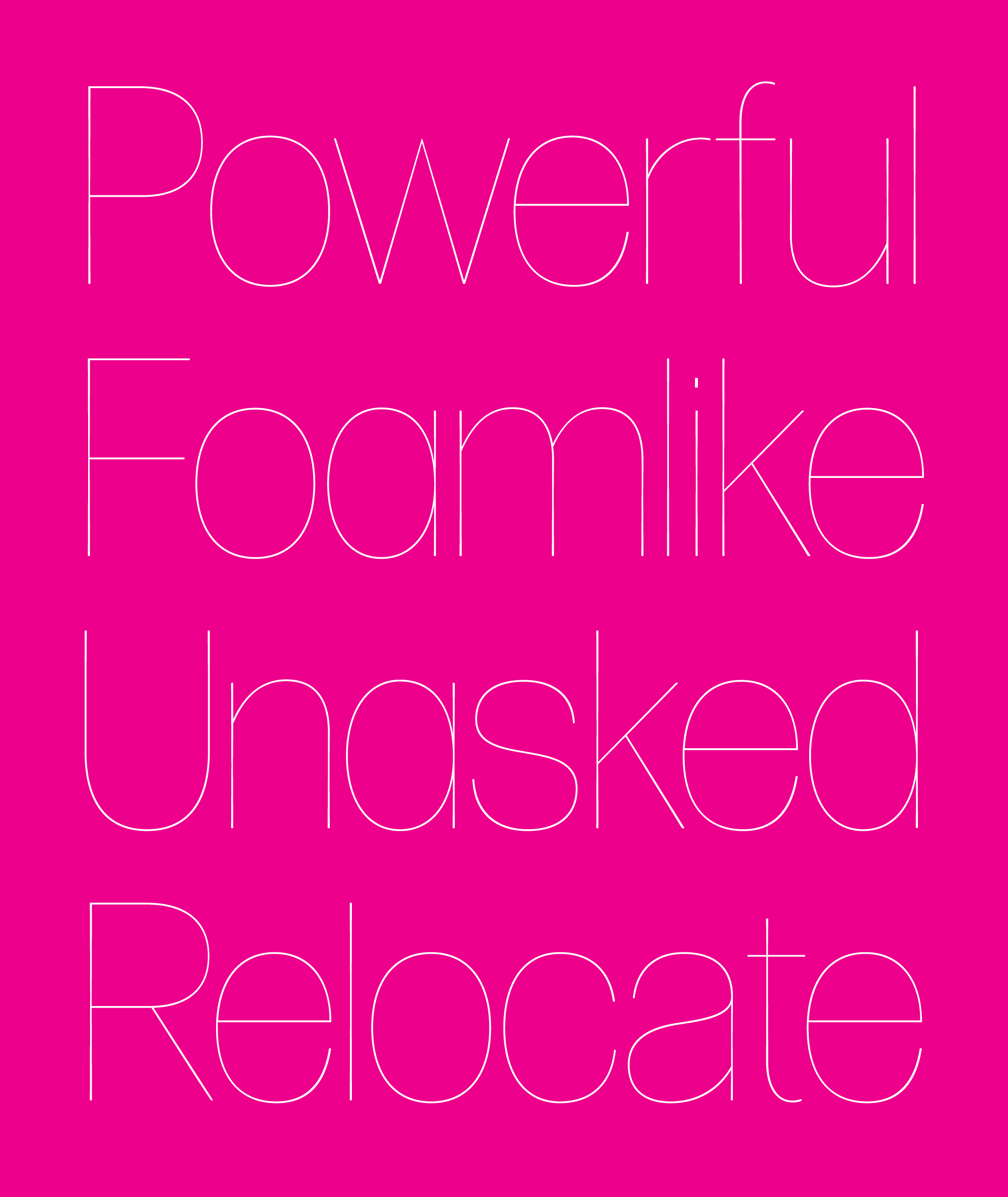
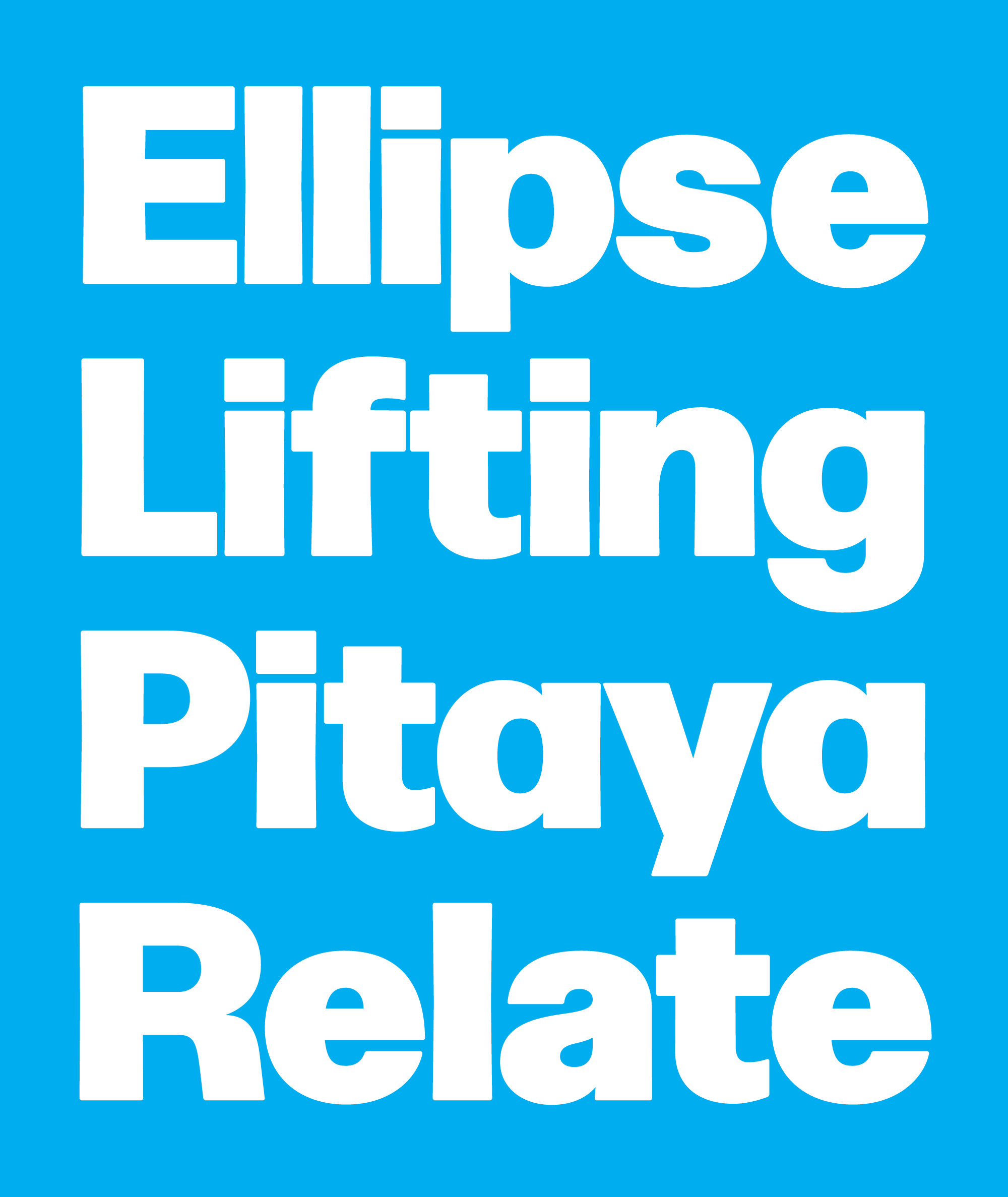
Because the family was always meant for large, fashiony displays, the next logical step was to go thinner. Forma DJR’s telltale rounded corners and tapered strokes made this a challenge; after the design is reduced to its skeletal form, even the most subtle shifts in weight become super-noticeable. In the end, I decided I was okay with it. Those adjustments are what sets this apart from most hairlines that are always trying to be clean and perfect.
Because the weights are so extreme and the spacing is so tight, I recommend that you use this typeface at large sizes. I hope that this release is useful to you, whether it is used alongside the retail family, mixed with Forma’s slab-serif cousin (issued six months ago), or used on its own.
Forma DJR Chiaroscuro was June’s installment of Font of the Month Club. You can still get it as a back issue if you sign up for the club!