December’s font of the month: Dattilo DJR
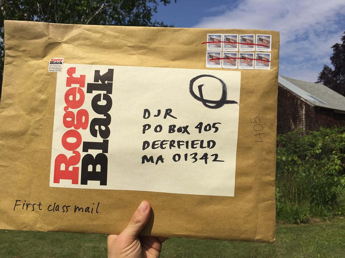
Last summer, I received a big envelope in the mail from Roger Black. You might already know that I worked with him on a revival of Forma, the sans serif published by the Italian type foundry Nebiolo in 1968. But what you might not know is that Nebiolo also produced a slab serif counterpart to Forma in the early 70s called Dattilo. And what Roger’s envelope contained was a handful of original specimens of that design.
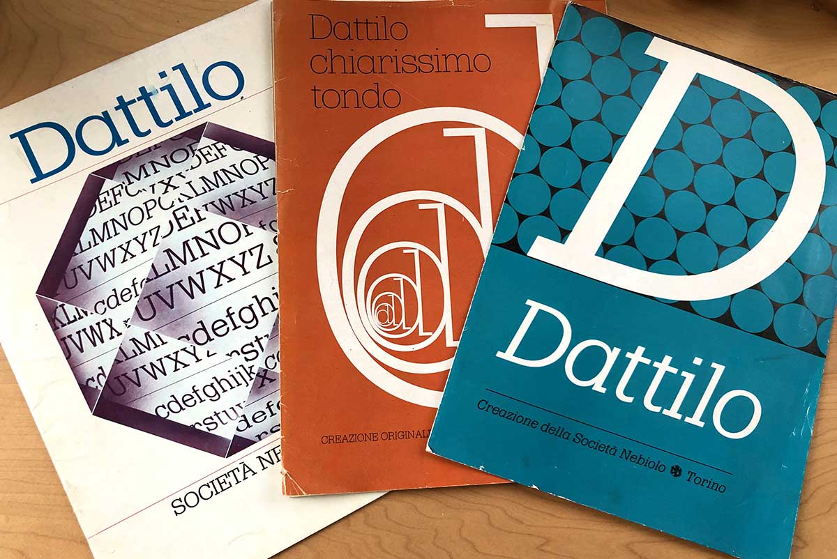
Forma and Dattilo share an interesting history as the product of a committee of eight prominent Italian graphic designers led by Nebiolo’s art director, Aldo Novarese. The struggling foundry assembled this committee to create a new “universal” typeface that would compete with the likes of Helvetica and Univers. Indra Kupferschmid documented this unusual tale of design-by-committee in an article that accompanied Forma DJR’s release, and even more detail can now be found in a pair of recent articles by Alessandro Colizzi. Just like Forma, Roger has admired the design for decades, even commissioning a phototype version from Jim Parkinson for a 1977 cover of Rolling Stone when the original metal was unavailable.
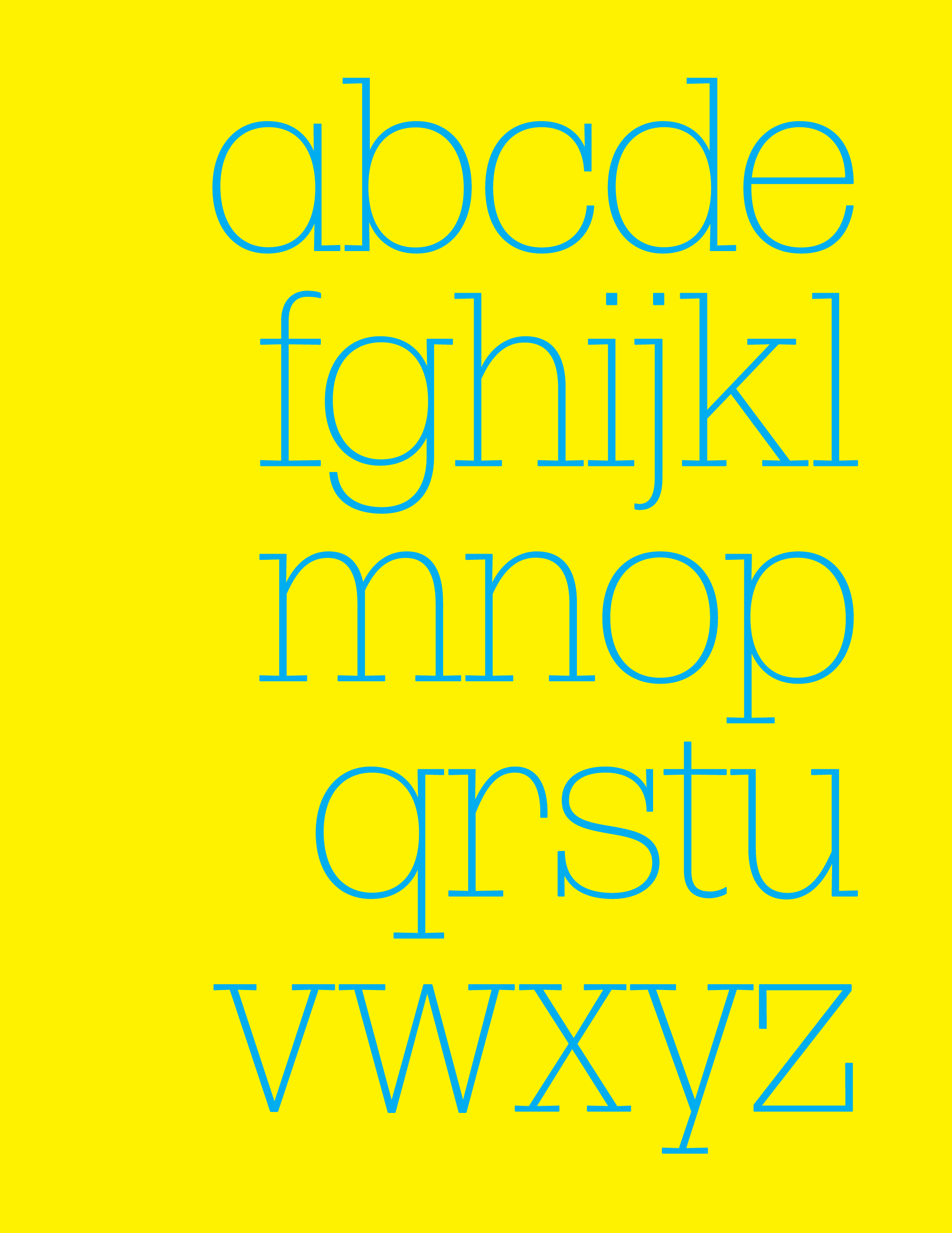
With our revival of Forma published in 2016, a complementary revival of Dattilo seemed like a natural next step for the design system. And this month I’m happy to share with you a preview of the lightest weight of the largest size of the new in-progress family: Dattilo DJR Banner Extra Light.
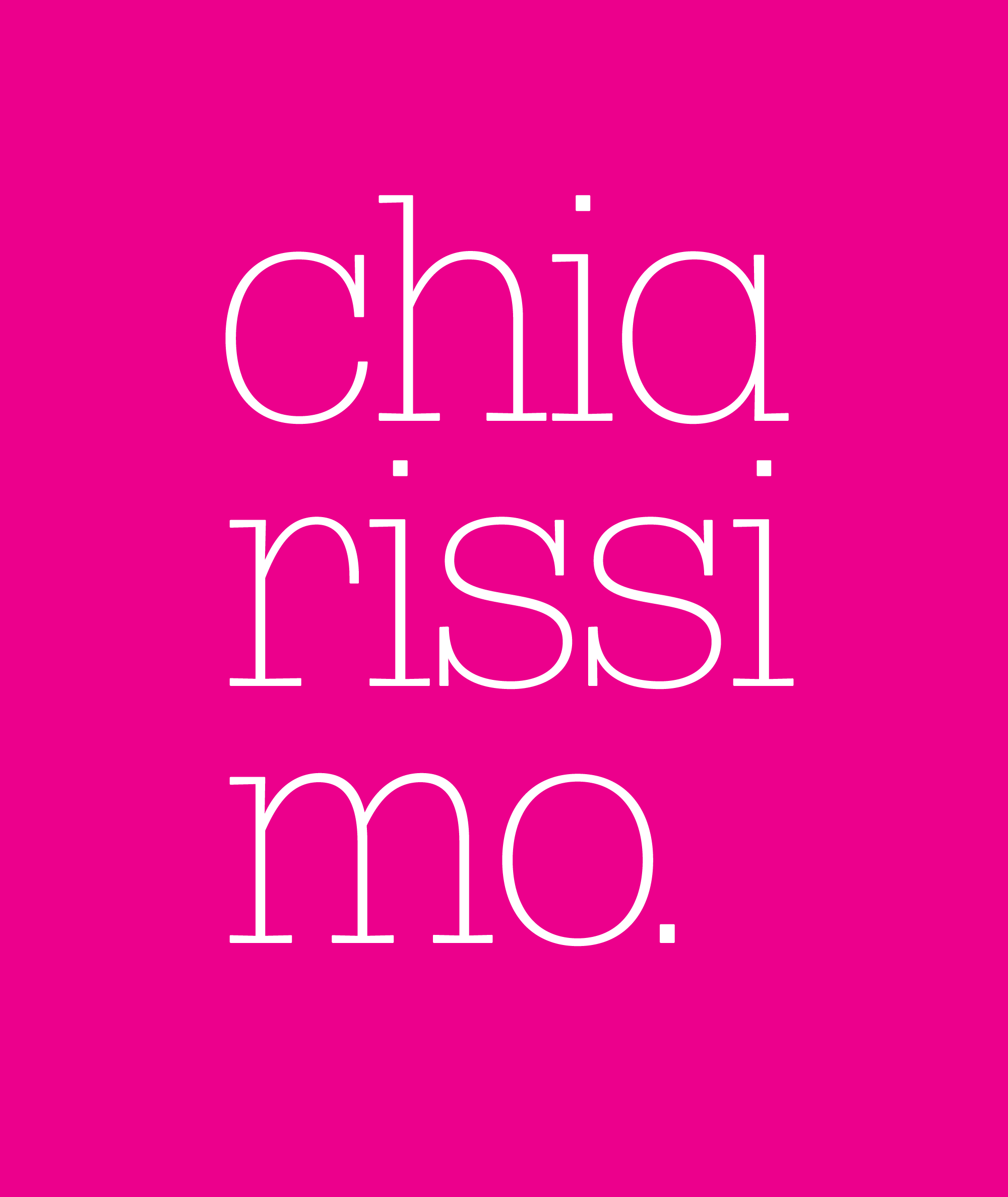
Picking up where Forma DJR left off, my interpretation of Dattilo is guided by the things that Roger loved about this era of typesetting: the meeting of lofty ideals of universality and perfection and the realities of working with ink, metal, and paper. Rather than trying to achieve the most beautiful or perfect shapes, I was focused on conveying some of the design’s physicality. So you can see slight variations in stroke contrast, as well as blunted corners and ever-so-slightly tapered serifs...but no tapered stems this time!
One of Forma’s defining characteristics is its super-tight spacing, which is a bit harder to achieve in Dattilo with all those serifs in the way. But that additional space endows Dattilo with an interesting rhythm and a typewriter-influenced personality distinct from its sans serif counterpart. And the spacing still prioritizes closeness over a steady rhythm, giving text a 70s vibe.
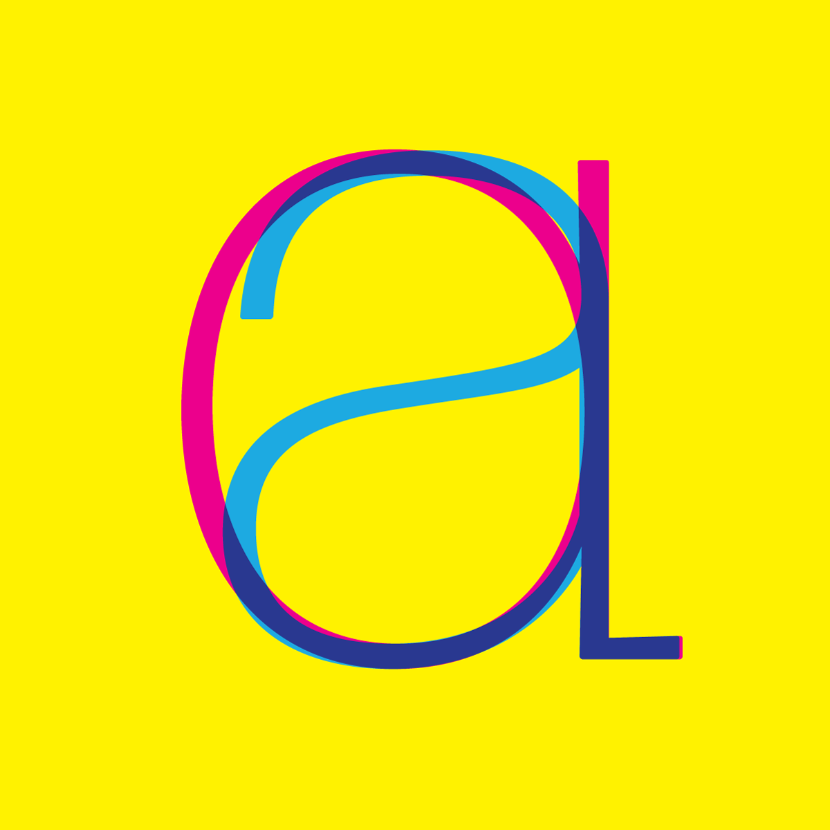
A few of Dattilo forms diverge from Forma’s design, and instead borrow from Forma’s set of Swiss-style alternates, including the R with a curved leg and the bearded G. And while Dattilo retains Forma’s trademark single-story a, it does come with a two-story alternate.
Now that I’m sending the Extra Light to you, I’m going to use this as an excuse to spend some more time with the heavier side of the family, which diverges even more from Forma in its look and feel.
Dattilo DJR has already been used to great effect by Roger in the latest issue of Type Magazine (pictured below), as well as by Mark Porter in his recent redesign of Domus, the Italian architecture and design magazine. Now I’m excited to see what you do with it!
Dattilo DJR Banner Extra Light is available this month to members of Font of the Month Club. You can join for as little as $6/month, and gift subscriptions are available!