January’s font of the month: Roslindale Variable Italic

Earlier this week, I had the pleasure of sending out Roslindale Variable Italic to the members of the Font of the Month Club. Try it on v-fonts.com to get a feel for what it does. Here’s a little bit more about the design.
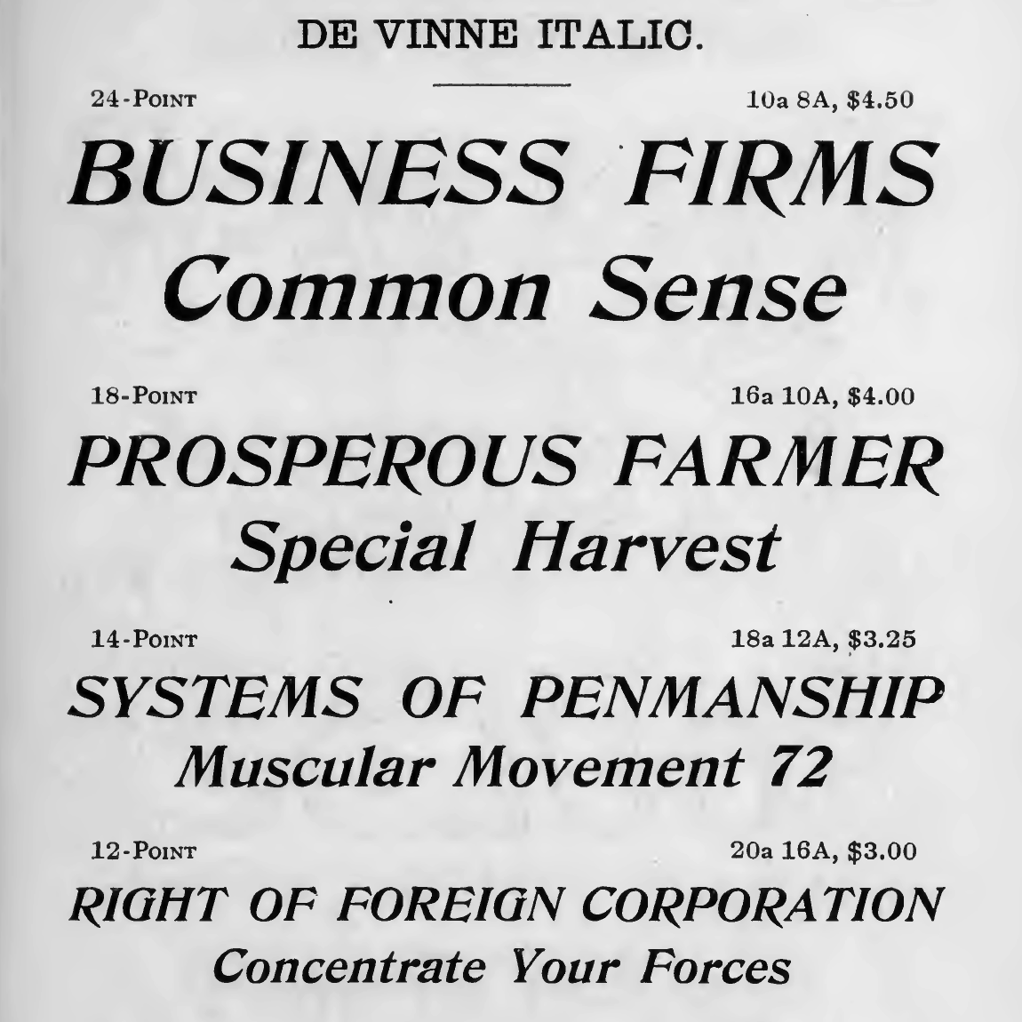
As you may remember from previous months, Roslindale is my take on the style of De Vinne, a typeface attributed to Gustav Schroeder and Nicholas Werner and released by the Central Type Foundry in 1892. The family grew over the following years to include De Vinne Italic, which was essentially a sloped version of the original Roman design.
But I didn’t feel like a sloped Roman was enough for Roslindale. Like De Vinne before it, Roslindale combines a rational structure typical of the Victorian era with echoes of historicized “oldstyle” shapes. And because Roz has a foot in both the “modern” and “oldstyle” worlds, I felt that its Italic should as well. (I should say that I have no problem with sloped Romans in general...in fact, I’m particularly proud of Gimlet’s funky Italics that juxtaposed sloped Roman letters with exuberant swashy forms.)

Compared to type family extensions like weights or widths, Italics can have an especially complicated relationship with their companion Romans. This is because they can differ from the Roman not only in slope, but can draw (to varying degrees) on an entirely separate calligraphic tradition of cursive forms with different letter structures, densities, and textures.
The recent(ish) introduction of OpenType Variations has made this complicated relationship more apparent: even though a variable font file can theoretically contain an entire family, it is often more pragmatic to maintain separate variable fonts for Romans and Italics if the designs are just too different to combine.
Variable Fonts also gives us an opportunity to rethink the role that an Italic plays in a type family. Could there, or should there, be a space between Roman and Italic? What would that even look like? Would it actually be useful to fine-tune the “italicness” of a font?
I honestly don’t know the answers to these questions, or if taking the time to explore them makes any practical sense. But there is some precedent for this kind of thinking in families like Auto and Arietta and even Dwiggins’s Electra that were drawn with multiple italics, I figured it was something worth playing with. With a sloped Roman in its DNA, Roslindale seemed like a suitable playground.
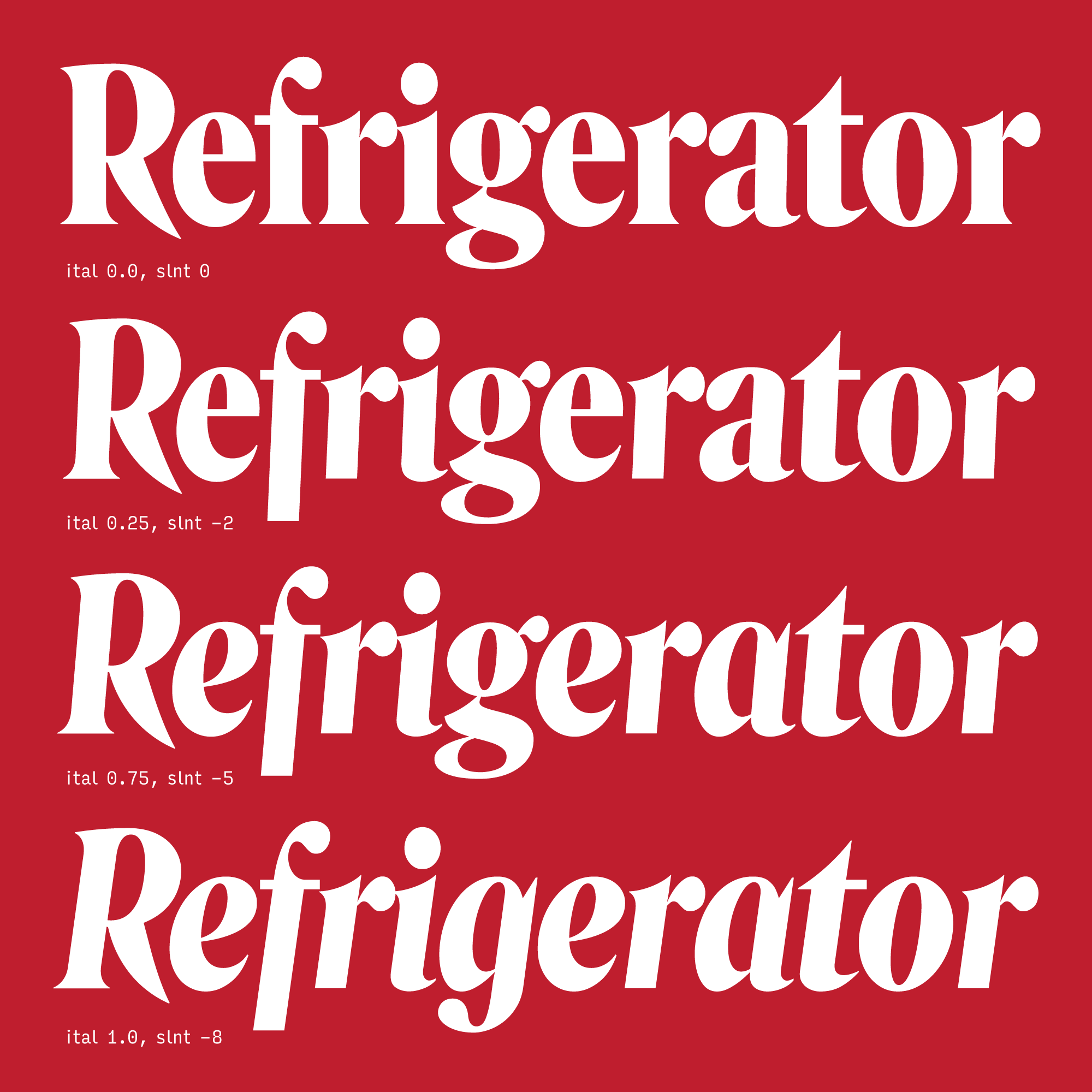
So, in addition to issuing the self-explanatory Roslindale Display Condensed Bold Italic (which I hope club members find useful, by the way), I also issued an experimental variable font called Roslindale Variable Italic. This font allows you to manipulate Roslindale’s “italicness” independently from its slant. Rather than drawing separate Roman and Italic masters, I drew alternate cursive-style forms in both upright and optically-corrected-oblique configurations. These are available as OpenType Stylistic Sets and also begin to appear (in a somewhat-logical progression, maybe?) as the variable Italic axis gets more and more Italic.

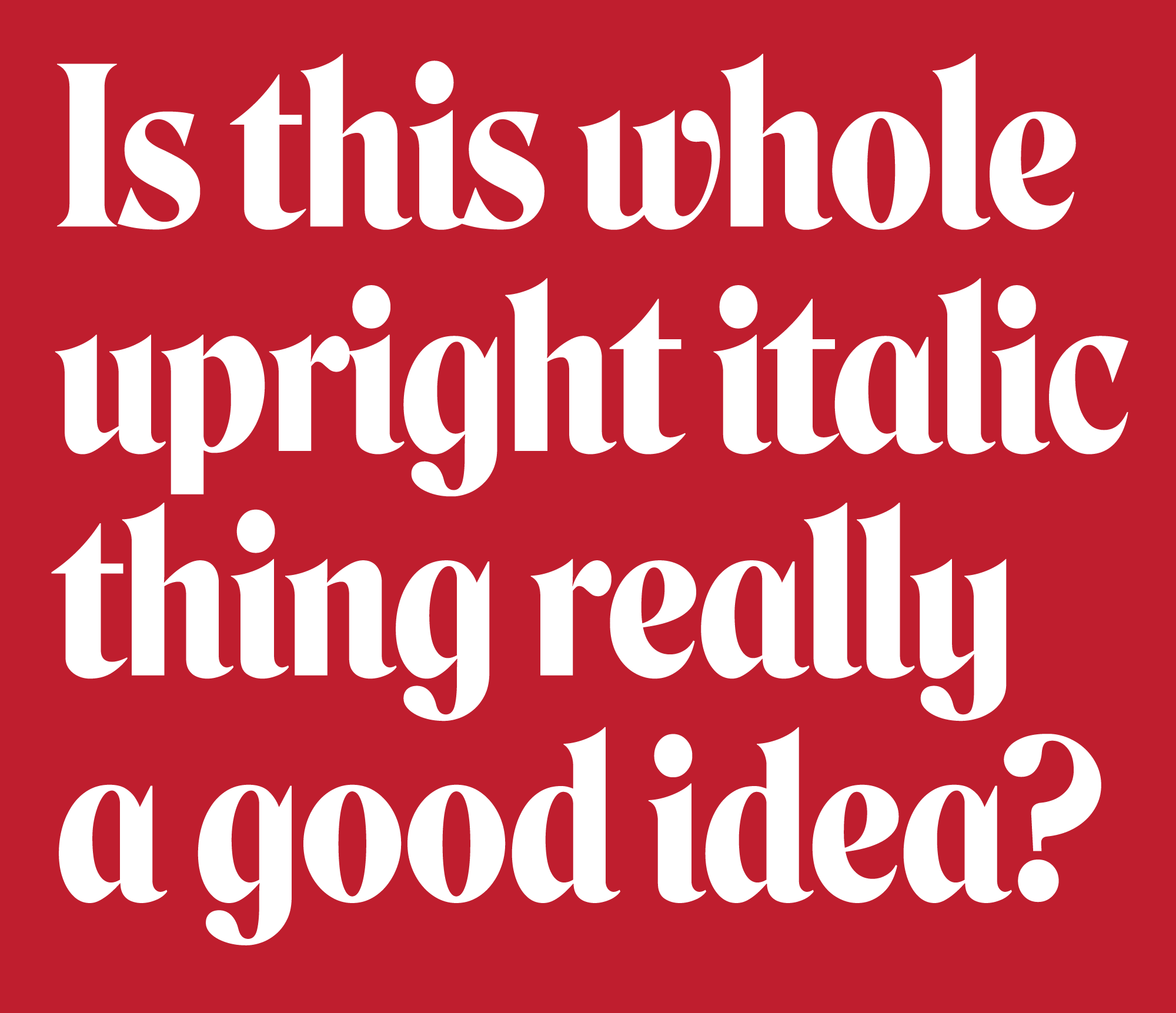
In addition to being able to customize the “italicness” of the Italic, this font also gives you the ability to incorporate Italic forms into the upright Roman as well. I was excited to see this part of the experiment dovetail with the upright cursive forms of ITC Bernase Roman, a 1970s interpretation of the same De Vinne style.

Roslindale Variable Italic is available to members of the Font of the Month Club; memberships go for as little as $6/month. If all goes according to plan, I’ll also send out a bonus version of Roslindale Variable that will incorporate all of the extensions that I’ve offered so far (Weight, Optical Size, and Italic), but only to those members who have also received Roslindale’s previous installments. So make sure you grab those back issues on the signup form!