Roslindale: releasing a work in progress
June’s Font of the Month, Roslindale is a condensed headline serif that takes its inspiration from De Vinne.
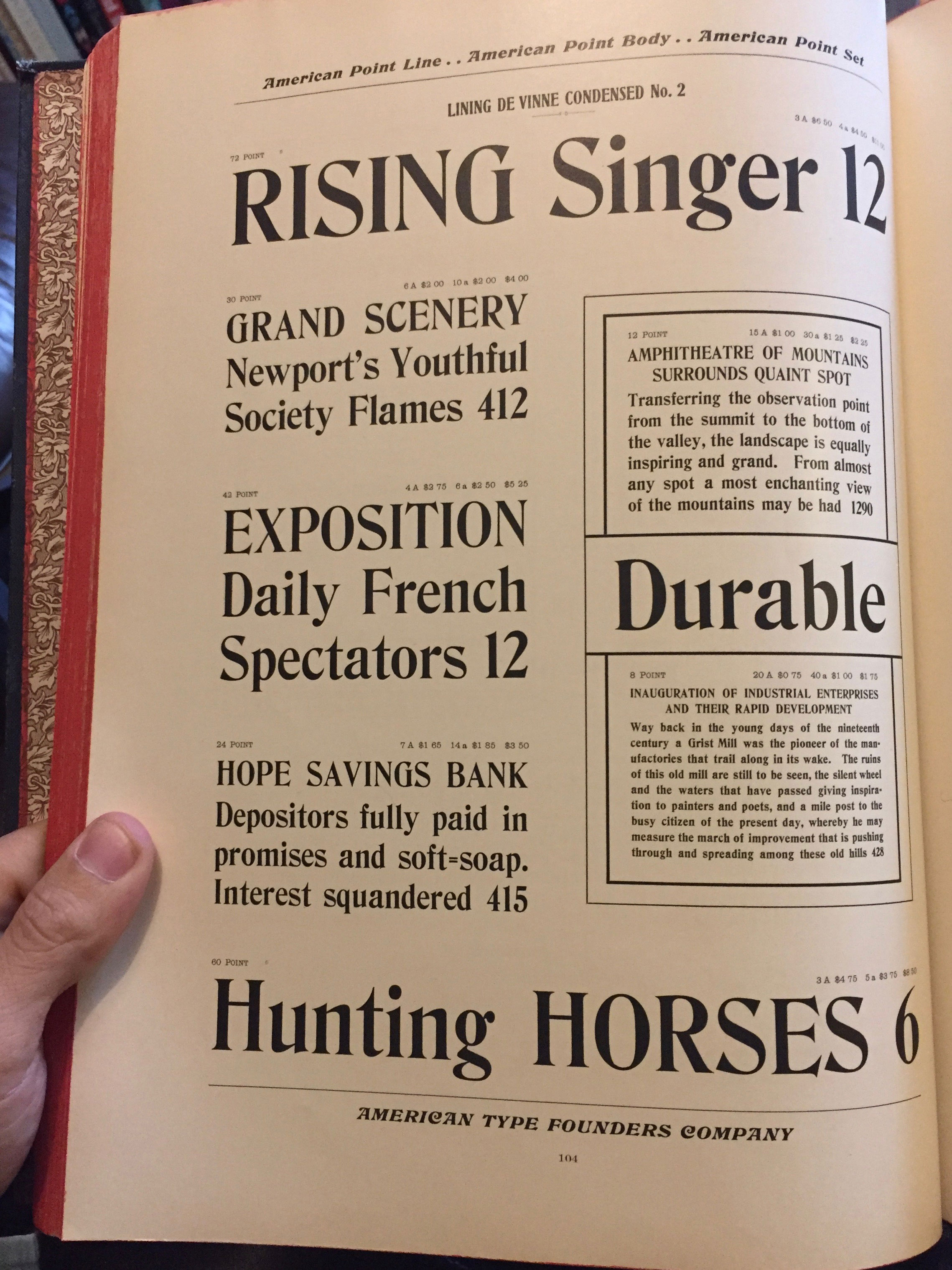
De Vinne is a fresh Victorian take on the traditional oldstyle, with distinctive diagonal stress, open forms, and heavy bracketing in the serifs. Named for the famed nineteenth century printer Theodore Low De Vinne, De Vinne was designed in the 1890s by Gustav Schroeder and Nicholas Werner of the Central Type Foundry. It stands apart from the vast majority of nineteenth century types, which were drawn in the upright “modern” style or one of its myriad variations.
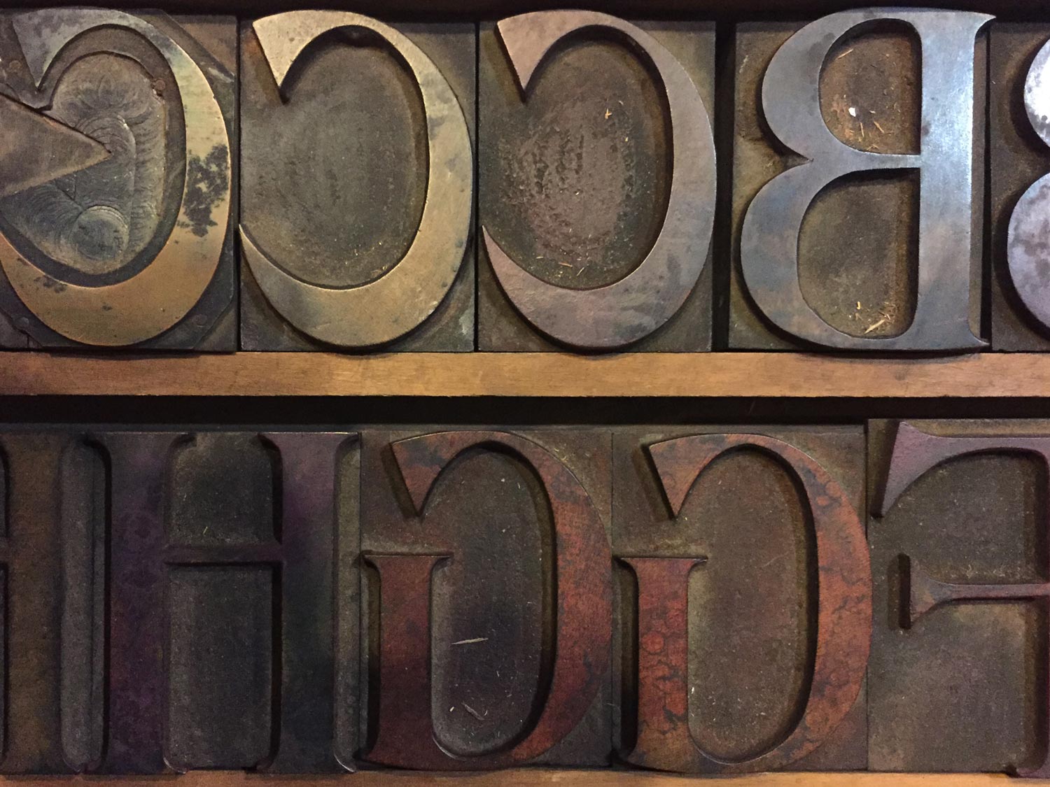
I first became interested in the De Vinne style in 2015, when Indra Kupferschmid invited me to tag along on a visit to the workshop of Patrick Goossens. Patrick is a collector in Antwerp with an amazing array of presses and type, and among the slabs and grots in his wood type collection I found this bizarre ugly duckling. Even though I only emerged with the blurry photo below, I was charmed by its clunkiness and the unforgettable tension between the historicized look of the oldstyle letterforms and the rational mind of the Victorian designer.
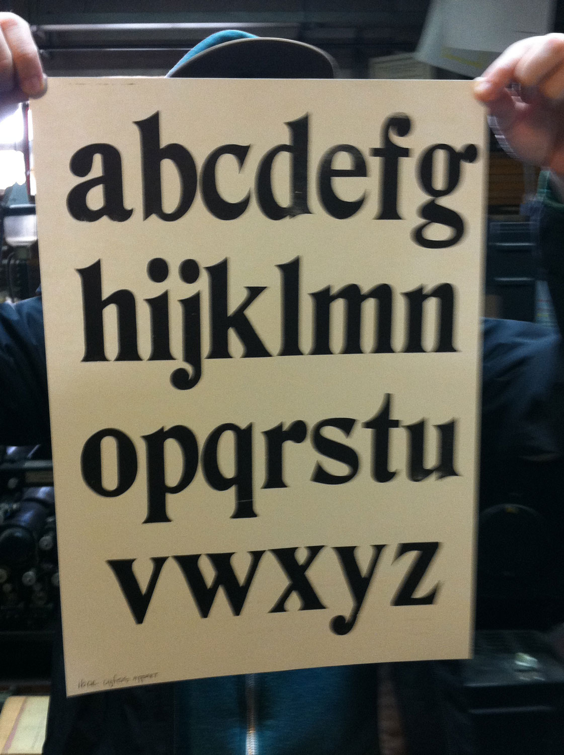
This offbeat “Elzevir” type made me wonder: can a typeface be simple and ornate at the same time? The idea sat around for a while, until Nick Sherman suggested that I take another look at De Vinne. Shortly thereafter I found myself in the lovely studio of Okay Type’s Jackson Cavanaugh surrounded by his vast array of specimen books. Examining De Vinne with fresh eyes, I loved what was happening in its narrower styles. And then, sitting in Jackson’s studio, I started to draw.
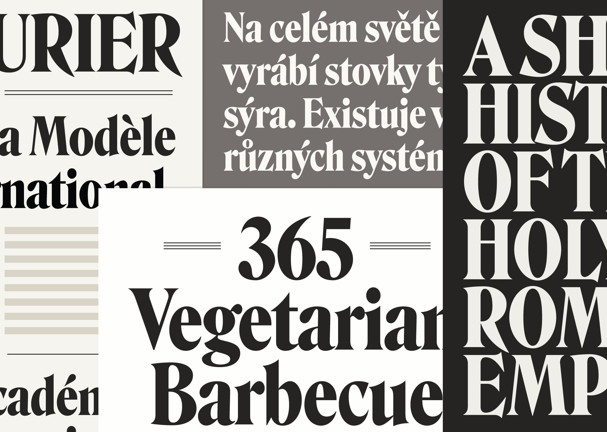
I’ve already explored the Victorian “faux-oldstyle” with my typeface Turnip, and this time I wanted to do something different. While Turnip embraced its chunkiness, Roslindale is slick and high-contrast, which I think serves to exaggerate its oldstyle attributes: the swooping wedge-like vertical serifs on the E, the round tops of the D and R, the diagonal stress of the e, the blobby terminal of the a, the sharp arches in m.

It’s worth mentioning that Roslindale’s slender forms and high contrast start to relate to 1970s reinterpretations of this style like ITC Bernase. This wasn’t intentional, but I’m kind of into it!
In creating the Font of the Month Club, one of my goals was to push myself to experiment quickly with ideas that could eventually turn into full families. I think Roslindale is a great candidate for that, and I’m already playing with a text version.

Earlier this month, I sent Roslindale Condensed to Font of the Month Club members, and they are already starting to put it to use. It is still available to new members until the end of June — just one more week — so sign up now!