
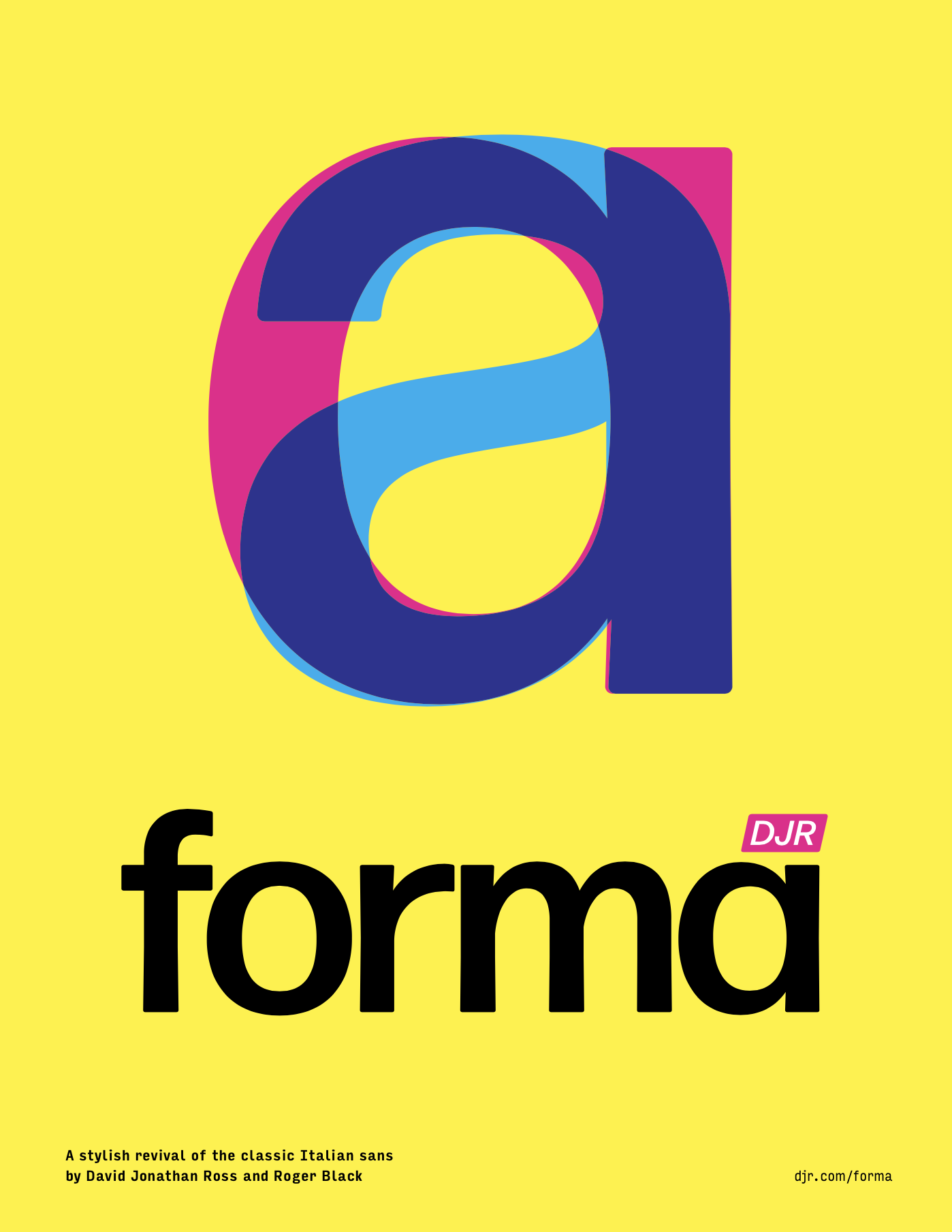
Forma DJR
A revival of
the classic
Italian sans
Kinda like Helvetica, except for absolutely everything about it.
Originally released in 1968, Forma was the Italian type foundry Nebiolo’s answer to Helvetica. It was created by a team of eight designers, led by the legendary Aldo Novarese, that Nebiolo assembled to design a more mature and humane neo-grotesque. As a result, Forma’s rationality is tempered by its warmth, and its trademark single-story a sets it apart from the rest. Read more about Nebiolo’s Forma »
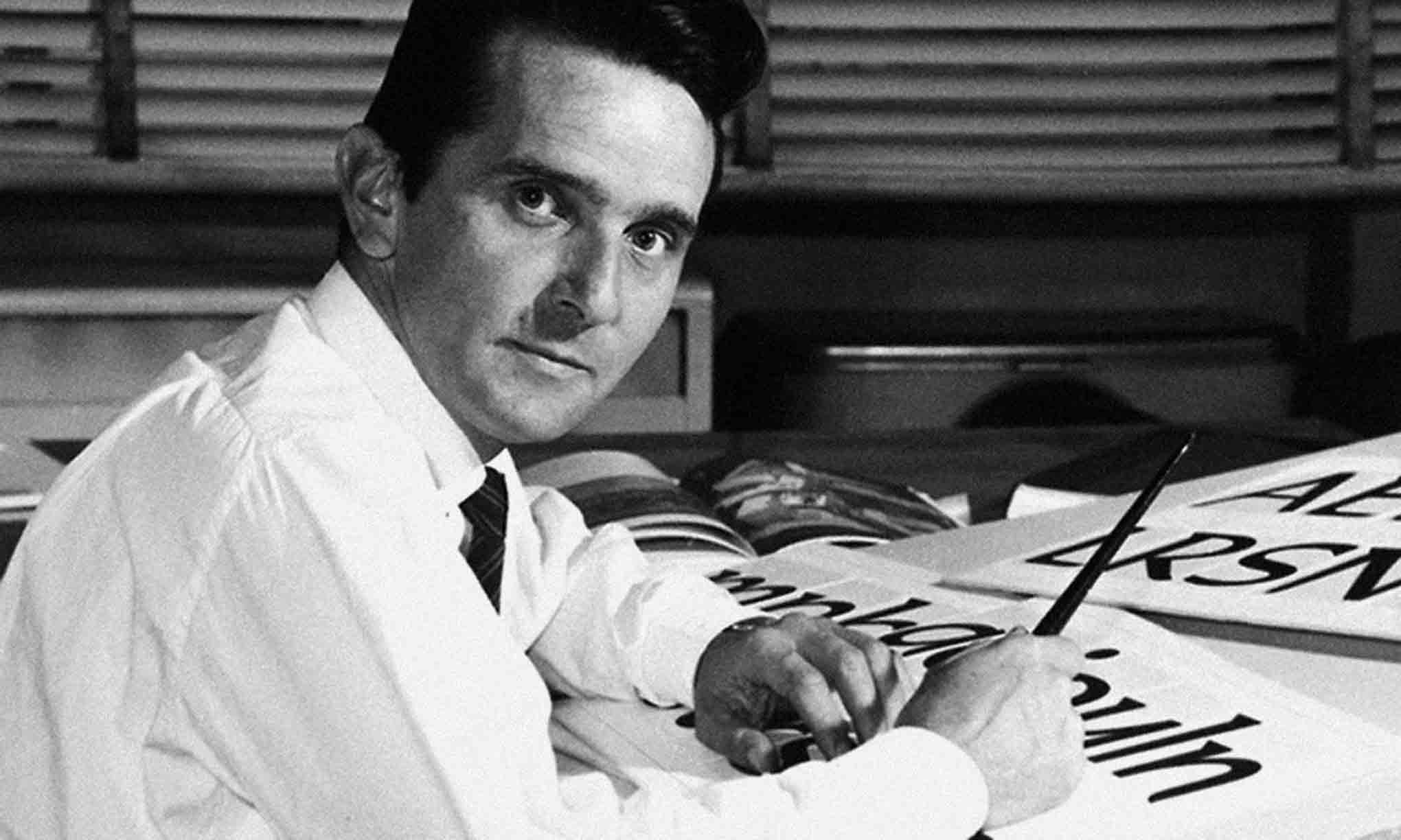
Issued in metal over a decade after Helvetica and Univers, Forma was relatively late to the neutral sans serif game. It never made the jump to phototypesetting and virtually disappeared after Nebiolo closed its doors in 1978. However, publications designer Roger Black always continued to admire the design, and in 2013 asked me to bring it back for his redesign of Hong Kong Tatler magazine.
I’ll admit it: when I first looked at Forma, I thought it was a bit boring. But through Roger’s eyes, I began to see the typeface in a new light. Gazing at his old type specimens, we looked beyond its obvious Helveticaishness and saw the culmination of an entire era of typography: an era when formal purity was the ultimate design achievement, when the spacing of headlines was outrageously tight, and when neutral neo-grotesque sans serifs were actually something fresh and exciting to read. Our digital interpretation, named Forma DJR, seeks to revive that excitement.
Seeking the warmth of the printed page.
Forma DJR embodies the peculiar collision of midcentury modernist precision and the smudgy realities of metal, ink, and paper. This revival is not based on Forma’s original drawings, nor does it try to truly capture its designers’ original intent. Instead it brings new life to a bygone typographic era, and seeks to recapture everything that Roger has loved about Forma for so long.
Expert type hunter Indra Kupferschmid obtained a casting of the original Forma in lead, and printed fresh proofs for us to use as source material for our revival. We found that many of the most interesting details were not present in Forma’s original drawings, but were instead byproducts of the printing process. Stems that were supposed to be straight swelled at either end. Corners that were supposed to be sharp were rounded. We believe that Forma comes alive in these unintentional details, and worked to incorporate subtle bits of unevenness into our digital interpretation. Learn more about the research process »
Since its public release in 2016, Forma DJR has expanded into a formidable digital type family of weights, widths, optical sizes, and italics that far exceeds the scope of Nebiolo’s original. Italian designer Ruggero Magrì has made major contributions to the ever-growing designspace, including Forma’s Condensed styles and its Monospaced version.
In addition to the Latin fonts shown on this page, select styles of Forma are also available upon request in the following writing systems:
-
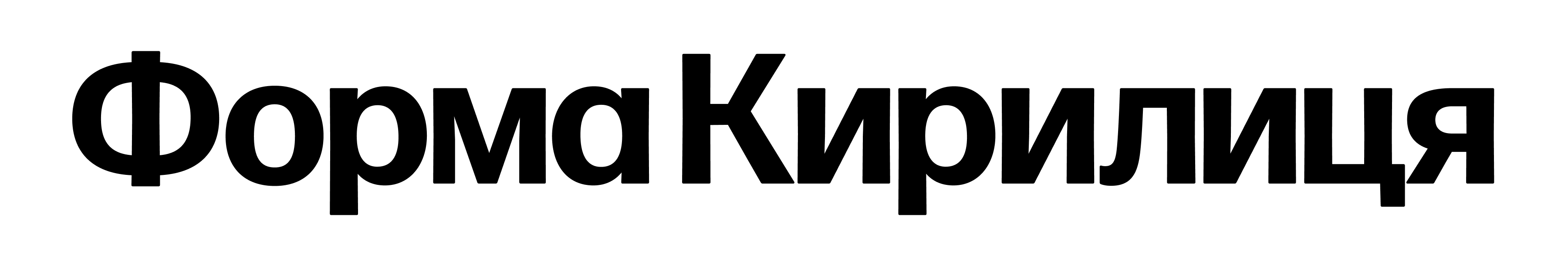
Cyrillic, designed by Jovana Jocić 
Arabic, designed by Wael Morcos and Khajag Apelian
Thai, designed by Knaz Uiyamathiti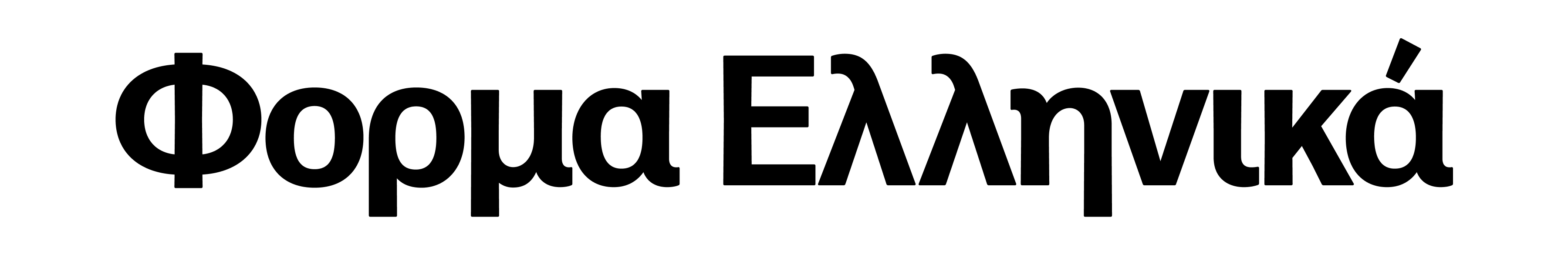
Greek, designed by Aleksandra Samuļenkova
Hebrew, designed by Liron Lavi Turkenich
Swiss alternates, Italian style.
While Aldo Novarese and his team created Forma as an alternative to the rigidity of the ever-popular Swiss style, they also realized that Forma could operate comfortably within it. They offered three Helvetica-style alternates that completely changed the tone of the typeface: a G with a beard, an R with a curved leg, and a two-story a.
G
G
R
R
a
a
And extra clarity when you need it most.
Forma also offers a variety of high-legibility alternates to help you balance style and accessibility. These are always available as OpenType alternates, and some also are employed by default at small sizes where it is most crucial for readers to be able to distinguish between similar characters.
Q
Q
a
a
a
j
j
y
y
l
l
123
123
I
I
0
0
Interdisciplinary Qualifying Project. Call 1 (800) 435 8293. The quick brown fox jumps over the lazy dog. Pack my box with five dozen liquor jugs. Sixty zippers were quickly picked from the woven jute bag. Will Major Douglas be expected to take this true-false quiz very soon? A mad boxer shot a quick, gloved jab to the jaw of his dizzy opponent. Jimmy and Zack, the police explained, were last seen diving into a field of buttered quahogs. Jaded zombies acted quaintly but kept driving their oxen forward.
Interdisciplinary Qualifying Project. Call 1 (800) 435 8293. The quick brown fox jumps over the lazy dog. Pack my box with five dozen liquor jugs. Sixty zippers were quickly picked from the woven jute bag. Will Major Douglas be expected to take this true-false quiz very soon? A mad boxer shot a quick, gloved jab to the jaw of his dizzy opponent. Jimmy and Zack, the police explained, were last seen diving into a field of buttered quahogs. Jaded zombies acted quaintly but kept driving their oxen forward.
Interdisciplinary Qualifying Project. Call 1 (800) 435 8293. The quick brown fox jumps over the lazy dog. Pack my box with five dozen liquor jugs. Sixty zippers were quickly picked from the woven jute bag. Will Major Douglas be expected to take this true-false quiz very soon? A mad boxer shot a quick, gloved jab to the jaw of his dizzy opponent. Jimmy and Zack, the police explained, were last seen diving into a field of buttered quahogs. Jaded zombies acted quaintly but kept driving their oxen forward.
Interdisciplinary Qualifying Project. Call 1 (800) 435 8293. The quick brown fox jumps over the lazy dog. Pack my box with five dozen liquor jugs. Sixty zippers were quickly picked from the woven jute bag. Will Major Douglas be expected to take this true-false quiz very soon? A mad boxer shot a quick, gloved jab to the jaw of his dizzy opponent. Jimmy and Zack, the police explained, were last seen diving into a field of buttered quahogs. Jaded zombies acted quaintly but kept driving their oxen forward.
Interdisciplinary Qualifying Project. Call 1 (800) 435 8293. The quick brown fox jumps over the lazy dog. Pack my box with five dozen liquor jugs. Sixty zippers were quickly picked from the woven jute bag. Will Major Douglas be expected to take this true-false quiz very soon? A mad boxer shot a quick, gloved jab to the jaw of his dizzy opponent. Jimmy and Zack, the police explained, were last seen diving into a field of buttered quahogs. Jaded zombies acted quaintly but kept driving their oxen forward.
Interdisciplinary Qualifying Project. Call 1 (800) 435 8293. The quick brown fox jumps over the lazy dog. Pack my box with five dozen liquor jugs. Sixty zippers were quickly picked from the woven jute bag. Will Major Douglas be expected to take this true-false quiz very soon? A mad boxer shot a quick, gloved jab to the jaw of his dizzy opponent. Jimmy and Zack, the police explained, were last seen diving into a field of buttered quahogs. Jaded zombies acted quaintly but kept driving their oxen forward.Interdisciplinary Qualifying Project. Call 1 (800) 435 8293. The quick brown fox jumps over the lazy dog. Pack my box with five dozen liquor jugs. Sixty zippers were quickly picked from the woven jute bag. Will Major Douglas be expected to take this true-false quiz very soon? A mad boxer shot a quick, gloved jab to the jaw of his dizzy opponent. Jimmy and Zack, the police explained, were last seen diving into a field of buttered quahogs. Jaded zombies acted quaintly but kept driving their oxen forward.
Tight but not touching, no matter the size.
One of Forma’s most distinguishing features is its letter spacing, or rather its total lack thereof. Following the razor-thin sidebearings of the metal original, Forma is spaced in true late-60s/early-70s fashion, favoring “tight but not touching” letterforms over evenly balanced white shapes.
The tight-but-not-touching technique is extremely sensitive to size: what looks perfect at 100pt is virtually illegible at 10pt. To account for this, Forma has an optical size range of (8–72+) where the letter spacing is tuned to walk that fine line between retro and ridiculous:
- Banner, 72pt+ / 96px+
- Display, 36–72pt / 48–96px
- Deck, 14-36pt / 19–48px
- Text, 11–14pt / 15–19px
- Micro, 8–11pt / 11–15px
In the smaller optical sizes, I also exaggerated the rounded corners and tapered stems in order to ensure that the typeface retains its distinctive character in text. And at the smallest extreme, Forma DJR UI abandons the tight-but-not-touching approach altogether in order to prioritize clear communication.

A celebrated foundry, a legendary designer, and a rich history.
To commemorate Forma’s revival, Indra and Roger published a series of articles on Type Network documenting the history of the Nebiolo foundry and its principal designer, Aldo Novarese; the origins of Forma; and the process of our subsequent revival. Check them out! »
If you’re interested in Forma’s history, it’s also worth reading Alessandro Colizzi’s article on this period of Nebiolo’s history. And if you’re looking for a slab serif companion to Forma, check out my in-progress revival of Dattilo!
Mille grazie to Roger Black, my guide on this adventure; to all of Forma’s contributors, who a type family of this scale possible; Indra Kupferschmid, whose type hunting, printing, and research made this revival possible; Alessandro Colizzi, who provided us with additional perspective on Forma’s one-of-a-kind history; Donny Trương, who encouraged Ruggero and me to take risks on the Vietnamese; Robb Rice and Jeffrey Zeldman, for taking a chance on the in-progress typeface early in its development; and finally, to the staffs of Font Bureau and Type Network, who offered support at every step of the way.


Get Forma DJR, the interesting boring sans.
Each purchased weight comes in all available optical sizes at no additional charge.
Forma DJR Elsewhere
-
 Forma DJR at Type Network
Hosted webfonts and larger licenses
Forma DJR at Type Network
Hosted webfonts and larger licenses
-
 Forma DJR at Fontstand
Free trials and inexpensive desktop rentals
Forma DJR at Fontstand
Free trials and inexpensive desktop rentals
-
 Forma DJR at Adobe Fonts
Easy integration with Adobe Creative Cloud
Forma DJR at Adobe Fonts
Easy integration with Adobe Creative Cloud
Design credits
- Includes credits for several script expansions currently available by request.
- David Jonathan Ross principal type design (insta, twitter)
- Roger Black art director (twitter)
- Indra Kupferschmid copywriter, historian (twitter)
- Ruggero Magrì Hairline Italic, and additional drawing (insta, twitter)
- Jovana Jocić Forma Cyrillic (insta, twitter)
- Dyana Weissman Language expansion project manager (insta, twitter)
- Victoria Rushton additional drawing, Latin (insta, twitter)
- Aleksandra Samulenkova Forma Greek (insta)
- Tanya George Forma Devanagari (insta, twitter)
- Wael Morcos Forma Arabic (insta, twitter)
- Khajag (KJ) Apelian Forma Arabic (insta, twitter)
- Liron Lavi Turkenich Forma Hebrew (insta, twitter)
- Knaz (Kano) Uiyamathiti Forma Thai (insta)
- Maria Glenda Bellarosa QA (twitter)
- Guido Ferreyra QA (insta, twitter)
Additional information
- PDF Specimen
- Character showing
- Desktop Format: OpenType CFF Format (Postscript OTF)
- Web Formats: Web OpenType Font Format (WOFF & WOFF2)
- App Format: OpenType TrueType (TTF)
- Language Support: Latin, Western & Eastern European • Latin, Vietnamese
- Cases: Uppercase • Lowercase
- Figures: Lining
- Other: Superiors • Inferiors • Fractions
- Stylistic Alternates: Bearded ‘G’ • ‘R’ with curled tail • Double-story ‘a’ • ‘j’ with curl • Unsimplified marks
- Variable Axes: Weight • Optical sizes
- Don’t see what you need? Get in touch!