September’s Font of the Month: Kuhlman
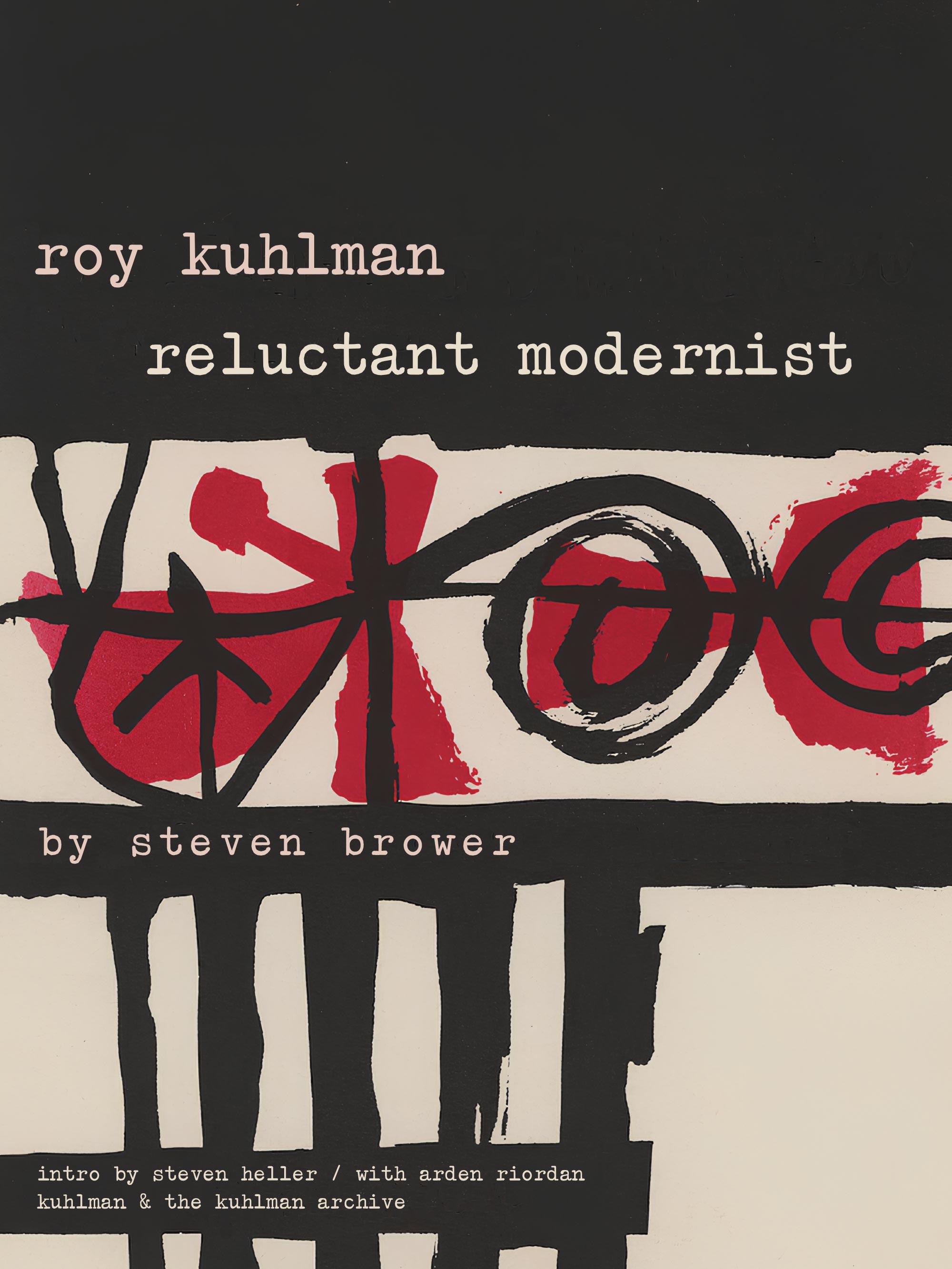
Roy Kuhlman: Reluctant Modernist is an upcoming monograph about the graphic designer Roy Kuhlman. It will be published November 4 by Fantagraphics, an excellent publisher of comics, graphic novels, and books about visual culture (not to mention a frequent user of my typefaces!).
I had the privilege of working with Steven Brower, the book’s author, and his collaborator Craig Welsh to design a typeface that celebrates Kuhlman’s designs and commemorates the book’s publication. And with the blessing of The Kuhlman Archive, I am delighted to be able to share the Kuhlman font with you today.
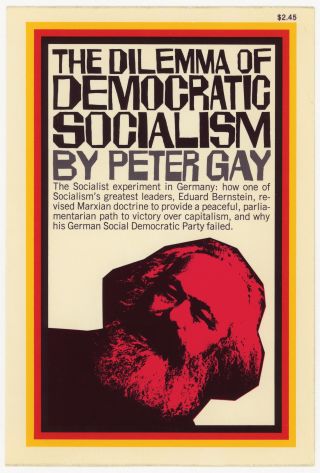
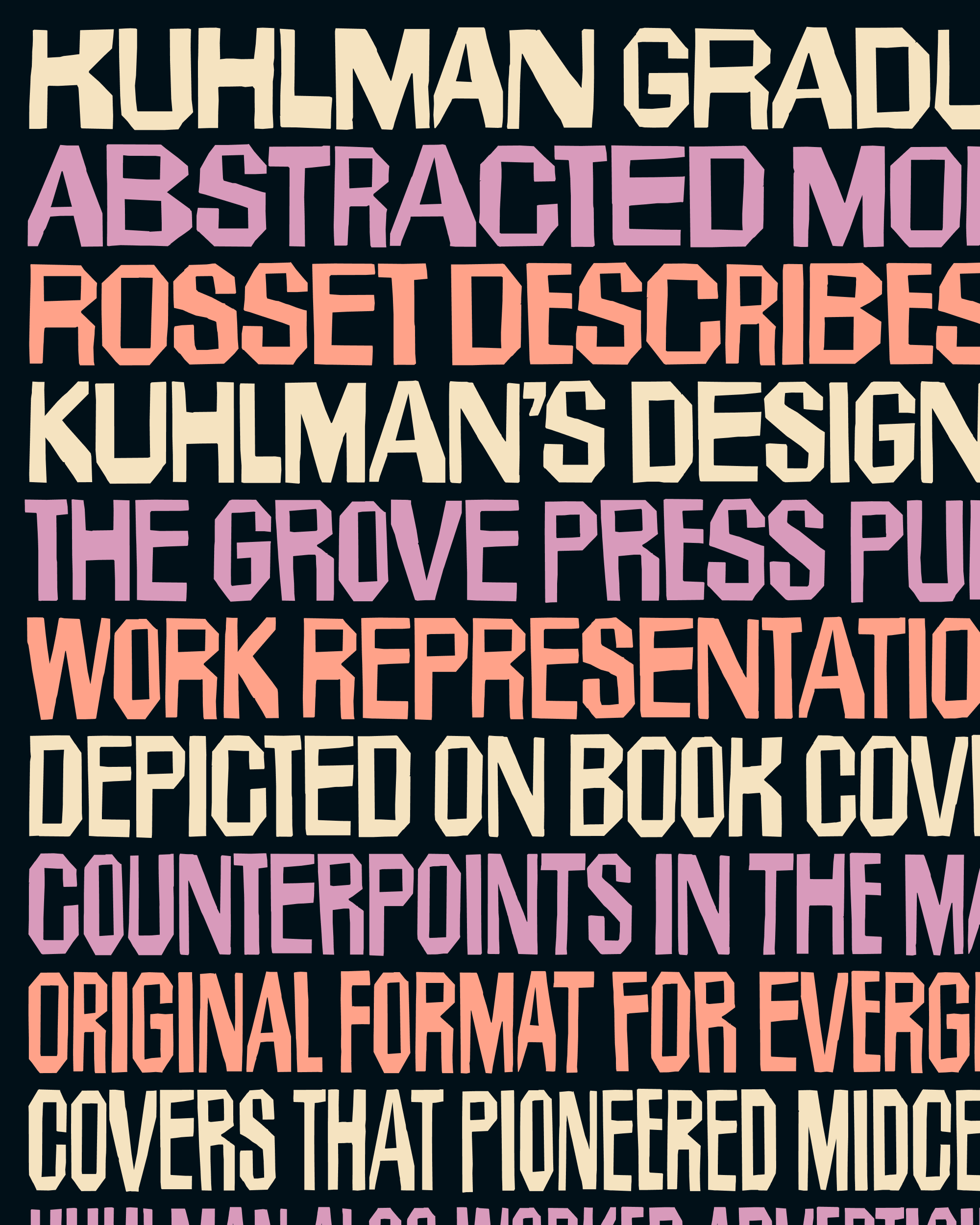
According to Brower, Kuhlman’s cover designs for Barney Rosset’s Grove Press in the 1950s were “at once, illustrative, abstract, conceptual, comical, serious and revolutionary.” Some of Kuhlman’s covers featured his distinctive hand-lettering style, which Brower describes as “conveying the ‘beat’ sensibility of the times.” He created this lettering using cut paper or Rubylith/Amberlith, a masking film on acetate. Brower continues, “Kuhlman would remove this film after cutting with an Exacto knife, leaving the desired forms in place.”
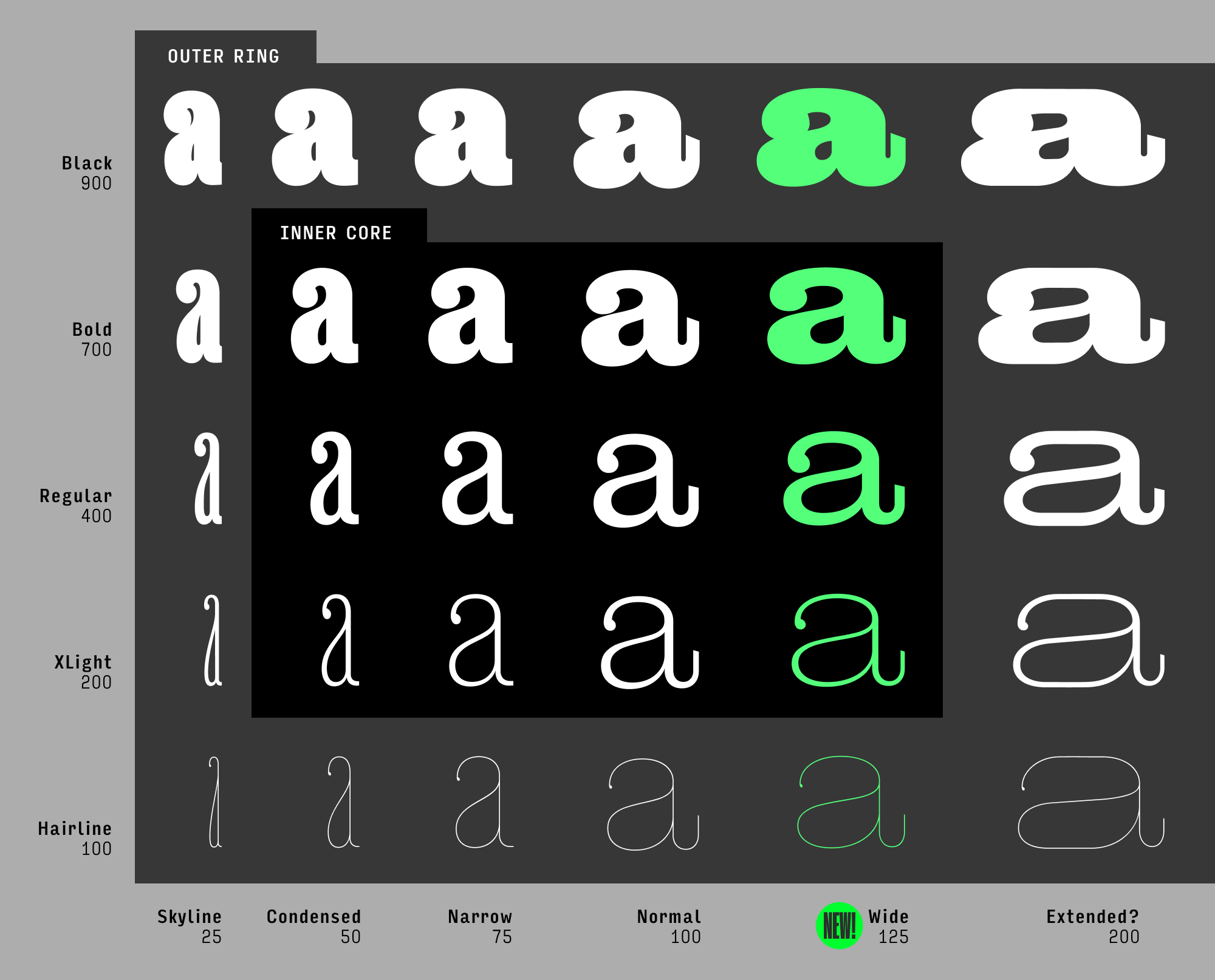
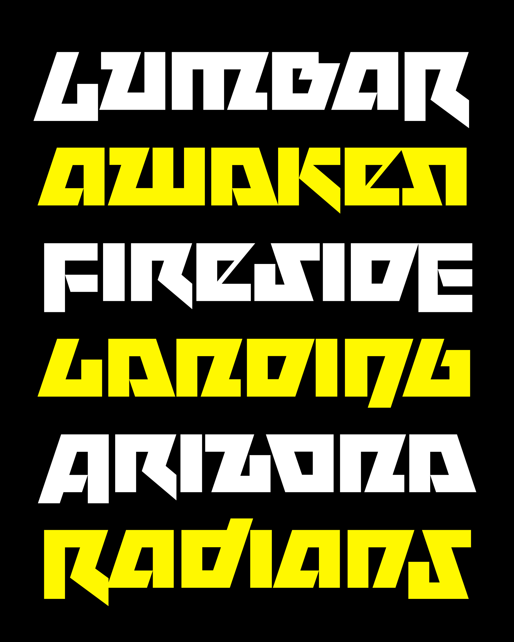
Brower and Welsh sifted through Kuhlman’s covers and compiled contact sheets of the letterforms in alphabetical order. Seeing the letterforms assembled like this really demonstrates the variety of weights, widths, and contrasts that Kuhlman employed across his covers. But at the same time it also exposes how consistent his other stylistic choices were: octagonal rounds, clipped diagonals, opportunistic horizontal stress, wobbly edges, and not-so-subtle misalignments. I knew a prefabricated typeface could never replicate the inventiveness of a designer with an Exacto knife, so my challenge with this font was to capture a bit of Kuhlman’s particular blend of chaos and consistency.
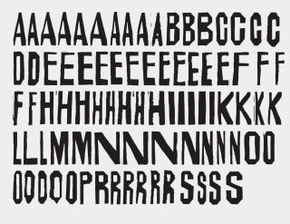
Collected letterforms from Kuhlman’s covers, assembled by Steven Brower
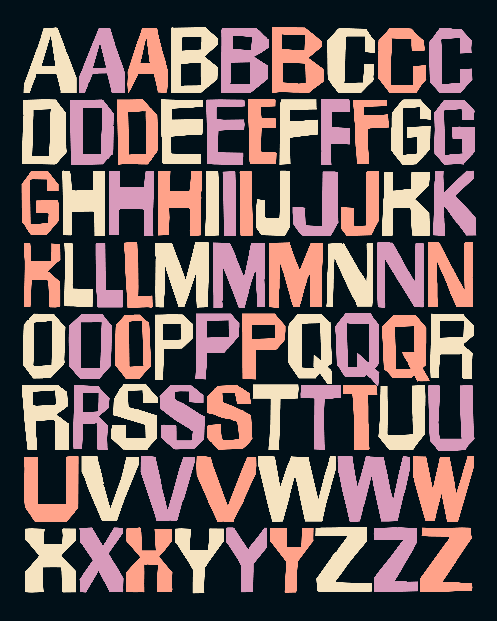
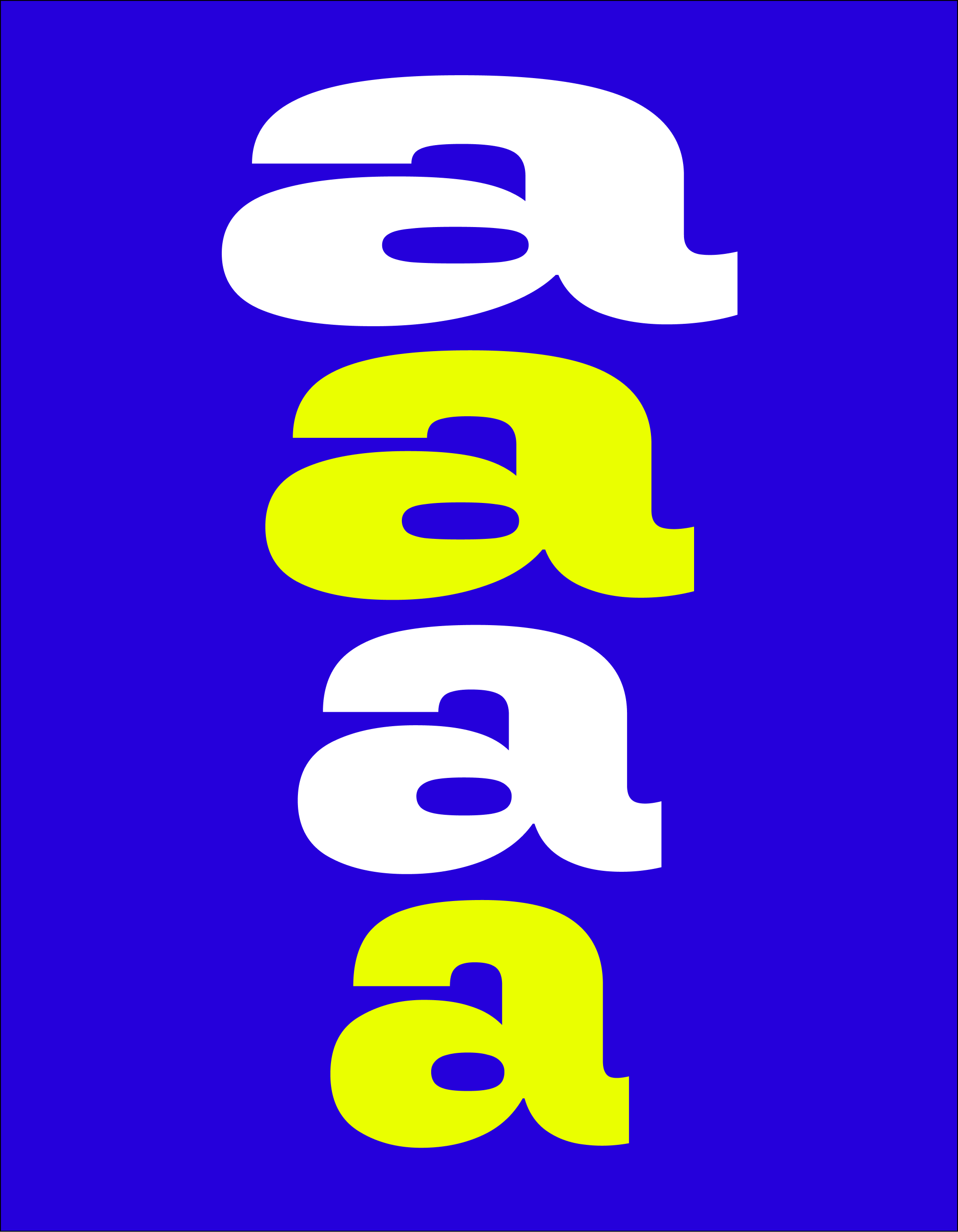
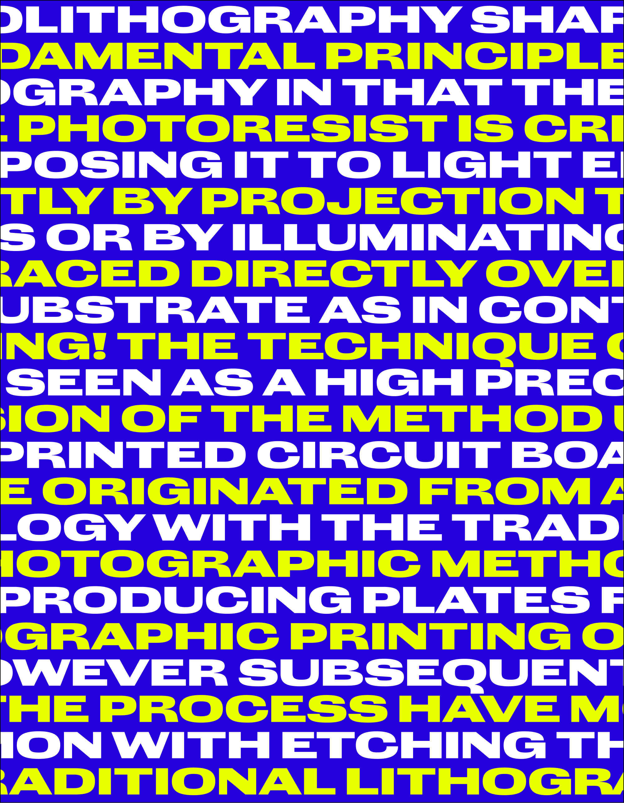
Never before has a typeface of mine called out so desperately for OpenType randomization. Kuhlman contains three separate alphabets that the font automagically cycles through. Because randomization sequences cannot extend across multiple lines, you can use the “Random Seed” variable axis to alter the starting point for randomization in each line of your text block and avoid repeating shapes.
My hope is that these automatic alternates will act as a baseline for randomization, and that you, the designer, will add your own playful spin on top of that.
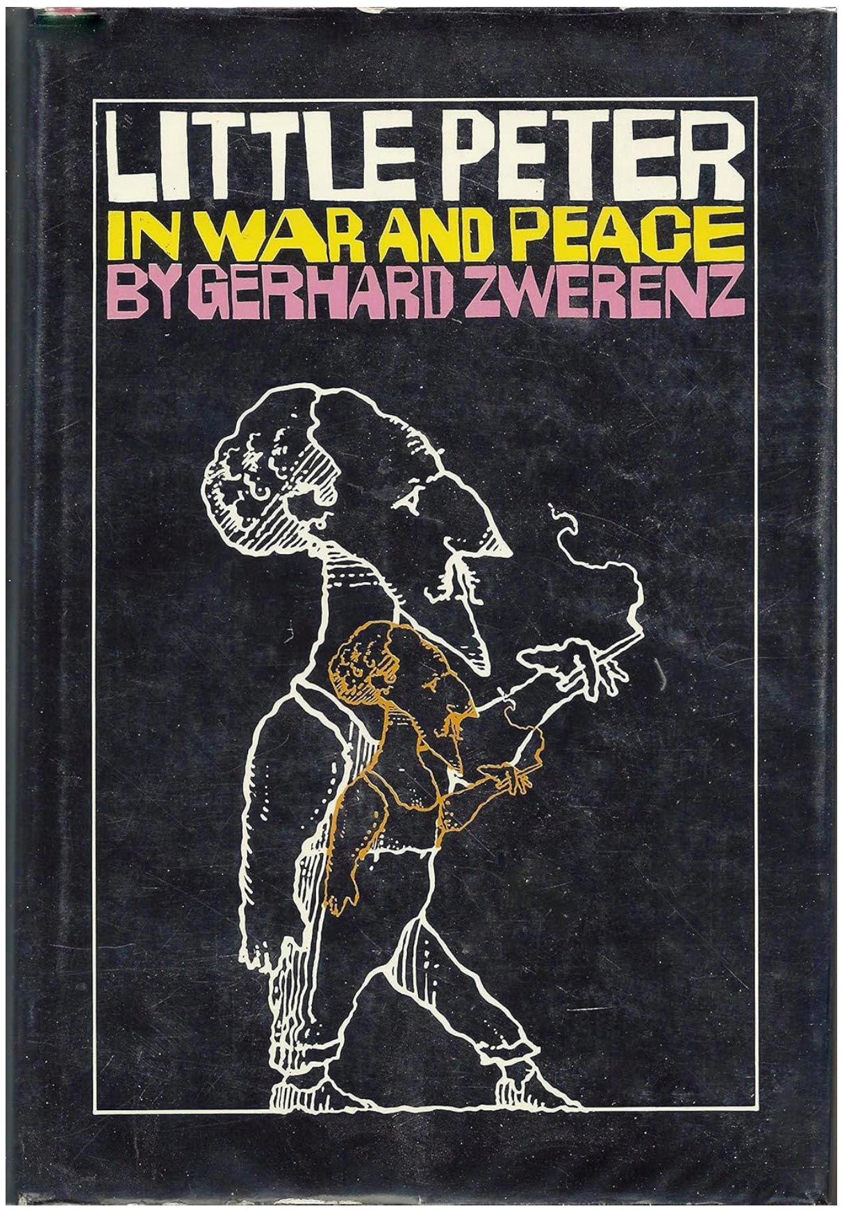
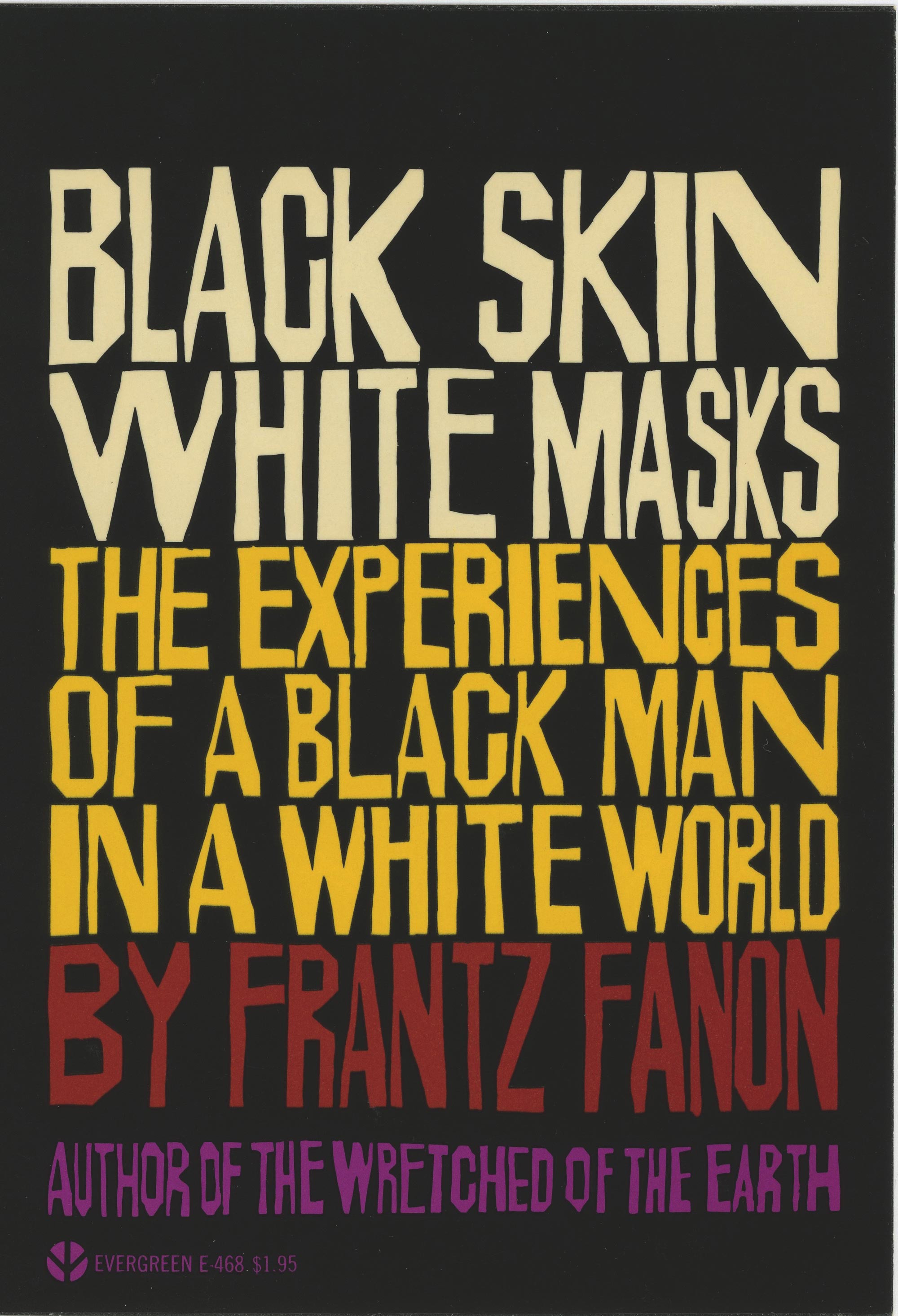
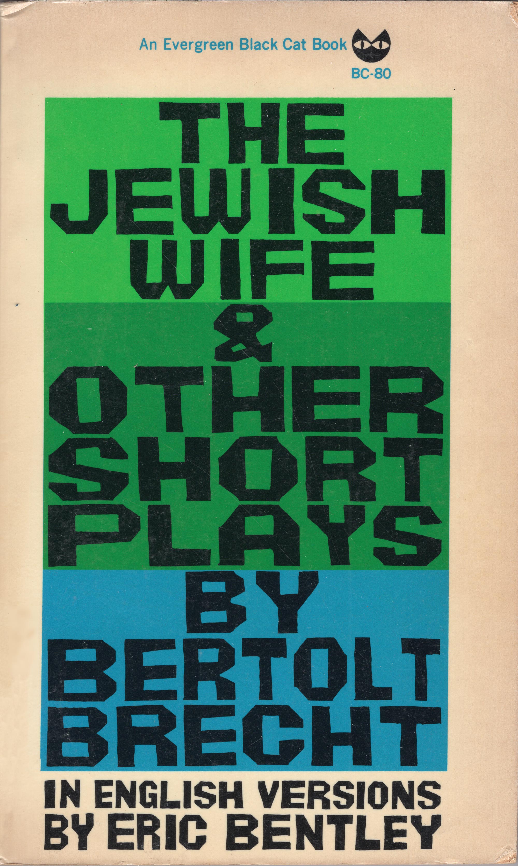
To that end, I have also included a variable width axis that allows you to traverse the expansive range of Kuhlman’s work, from the broad, squarish letters of Little Peter in War and Peace to the slender letters of Black Skin, White Masks. (I’ve also started to rough in a third pole that gets closer to The Jewish Wife & Other Short Plays.) The width axis can also come in handy when justifying a text block—you can either apply your own randomness by mixing widths in a single line, or you can simply widen the entire line until it fits.
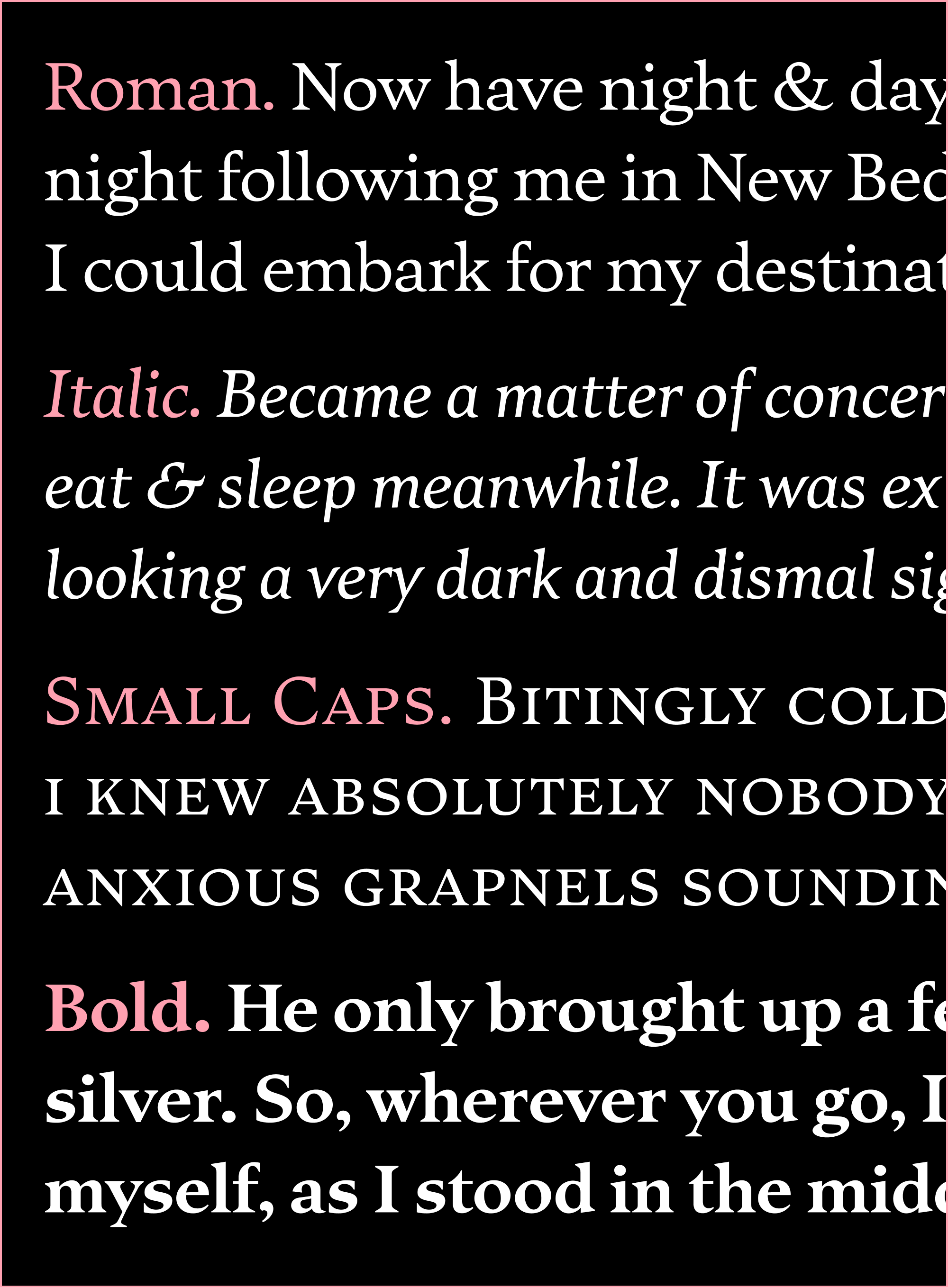
At the risk of it feeling a bit “autotracey”, I resisted the urge to clean up the vectors too much. Brower, Welsh, and I discussed how rough the font should feel, and settled on a middle ground where the crumpled edges preserve the rawness of the original design but are not so obtrusive that they distract from the letter’s essential shape. And in the whole typeface, there is nary a curve to be found.
I hope that, if nothing else, this font encourages you to explore Kuhlman’s work and maybe even get out your Exacto knife and do some cut-paper lettering of your own. And I probably don’t have to tell you how important preorders are in the book business these days, but they are. With that in mind, I encourage you to check out Brower’s book and consider ordering a copy!
Wishing you a wonderful month!


