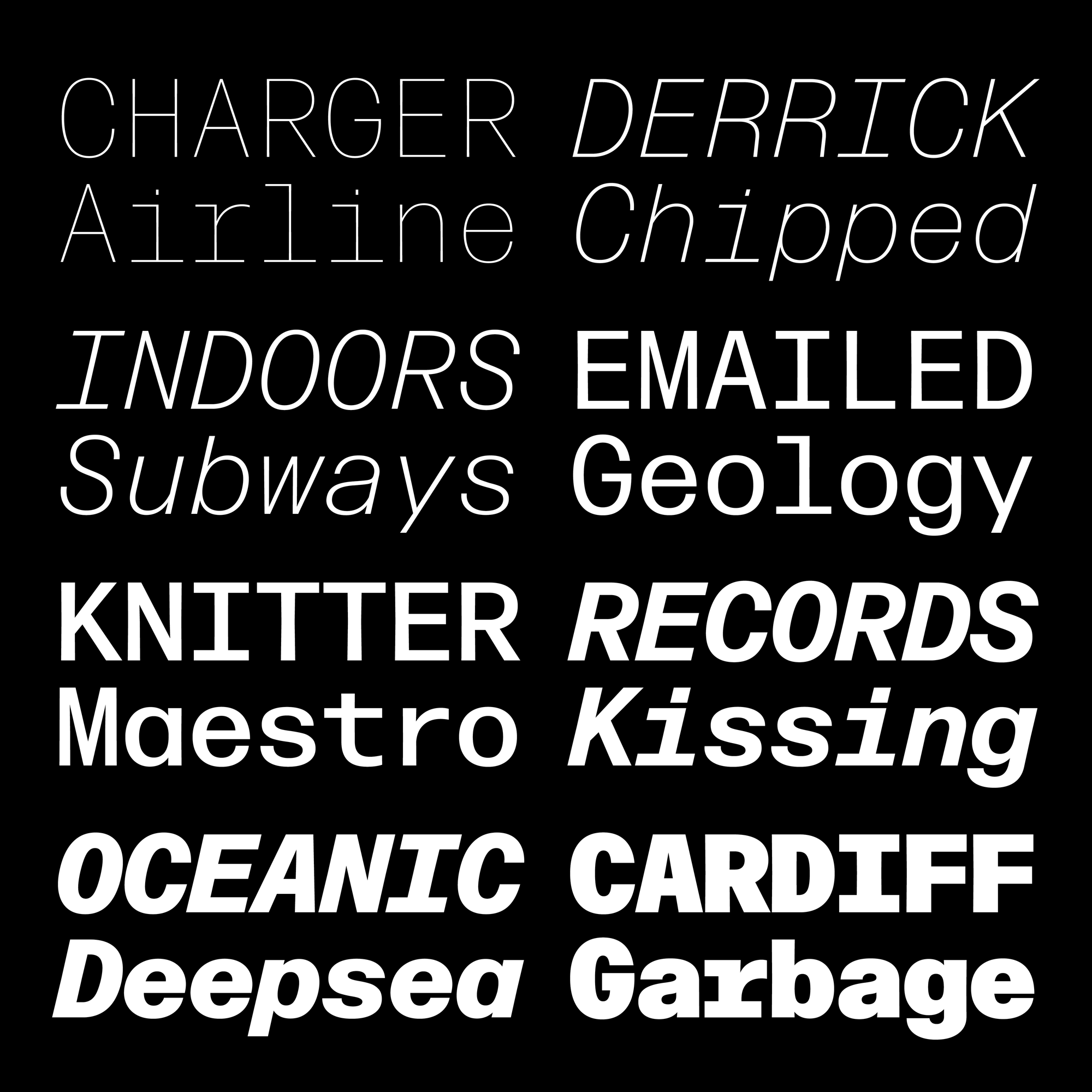
October’s Font of the Month: Lentiform
Earlier this month, I had the honor of giving the Beatrice Warde Memorial Lecture at St Bride Foundation in London. I spoke about my experience with Font of the Month Club, taking some time away from the club’s go-go-go schedule to reflect on why I’m still doing this. I spoke about how it still helps me bypass uncertainty and self-doubt, and endless questioning of when a typeface is finished or why it exists. And I spoke about the peace that I feel when I can set aside all other tasks and just focus on producing an email, a PDF, and some font files. (I believe St Bride may post the recording at some point; in the meantime they have many other talks to explore.)
This trip gave me a chance to see lots of letterforms and letter-people—in the St Bride Library, at the University of Reading, and at the inaugural Typography Theory Practice conference in Leeds. And I got to explore a little too. On the drizzly morning after the conference in Leeds, I went for a stroll up the canal and stumbled upon the Leeds Industrial Museum. I had a bit of time to kill before my train back to London, and my supposedly-waterproof shoes were starting to soak through to my socks, so I decided to pop in.
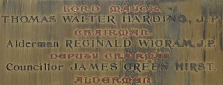
The museum is an old mill building packed with machinery from the Industrial Revolution, and, unsurprisingly, a healthy amount of Victorian lettering. I snapped a photo of this plaque in a stairwell—I was initially drawn in by the De Vinne-syle lettering, but found myself appreciating the tasty typographic hierarchy at play here…a blackletter, a sans, that De Vinne-esque serif, more sans, and…a Lombardic?
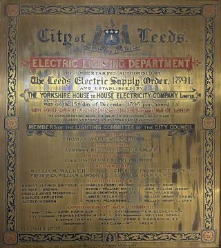
A plaque displayed in the Leeds Industrial Museum, 1898.
In contemporary typography, ornamented fonts are used mostly for Display, and rightly so. But here, the Lombardic caps in red play a decidedly supporting role. They offer a lowkey blast of flavor for what would essentially be a <h4> or <h5> if this were an HTML document, setting themselves apart while not drawing undue attention. It’s like the spicy ketchup that comes alongside the fries that come alongside your meal—a side for a side dish.
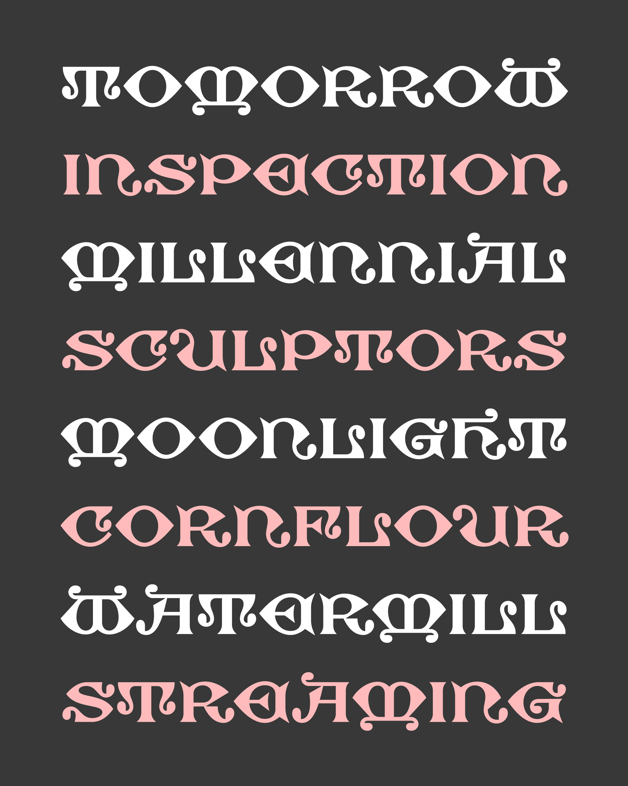
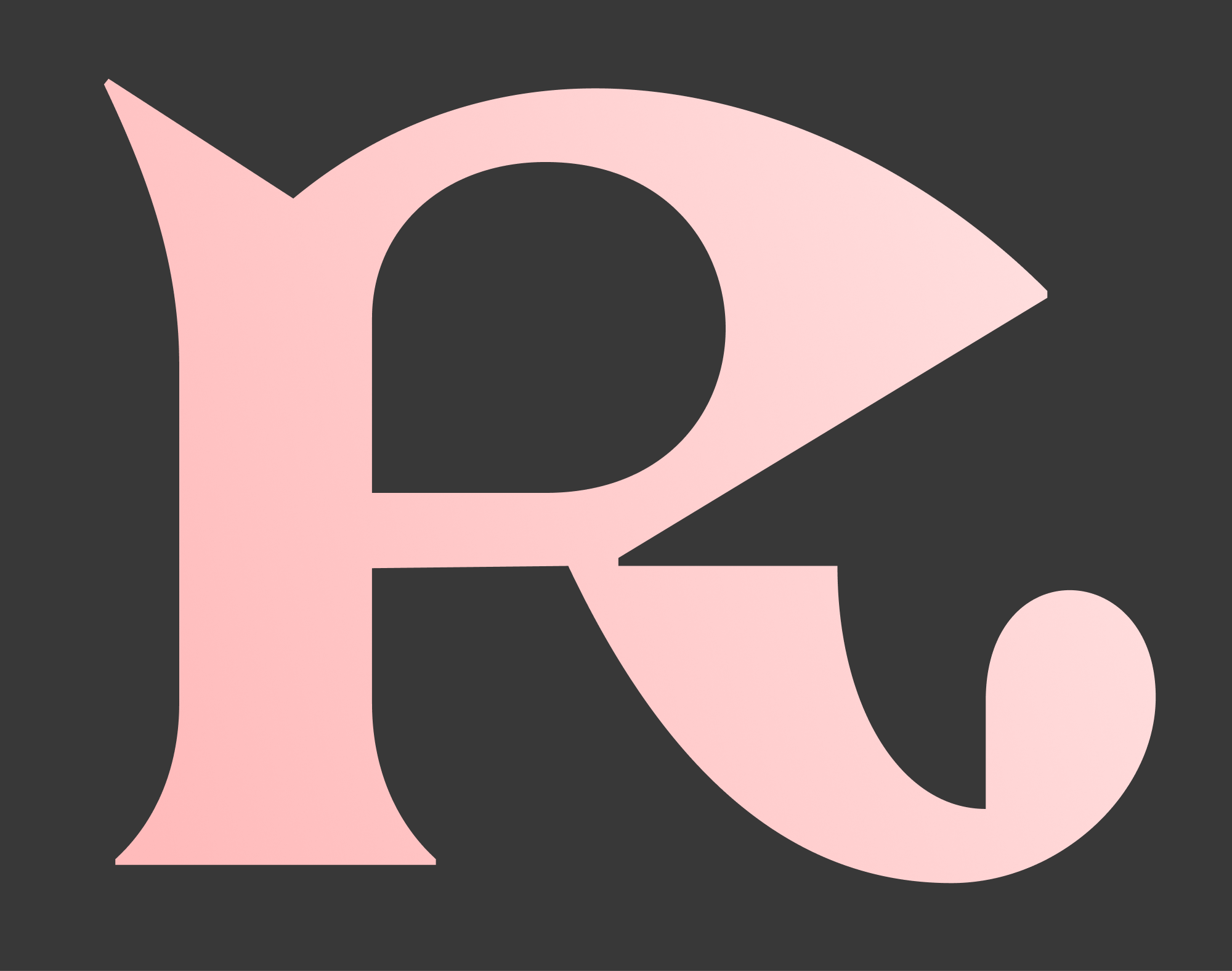
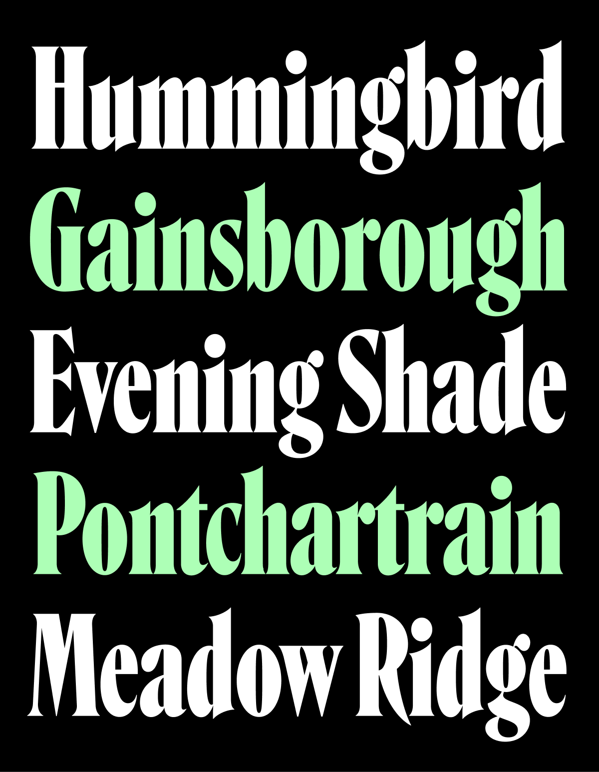
On my journey home last Tuesday, I started drawing. I still don’t really know what I’m doing with this font, or what I expect you to do with this font for that matter. But in the spirit of the WIP ethos I spoke about in my lecture, I decided not overthink it and just keep drawing. And now, after nine days of steady work, I’m sending you what I have so far on Lentiform, named after its distinctive lens/lentil-shaped O.
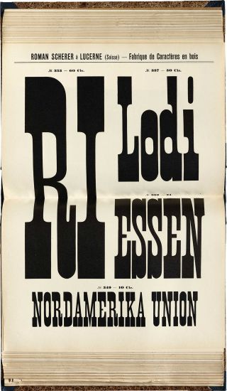
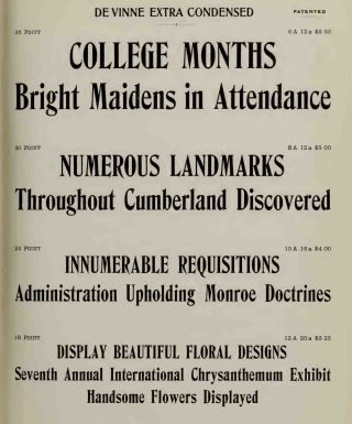
When I hold old type specimens in my hands, as I was able to do earlier in the month, I am always shocked by the small-size ornamental typefaces that foundries were willing to produce. As an example, here is Two-Line Pearl Caslon’s Italian, which is about 10pt.
I tried to channel some of this display-but-not-big energy into Lentiform, sticking with a fairly low contrast and a regularized system that contrasts convex curves with angular cuts, and spiky serifs with curling ball terminals…the R is a good example of all of these in action.
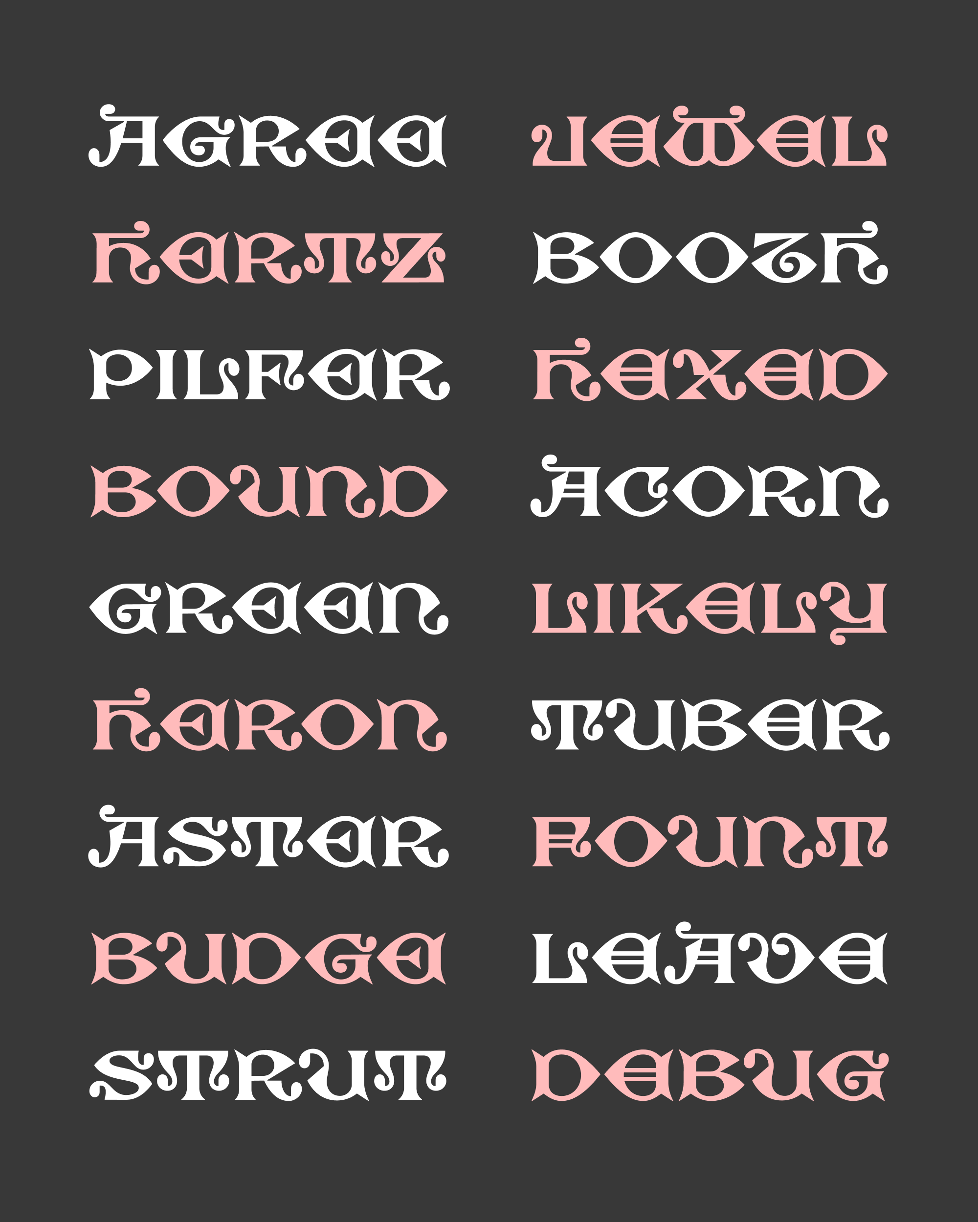
If you look closely at that plaque, you might notice that I replaced the double-strike crossbars on A and E with simpler ones, and the blackletter-style T with a symmetrical Roman-style one. These were casualties of my process of simplification and systemization, but I thought they were fun so you can still find those original forms as OpenType alternates.
There is a growing number of expressive digital Lombardics out there, from the techy segmentation of Minotaur Lombardic, to the striking contours of Ready Bygone, to the softened, worn edges of Kyrios. These contemporaries make me wonder if I should push Lentiform further—part of me wants to turn this into a true Micro, adding inktraps and eliminating the tight counterforms and clearances that prevent it from being truly legible below 10pt. Another part of me wants to push it towards a more traditional display face…narrower, curvier, contrastier, kind of like the line beginning “THE LORD MAYOR…” in the sample above. And a third part of me wants to just put it down and get back to other, more pragmatic projects!
I rarely start a font in the same month that I send it out, so I hope that it is at least a little interesting to see a design in its primordial stage.

