February’s Font of the Month: Megascope
Geometry means rules, and I like rules. I like establishing them for my typefaces, I like following them, and, when I need to, I like figuring out how to bend or break them.
Rules might seem like a drag, but honestly I find that the more rules a typeface has, the more the design process feels like a game. Geometric rules in particular introduce some interesting constraints on what can happen in a typeface. For example, say we have a circle and want to make it taller—it must get wider at the same rate or it’s no longer a circle. This leads to shapes getting wider or narrower than we might otherwise draw them, which is precisely the thing that lends Geometric fonts their particular rigid, inorganic flavor.
Over the last three years, I’ve sent you Megabase, Megavolt, and Megazoid, three sans serifs with science fiction connotations. Each forces the alphabet to contort to its own interpretation of the rules of geometry, resulting in shapes that are otherworldly if not downright weird. And this month, I’m happy to send you the latest in this series: Megascope.
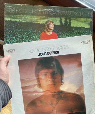
Some of my haul from the used bookstore (yes I know they’re not books)
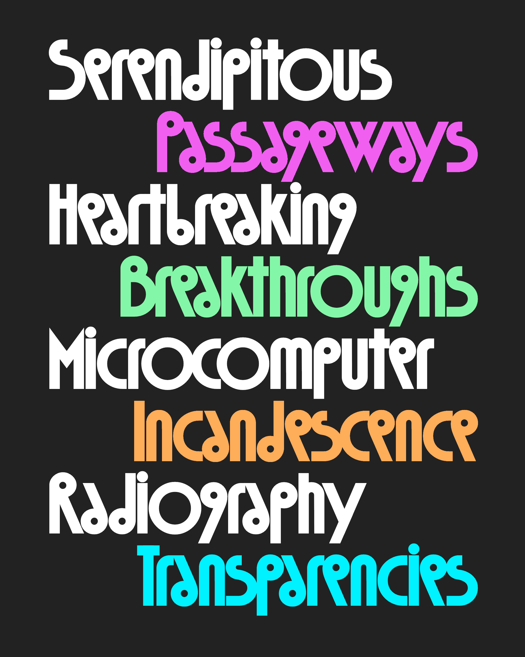
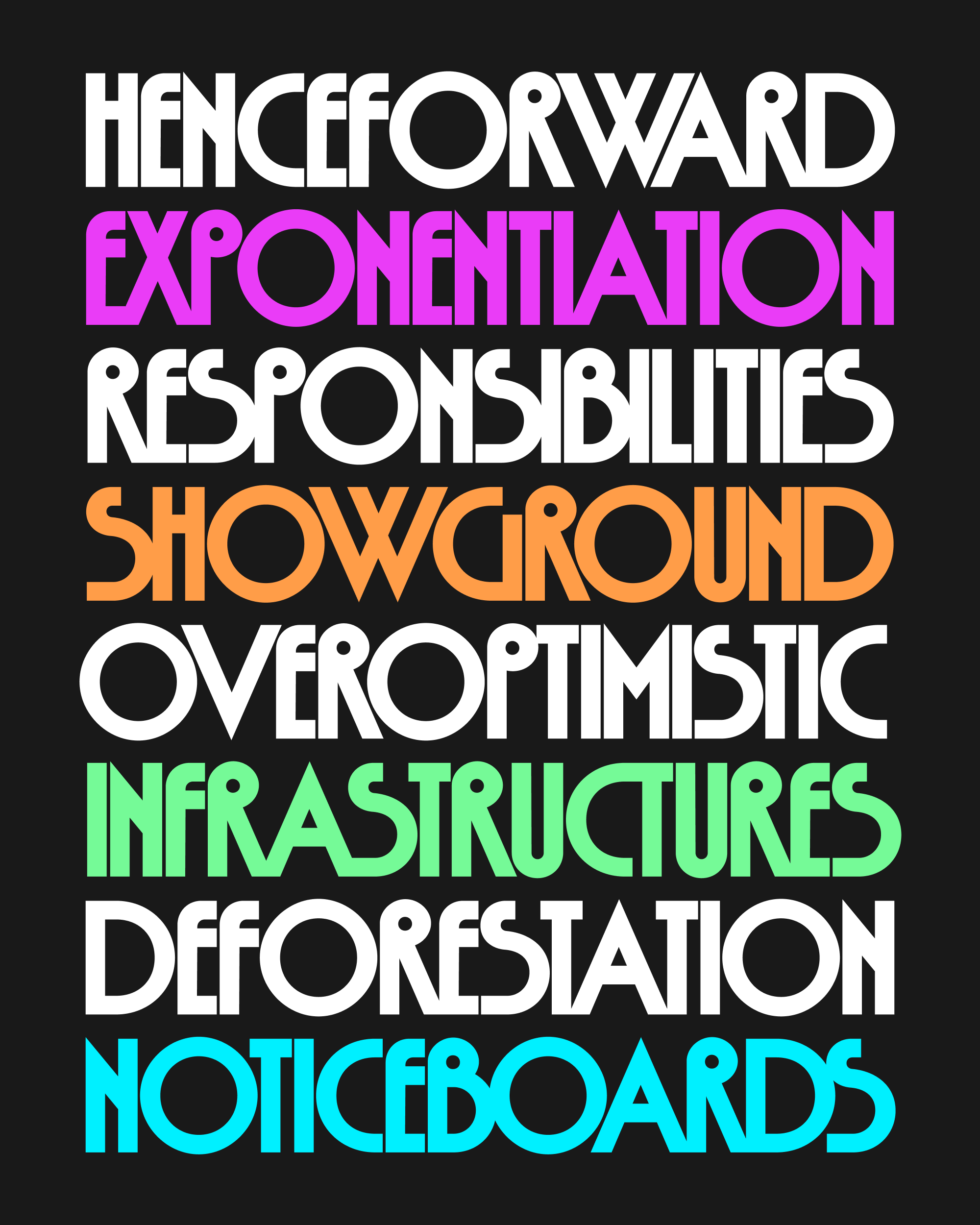
Megascope is my take on the expressive Deco-inspired geometric sans serifs of the 1970s. This style graced many a sci-fi book and album cover in its day, some of which I recently had the opportunity to sift through during a moving sale at a local used bookstore. My design is characterized by little circles in B/P/R that synthesize the roundness of fonts like ITC Ronda and Bauhaus with the high waist and exaggerated proportions of fonts like Syncopation and Washington.
Typically I would draw the diagonals of A/K/R/V/W/X/Y/Z at different angles that suit their particular shapes, but for Megascope, I made it a rule that diagonals should stick to a 66° angle whenever possible. This forces the diagonal character widths to be based on where its strokes begin and end, exacerbating the difference between wide and narrow letters—I usually try to balance the widths of M and W, but not here!
These coordinated diagonals make for some nice alignments thanks to Megascope’s tight-but-not-touching style of spacing. Actually, despite that name, you’ll find that I allowed letter pairs to touch quite a bit, and I heartily encourage you to manually kern other pairs together too if it suits your design.
I wanted to steer Megascope away from Deco glitz and glam (for that, see Extraordinaire). So I purposefully started with a Medium weight that felt more pedestrian than an elegant Hairline or a flashy Ultra. Even so, the uppercase letters kept leaning more towards disco than sci-fi, and I struggled to strike a balance. I mentioned this to Mathieu Triay, who revived the geometric classic Marvin as Marvin Visions. He replied, “Maybe the difference between ’70s photo-lettering and sci-fi is just colour, spacing and context?”
Megascope’s lowercase is where the typeface truly becomes extraterrestrial. I originally intended for this to be an all-caps font, but I realized that the lowercase has even more opportunities to play with a mashup of circles, straight lines, and diagonals. Most notably, the small circles from the caps found their way into a/e/g and p/d/b/q, making them weirdly shrunken and unbalanced, but also kinda cute.
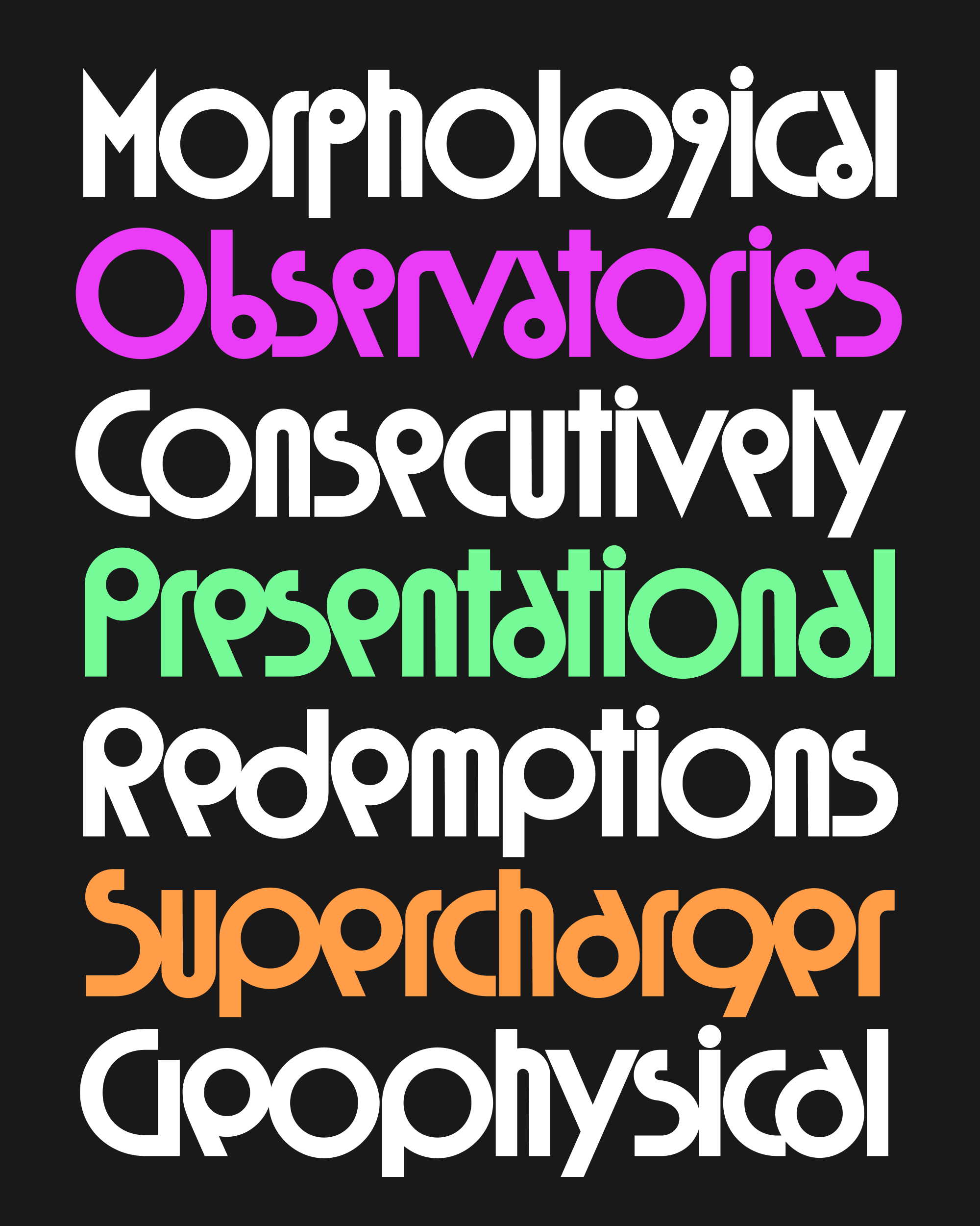
Now what if these circles weren’t so small? At first I made large-circle alternates for Megascope’s small-circle letters, but then settled on a variable “Scope” axis where you can scale these circles yourself, seeing the effects of changing the geometric rules in real time.
It’s a concept that’s so simple that it’s almost silly, but implementing it presented some interesting technical challenges. The interpolation between the small-circle and big-circle shapes is entirely linear, but their spacing and kerning between had to be nonlinear to accommodate the changing “pressure points” of the letters as they drastically change proportion.
Take the R/a pair below as an example: in the small-circle version, the diagonal stroke of the R is the “pressure point” that determines the spacing, but eventually the circle gets big enough that it becomes the determining factor instead. At that moment, the a has to push out at a much faster rate to avoid colliding with the R. This meant that I couldn’t trust that the kerning at either extreme would provide a decent result in the middle, and I had to check each kerning pair for round letters at several points along the axis. I’m sure I missed something, so let me know if you find any spacing that seems particularly egregious.
I’ve thought a lot about why a versatile, multipurpose Geometric Sans is conspicuously absent from my font library. Part of it, I think, is because it’s hard for a multipurpose font to get too preoccupied with the rules of geometry—it has too many other things to worry about (like being generally useful).
And to me, the rules are kinda the whole point! It’s so much fun to watch the most humdrum, pared-down set of basic shapes form something individualistic, something that carries a specific tone. Someday maybe I’ll find a way to do this in a more general purpose design—others have before! Or maybe I’ll just go make a hundred more Megafonts instead…