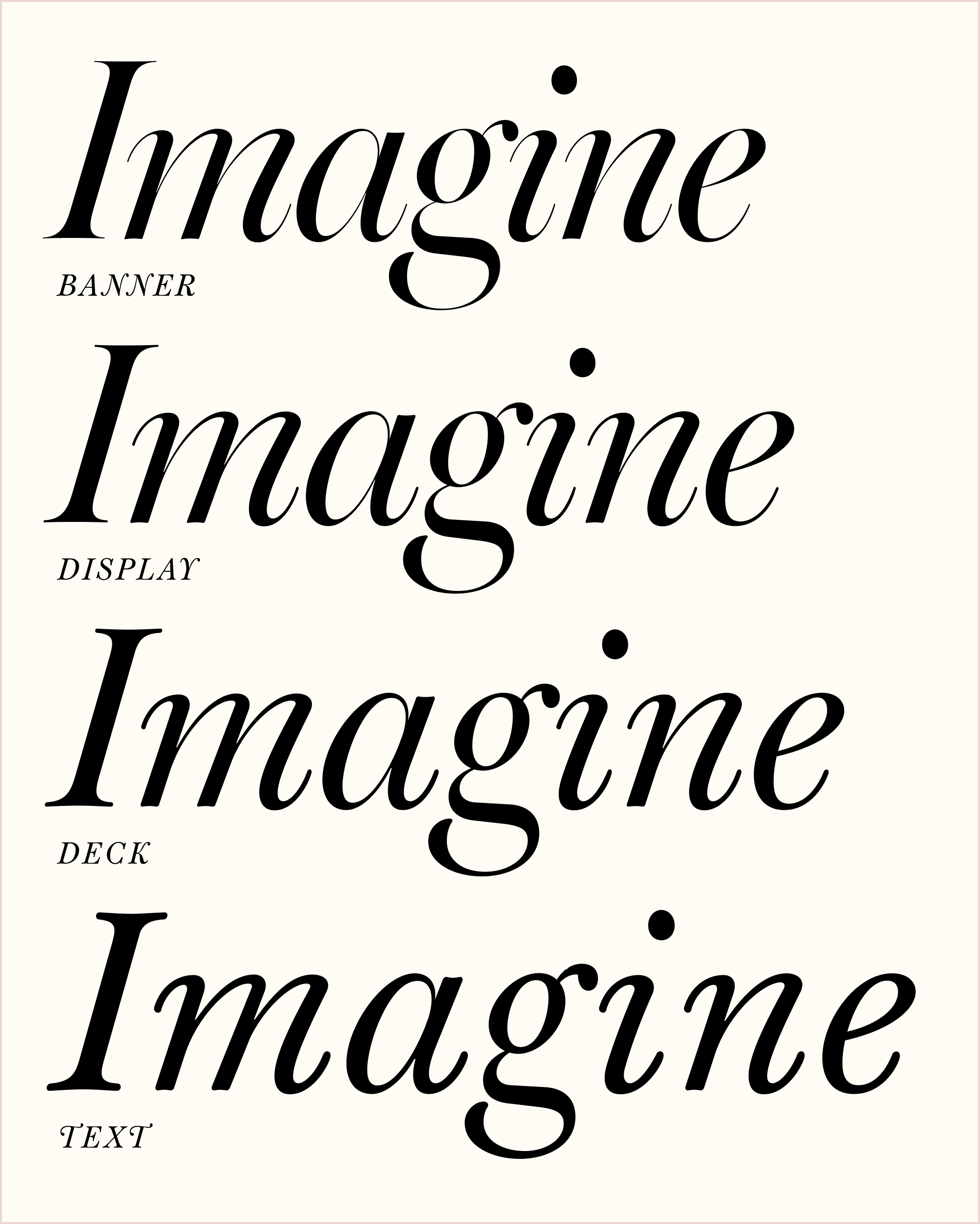
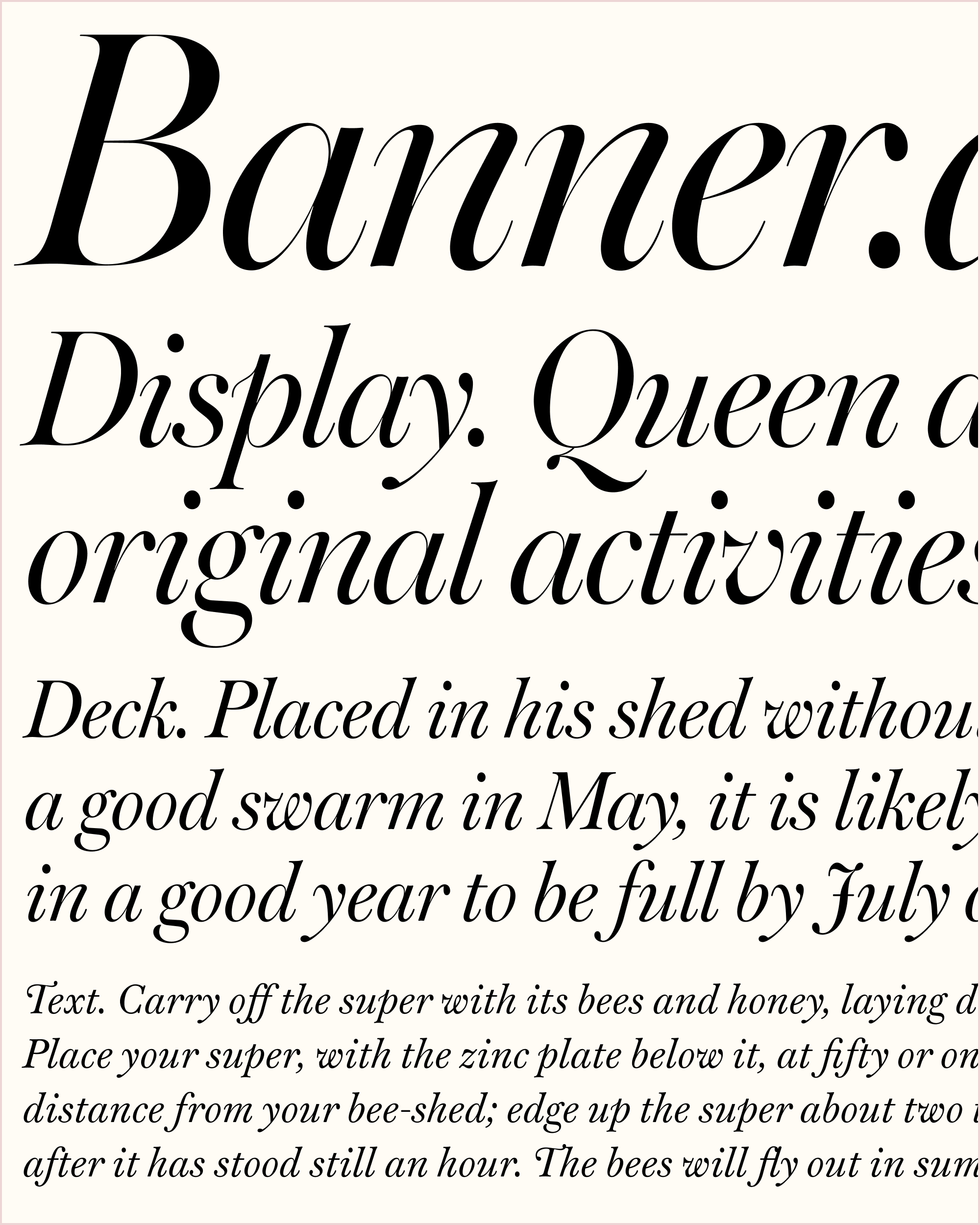
April’s Font of the Month: Warbler Banner Italic
In a font editor, there are two main ways to manipulate a vector shape: you can nudge points by repeatedly tapping the arrow keys on the keyboard, or you can drag them around with a mouse.
For those of you who draw letters, I’m curious if you consider yourself to be more of a nudgy-tappy designer or a pushy-draggy one…I think I tend to be more nudgy-tappy myself. You can hear an audible taptaptaptap as I move points around in increments of 1 or 10 units, a method which allows for precise, systematic, and repeatable changes to the shapes in a font.
Typefaces with a sense of organic looseness may lend themselves to a pushy-draggy approach. This way of editing feels less surgical and more sculptural, as if you’re pushing clay back and forth until you arrive at the desired shape. And gosh was it refreshing to chill out a bit, set aside my measure-twice-cut-once ways, and do some pushing and dragging in Warbler Banner Italic.
This month’s installment is unique in that it started as a commission. Michael Russem of Katherine Small Gallery (my favorite place for type books new and old) asked me to draw a few words in Warbler Deck Italic for an upcoming book. Size-specific designs for Warbler’s upright styles have been available since last March, but this ended up being the push I needed to finally give the same treatment to its Italics.
Even though what Michael asked for is in the middle of the optical size range, I did my work in the most extreme variant (Banner Italic) and then interpolated my way back to the Deck. This indirect workflow was a bit more effort, but it provided me with the starting point for the full range of optical sizes that I’m sending you today.
The other nice thing about drawing in the Banner Italic was that I didn’t have to worry about holding back. I could focus on figuring out what these letters should look like with their full range of expression, knowing that I could always tone it down for smaller sizes at the end.
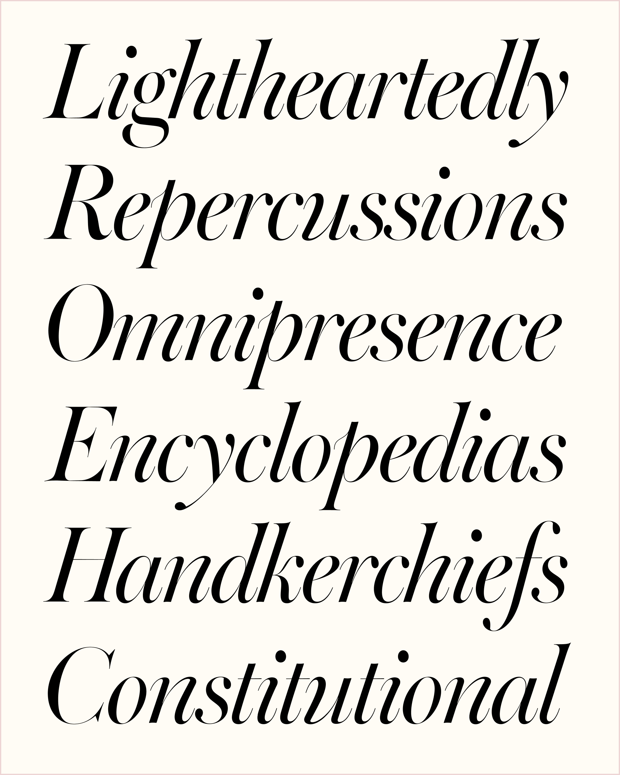
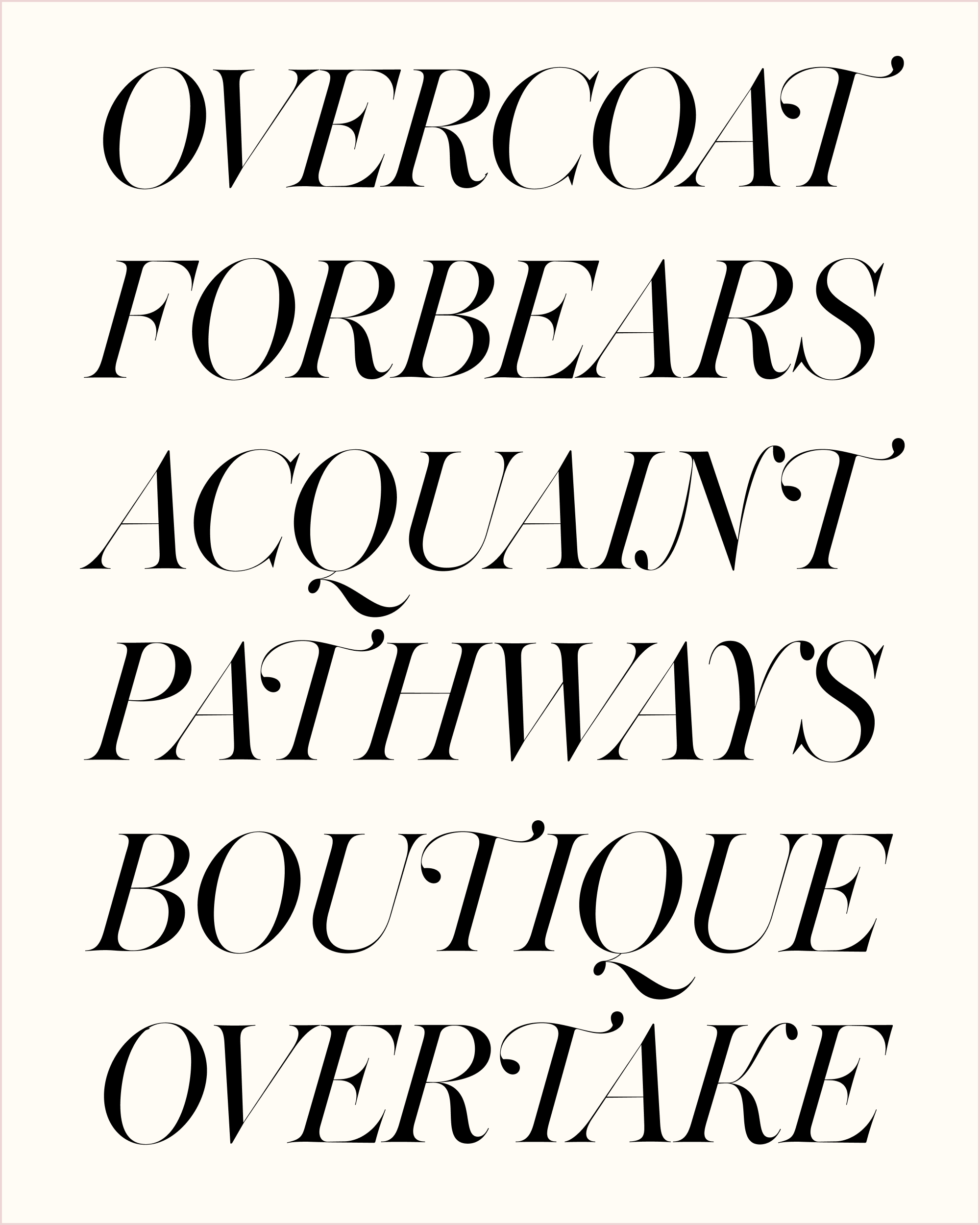
Warbler’s Banner Italics mostly follow the same script as the uprights: shorter x-height, longer ascenders and descenders, and a radically high stroke contrast with razor-thin hairlines. I mostly worked directly from Warbler Text without consulting other references, as I didn’t find large-size Italic cuts of Bulmer and Martin’s types from 1790, and ATF’s Bulmer Italics had a slightly different flavor than what I wanted here.
I tried to play up the aforementioned looseness of the drawing, so that it continues to feel wobbly and delicate and not too perfect or crisp. This included subtle exaggerations to the variety of italic angles, the “sway” of m and n, the asymmetry of o, the distinctive ascender of p, and the unusual instrokes of v and w. The uppercase remains slightly too heavy for their own good, set apart by the charactertic cursive forms of J/K/N/T/Y.
This update continues Warbler’s 14-month journey from a simple pair of text fonts into a multisize family for book design and editorial use. If you have the v1 uprights from last March already, these fonts should install right alongside those. I hope that this Italic serves you well, not only as a faithful companion to the upright, but as an expressive typographic accent all on its own.