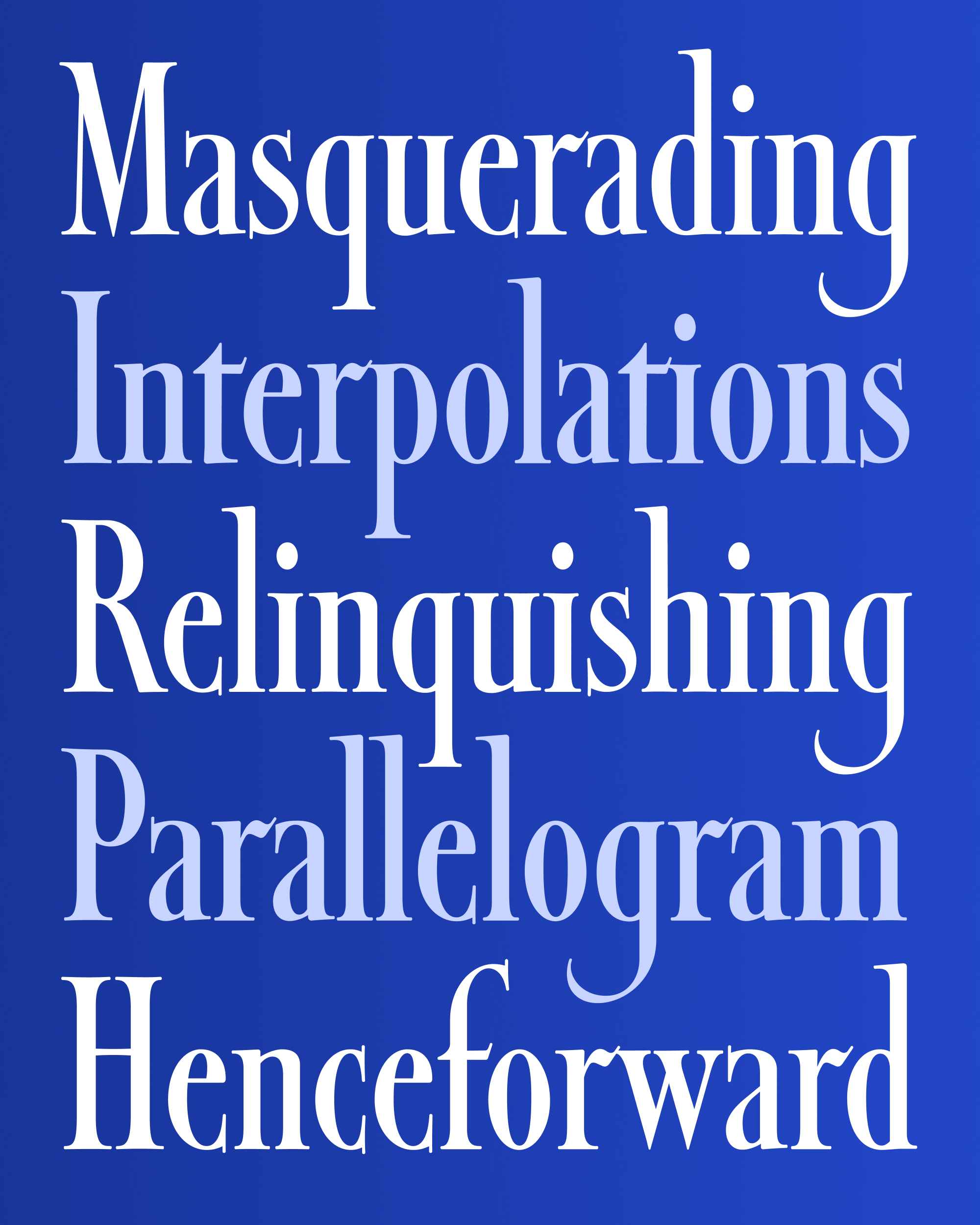
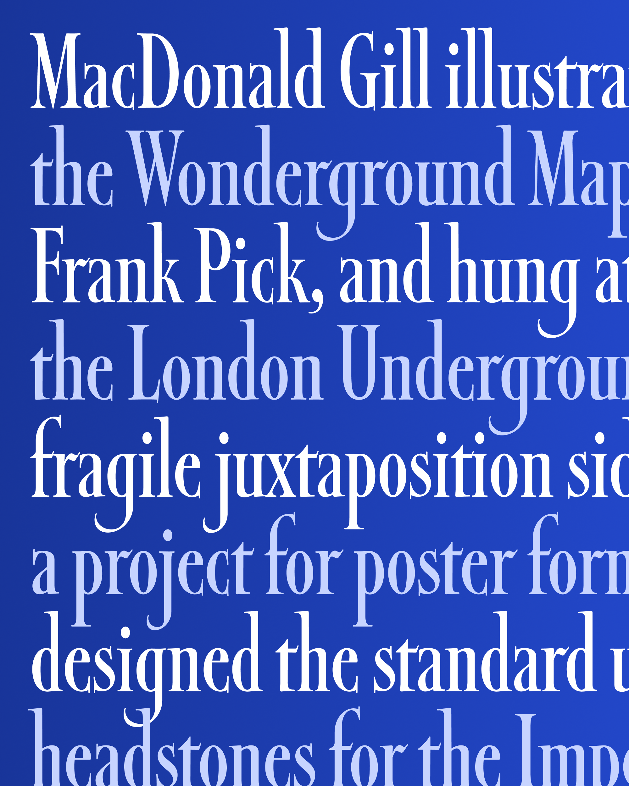
January’s Font of the Month: Daily Special
In 2017, I got an out-of-the-blue email from Johnny, someone I went to high school with. As we caught up, I learned that he and his wife Joanna started a company called Letterfolk that produced felt letter boards. You know, the kind that you’d see used for the specials board in a diner, or the menu at a café, or the directory of an office building. Or, as Johnny and Joanna discovered, the kind that is increasingly used for home decoration and family photo-ops.
Even though they dealt with letterforms in the physical world, they were looking to create some digital fonts that could A) help users plan their letterboard designs digitally before committing them to felt, and B) be used to produce additional characters and styles of physical letterforms. And thus a typographic collaboration was born.
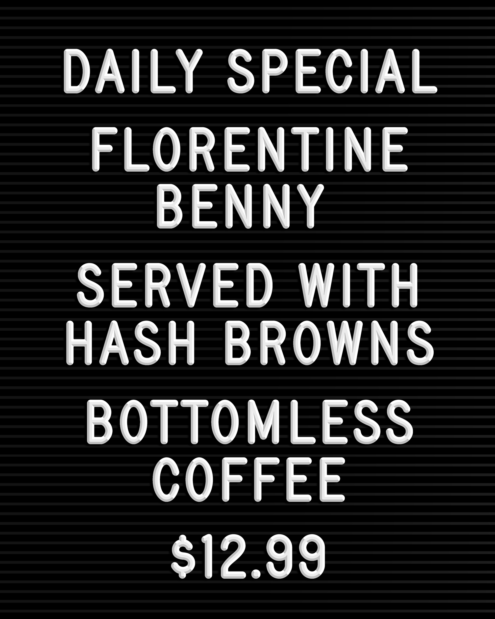
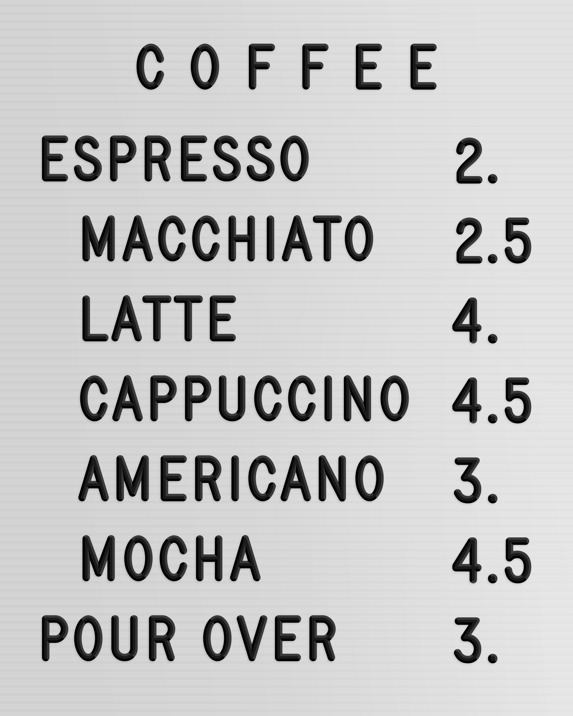
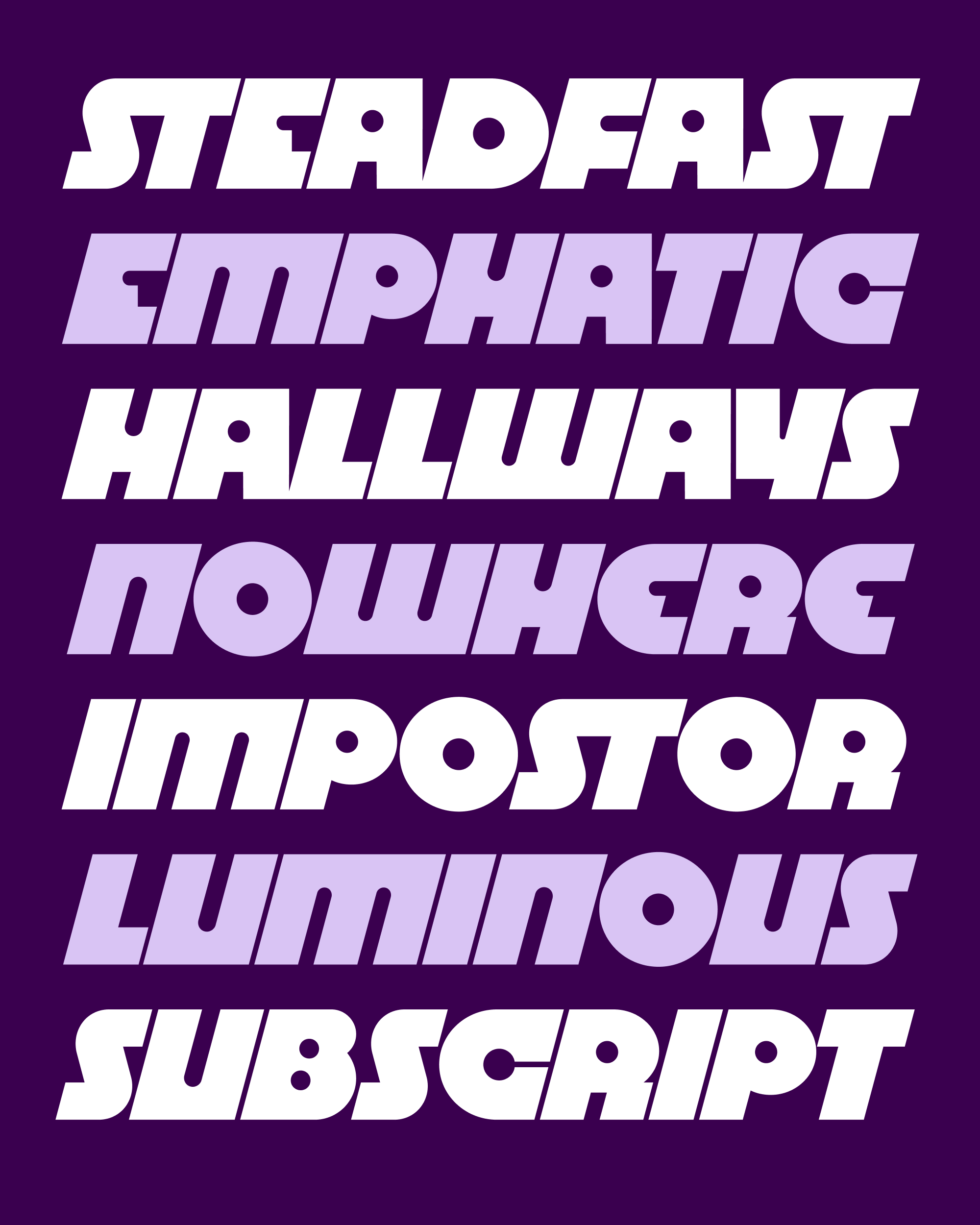
We agreed that, after a period of exclusivity, I could expand and repurpose these fonts for wider use. So this month, I’m excited to send you Daily Special, a dimensional letterboard color font based on Letterfolk’s house style.
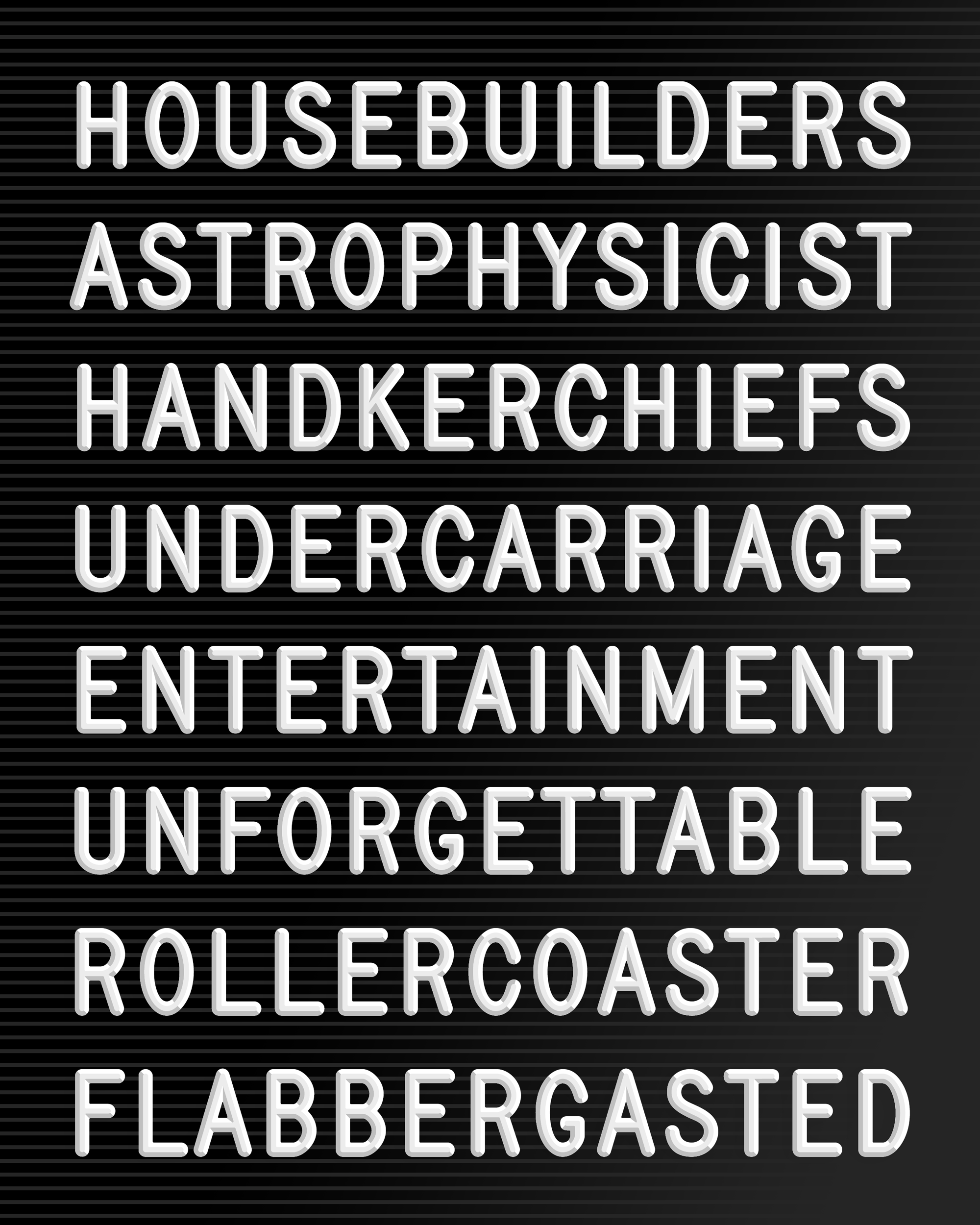
Letterboard alphabets are produced in various sizes—the larger the letter, the flatter the face. This particular design replicates the three-quarter-inch letters (1.9cm, or in this font, 70pt). It is an exceedingly simple sans serif design that feels more “engineered” than “drawn”, with no stroke contrast, no optical correction, and rounded stroke endings. Its most eccentric feature is perhaps the overhang on the top of G.
Johnny and Joanna sent a letterboard and a set of their letters for me to use as a starting point. I wasn’t able to find out much about the origins of this particular style—it seems to be one of several standard styles that have been replicated by many sign companies over the last half-century. (If you have any intel, please let me know!)
These fonts were intended to go “full circle”—they were inspired by physical letters, and they were also used to produce new physical letters, including additional characters and symbols. It was fascinating to learn a bit about how these letters were produced, and to take these logistics into account as I created the digital design. I especially loved the challenge of figuring out where to place the little tabs on the backsides of the letters so that they would sit correctly on the horizontal rows of felt.
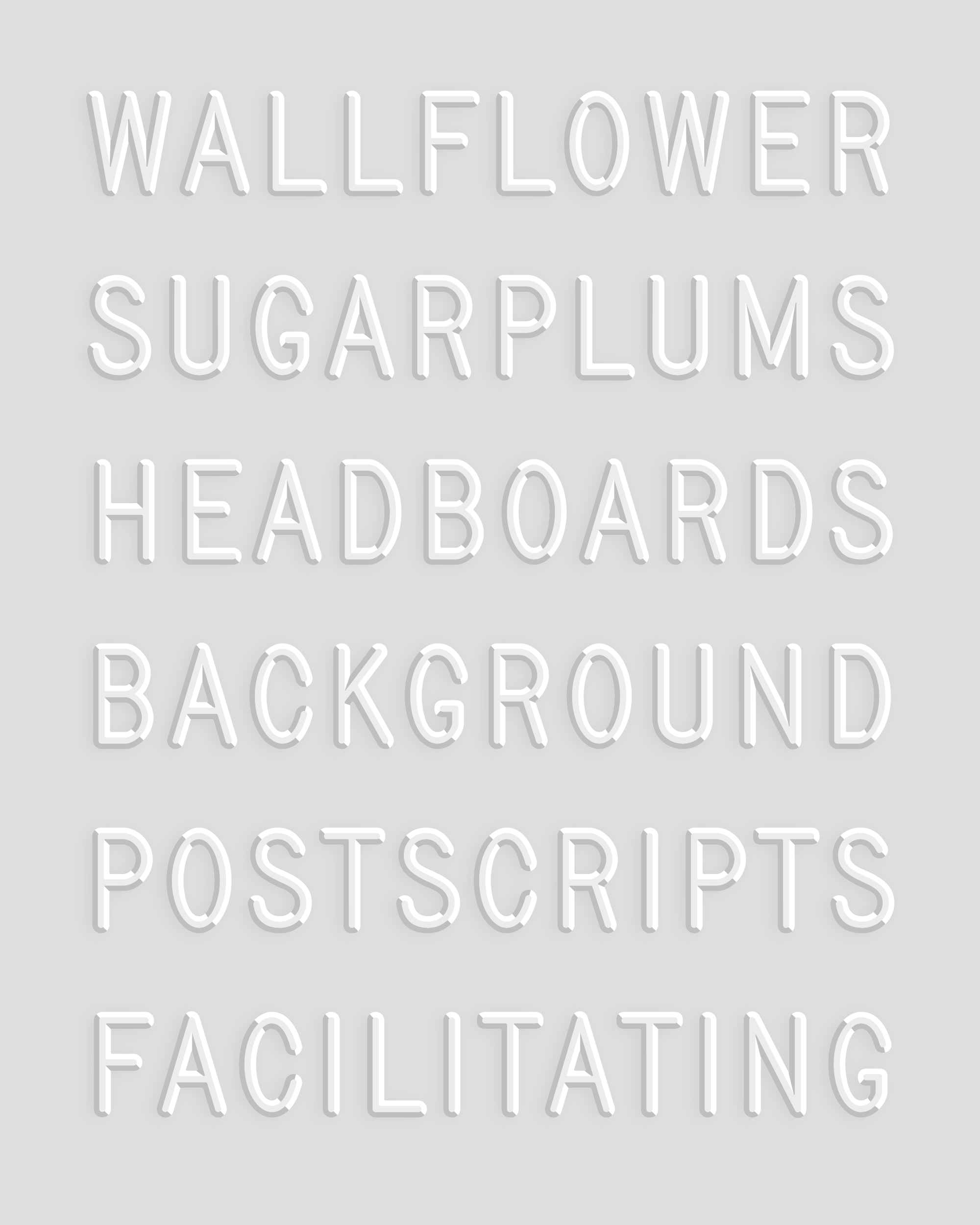
Recently, I came back to this design and converted it from a series of stackable layers into a proper color font. The interior edges of the color fields are crisper and more “graphic” than what you would typically see from a 3D bevel effect. To me this creates a heightened sense of dimensionality, taking what is otherwise a fairly workaday letter style and making it pop.
Daily Special’s Regular style will adapt to the current color of your text, while the other styles use predefined color palettes. Of course, you can always mix your own color palettes using my Color Font Customizer or CSS font-palette-values. And at the risk of sounding like a broken record, I want to reiterate my hope that design apps will make it possible to customize color palettes as well!
Even if you don’t plan to produce tons of little plastic letters, I could imagine Daily Special being useful in book covers, posters, and logos that reference the vernacular, prefabricated signage we encounter in our daily lives. And maybe it could even be taken outside of the letterboard context altogether—regardless, I’m excited to see what you make with it!


.jpg)