October’s Font of the Month: Nickel Gothic Condensed and Compressed
Six months ago, I sent an update to Nickel Gothic that included lowercase and a couple narrower widths. As I hit “Send” on the mailing, I felt a pang of regret, thinking to myself: “I should have gone narrower!”
After that, I started to notice narrow, rectilinear sans serifs in the wild—on freight train cars, on construction equipment, and even on the sign for the church in the next town over. They taunted me. And they made me think about how much more useful and fun Nickel Gothic would be if it was used in the same way that folks employ classic fonts like Impact and Haettenschweiler. So I made it narrower.
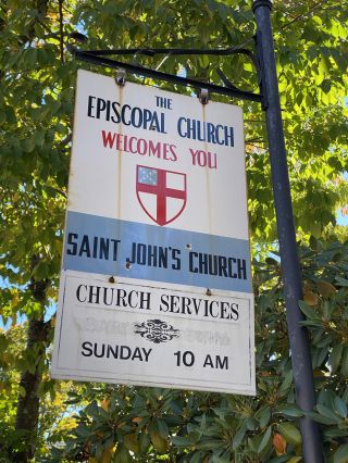
Saint John’s Church, Ashfield, Massachusetts
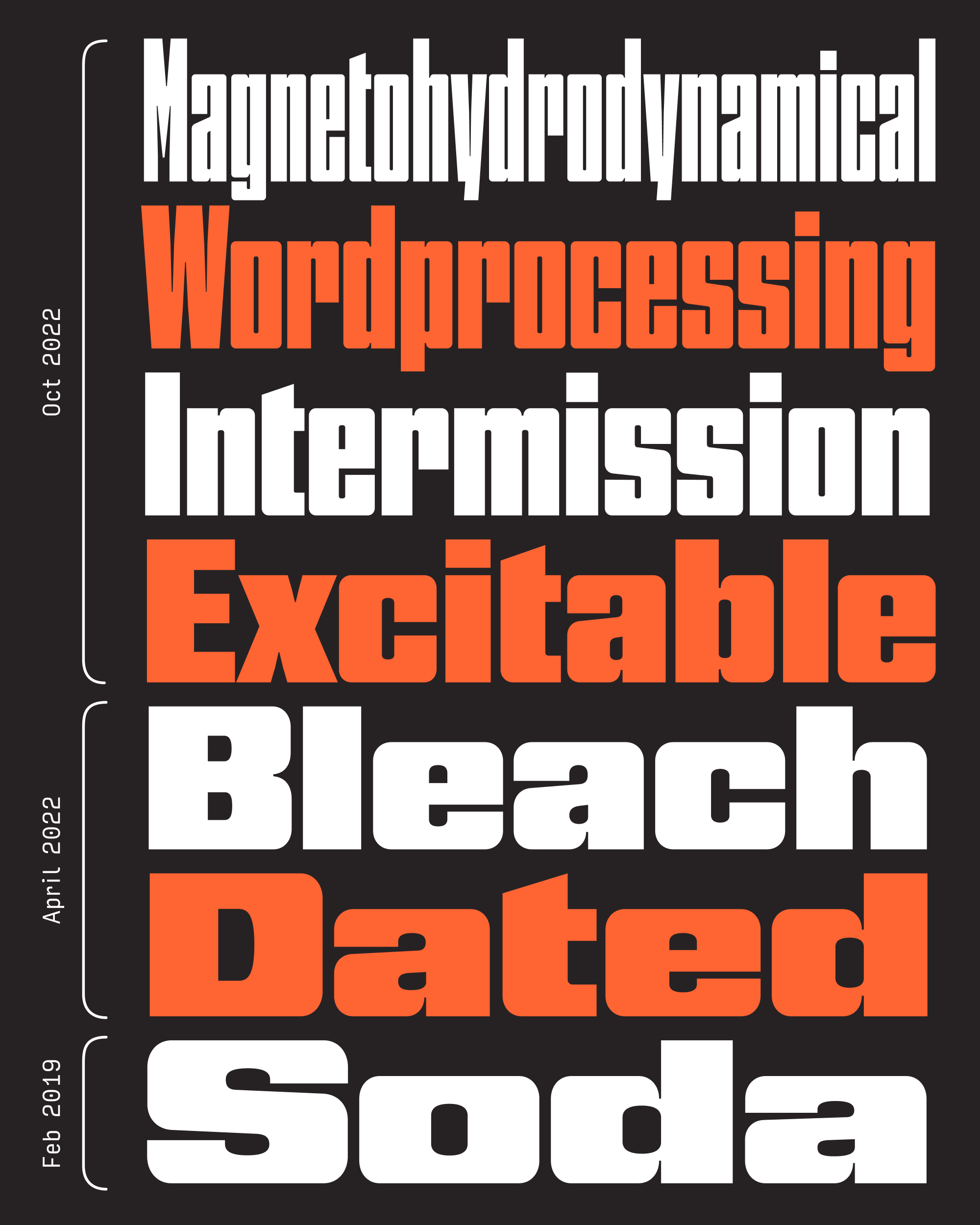
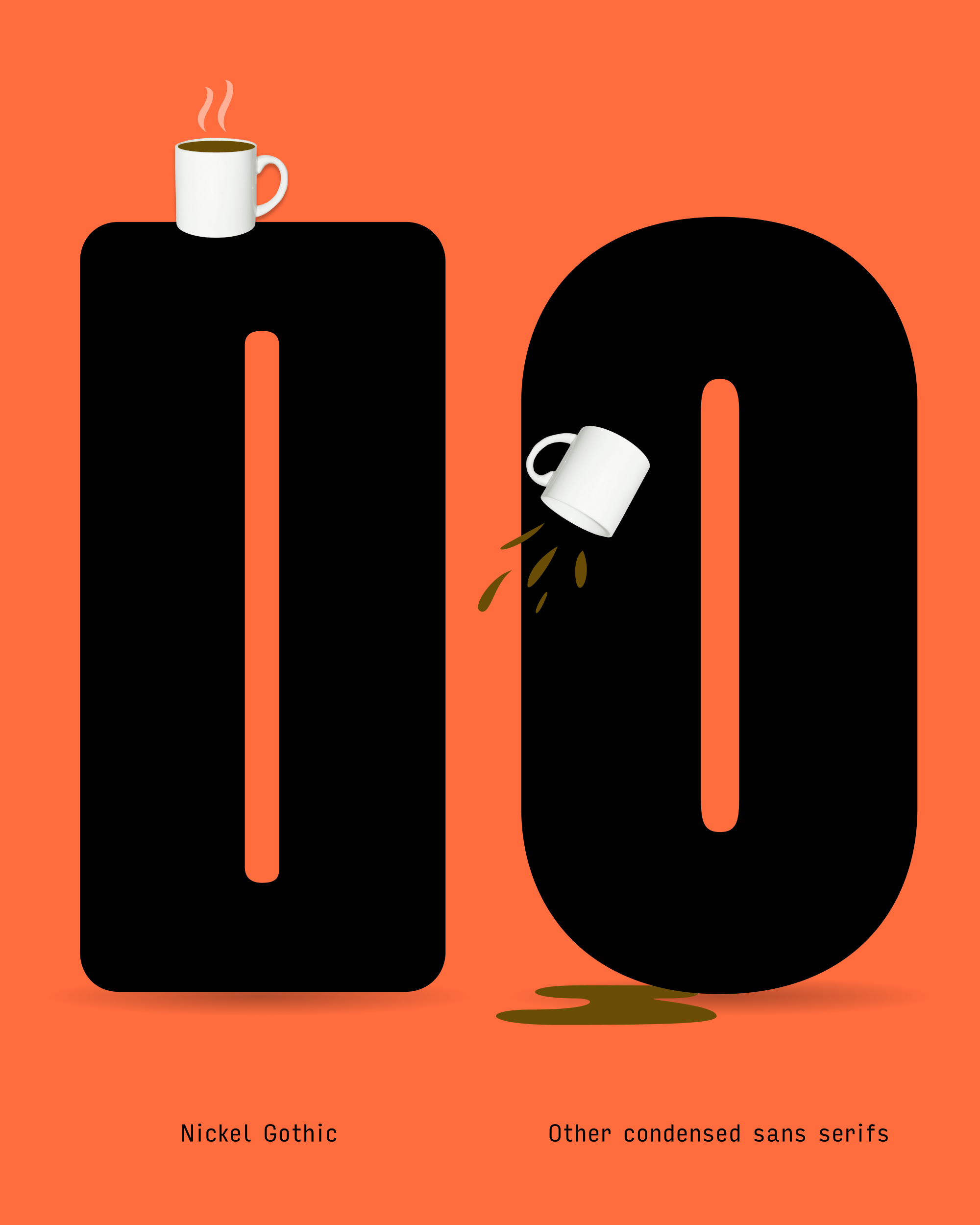
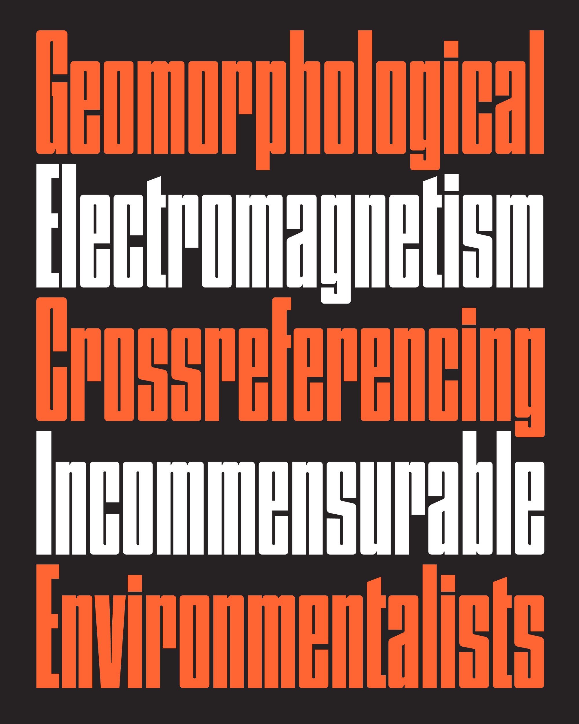
The Condensed Sans genre is a crowded one. It’s one of the reasons I’ve hesitated to update Bild even though I know I should…I’m still trying to find the thing that makes Bild special. But for whatever reason, Nickel Gothic feels easier. I said in my April mailing that each letter of Nickel Gothic should land with a resounding thud, and a big part of that has to do with the exaggerated flatness of “round” shapes like O.
Plenty of sans serifs get more rigid as they get narrower, exchanging their ovoid O for a stadium shape. Heck, it even happens in Helvetica Compressed! But Nickel Gothic has “rounds” that have straight sides to begin with, not to mention completely flat tops and bottoms. These flat-top exteriors contrast with the round-top interiors and leave additional weight in the corners (shoulderpads?), giving Nickel Gothic the feeling of being more “engineered” than “drawn”.
The problem with making Nickel Gothic narrower is that these distinctive flat tops started to get less and less noticeable. So I raised the thick/thin contrast and reduced the corner radius of the exterior shapes, accentuating the flat surfaces as much as possible. And I made no attempt to create a gradual transition between the straight and round segments, further underscoring the flatness that sets Nickel Gothic apart.
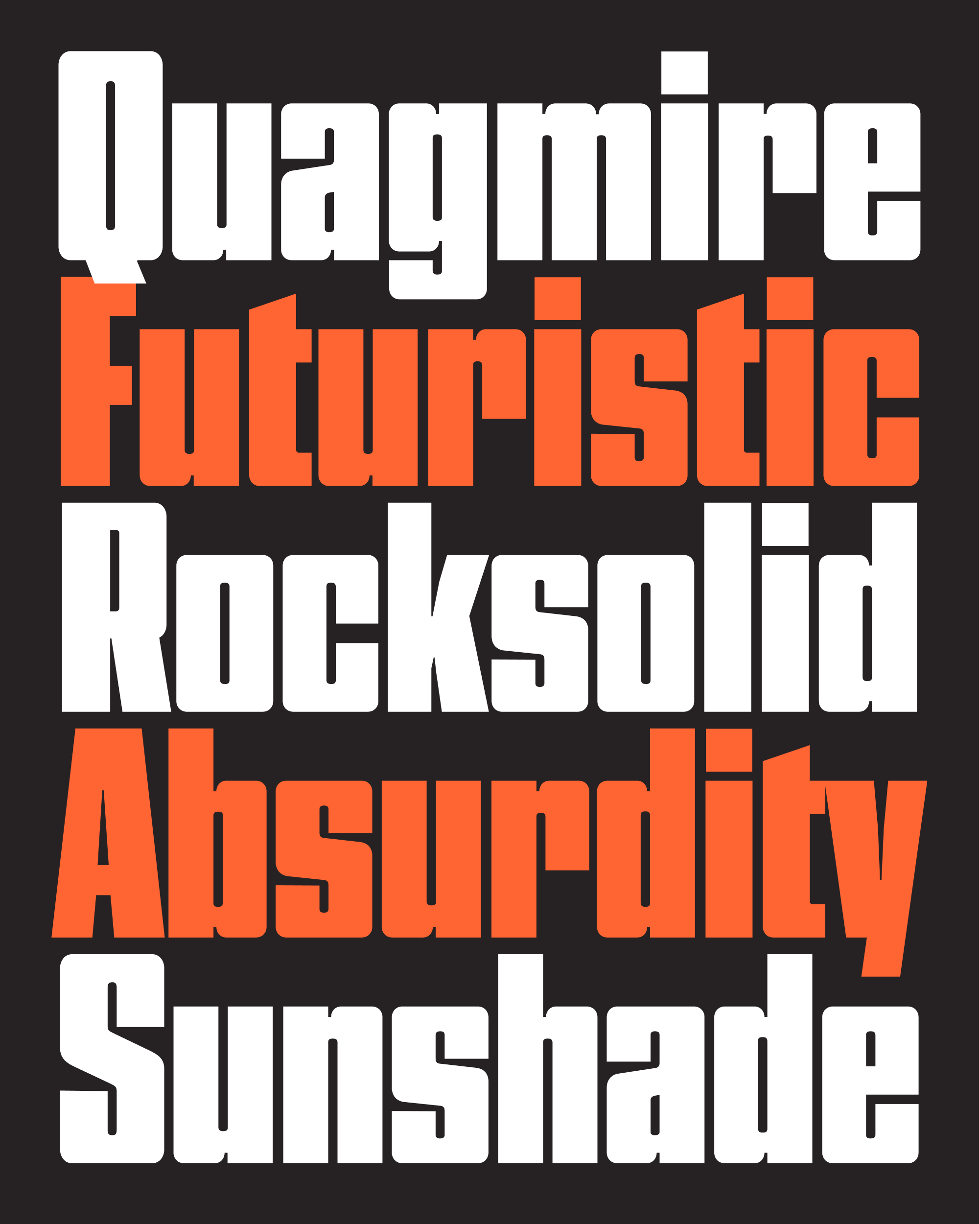
I tend to gravitate towards typefaces that hang out in between genres. The thing I like about Nickel Gothic Condensed is that it’s not materially different from a classic headline sans, but its flat-top style moves it one step closer to abstract shapes. It’s an odd midpoint between a functional sans like Bild and a novelty sans like Fit.
Nickel Gothic’s narrower version exacerbated the difference between closed-in, double-stroke letters like O and C and open, single-stroke letters like E and T. The latter group had to get significantly narrower in order to avoid leaving big open spaces in text. Diagonal letters like v and y also took lots of extra massaging to get their intersections to not feel overwhelmingly congested.
But, as I was writing up this mailing a couple weeks ago, I started to feel the same pang of regret that I felt in April. I should have gone even narrower!
I didn’t necessarily feel the need to explore the illegible extremes of something like Barcode (after all, Fit has been there, done that), but as I was looking at uses of Permanent Headline and Compacta I wondered if Nickel Gothic could be a flat-top alternative to those as well. I followed their lead and added a bit of letter spacing to battle the picket-fence-effect that Compressed fonts get when the space outside the letters is equal to the space within them.
These new styles get pretty far from the 1918 Chinese banknote that served as Nickel Gothic’s jumping-off point, but I think they feel like a logical extension for the family, not to mention a lively variable axis to play with in your headlines.
Thanks for letting me take the extra time this month, and I hope a few of you appreciate that these four new widths are available in Cyrillic and Greek as well. Let’s plan on the next mailing landing late as well so I can play a little catch-up. 😅 Enjoy your month!