I can only speak for myself, but not much of a slowdown over here, not too many “toy fonts” (aside from Fit), and hopefully accessibly priced (discounted licenses are also available).
Also, all of my major families are available as variable fonts, except for Turnip and Input which are hopefully coming in 2023.
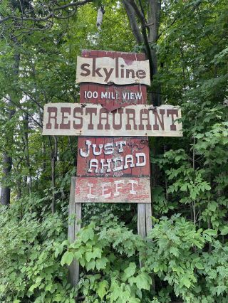
This summer, my wife Emily and I were passing through Southern Vermont and we stumbled upon this A+ sign on the side of the road. The forest was starting to overtake it, and we almost missed it. We quickly pulled into the brewery that now occupies the Skyline Restaurant building, placed an order for pizza and beer, and walked back a quarter mile to get a closer look.
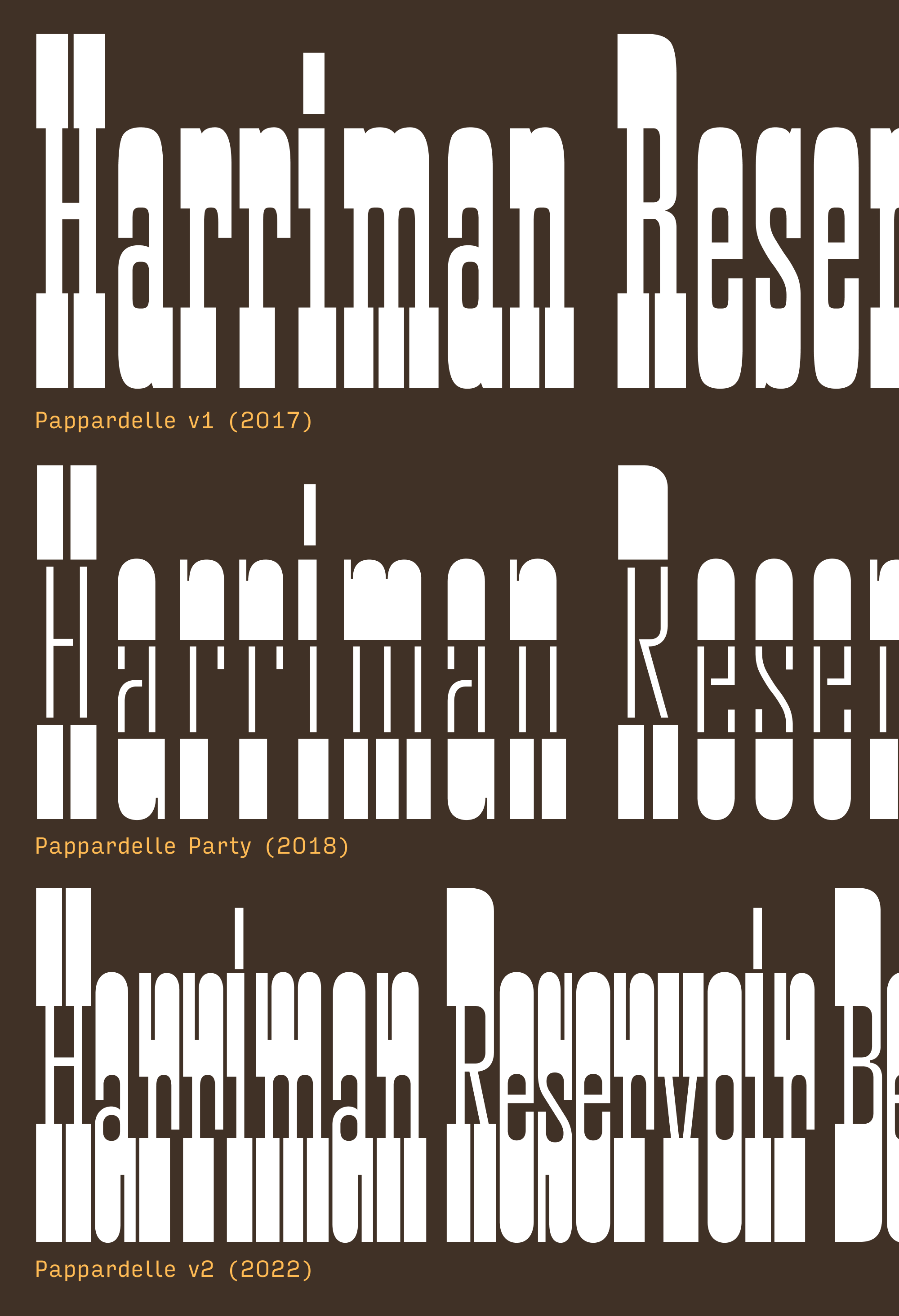
Unsurprisingly, my first thought was, “I should make a font like that.” But then I realized, I already have a font like that! Pappardelle, released October 2017, was my take on the 20th Century French Antique, directly inspired by Herbert Matter’s midcentury logotype for Knoll furniture.
When I first drew it in 2017, Pappardelle was my jam—I even used it in the Font of the Month Club’s original logo. But it always felt like it was more fun for me to make than it was for anyone else to use; even though it’s ostensibly a Display font, it felt too straight-down-the-middle and throwbacky to have any freshness or spark. I typically try to put a damper on “look at me” energy in my typefaces, but Pappardelle needed exactly that. So this month I’m sending you Pappardelle v2, a top-to-bottom overhaul of my beloved little French Antique.
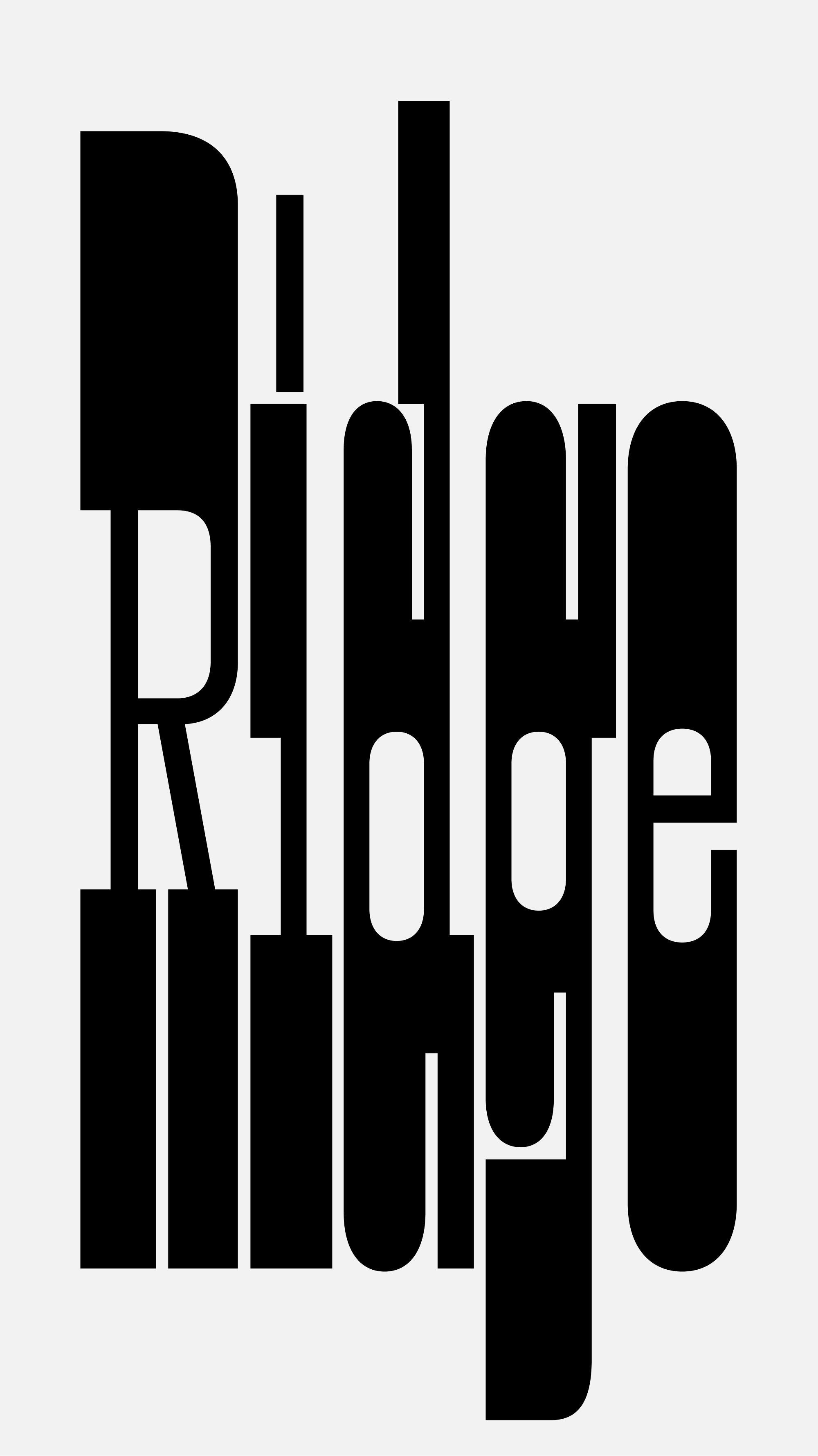
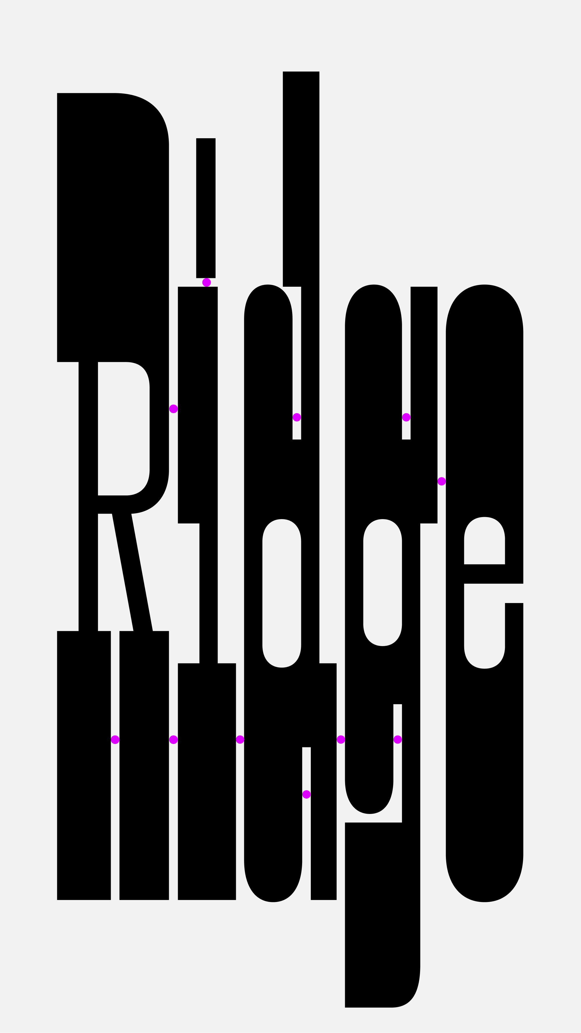
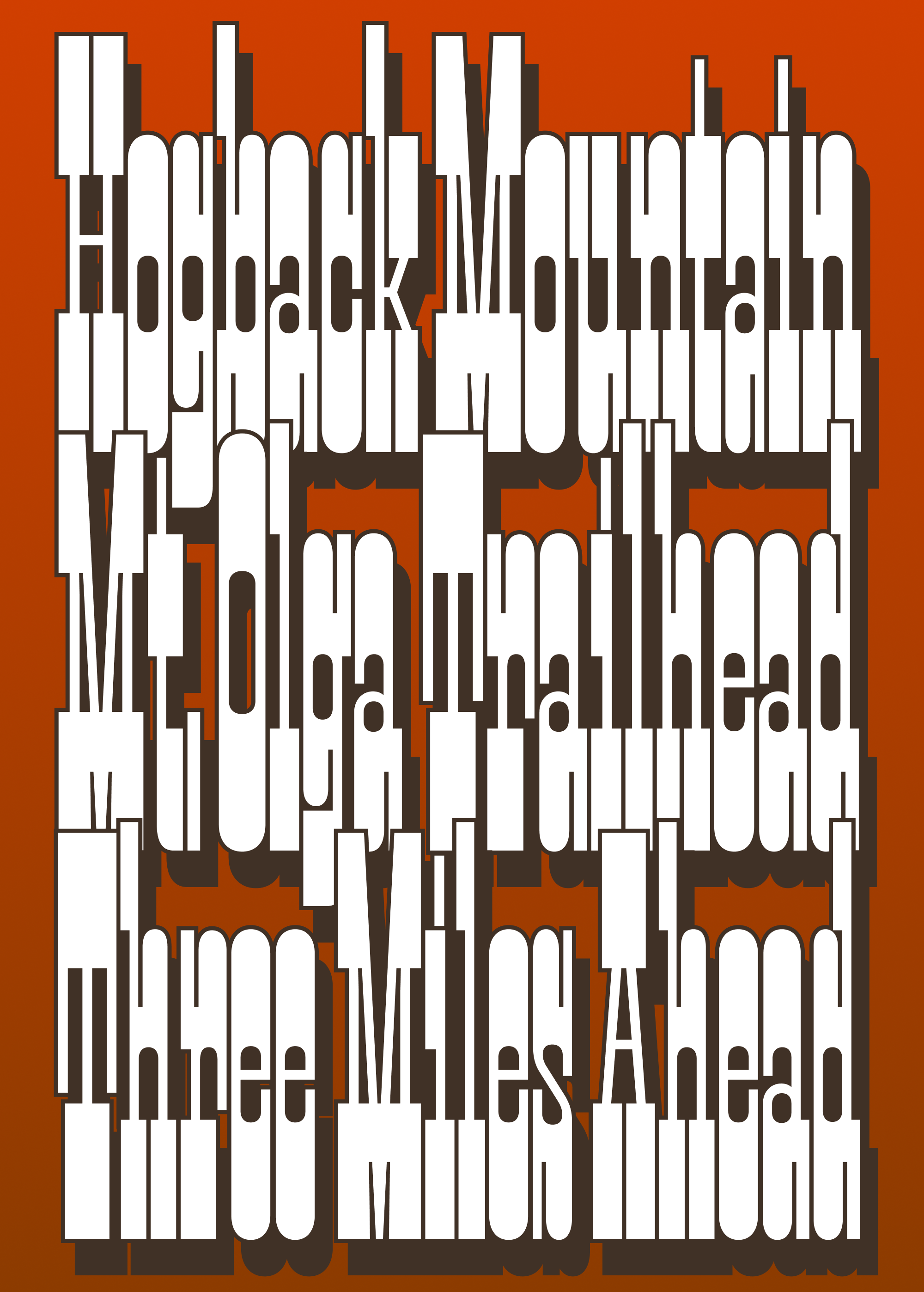
The first thing I did was bump up the x-height and make the thick horizontals a whole lot thicker. In the caps, they went from roughly a quarter of the cap height to a third. These new proportions and increased density feel closer to the Condensed French Antiques made by Wood Type manufacturers in the second half of the nineteenth century. The thin vertical strokes and geometric curves are closer to Pappardelle Party, the stencil color variable experiment I made in 2018. And like Pappardelle Party, the curves are now less organic and more geometric; it’s easier to see the point at which straight segments become curves.
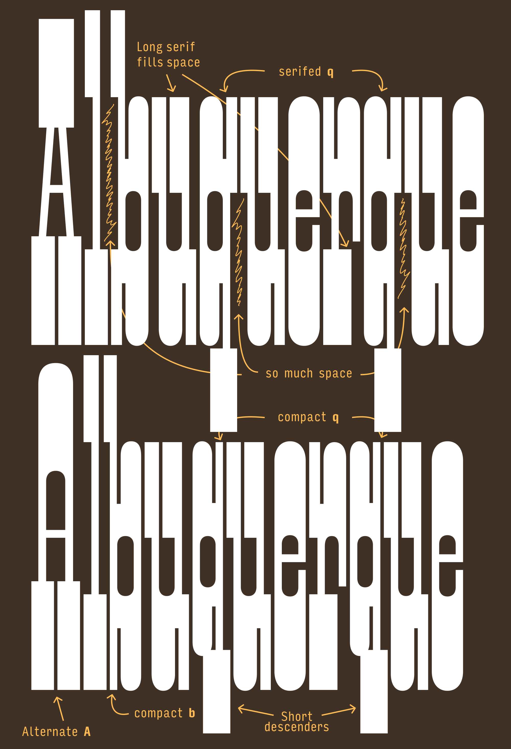
I also decided that I didn’t need to stick so close to historical precedent. I made the vertical serifs in L, T, etc. as long as I could, and let the crossbars of E and F extend out to the outermost edge of the letterform. I also separated serifs from curves by adding elongated inktrap-like divots to a majority of the lowercase and a handful of the uppercase (C, G, S). Not only do these divots make the letters more readable, they make them feel even more elongated than they actually are. Letters like M and N get their own type of divot when slab serifs collide with their diagonal strokes.
Horizontal stress is always a bit of an awkward fit with the Latin script, and tension arises when some letters (like H) get overrun with super-thick serifs and others (like O) don’t. The serifs in this style carry so much weight that everything is thrown off balance, especially in letters like E or p which have serifs on one side but not the other.
One solution would be to reduce the serif length. But it’s a Slab Serif font...the serifs are kinda the point! The old Pappardelle used judicious letterspacing to alleviate some of this tension, following typographic convention by letting the serifs pack closer together and giving more breathing room to the round characters (compare man and ese in the image above.) This tracked-out feeling was nice in logos (like Matter’s logo for Knoll), but caused the headlines to lose some punch.
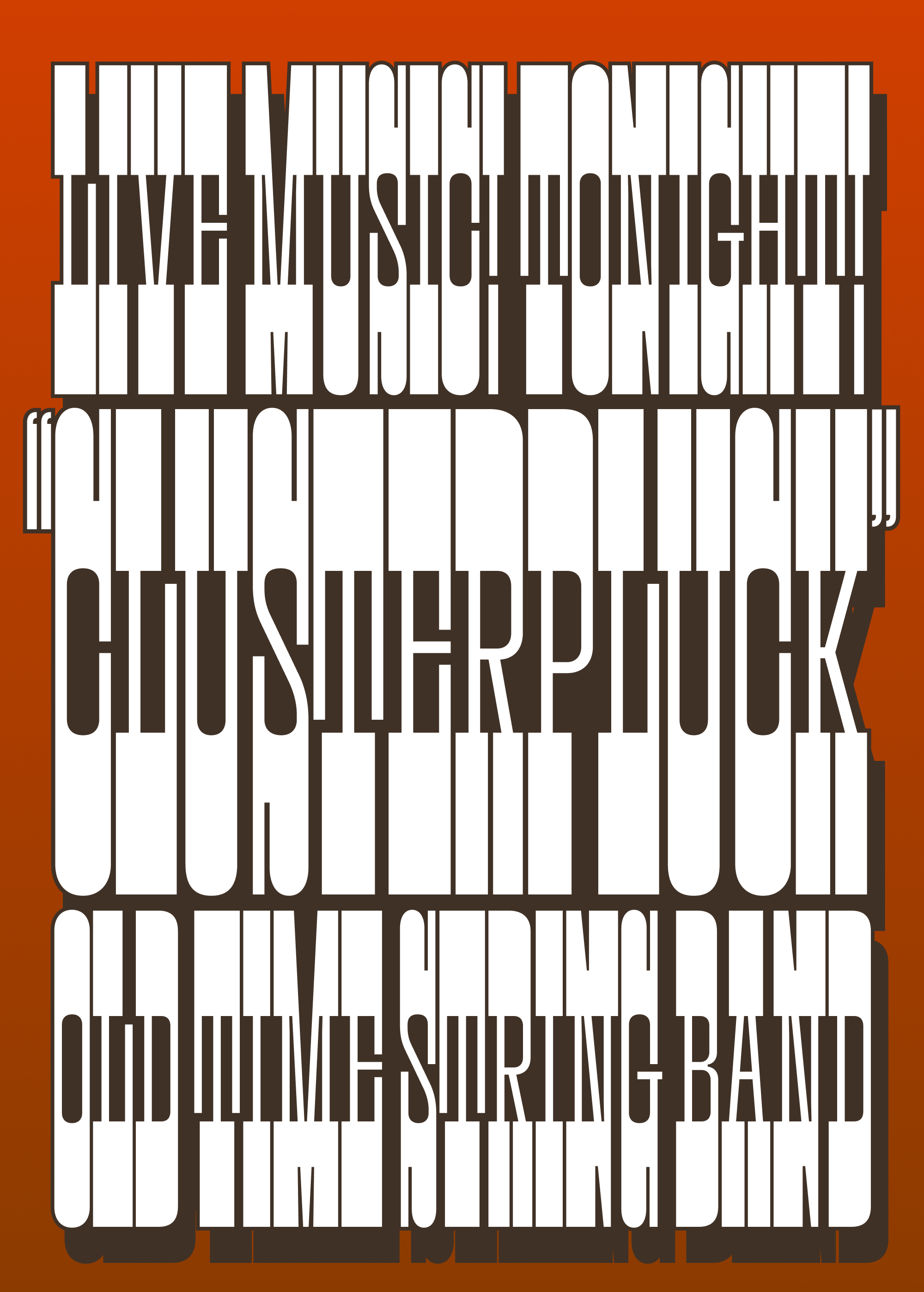
Now, the new Pappardelle packs tight. You can still track it out if you want to, but by default it will set taut, frenetic headlines. I only cared about one thing when spacing this typeface: making as many 8-unit gaps between serifs as possible, balanced letterspacing be damned. The result is so simple it’s essentially spaced like wood type: the H sidebearing is 4 units, the O sidebearing is 4 units, and pretty much every other letter follows suit.
In the uppercase, this creates dense bands and the top and bottom of each line, something I’ve seen referred to as “the railroad track effect.” The 8-unit gaps between letters creates a rhythm that punctuates these bands, which is further reinforced by the 8-unit divots and 8-unit gaps within the letters. As you can see in the samples above, I’ve been having fun with drop shades and stroking the outside of the letters at 0.65% of the font size, which ends up being just enough to fill those gaps.
What happens in the lowercase is much more complex…there’s a lot more asymmetry and you really start to feel the push and pull between serifed and unserifed shapes. Serifs ascend and descend to disrupt the railroad track effect, and overhanging/underhanging serifs jut out into the space of the next letter and disrupt the spacing.
Mostly, I decided that this is a feature, not a bug—the imbalance only adds to the typeface’s newfound frenetic energy—but I did take some small steps to mitigate these disruptions. I tweaked serif lengths slightly to compensate for asymmetry, and employed contextual alternates to help minimize spacing in especially tricky letter combinations. And I added stylistic alternates with short descenders that help out when you want to pack lines closer together. (You can also let lines overlap…the nice thing about horizontal stress is that the tops and bottoms of letters are not necessary for legibility!)
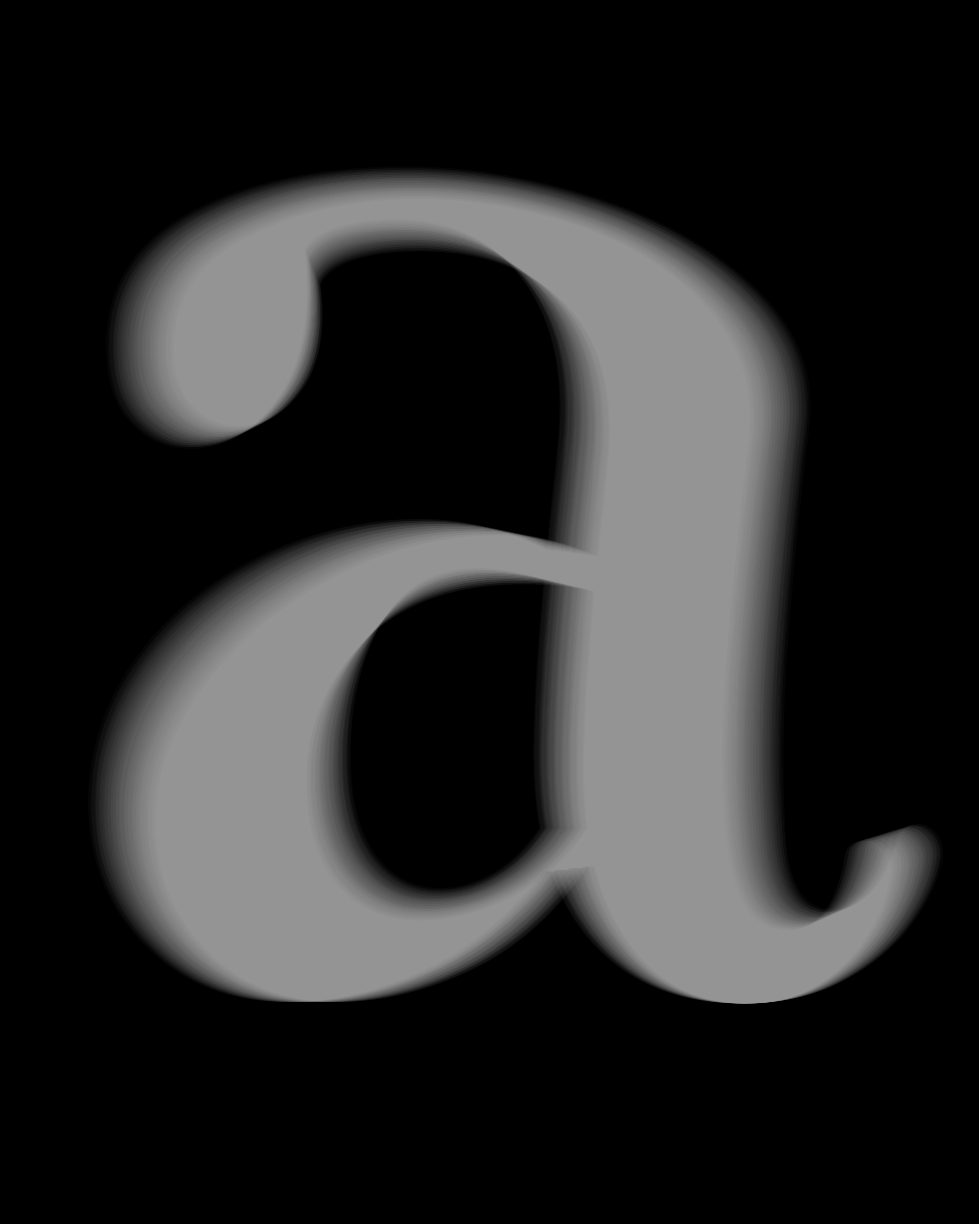
This didn’t turn out anything like that sign I found in Vermont, but I did throw in a straight-sided alternate A in its honor. Enjoy it, and have a wonderful December! 🤠
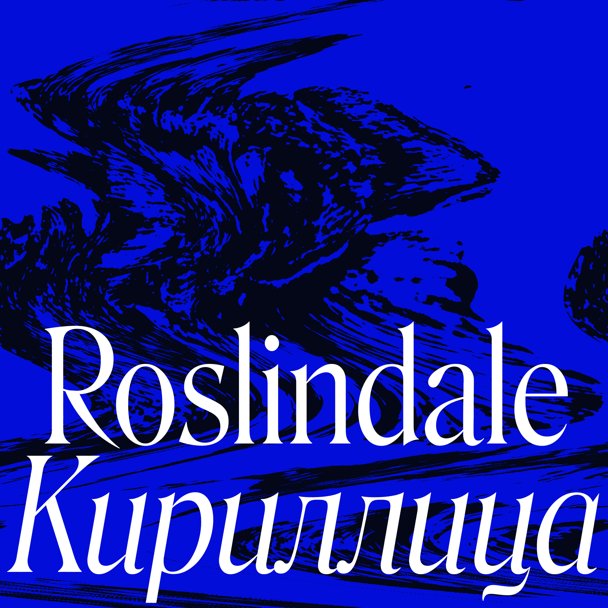
In my recent interview with The Weekly Typographic podcast, we talked about the two sides of running a type foundry: making fonts and everything else. Over the past couple months, the everything else got the better of me. This isn’t necessarily a bad thing; I tend to neglect administrative tasks. It was exciting to put some projects in motion for next year and release Serbia-based designer Jovana Jocić’s beautiful rendition of Roslindale Cyrillic.
But I appreciate your patience as I sneak in a small update for November’s font right under the wire. Tomorrow, I’ll be back again with a mailing for December.
Since I released Warbler Text in February, I’ve received more requests for Warbler Text Bold than anything else. It’s not a glitzy request, but I get it. Roman + Italic + Small Caps might be enough to typeset a traditional start-to-finish book, but a more complex document calls for more complex typography to guide the reader through it. And in turn, more complex typography calls for more complex type families. A Bold certainly comes in handy!
But here’s the problem: As I discussed in previousmailings, what I appreciate most about Warbler—and the types William Martin cut for William Bulmer before it—is its quiet, delicate touch, and the quiet, delicate typography that it presupposes. Bolds, on the other hand, tend to be brash. They turn up the volume on a typeface and amplify its features—a caricature of the Roman whose entire purpose is to stick out.
Slab serifs and fat faces used as Bolds, in “Hill’s Manual of Social and Business Forms”, circa 1884. Example courtesy of Kent Lew.
Warbler attempts to channel the last gasps of pre-Industrial typographic style in Britain, before advertising and mass-market ephemera transformed the design landscape. Its source material dates back to 1790, a time when fonts didn’t come with their own Bold variants. And like with Fern, I’ve been reticent to make the family more than it needs to be.
The Bold is really a creature of the 1800s, getting roped into type families only after typographers started throwing separate Fat Faces and Slab Serifs into the typographic mix for visual emphasis, as shown in the image above. There’s a funny anachronism to Bold in any pre-Industrial style, and it can be tough to shake those 19th Century origins: if you take any serif typeface and add enough weight to the vertical stems, it becomes a Fat Face. If you add enough weight to the stems and serifs, it becomes a Slab.
Warblur?
The 19th-century Scotch Roman is not too far off from the Warbler/Bulmer style, and has proven to be widely adaptable to extremes in width and weight. But as the Warbler family grows, I’m more and more determined to set it apart from Scotch Romans. Its relative inadaptability dovetails with my own laziness this month, to become a philosophy of “Minimum Viable Boldness”: what’s the least I could change about Warbler Text to make it function as a Bold?
So I added weight more-or-less evenly to the inside and the outside of the letterforms, and enlarged ball terminals just enough for them not to feel shrunken. I left the serifs alone as much as I could, striving for a thick-thin contrast that was sharp enough to not feel gummy, but low enough to not feel overtly Fat Face-y. I’ve thrown in SemiBold and ExtraBold options as well, so you can choose how much contrast feels right for you.
Warbler Text Bold ended up being defined more by what I don’t want it to be than by what it I do want it to be. I don’t know if that’s a good thing or not, but honestly I like a little friction in my design process. Display Italics are next on my list, but I’ll probably continue to resist a Display Bold (and certainly a Text Bold Italic) until the need presents itself (or someone pays me to do it 😜).
I hope this small addition makes Warbler Text a richer, more utilitarian option for your complex texts.
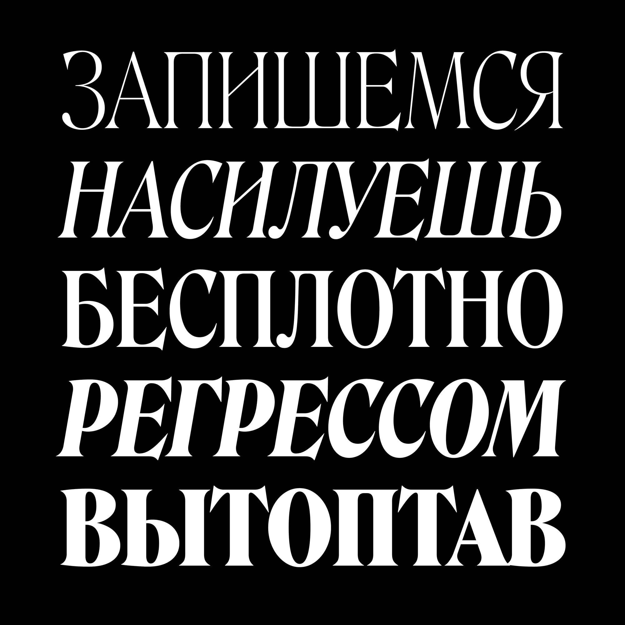
Last year, Jovana drew a Cyrillic extension for Forma DJR, and I thought she knocked it out of the park. So I was excited to work with her again on Roslindale, a quirky Victorian stew where pointy serifs, bulbous terminals, and italic forms add a new layer of complexity.
Roslindale is a reinterpretation of De Vinne, a typeface that was originally published in the 1890s by the Central Type Foundry. It turns out that its spiky/blobby contrast is a natural fit for the Cyrillic script, which has more opportunities than Latin for both spikes and blobs. And in her Cyrillic extension, Jovana passes up no opportunity to heighten this juxtaposition.
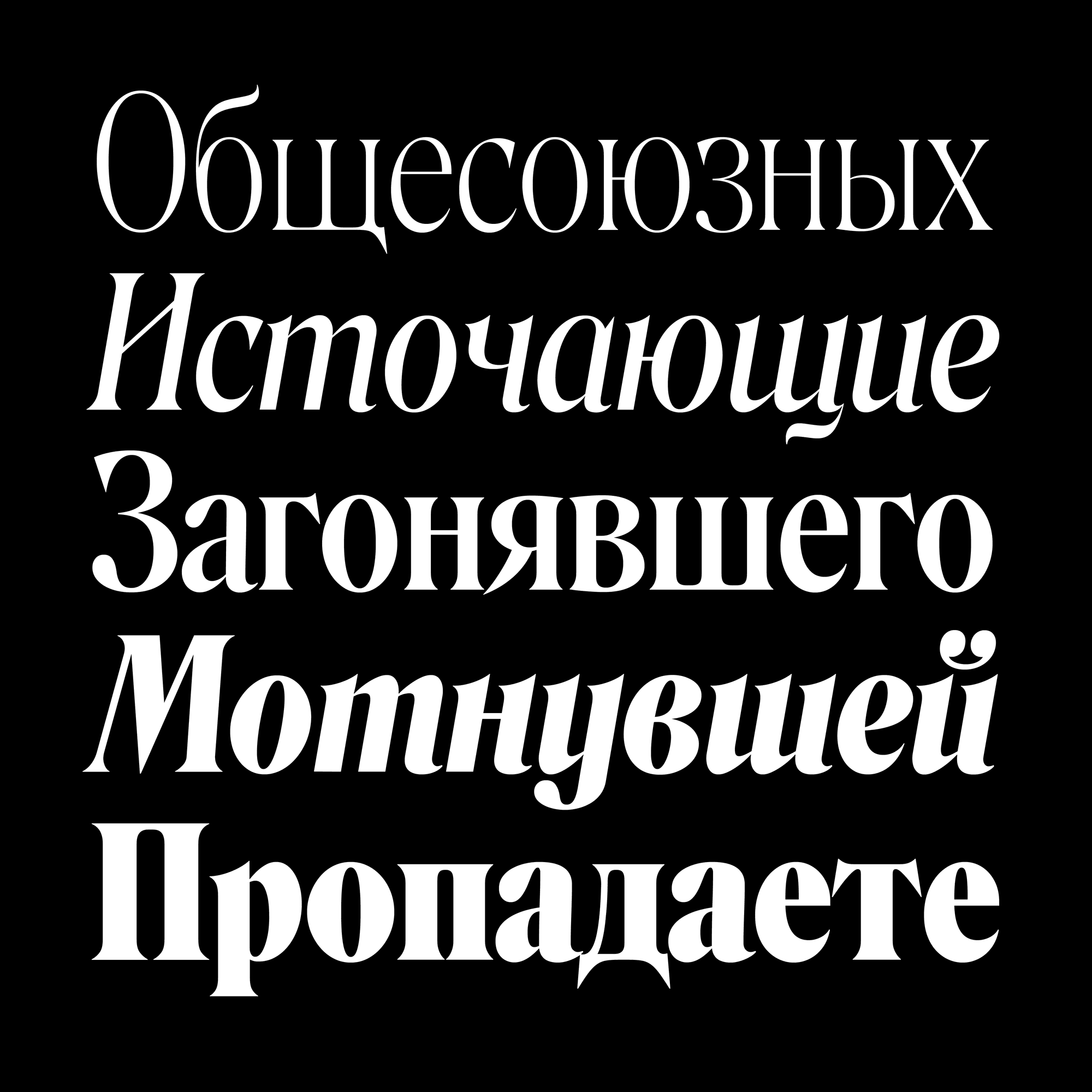
Of course, Jovana made sure that the key features of my Latin design were brought over to the Cyrillic. For example, the spike on the Я is similar to the Latin R (but not exactly a reflection of it!). But she also carefully expanded Roslindale’s vocabulary of shapes to include forms that don’t exist in the Latin. This includes the “teeth” that descend at the bottom of д and ц, the ball terminals atop Й, and the swishes in Э and б that feel like toothpaste being squeezed out of a tube.
Throughout the design process, Jovana and I met regularly, looked over proofs, and discussed the best way to balance the needs of the typeface with the needs of the script.
Roslindale Cyrillic is available in a series of Display Condensed weights from Extra Light to Ultra, as well as a more limited set of sturdier Deck and Text weights for smaller sizes. It contains Bulgarian, Serbian, and Macedonian alternates, as well as stylistic alternates that allow you to easily deploy Italic forms in the Upright fonts and vice versa. Oh and there’s a variable font too!
The images on this page are only the beginning...feel free to browse the specimen page, view the PDF specimen that Jovana designed, and grab a copy of the the trial fonts. We can’t wait to see what you do with this extension!