May’s font of the month: Nickel v2
Exactly five years ago, I published the inaugural edition of the Font of the Month Club. I thought I’d be ready to celebrate this anniversary with some big, insightful retrospective on how the experience has redefined my process (which it has) and transformed the way I think about making and releasing type (which it did).
But that’s the thing about working this way: the months pass by so fast that it’s hard to pause and reflect. And if I have to choose between writing a thinkpiece or reinvigorating one of my lesser-used fonts with a superfluous 3D highlight, I’m always gonna choose fonts! 🤷
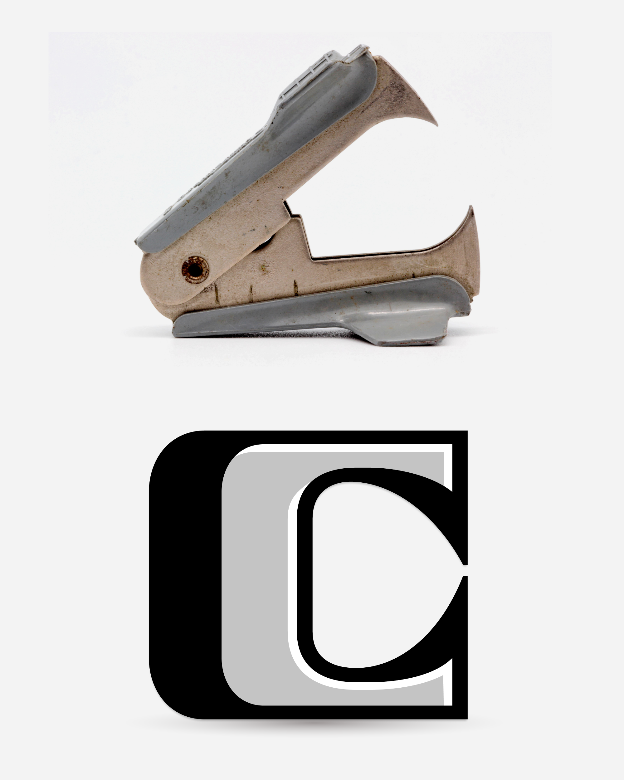
Hot on the heels of Nickel Gothic’s expansion, I’m sending you an expanded version of Nickel, the original font of the month (May 2017). Like last month, I started by adding a lowercase, and like last month, it was a pretty clear-cut transformation that turned out even nicer than I had hoped. The imposing vertical serifs (essentially the jaws of a staple remover) get even larger than they were in the uppercase...what can I say, I like tall vertical serifs!
Like Forum, Augustea Open, and other midcentury outline fonts before it, Nickel’s Open Face variant plays with the tension between 2D abstract shapes and 3D optical illusion. Coming back to it now, I added optical correction to the open shapes so the horizontal lines no longer feel too thick.
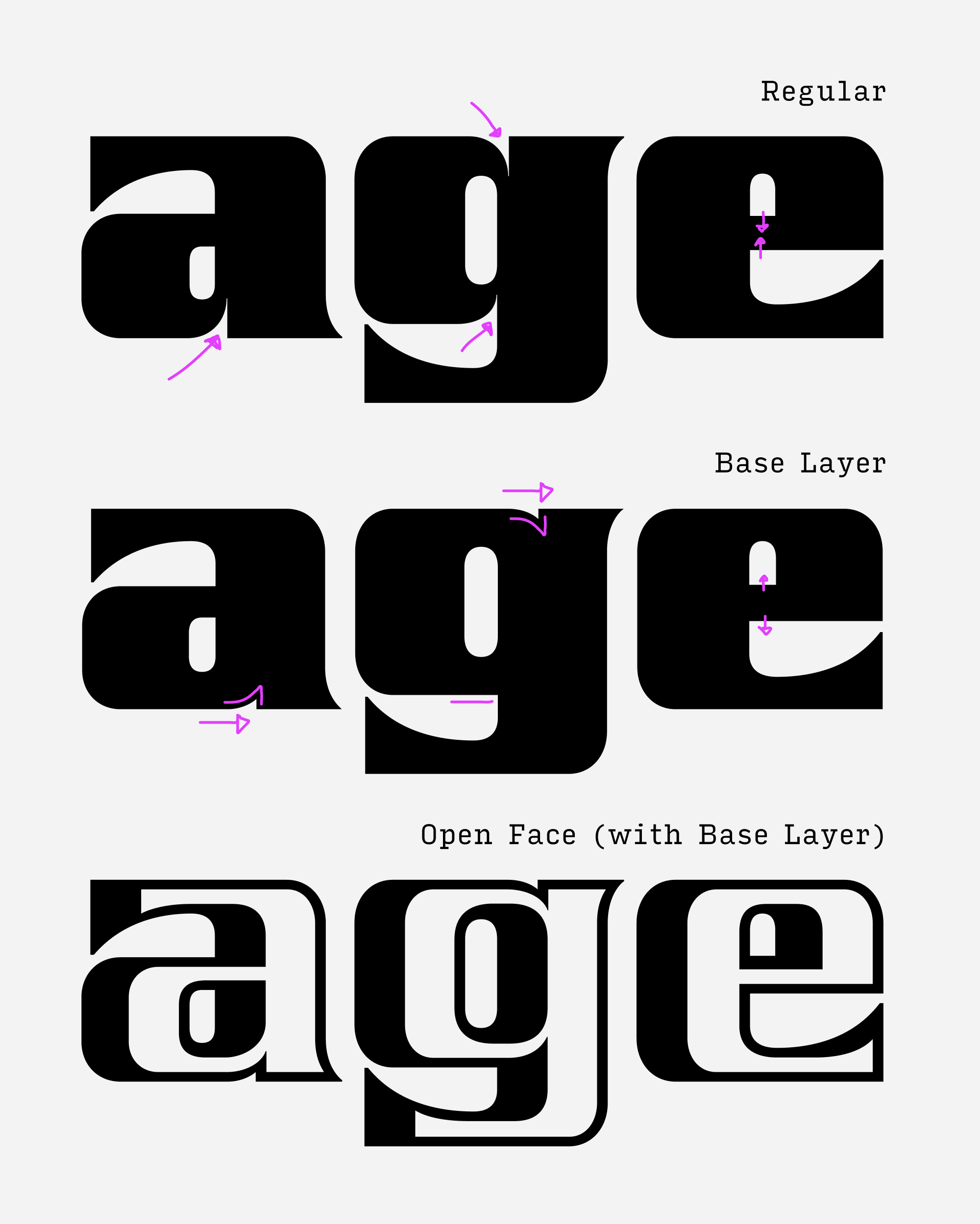
I also “forked” the base layer, so there are different versions for using alone and in combination with the open shapes. This allowed me to make specific accommodations, most visible in the pinching counterforms of the lowercase. When used alone, I wanted those pinches to feel sharp and incisive. When used with the open shapes, I needed them to shrink or disappear to make room for the inline shapes.
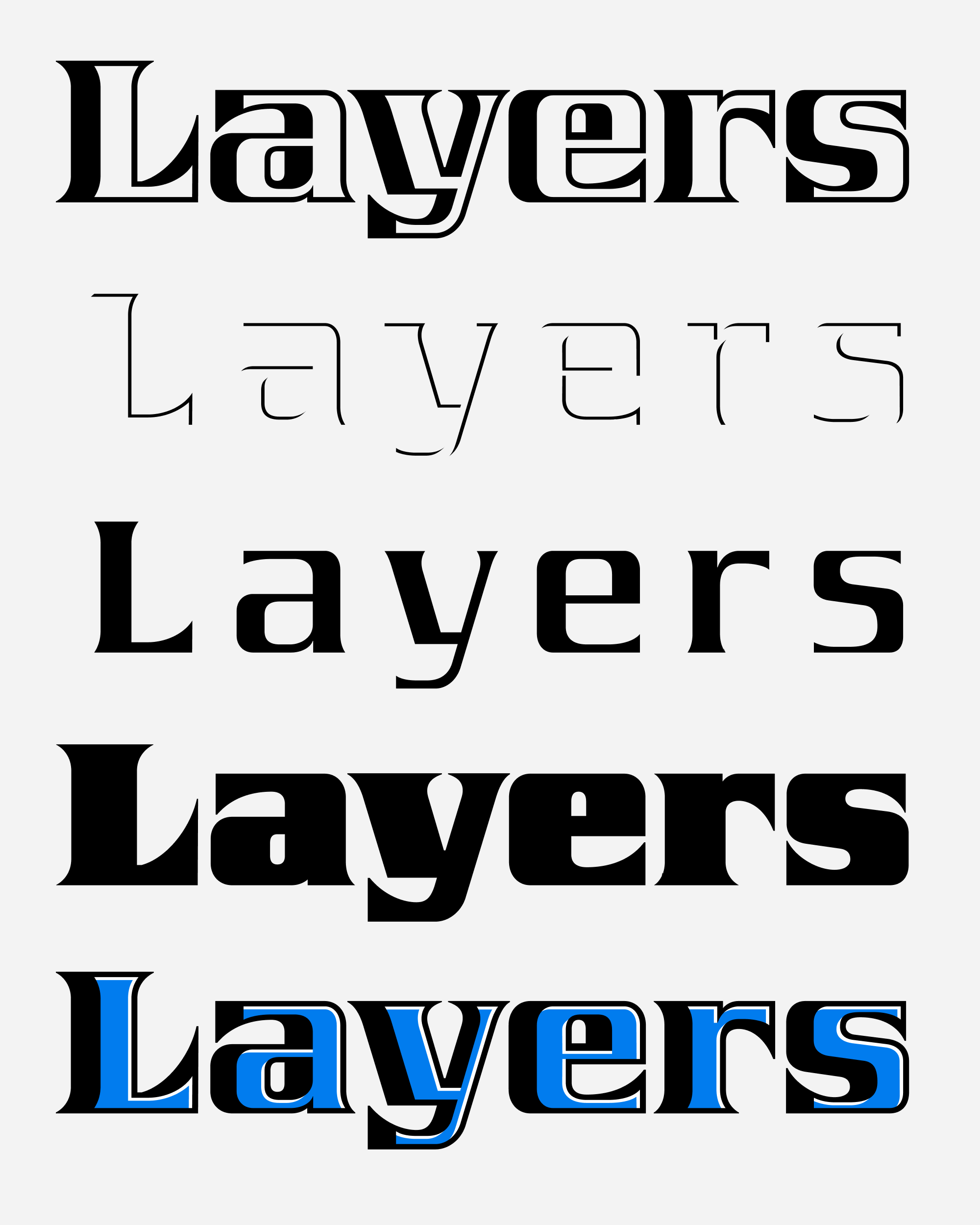
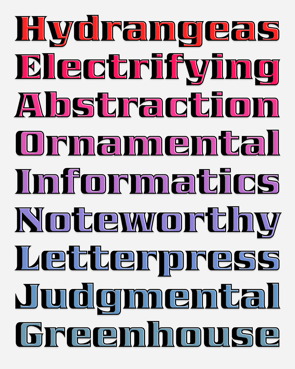
Last but not least, I drew the aforementioned highlight layer to add a little extra oomph and gave Nickel the full color fonts treatment: it now comes as layerable fonts (Nickel Layers) and color fonts (Nickel Color).
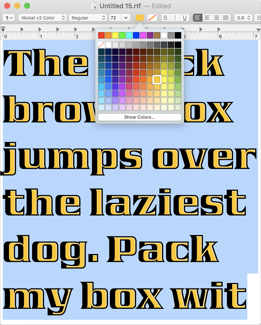
On the technical front, there’s been recent progress in support of customizable color palettes in Safari and Chrome, which I hope will make my color fonts easier and more fun to use. I’d love to see color palette selection in Desktop apps, but in the meantime you can always use my Color Font Customizer to tweak the color palettes embedded in the font file.
And for the first time, I’m including a version (Nickel v2 Color Regular) that doesn’t rely on predefined color palettes and instead uses the primary color of your text. It doesn’t seem to work in Adobe apps, which is a bummer, but I think it’s still pretty nifty.
Maybe someday I’ll sit down and write that retrospective, but for now let me just take this opportunity to thank Font of the Month Club members for supporting my work! Five years later, I still think this club pushes me to make more interesting work than I would be otherwise, and it’s hard for me to imagine what my life would be like without it. Whether you’ve been a member since the start or you just joined last month, you made that possible. 💜
Fit Devanagari Process piece
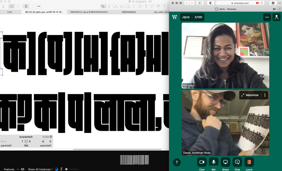
Kimya wrote a fantastic piece about the process of making Fit Devanagari...I encourage you to give it a read!
Now available: Fit Devanagari
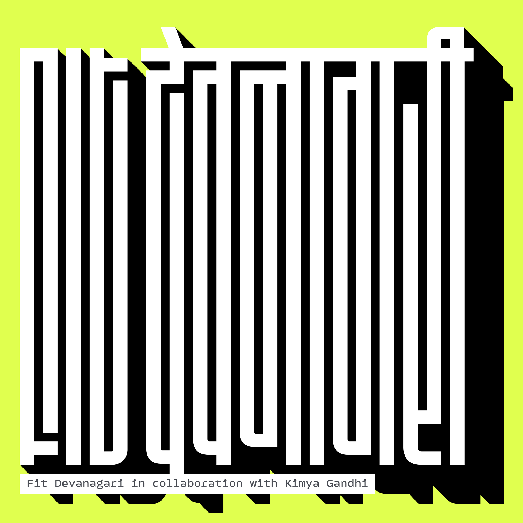
I am excited to announce Fit Devanagari, designed by Kimya Gandhi.
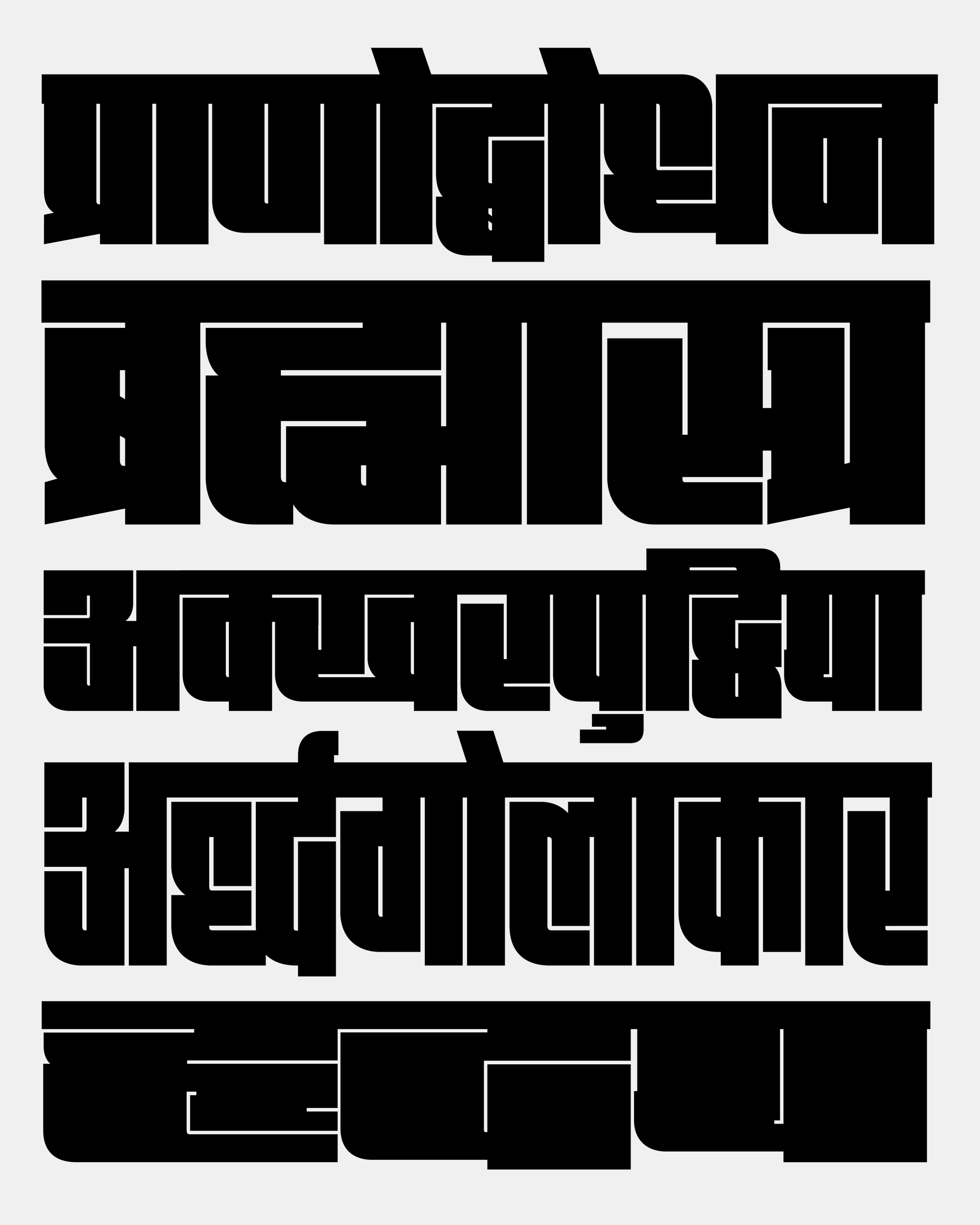
Fit is a blocky display sans-serif that is designed to fill space with maximum impact. Its comes in an agonizingly wide array of widths (and a variable font). This gives Fit the ability to squeeze just about any text into just about any space, forming an intricate maze of positive and negative shapes in the process.
With Fit Devanagari, Gandhi takes this concept to new heights of labyrinthine complexity. She had the difficult task of finding abstract shapes in letterforms that maintain a close connection to calligraphy, and then executing them in a way that maximizes their recognizability as well as their graphic impact.
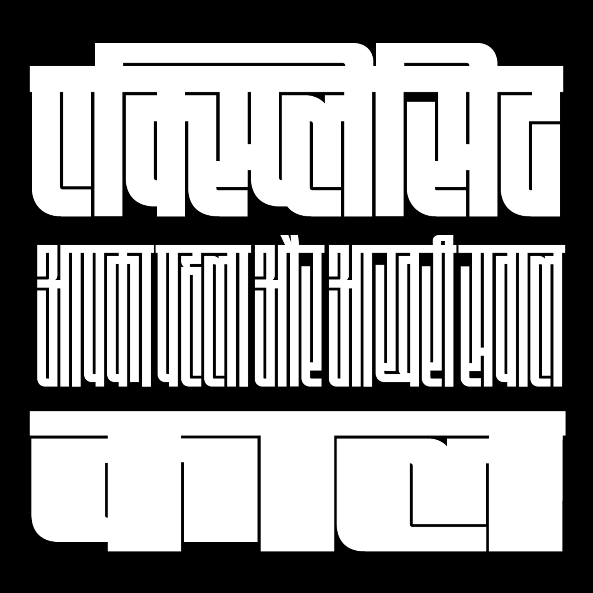
Fit Devanagari is the latest of a series of script expansions for the typeface. Fit’s original release in 2017 supported typesetting Latin, Cyrillic, and Greek scripts, and it was later expanded into Fit Hebrew by Oded Ezer in 2018 and Fit Armenian by Gor Jihanian in 2019.
Using their combination of squares and curves as a jumping-off point, Gandhi carefully constructed a distinct vocabulary of shapes for the Devanagari, with a powerful top line (shirorekhā), swooping curves in the lower-left, and a dazzling array of divets and intersections needed to express the hundreds of complex conjuncts that are part of the Devanagari script.
There are relatively few Indic typefaces that reach this design’s extremes of weight and width, that engage with stark geometry so directly, and that utilize Variable Font technology so dramatically. For these reasons, and so many others, I hope you find Fit Devanagari to be a worthy contribution, and a powerful tool for posters and titles.
Fit Devanagari is available for purchase directly from its designer over at Mota Italic (you’ll also find it included in my Fit offerings as well). And I encourage you to browse its specimen page and PDF specimen as well!

Dinamo’s Type Foundry Survey

I had the privilege of participating in the Dinamo Type Foundry Survey, where the folks at Dinamo asked some really thoughtful questions about the type biz and generated some refreshingly frank discussion from my colleagues about what’s involved in running a type foundry today.