July’s Font of the Month: Pomfret Lowercase
Exactly one year ago, I sent you Pomfret, a set of titling capitals I made in response to Bertram Goodhue’s striking cover for an 1892 edition of The Knight Errant. Ever since I took Roger Black’s suggestion to draw something based on Goodhue’s work, I’ve been looking for an excuse to get back to it. So what better way to celebrate Pomfret’s first birthday than with an accompanying lowercase!
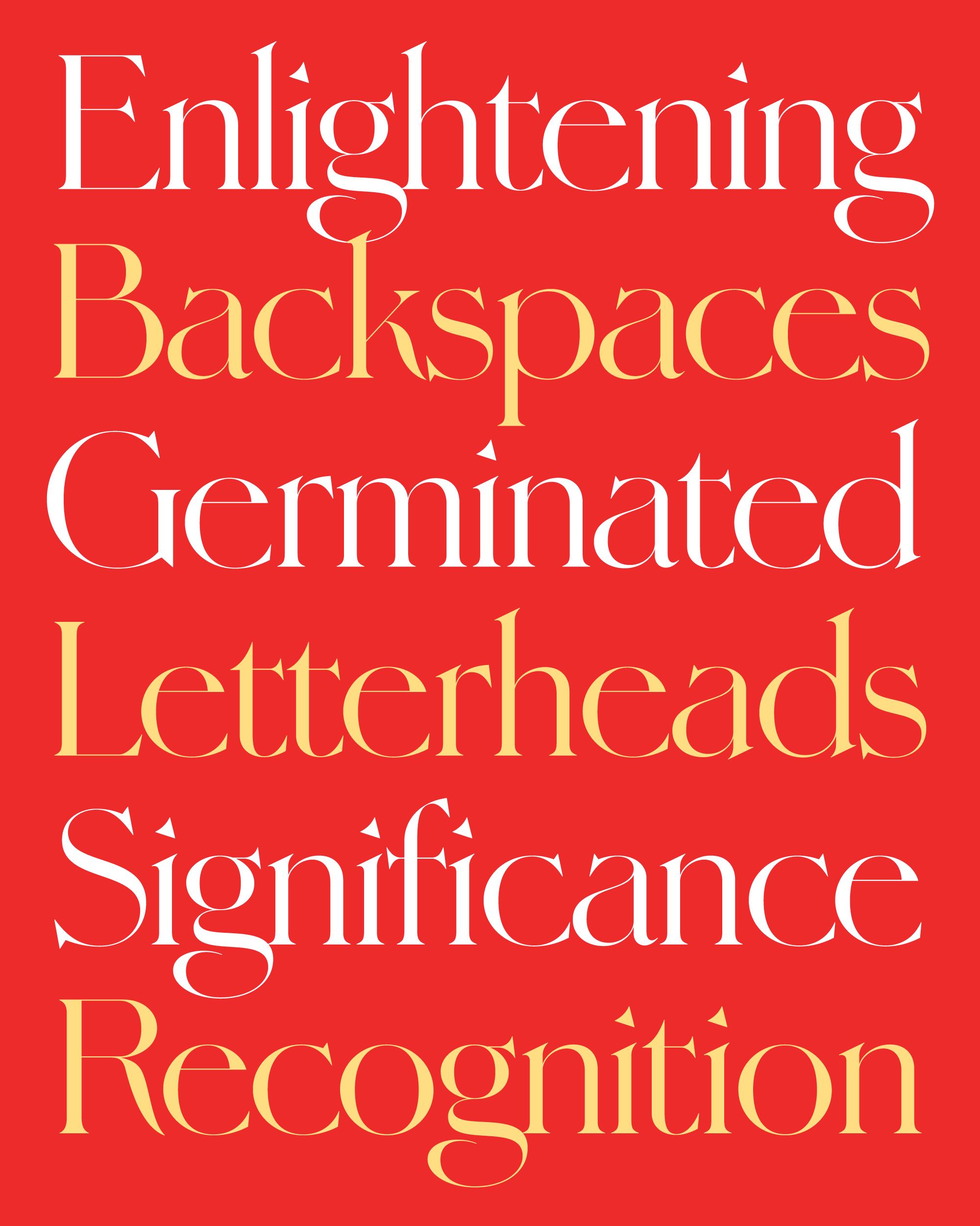
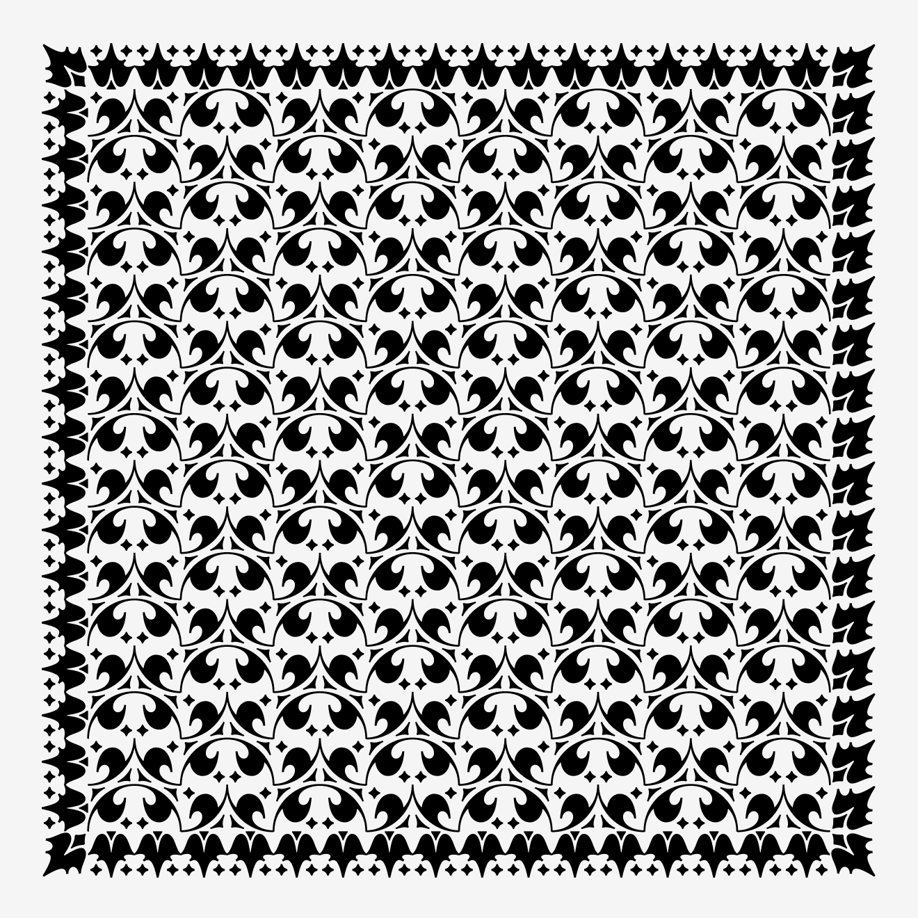
Typically I like to mix things up for the club, and I try to avoid sending you back-to-back family updates—especially two “classical” serif updates. But I do think Pomfret is an illuminating counterpoint to last month’s Fern Text. Fern is firmly rooted in the pen-informed, diagonal-axis tradition of Venetian text faces dating back to Nicolaus Jenson. Pomfret has hints of the Venetian style (the internal serifs atop M and N, the gently draping tails of K and R), but structurally-speaking it’s an entirely different beast. It is delicate and high-contrast, with an entirely vertical stroke axis and shapes that feel more constructed than written (I guess that makes sense for something based on the work of an architect).
As far as Pomfret’s lowercase goes, I’ll admit I kinda winged it. There was no lowercase precedent to be found on the Knight Errant cover, and even though Goodhue drew a similar design for the Merrymount Press, its lowercase just didn’t fit the sharp, delicate, restrained direction in which I’ve taken Pomfret (I did borrow a couple features from Merrymount though, including the serifed crossbar of t.)
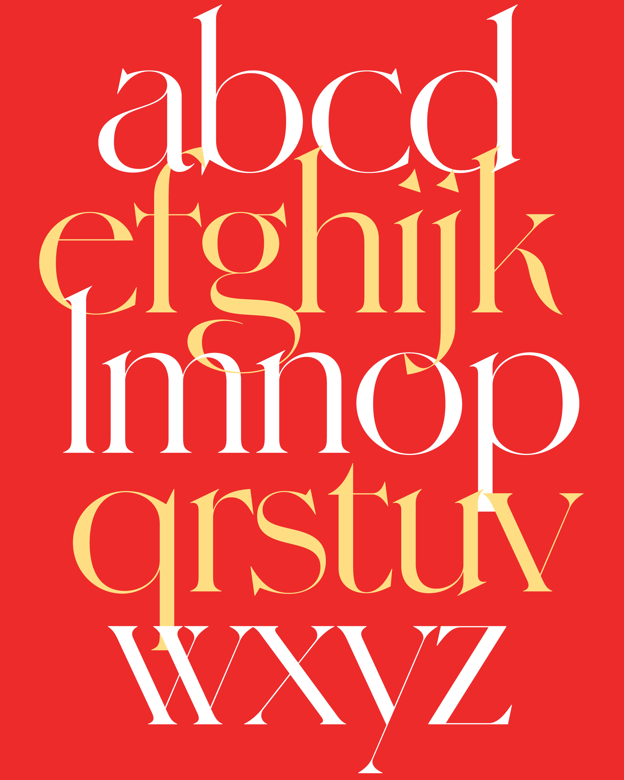
In my first pass of the lowercase, I looked for opportunities to echo the signature moves of the capitals letters. Certain features—the underbite of C, the “shy” tail of K, and the complexity of W—translated easily to their lowercase counterparts (I never get away with this, but Pomfret’s w is literally two v’s, just like the caps!).
The lowercase has so many more round shapes than the uppercase, and I quickly realized that I would have to heighten some of Pomfret’s other design elements to give it enough of the rigid refinement of the caps. The caps have a pretty high waist already (see E and P), but I pushed that even further in the top/bottom differentiation of a and e (the swooping curve of a also has a lot in common with a backwards s.) The difference in width between straight and round letters is also more extreme in the lowercase.
Pomfret’s lowercase also needed to span the stylistic divide between the Venetian-esque detailing and its unwaveringly upright axis and constructed appearance. The double-sided “head” serifs atop n and u are an unusual contrivance (typically head serifs only stick out to the left), but they echo the distinctive double-sided serifs on the capital M and N. They also serve to connect the design (at least superficially) to the angle of a broadnib pen, and are similar to shapes you might find in the Speedball textbook or University Roman.
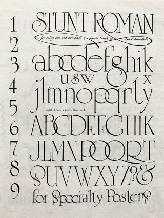
Stunt Roman, from the Speedball Textbook. See also Ross F. George at Letterform Archive.
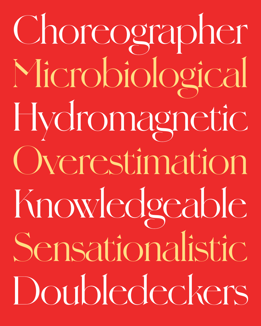
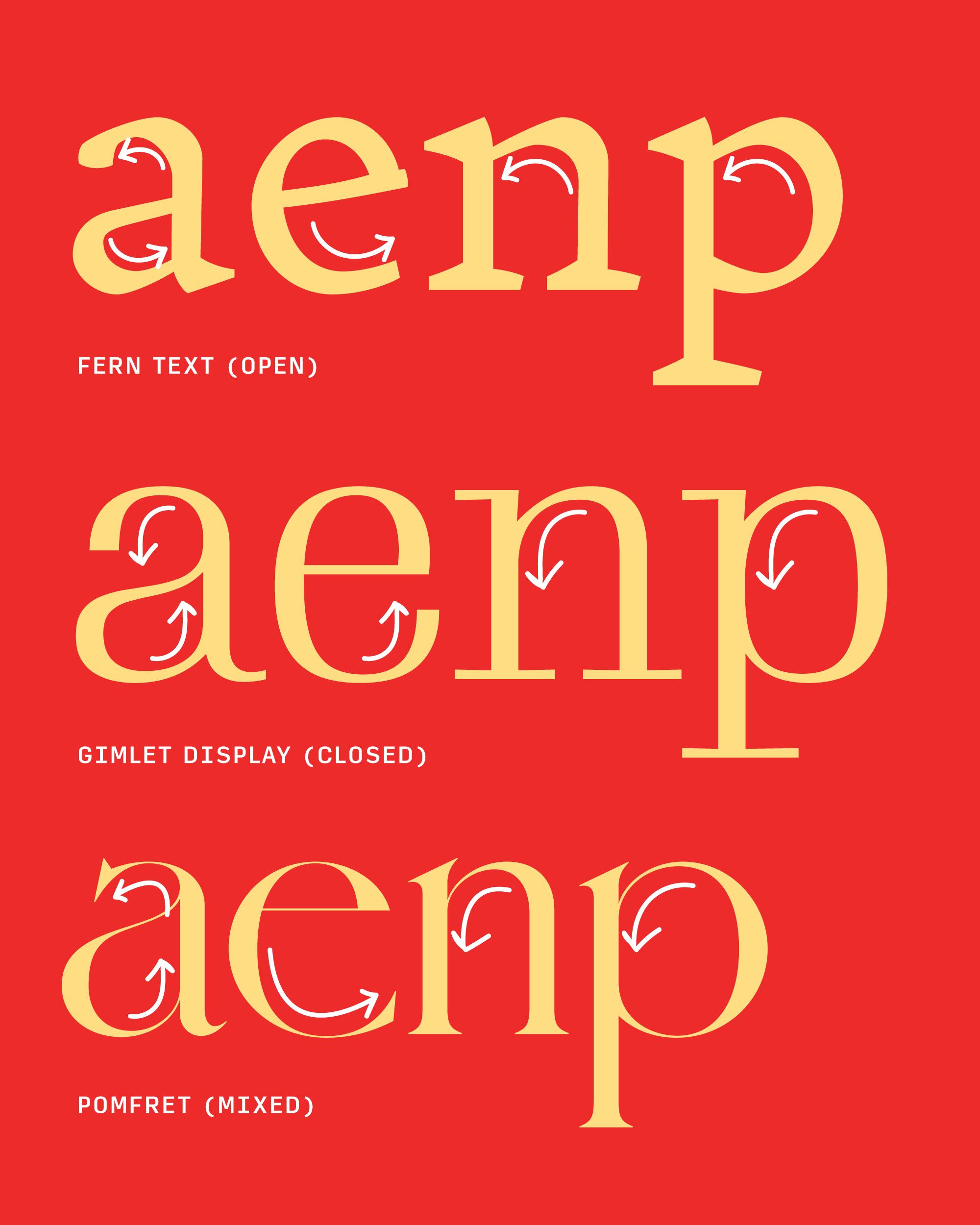
I’m usually a stickler for keeping the overall openness/closedness of arches and terminals consistent in my typefaces. For example, the arches of Fern’s n and p are flat and the “mouth” of the e stays open in order to echo that flatness. In contrast, Gimlet’s arches bend until they smoothly join the stem, and its terminals follow suit and close in. But in Pomfret, I forced myself to let go of this habit and the arches close in while the terminals remain wide open, another effort to bridge that stylistic gap.
All in all, the lowercase I ended up with for Pomfret was certainly not the lowercase I expected. It probably has more in common with ’60s quasi-inscriptional designs like Americana and Friz Quadrata than it does anything created by Goodhue. But I *think* it coexists happily with the uppercase, and I hope you do too!
What’s next for Pomfret? Now that I’ve done this lowercase, I’m curious to see how it translates to an italic. And I know that Pomfret’s utility is extremely limited by its super-high contrast, so I’ve been sketching a low contrast version for small sizes as well...

