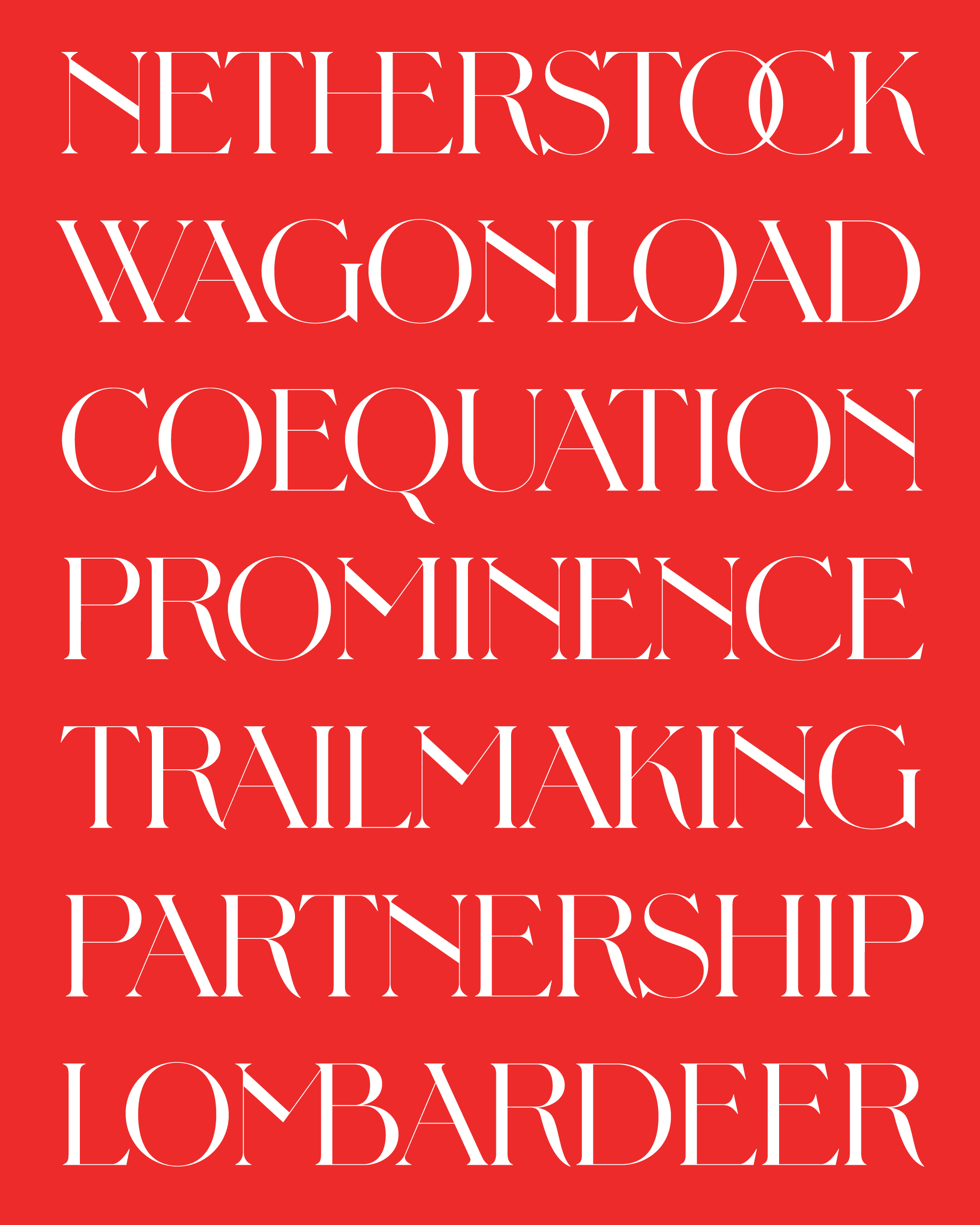
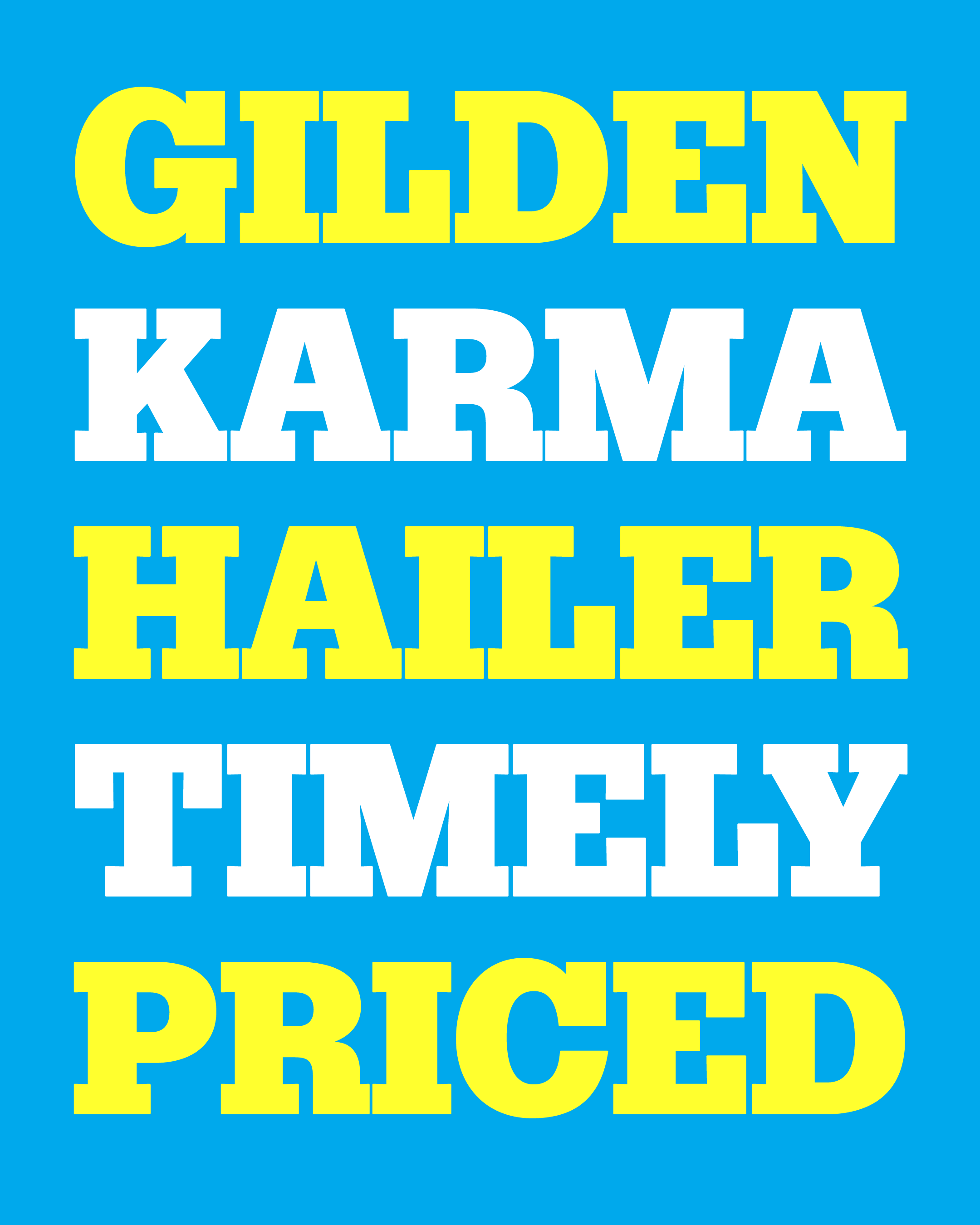
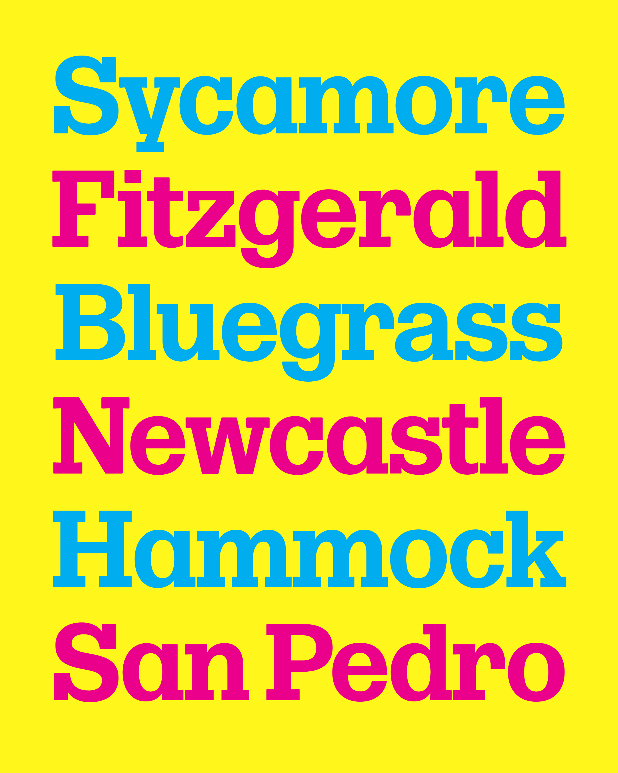
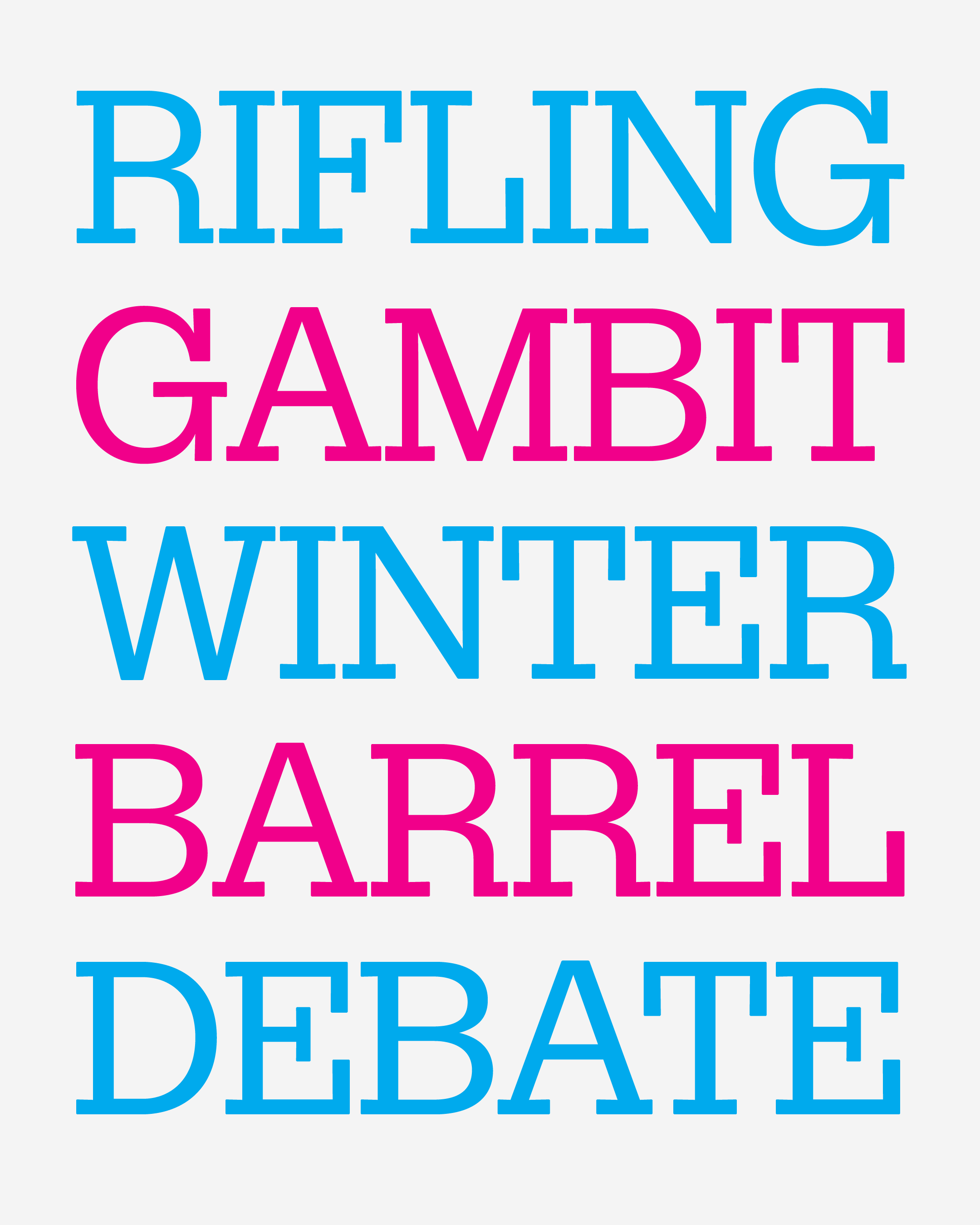
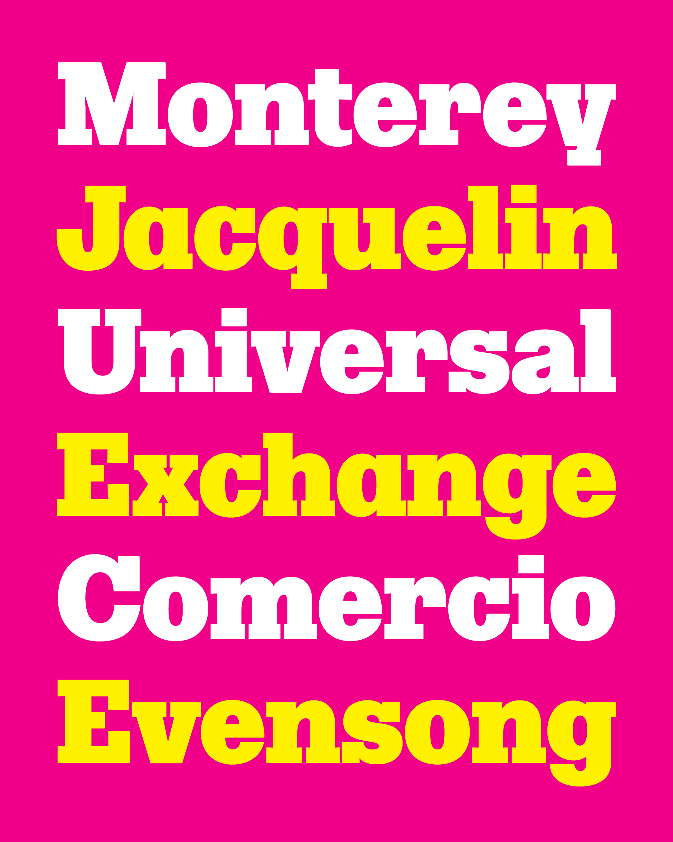
September’s font of the month: Roslindale Display Widths
I’m learning that this club is a great way for me to start new projects, but way-less-great for finishing them. The final stretch of a typeface’s development involves a decent amount of drudgery that doesn’t exactly lend itself to monthly installments. After all, type design doesn’t follow a traditional narrative arc; there’s no exciting build-up to the climax.
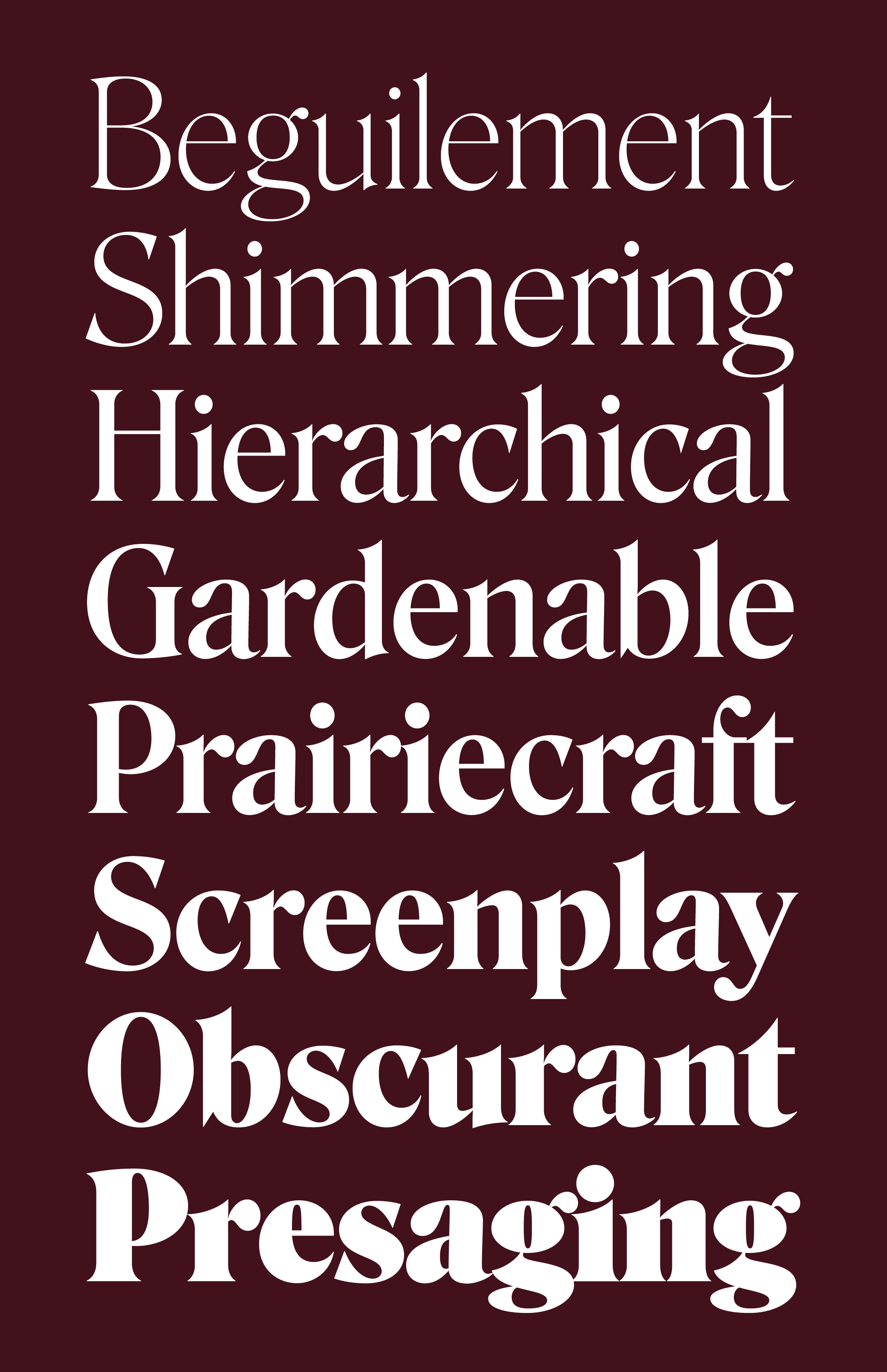
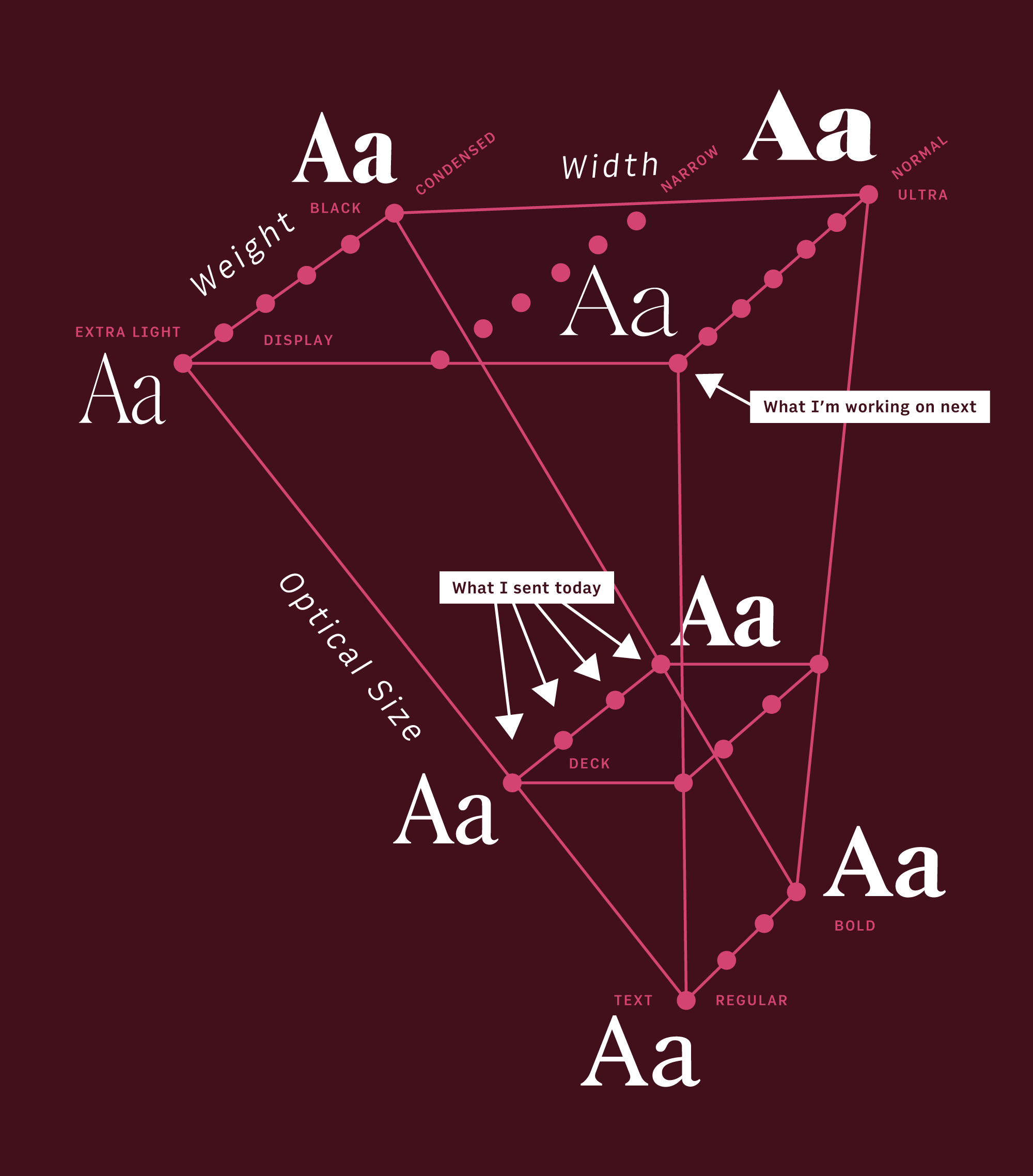
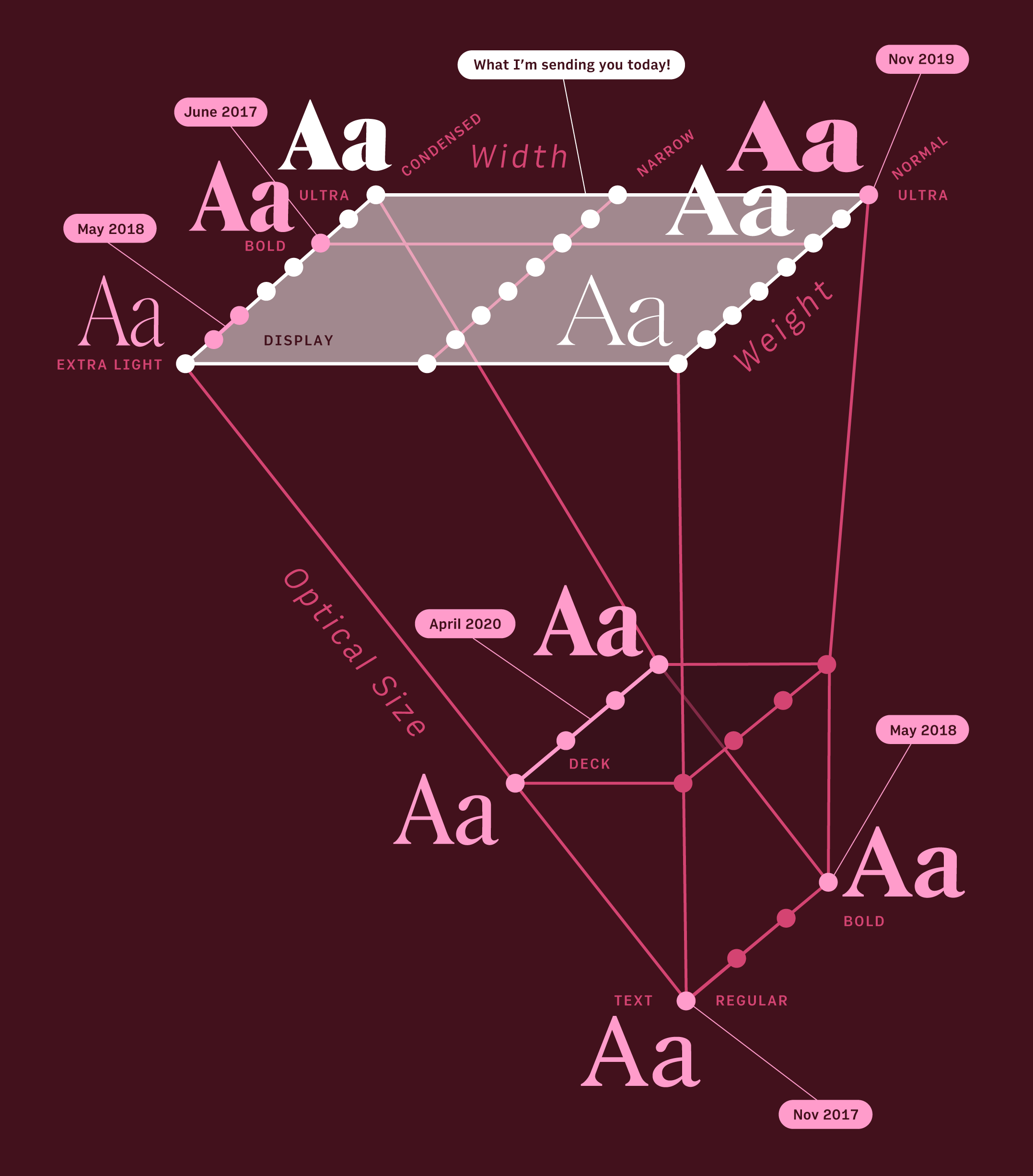
During the early stages of type design, I’m figuring out a system of shapes through exploration and trial and error. Once things begin to solidify, my process becomes more about managing the execution of that system through interpolation. This is essentially where I’m at with Roslindale, so I figured it was as good a time as any to send the club an update of the newly-expanded Roslindale Display (v2) and see what they think.
Interpolation is just math… it’s easy enough for a computer to interpolate between a Light outline and a Bold outline and spit out a Medium. Whether or not that blended result looks any good is a totally different story, and much of my time is spent futzing with outlines trying to get the different parts of the space to play nice with each other.
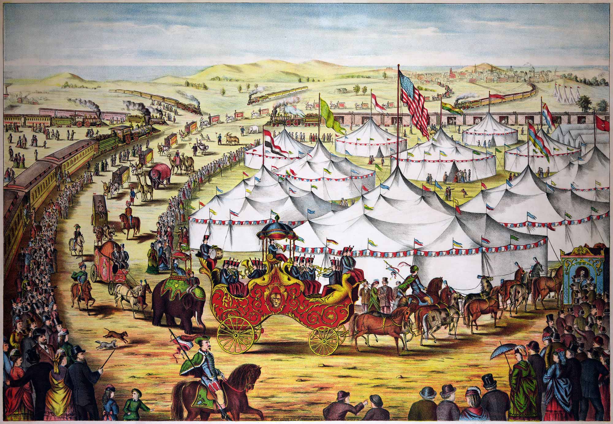
For me, a large interpolating family like Roslindale is a circus tent: a massive canvas propped up by tent posts in order to cover a certain amount of space. Math is the canvas, the connective material that unites the space, but it’s the strategic placement of the tent posts (not to mention their structural integrity) that keeps the tent aloft.
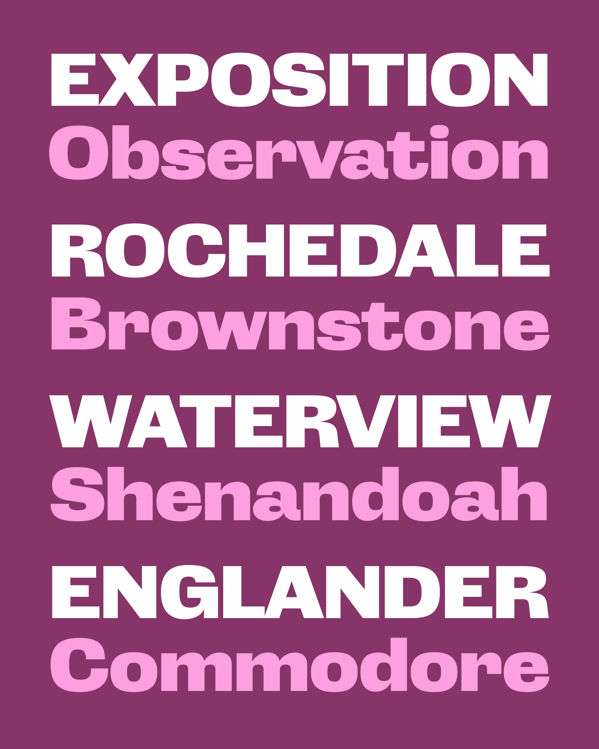
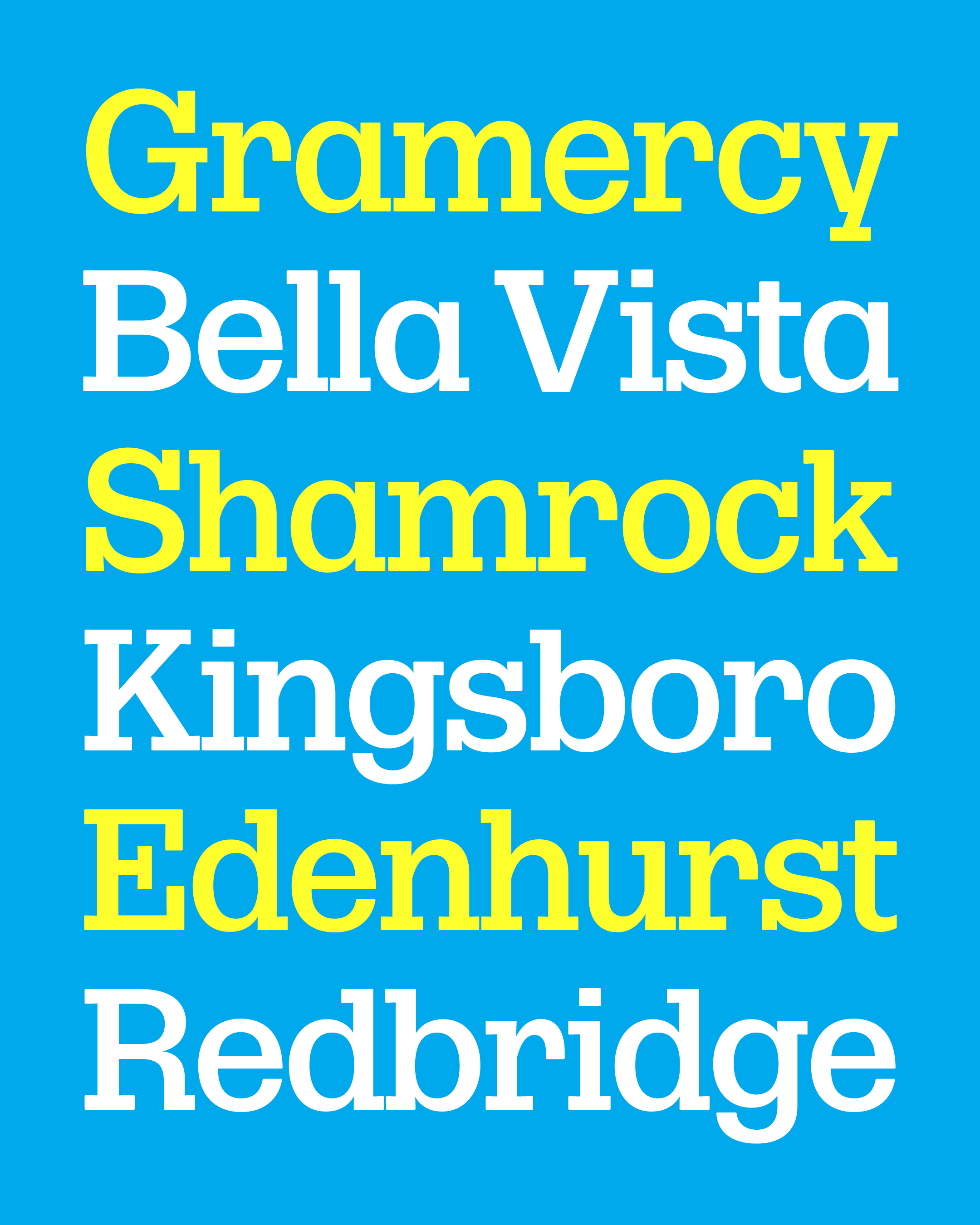
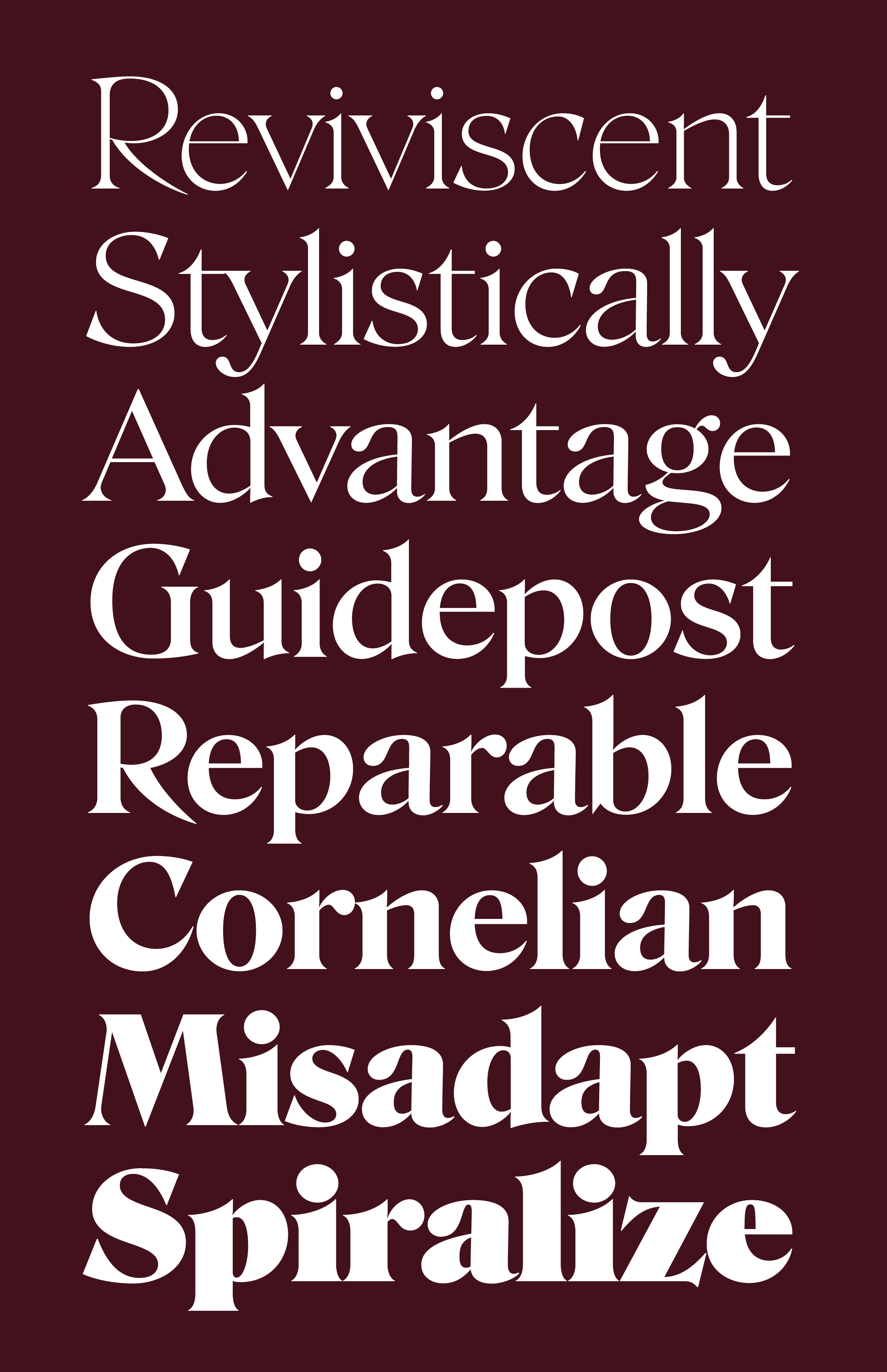
Up until recently, Roslindale Display was anchored by three tent posts: Condensed Bold from June 2017, Condensed Light from May 2018 (subsequently pushed further to Extra Light), and Ultra from last November. In anticipation of this month’s mailing, I’ve added three more: Extra Light, Bold, and Condensed Ultra.
Fewer tent posts means less work, less complexity, and (for a variable font) less weight. But it also means that the fabric can start to sag in the middle, where the result is rarely catastrophic (barring a technical error) but it can get soft and gummy and just a bit “meh.”
This is precisely what happened between my new Display Extra Light and the existing Display Ultra, which I needed to create for the lightest + widest corner of the space. The thick parts of the letters got thick too fast, and the thin parts of the letters didn’t get thick enough fast enough.
My solution was twofold: first, I went back and subtly overhauled the way strokes taper in the Ultra weight. Next, I stuck another tent post in the middle (Display Bold), which gave me the additional support I needed to manage the progression of thicks and thins.
Interpolation doubtlessly involves compromise… it is, of course, a literal compromise between different outlines. But I try to draw shapes in a way that every instance within that interpolating designspace “pops” as if it is the only one.
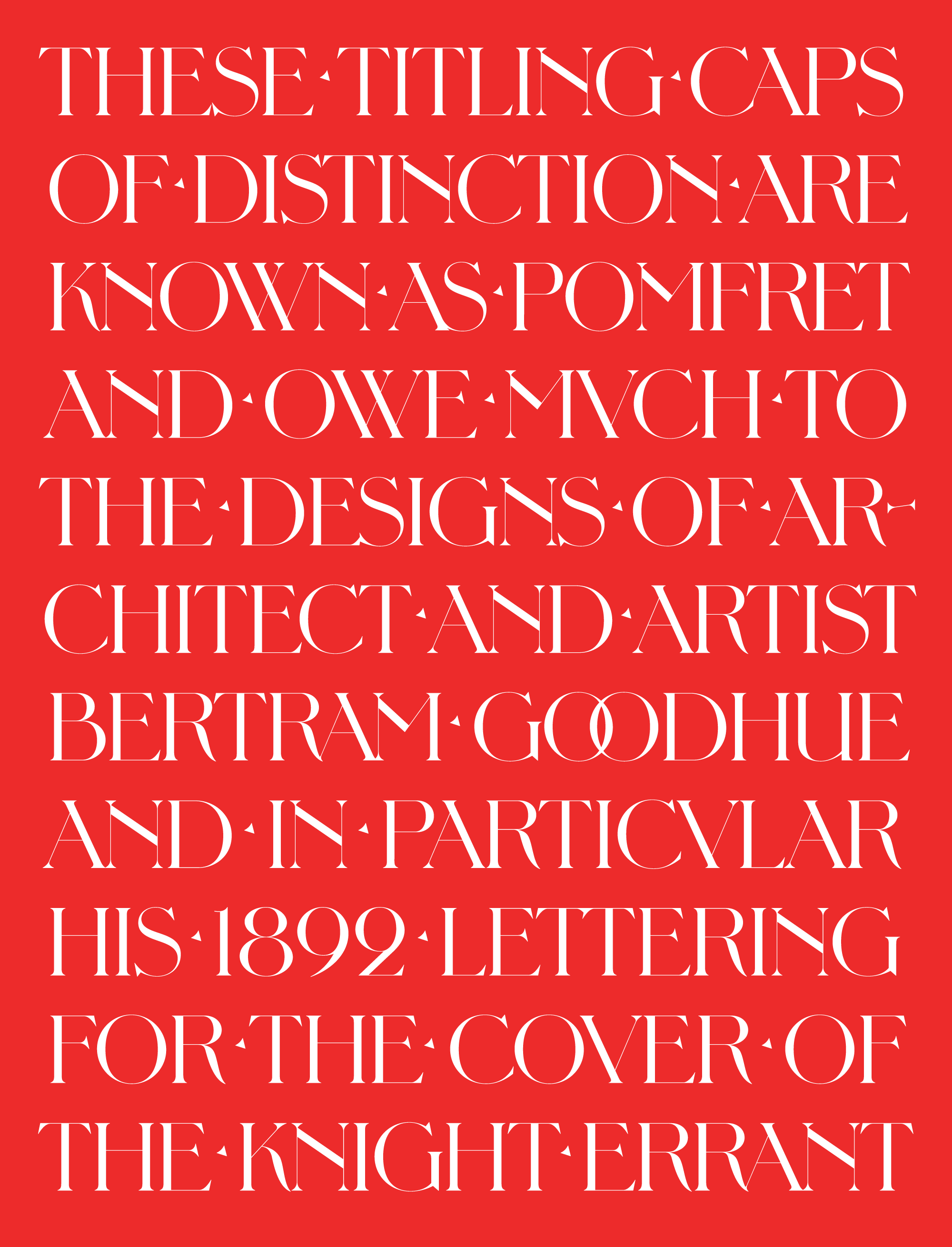
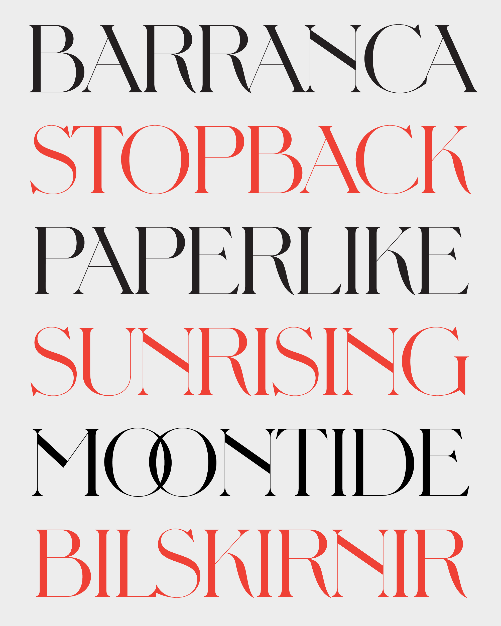
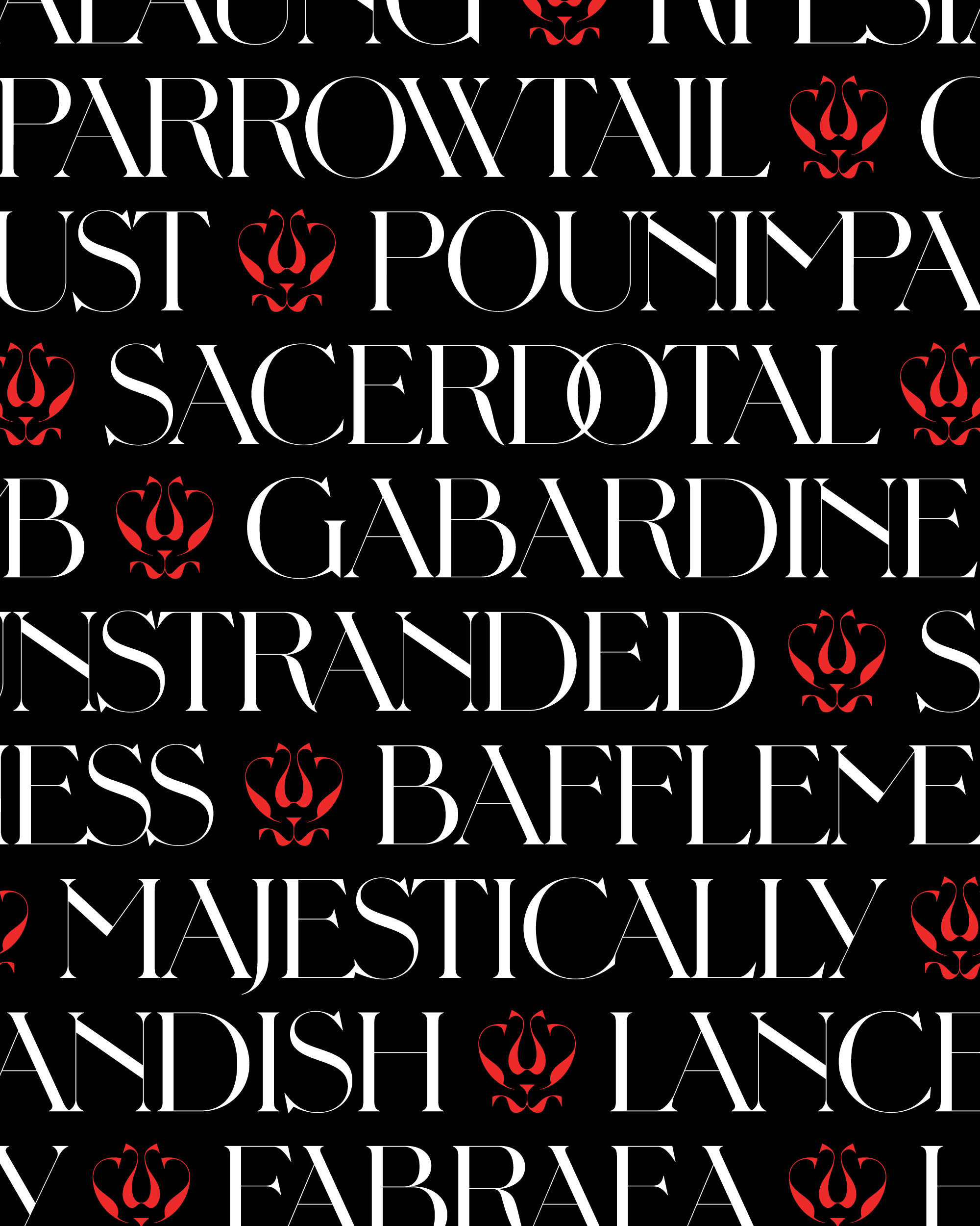
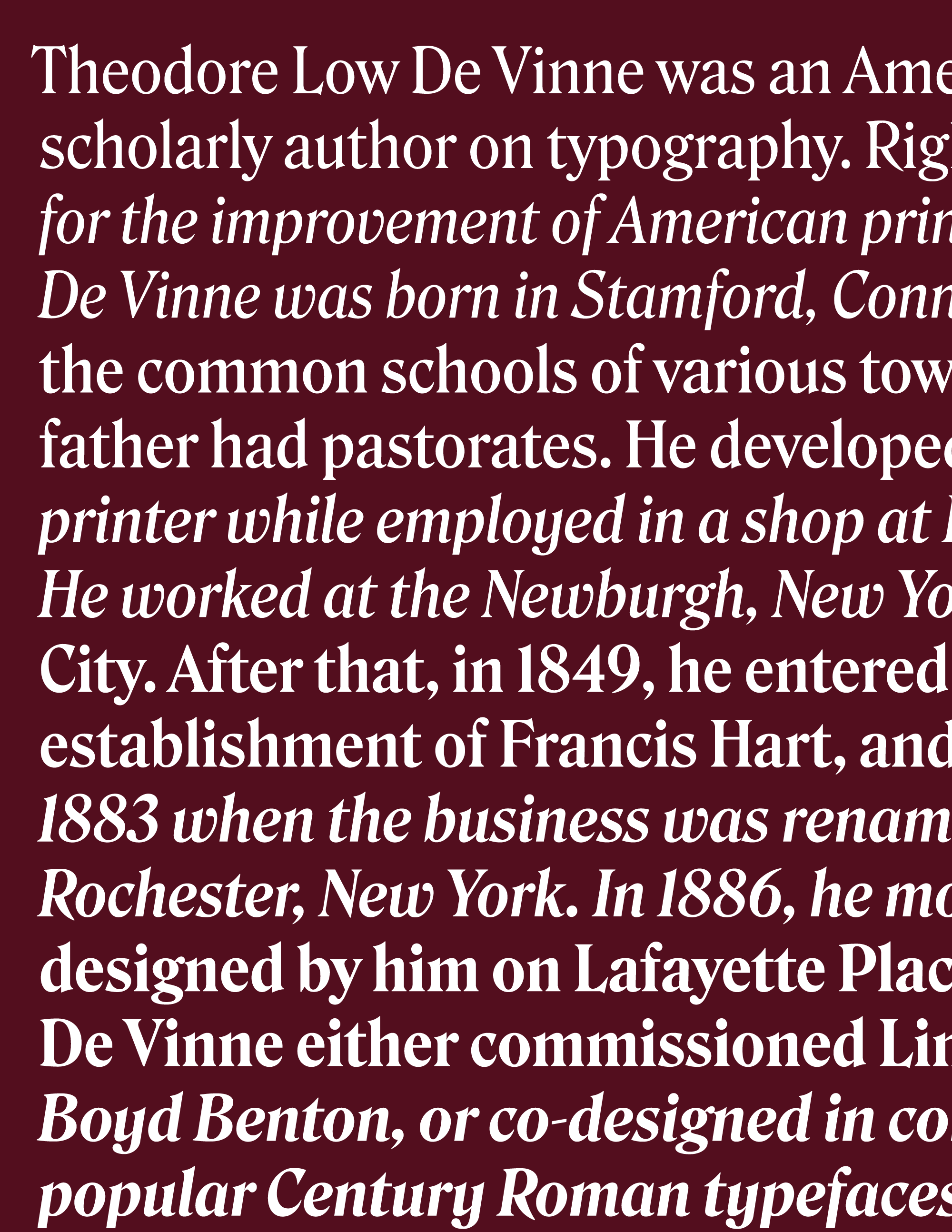
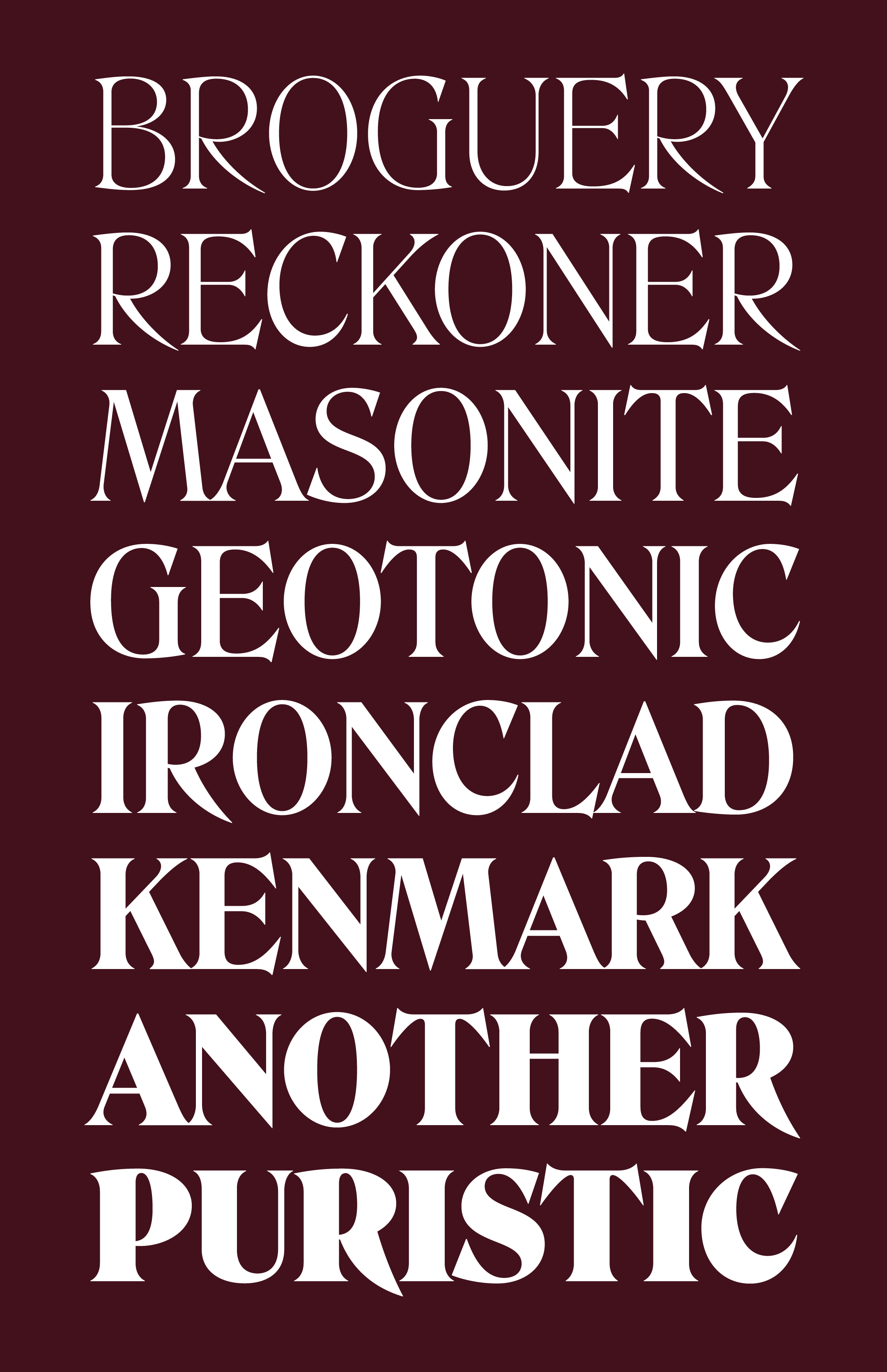
Even if all of this interpolation talk was a bit dry, I still hope that you enjoy the circus that is Roslindale Display! (I’ll be curious to hear if you think the new Wide styles retain enough of their De Vinne flavor.) I plan to keep working on these right up until the family’s full release, so feel free to re-download the fonts here at any point if you want to make sure you have the latest.
Roslindale Display is September’s installment of Font of the Month Club; this month only, you can get all 24 styles sign up for as little as $24.